Published by
Princeton Architectural Press
37 East 7th Street
New York, New York 10003
Visit our website at www.papress.com
2013 Princeton Architectural Press
All rights reserved
16 15 14 13 4 3 2 1 First edition
No part of this book may be used or reproduced in any manner without written permission from the publisher, except in the context of reviews.
Every reasonable attempt has been made to identify owners of copyright. Errors or omissions will be corrected in subsequent editions.
Hand-painted front cover artwork: Ira Coyne
Hand-lettered interior typography: Josh Luke
Editor: Sara Bader
Book design: Paul Wagner
Design assistance: Benjamin English
Special thanks to: Bree Anne Apperley, Nicola Bednarek Brower, Janet Behning, Fannie Bushin, Megan Carey, Carina Cha, Andrea Chlad, Russell Fernandez, Will Foster, Jan Haux, Diane Levinson, Jennifer Lippert, Jacob Moore, Gina Morrow, Katharine Myers, Margaret Rogalski, Elana Schlenker, Dan Simon, Andrew Stepanian, and Joseph Weston of Princeton Architectural Press Kevin C. Lippert, publisher
Library of Congress Cataloging-in-Publication Data
Levine, Faythe, 1977
Sign painters / Faythe Levine and Sam Macon.
p. cm.
ISBN 978-1-61689-083-4 (pbk. : alk. paper)
ISNB 978-1-61689-198-5 (digital)
1. Signs and signboardsUnited States. I. Macon, Sam. II. Title.
hf5841 .l482012
659.1342dc23
2012012992
Ed Ruscha
Faythe Levine & Sam Macon
Glenn Adamson
WAGNERS Blue Print Text Book
of Sign and Show Card LetteriNG
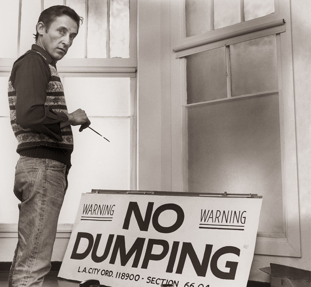
Ed Ruscha at 102 North Western Avenue, Hollywood, ca. 1981. Photo by James Wojcik.


Growing up in the Southwest in the 1950s, I was exposed every day to hand-lettered signs, usually on wrinkly sheets of metal, say, for an unplanned watermelon sign or a hamburger menu. Some sign painters had the facility to make any word grouping look good and make any letter of the alphabet look stylish. The watermelon sign, a particular American icon, often misspelled and full of genuinely folkish paint strokes, was everywhere. Then there were the painters who added impressive illustrations along with the smoothly handled letterforms. Sometimes they did it with gloss black one-stroked enamel letters on a glossy white background. Wow! And the ecstasy of seeing a sign on metal with a beautifully built-up edge of paint bulging from one side of the letter stroke! Its not science, but its beautiful and all artists recognize this. These painters knew about optical illusions, that some letters like O and S need to go a shade higher and lower than the baselines to appear equal in the lineup. This is something you take to heart.
Im reminded of the late Clark Byers (ca. 1915 2004 ), known as the barnyard Rembrandt. He painted SEE ROCK CITY (a roadside attraction outside of Chattanooga) on the sides of more than nine hundred barns in Tennessee and Georgia. He said, I never passed up a good roof. That leads me to flash forward to todays world with our seven-story wraparound motion graphics la Las Vegas or Times Square.
The creators of hand-painted signs have engaged in an elegant and noble art form in all of its extremes, but in a world of computer plastics, where do we go? Children are not even taught longhand writing these days. You might say the closest thing to a sign painter would be a graffiti artist out on the street, looking for walls. (And boy, can they embellish Old English letters upside down and backward!)
We have seen sign painting grow from primitive instincts and humble beginnings to this present world of advanced culture. Obviously I am all for the triumph and nobility of the hand-painted item, but all sign makers, whatever their method, know you have to do one main thing:
Ed Ruscha
Los Angeles, California, 2012
Faythe: Its just a sign until it influences your entire life. My love for urban landscapes and signage predates my awareness of sign painters. Ive always had a love for letters, and as I evolved as an artist in my early twenties my handwriting became an integral part of my artistic process. It was while I was living in Minneapolis in the late 1990s that sign painters entered my story.
My group of friends spent time hanging out on the West Bank at a caf called Hard Times. It was there that I first saw and took note of signs painted by a guy we called Sign Painter Phil. Phil Vandervaart ended up influencing and mentoring this group of friends, all of whom Ive maintained a friendship with over the years. Ira Coyne, Japhy Witte, Sean Barton, Sven Lynch, and Forrest Wozniak stuck with brush lettering and work as traditional sign painters around America (except Sven, who now runs his shop in Stockholm, Sweden).
Phils influence, first on my friends, and then trickling down to me, made a lasting impression. His work triggered an awareness, and Ive never looked at signs the same way since. After wrapping up my last documentary and book, Handmade Nation, I kept thinking about the fact that there wasnt more information available on sign painters. It was surprising to me, considering the general interest most people have for the topic. It was then that I approached Sam, with whom Ive collaborated professionally over the years, to see if he wanted to codirect a documentary on sign painters. I was confident that his extensive experience as a director, and our mutual interest in design and typography, would benefit the project.
Sam: When Faythe approached me with the idea of making a documentary about sign painters I was intrigued, but Id be lying if I said I knew what we were getting into. Ive always been a visually minded person. Many of my earliest memories involve travel, much of which was by car. I'd stare out the window of the family station wagon and watch America transition from one place to the next. Even before I could read them, regionally specific signage denoted by color, shape, and design would indicate this passage. When we'd drive by an old painted barn sign demanding us to SEE ROCK CITY , I knew we were roughly halfway between Wisconsin and Florida. This basic awareness of signs grew and developed over the years, but it was not until we began this project that I learned what it was about good signs that draws me in.

