Copyright
Copyright 2019 by Dover Publications, Inc.
Foreword copyright 2019 by James Gurney
All rights reserved.
Bibliographical Note
This Dover edition, first published in 2019, is an unabridged republication of Art Alphabets and Lettering (fourth edition) and selections from Art Monograms and Lettering (tenth edition), originally printed by J. M. Bergling, Chicago, in 1923 and 1920. A new foreword by James Gurney has been specially written for this volume.
Library of Congress Cataloging-in-Publication Data
Names: Bergling, J. M. (John Mauritz), 18661933, author. | Gurney, James, 1958 writer of foreword. | Container of (work): Bergling, J. M. (John Mauritz), 18661933. Art alphabets and lettering. | Container of (work): Bergling, J. M. (John Mauritz), 18661933. Art monograms and lettering. Selections.
Title: Art alphabets, monograms, and lettering / J.M. Bergling ; foreword by James Gurney.
Description: Mineola, New York : Dover Publications, Inc., 2019. | This Dover edition, first published in 2019, is an unabridged republication of Art Alphabets and Lettering (fourth edition) and selections from Art Monograms and Lettering (tenth edition), originally printed by J. M. Bergling, Chicago, in 1923 and 1920.
Identifiers: LCCN 2018042965| ISBN 9780486831701 | ISBN 0486831701
Subjects: LCSH: Alphabets. | Monograms. | Lettering.
Classification: LCC NK3640 .B435 2019 | DDC 745.6/1dc23
LC record available at https://lccn.loc.gov/2018042965
Manufactured in the United States by LSC Communications 83170101 2019
www.doverpublications.com
FOREWORD
From the perspective of our era of computer-generated typography, it is difficult to appreciate the ubiquity of handmade lettering a century ago. Writing made by hand appeared not only in personal letters and postcards, but also in business correspondence, architects plans, store windows, roadside billboards, theater lobbies, newspaper advertisements, college diplomas, engraved silverware, and even embroidered handkerchiefs.
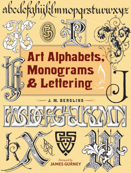
At the dawn of the twentieth century, the art of hand lettering reached flamboyant, exuberant heights. The period known as the Golden Age of Ornamental Penmanship was still in full flower when John Mauritz Bergling (18661933) first published Art Alphabets and Lettering in 1914. He expanded his encyclopedia of lettering through three subsequent editions, culminating in an enlarged fourth edition of 1923. Art Alphabets, Monograms & Lettering is an exclusive volume from Dover Publications that combines the 1923 edition with specially selected pieces from Art Monograms and Lettering (tenth edition, 1920).
Art Alphabets and Lettering is one of the most sought-after of the many treasuries of designs and alphabets from that period, not only because of the high standards of Berglings examples, but also because of the wide range of practical applications that he addressed.
In Berglings day, the field of artistic writing spanned the work of many specialists: engravers, engrossers, architects, show card writers, and commercial artists. He took care to consider the appropriate spirit for each kind of communication, ranging all the way from a sober commemoration of a retirement from an insurance company ().
Bergling was an authority in all these disciplines. As a boy, he emigrated with his father from Sweden, working in San Jose, California, and Chicago, Illinois, where he built his reputation as an engraver for watch cases and jewelry. He became one of the foremost practitioners of the art of the monogram, a popular graphic form where an individuals three initials are woven together into a clever artistic design. He produced three other design collections: Art Monograms and Lettering, Ornamental Designs and Illustrations, and Heraldic Designs and Engravings.
Art Alphabets and Lettering is Berglings crowning achievement, culling the best specimens from his many years as a leading engraver and pen artist. To make room for more samples, Bergling eliminated the introductory text typically found in comparable books, such as Ames Compendium of Practical and Ornamental Penmanship by Daniel T. Ames (1883) and Studies in Pen Art by William E. Dennis (1914). In such guidebooks, the text would have explained the theory and practice behind the alphabets. The modern reader might want to know at least the basics of the practical knowledge that Bergling took for granted.
For everyday penmanship, the steel dip pen had largely replaced the quill pen, which was made from a prepared primary flight feather of a goose or turkey. However, the quill pen wasand still isthe preferred tool for certain kinds of elegant writing and was the primary instrument for letterers before the nineteenth century. Steel pen nibs in Berglings day were available in a range of degrees of flexibility, and many of them are still available today. The nibs fitted into a pen holder and were dipped into an inkwell of India ink, which was waterproof, or a water-soluble ink such as Higgins Eternal.
The collection begins with script alphabets, notable for their flowing connected letters, such as American Round-hand and Spencerian on and 3. These models provide excellent guides for handwriting applications where a graceful elegance is required. The Spencerian alphabet was invented by Platt Rogers Spencer (18001864). It became standard in the United States between 1850 and 1925, after which it was replaced by the simpler Palmer method that was taught in schools up until recently.
Businesspersons were expected to convey their integrity and confidence by means of pen skills, culminating in a confident flourished signature. To achieve this kind of writing, penmanship instructors stressed the importance of good posture. First, the pen artist must take the proper position, seated in a straight chair with both feet flat on the floor, the back held straight. The pen is held, not in the tight grip of most beginners, but in a relaxed manner, the arm with its large muscle below the elbow resting lightly on the table.
Whole arm or off hand capitals, with their elaborate looping flourishes, are made without penciling the letterforms in advance. Their flowing grace requires a great deal of practice. They are written with broad movements of the arm, swinging easily from the shoulder. Fingers, wrist, and arm cooperate to create fluid movements. Each part of the flourish uses a smooth continuous stroke. By contrast, small letters should be rhythmically created with controlled finger movements.
Ideally, these scripts should be executed on a smooth cotton rag paper over lightly ruled guidelines drawn with a hard pencil. The slant of the letters should be absolutely uniform. The slant can be ruled lightly with an adjustable triangle set to a fixed slope and resting on a T-square or parallel rule. Most scripts require a slant of between fifty-two and fifty-four degrees from horizontal, or the three-quarter angle diagrammed on An oblique pen holder angles the nib to the right, allowing a better wrist position.
In settings where script writing needs to be larger and more precisely considered, it can be constructed by drawing the letters first in outline and then filling them in with a brush or pen, as shown on In general, it is a good idea for the student to begin constructing letters larger and at a slow speed. With improving skill, the execution typically becomes smaller in scale and more rapid. It is advisable to try for accuracy and quality first and then for speed.
The pen-based script alphabets, with their German and French variants, derive from the models produced by engravers in the eighteenth century, requiring the artist to incise a series of fine lines into a copperplate with a sharpened steel tool called a burin. The position of the tip of the burin is shown in the drawings on broadens on the pulling downstroke. Whichever tool is used, this thick-and-thin copperplate style is slow to execute, making it more suitable for headings and superscriptions than for everyday handwriting.
Next page
