Scott Alexander - The Library of Scott Alexandria
Here you can read online Scott Alexander - The Library of Scott Alexandria full text of the book (entire story) in english for free. Download pdf and epub, get meaning, cover and reviews about this ebook. year: 2015, publisher: Less Wrong, genre: Art. Description of the work, (preface) as well as reviews are available. Best literature library LitArk.com created for fans of good reading and offers a wide selection of genres:
Romance novel
Science fiction
Adventure
Detective
Science
History
Home and family
Prose
Art
Politics
Computer
Non-fiction
Religion
Business
Children
Humor
Choose a favorite category and find really read worthwhile books. Enjoy immersion in the world of imagination, feel the emotions of the characters or learn something new for yourself, make an fascinating discovery.
- Book:The Library of Scott Alexandria
- Author:
- Publisher:Less Wrong
- Genre:
- Year:2015
- Rating:5 / 5
- Favourites:Add to favourites
- Your mark:
- 100
- 1
- 2
- 3
- 4
- 5
The Library of Scott Alexandria: summary, description and annotation
We offer to read an annotation, description, summary or preface (depends on what the author of the book "The Library of Scott Alexandria" wrote himself). If you haven't found the necessary information about the book — write in the comments, we will try to find it.
The Library of Scott Alexandria — read online for free the complete book (whole text) full work
Below is the text of the book, divided by pages. System saving the place of the last page read, allows you to conveniently read the book "The Library of Scott Alexandria" online for free, without having to search again every time where you left off. Put a bookmark, and you can go to the page where you finished reading at any time.
Font size:
Interval:
Bookmark:
This is a collection of essays by Scott Alexander, collected by Rob Bensinger.
The ebook was assembled by Nino Annighfer.
A man comes to the rabbi and complains about his life: I have almost no money, my wife is a shrew, and we live in a small apartment with seven unruly kids. Its messy, its noisy, its smelly, and I dont want to live.
The rabbi says, Buy a goat.
What? I just told you theres hardly room for nine people, and its messy as it is!
Look, you came for advice, so Im giving you advice. Buy a goat and come back in a month.
In a month the man comes back and he is even more depressed: Its gotten worse! The filthy goat breaks everything, and it stinks and makes more noise than my wife and seven kids! What should I do?
The rabbi says, Sell the goat.
A few days later the man returns to the rabbi, beaming with happiness: Life is wonderful! We enjoy every minute of it now that theres no goat - only the nine of us. The kids are well-behaved, the wife is agreeable - and we even have some money!
traditional Jewish joke
Related to:
Biases are cognitive illusions that work on the same principle as optical illusions, and a knowledge of the latter can be profitably applied to the former. Take, for example, these two cubes (source: Lotto Lab, via Boing Boing):
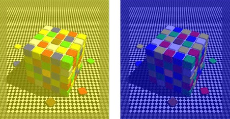
The blue tiles on the top face of the left cube are the same color as the yellow tiles on the top face of the right cube; if youre skeptical you can prove it with the eyedropper tool in Photoshop (in which both shades come out a rather ugly gray).
The illusion works because visual perception is relative. Outdoor light on a sunny day can be ten thousand times greater than a fluorescently lit indoor room. As one psychology book put it: for a student reading this book outside, the black print will be objectively lighter than the white space will be for a student reading the book inside. Nevertheless, both students will perceive the white space as subjectively white and the black space as subjectively black, because the visual system returns to consciousness information about relative rather than absolute lightness. In the two cubes, the visual system takes the yellow or blue tint as a given and outputs to consciousness the colors of each pixel compared to that background.
So this optical illusion occurs when the brain judges quantities relative to their surroundings rather than based on some objective standard. Whats the corresponding cognitive illusion?
In Predictably Irrational (relatively recommended, even though the latter chapters sort of fail to live up to the ones mentioned here) Dan Ariely asks his students to evaluate (appropriately) three subscription plans to the Economist:

Ariely asked his subjects which plan theyd buy if they needed an Economist subscription. 84% wanted the combo plan, 16% wanted the web only plan, and no one wanted the print only plan. After all, the print plan cost exactly the same as the print + web plan, but the print + web plan was obviously better. Which raises the question: why even include a print-only plan? Isnt it something of a waste of space?
Actually, including the print-only plan turns out to be a very good business move for the Economist. Ariely removed the print-only plan from the choices. Now the options looked like this.

There shouldnt be any difference. After all, hed only removed the plan no one chose, the plan no sane person would choose.
This time, 68% of students chose the web only plan and 32% the combo plan. Thats a 52% shift in preferences between the exact same options.
The rational way to make the decision is to compare the value of a print subscription to the Economist (as measured by the opportunity cost of that money) to the difference in cost between the web and combo subscriptions. But this would return the same answer in both of the above cases, so the students werent doing it that way.
What it looks like the students were doing was perceiving relative value in the same way the eye perceives relative color. The ugly gray of the cube appeared blue when it was next to something yellow, and yellow when it was next to something blue. In the same way, the $125 cost of the combo subscription looks like good value next to a worse deal, and bad value next to a better deal.
When the $125 combo subscription was placed next to a $125 plan with fewer features (print only instead of print plus web) it looked like a very good deal the equivalent of placing an ugly gray square next to something yellow to make it look blue. Take away the yellow, or the artificially bad deal, and it doesnt look nearly as attractive.
This is getting deep into Dark Arts territory, and according to Predictably Irrational, the opportunity to use these powers for evil has not gone unexploited. Retailers will deliberately include in their selection a super deluxe luxury model much fancier and more expensive than they expect anyone to ever want. The theory is that consumers are balancing a natural hedonism that tells them to get the best model possible against a commitment to financial prudence. So most consumers, however much they like television, will have enough good sense to avoid buying a $2000 TV. But if the retailer carries a $4000 super-TV, the $2000 TV suddenly doesnt look quite so bad.
The obvious next question is How do I use this knowledge to trick hot girls or guys into going out with me? Dan Ariely decided to run some experiments on his undergraduate class. He took photographs of sixty students, then asked other students to rate their attractiveness. Next, he grouped the photos into pairs of equally attractive students. And next, he went to Photoshop and made a slightly less attractive version of each student: a blemish here, an asymmetry there.
Finally, he went around campus, finding students and showing them three photographs and asking which person the student would like to go on a date with. Two of the photographs were from one pair of photos ranked equally attractive. The third was a version of one of the two, altered to make it less attractive. So, for example, he might have two people, Alice and Brenda, who had been ranked equally attractive, plus a Photoshopped ugly version of Brenda.
The students overwhelmingly (75%) chose the person with the ugly double (Brenda in the example above), even though the two non-Photoshopped faces were equally attractive. Ariely then went so far as to recommend in his book that for best effect, you should go to bars and clubs with a wingman who is similar to you but less attractive. Going with a random ugly person would accomplish nothing, but going with someone similar to but less attractive than you would put you into a reference class and then bump you up to the top of the reference class, just like in the previous face experiment.
Ariely puts these studies in a separate chapter from his studies on (which are also very good) but it all seems like the same process to me: being more interested in the difference between two values than in the absolute magnitude of them. All that makes anchoring and adjustment so interesting is that the two values have nothing in common with one another.
Font size:
Interval:
Bookmark:
Similar books «The Library of Scott Alexandria»
Look at similar books to The Library of Scott Alexandria. We have selected literature similar in name and meaning in the hope of providing readers with more options to find new, interesting, not yet read works.
Discussion, reviews of the book The Library of Scott Alexandria and just readers' own opinions. Leave your comments, write what you think about the work, its meaning or the main characters. Specify what exactly you liked and what you didn't like, and why you think so.

