Also by this author E DITING BY D ESIGN (FIRST, SECOND AND THIRD EDITIONS) D ESIGNING FOR M AGAZINES (FIRST AND SECOND EDITIONS) M ASTERING G RAPHICS U SING C HARTS AND G RAPHS G RAPHIC I DEA N OTEBOOK (FIRST AND SECOND EDITIONS) O N G RAPHICS : T IPS FOR E DITORS T HE G RID B OOK T HOUGHTS ON P UBLICATION D ESIGN G RAPHIC I DEA T RIGGERS G RAPHIC D ESIGN FOR THE E LECTRONIC A GE C OLOR FOR THE E LECTRONIC A GE G REAT P AGES C OLOR FOR I MPACT L EARN G RAPHIC D ESIGN (VIDEO) 1980, 1991, 2004 by Jan V. White Originally published by Watson-Guptill Publications, 1980 second edition published by Rockport Publishers, Inc., 1991. All rights reserved. Copyright under Berne Copyright Convention, Universal Copyright Convention, and Pan-American Copyright Convention. No part of this book may be reproduced, stored in a retrieval system, or transmitted in any form, or by any means, electronic, mechanical, photocopying, recording, or otherwise, without prior permission of the publisher. 10 East 23rd Street, New York, NY 10010 Cover design by Derek Bacchus Page composition / typography by Jan V. 10 East 23rd Street, New York, NY 10010 Cover design by Derek Bacchus Page composition / typography by Jan V.
White ISBN: 1-58115-354-6 Library of Congress Cataloging-in-Publication Data White, Jan V., 1928 Graphic Idea Notebook: A treasury of solutions to visual problems Jan V. White. Completely rev. 3rd ed.p.cm. ISBN 1-58115-354-6 1. Graphic design (Typography) 2.
Layout (Printing) 3. Magazine design. 4. Editing. Printed in Canada  McKenzie W riters conceive ideas in words. D esigners imagine in images.
Successful communication-in-print is an indissoluble blend of their skills, despite their traditional rivalry, misunderstanding, and professional prides and prejudices. Such blending is not easy, especially when the aim is CREATIVITY that desperate search for originality . Inventing anything from scratch is hard and, trust me, there aint nothing new under the sun. Inspiration comes but rarely. Awaiting the Muses kiss can be frustrating. What to do? You can cop out, say Ill sleep on it, and hope the brain will perform its magic as it sometimes does, but thats a bit risky.
It may not oblige by deadline. Settling down and thinking (i.e., working at it ) is more reliable but hard. Cool it. FESTINA LENTE , hurry slowly. First, find the obvious, then use it as a springboard. Work it up, develop it and what may start as a trite clich can metamorphose into a fresh and striking visual.
Such a caterpillar you turned into a butterfly has a huge advantage: your audience is likely to recognize and understand it. Hence this book. Flip through the pages, relax, open your mind, and allow the images to trigger ideas . Examine them in the light of your specific problem. Or look for clues in the words. That caterpillar may well be hiding in one of the categories into which the material is organized.
If it isnt, then random page-riffling is perfectly legitimate and probably ultimately more fruitful. This is an ideal cogitating-on-the-john-book. 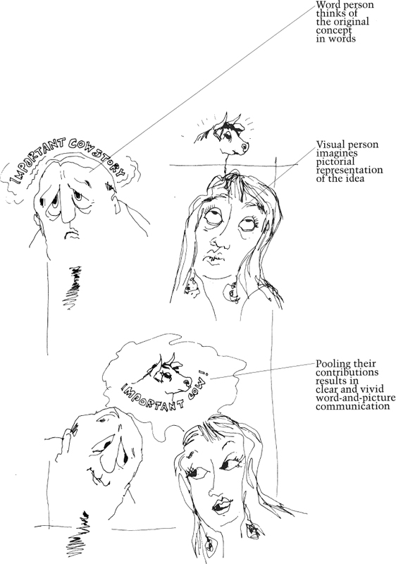
 If this is all so obvious, why do we do it so seldom in real life?
 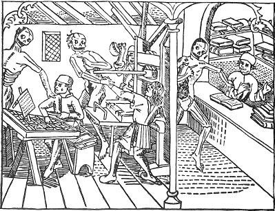 Publishing has been considered a risky business: first picture of printing: Death and the Printer La Grant Danse Macabre , Matthias Huss, Lyons, 1499.
 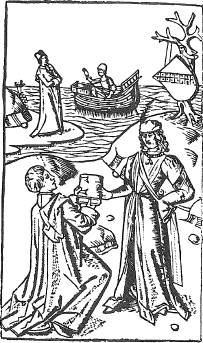 Author presenting Work to Philip the Good? No! Author delivering MS to editor. History of Jason , Haarlem, 1485.
 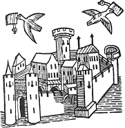 Carrier pigeons could fly up to 700 miles a day and were the most efficient means of fast long-distance communication in 1481 when this woodcut was made.
It shows a town in Syria, from Mandevilies Travels in the Orient . 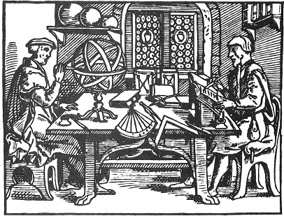 Entrepreneur and secretary? No! Circulation director and art consultant planning campaign. Thesaurarium artis scriptoriae , Caspar Neff, Cologne, 1549. Clip-art is fine. Without it, word-and-picture communication would be even more difficult than it already is. It would certainly be less startling, less decorative, and certainly much less fun .
Clip-art books and CDs group images by subject to illustrate specific elements. The pictures tend to be literal depictions of physical objects and the collections perform a vital function as storehouses cataloged for optimal retrieval of something you already know about and are looking for. Like a verbal thesaurus, you get lots of alternates. Reject the one that looks most startling. Pick the one that makes the most sense with the message. As far as they go, ready-made images are wonderful.
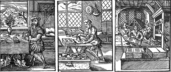
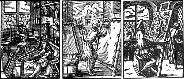
Imagine working without such wonderful old woodcuts as these. For instance, any time you see some historical reference made to the publishing and printing trades, youll probably see one of the pictures at right. In 1568, Sigmund Feyerabend of Frankfurt-am-Main in what is now Germany, published the Stndebuch or Book of Trades , with 119 woodcuts by Jost Amman and text in rhyming poems by Hans Sachs. They have become part of our visual language. P APERMAKER, TYPE FOUNDER, WOODBLOCK ENGRAVER, DESIGNER, ILLUMINATOR-ILLUSTRATOR, PRINTER, BOOKBINDER, PARCHMENT MAKER, PAINTER . A few more such jewels are shown on this page, purely for the fun of it.
Besides, they are all in the public domain, so you can swipe them, scan them, use them without permission, without a fee, and without worry. 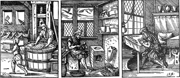
 But this is not a clip-art bookthis is a collection of visual ideas
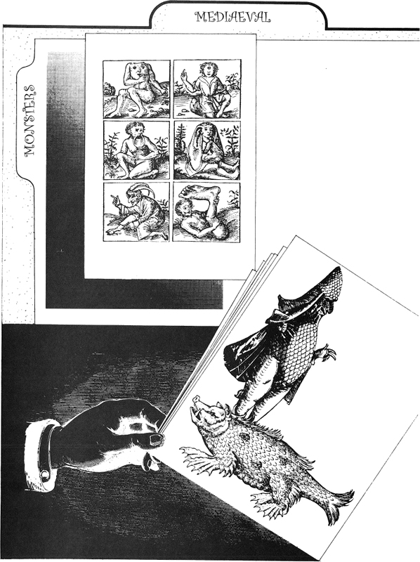
 The pictures are not intended to be realistic illustrations of specific subjects. Instead, they encourage you to go on random fishing expeditions, looking for ideas on how to handle abstract concepts. They are arranged in five groups. Some are logical, others subjective and instinctive, because one thought leads to another, and who knows how minds work? This is the Table of Contents. It is easier and quicker to flip the pages.











 McKenzie W riters conceive ideas in words. D esigners imagine in images.
 If this is all so obvious, why do we do it so seldom in real life?
  Publishing has been considered a risky business: first picture of printing: Death and the Printer La Grant Danse Macabre , Matthias Huss, Lyons, 1499.
  Author presenting Work to Philip the Good? No! Author delivering MS to editor. History of Jason , Haarlem, 1485.
  Carrier pigeons could fly up to 700 miles a day and were the most efficient means of fast long-distance communication in 1481 when this woodcut was made.
 Entrepreneur and secretary? No! Circulation director and art consultant planning campaign. Thesaurarium artis scriptoriae , Caspar Neff, Cologne, 1549. Clip-art is fine. Without it, word-and-picture communication would be even more difficult than it already is. It would certainly be less startling, less decorative, and certainly much less fun .

 But this is not a clip-art bookthis is a collection of visual ideas
 The pictures are not intended to be realistic illustrations of specific subjects. Instead, they encourage you to go on random fishing expeditions, looking for ideas on how to handle abstract concepts. They are arranged in five groups. Some are logical, others subjective and instinctive, because one thought leads to another, and who knows how minds work? This is the Table of Contents. It is easier and quicker to flip the pages.