Present across millions of websites and growing in popularity, JavaScript is an essential and practical for all programmers, designers and coding aficionados. Practical JavaScript Techniques offers expert instruction, tips and methodologies relevant for all levels of knowledge. Learn interactive CSS and jQuery techniques, how to take advantage of JavaScript's versatile capabilities and even how to build JavaScript-based gaming experiences. Whether you're perfecting Web design or building jQuery plugins, this vital resource is a must-have.
Develop A One-Of-A-Kind CSS/JS-Based Game Portfolio
By Daniel Sternlicht
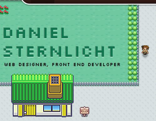
A portfolio is a must-have for any designer or developer who wants to stake their claim on the Web. It should be as unique as possible, and with a bit of HTML, CSS and JavaScript, you could have a one-of-a-kind portfolio that capably represents you to potential clients. In this chapter, I'll show you how I created my 2-D Web-based game portfolio.

The 2-D Web-based game portfolio of .
Before getting down to business, let's talk about portfolios.
A portfolio is a great tool for Web designers and developers to show off their skills. As with any project, spend some time learning to develop a portfolio and doing a little research on what's going on in the Web design industry, so that the portfolio presents you as an up to date, innovative and inspiring person. All the while, keep in mind that going with the flow isn't necessarily the best way to stand out from the crowd.
One last thing before we dive into the mystery of my Web-based game portfolio. I use jQuery which has made my life much easier by speeding up development and keeping my code clean and simple.
Now, let's get our hands dirty with some code.
The HTML
Let's warm up with a quick overview of some very basic HTML code. It's a bit long, I know, but let's take it step by step.
< div id = " wrapper " > < hgroup id = " myInfo " > < h1 > DANIEL STERNLICHT </</span>h1 > < h2 > Web Designer, Front-End Developer </</span>h2 > </</span>hgroup > < div id = " startCave " class = " cave " > </</span>div > < div id = " startCaveHole " class = " caveHole " > </</span>div > < div id = " mainRoad " class = " road " > </</span>div > < div id = " leftFence " > </</span>div > < div id = " rightFence " > </</span>div > < div id = " daniel " > </</span>div > < div id = " aboutRoad " class = " road side " > </</span>div > < div id = " aboutHouse " class = " house " > < div class = " door " > </</span>div > < div class = " lightbox " > ... </</span>div > < div id = " aboutSign " class = " sign " > < span > About Me </</span>span > </</span>div > < div id = " rightTrees " class = " trees " > </</span>div > < div id = " leftGrass " class = " grass " > </</span>div > < div id = " endSea " class = " sea " > </</span>div > < div id = " endBridge " class = " bridge " > </</span>div > < div id = " boat " class = " isMoored " > < div class = " meSail " > </</span>div > </</span>div > </</span>div >The HTML is not very complicated, and I could have used an element for this game, but I felt more comfortable using simple HTML DOM elements.
Basically, we have the main #wrapper div, which contains the game's elements, most of which are represented as div elements (I chose divs because they are easy to manipulate).
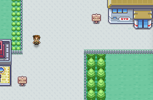
Have a . Can you detect what makes up the game view?

The game view
We have roads, trees, fences, water, caves, houses and so on.
Back to our HTML. You'll find an element for each of these items, with the relevant class and ID. Which brings us to the CSS.
The CSS
First of all, note that I prepared the HTML to follow the principles of by determining global classes for styling, and not using IDs as styling hooks. For example, I used the class .road on each element that should look like a road. The CSS for the .road class would be:
.road { position : absolute ; background : url(images/road.png) repeat ; }Take trees as another example:
.trees { position : absolute ; background : url(images/tree.png) repeat 0 0 ; }Note that almost all of the elements are absolutely positioned on the game's canvas. Positioning the elements relatively would be impossible for our purposes, especially because we want the game to be as responsive as possible (within limits, of course the minimum width that I deal with is 640 pixels). We can write a general rule giving all of the DOM elements in the game an absolute position:
#wrapper * { position : absolute ; }This snippet will handle all of the child elements inside the #wrapper div, and it frees us from having to repeat code.
One more word about the CSS. The animations in the game are done with CSS3 transitions and animations, excluding certain features such the lightboxes and player teleporting. There are two reasons for this.
The first is that one of the purposes of this portfolio is to demonstrate innovation and up-to-date development, and what's more innovative than using the power of CSS3?
The second reason is performance. Upon reading Richard Bradshaw's very interesting article , I came to the overwhelming conclusion: use CSS3 when you can.
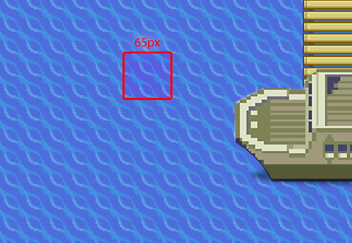
A great example of the power of CSS3 animations in my portfolio is the pattern of movement of the water. The CSS looks like this:
.sea { left : 0 ; width : 100% ; height : 800px ; background : url(images/sea.png) repeat 0 0 ; -webkit-animation : seamove 6s linear infinite ; /* Webkit support */ -moz-animation : seamove 6s linear infinite ; /* Firefox support */ animation : seamove 6s linear infinite ; /* Future browsers support */ }And here is the code for the animation itself:
/* Webkit support */ @-webkit-keyframes seamove { 0% { background-position : 0 0 ; } 100% { background-position : 65px 0 ; } } @-moz-keyframes seamove { } /* Firefox support */ @-keyframes seamove { } /* Future browsers support */




![Jon Duckett [Jon Duckett] - JavaScript and JQuery: Interactive Front-End Web Development](/uploads/posts/book/120511/thumbs/jon-duckett-jon-duckett-javascript-and-jquery.jpg)


