• Complain

Mike Crittenden - Responsive Theming for Drupal: Making Your Site Look Good on Any Device

Here you can read online Mike Crittenden - Responsive Theming for Drupal: Making Your Site Look Good on Any Device full text of the book (entire story) in english for free. Download pdf and epub, get meaning, cover and reviews about this ebook. year: 2014, publisher: OReilly Media, genre: Computer. Description of the work, (preface) as well as reviews are available. Best literature library LitArk.com created for fans of good reading and offers a wide selection of genres:

Romance novel Science fiction Adventure Detective Science History Home and family Prose Art Politics Computer Non-fiction Religion Business Children Humor

Choose a favorite category and find really read worthwhile books. Enjoy immersion in the world of imagination, feel the emotions of the characters or learn something new for yourself, make an fascinating discovery.

Mike Crittenden Responsive Theming for Drupal: Making Your Site Look Good on Any Device
  • Book:
    Responsive Theming for Drupal: Making Your Site Look Good on Any Device
  • Author:
  • Publisher:
    OReilly Media
  • Genre:
  • Year:
    2014
  • Rating:
    3 / 5
  • Favourites:
    Add to favourites
  • Your mark:
    • 60
    • 1
    • 2
    • 3
    • 4
    • 5

Responsive Theming for Drupal: Making Your Site Look Good on Any Device: summary, description and annotation

We offer to read an annotation, description, summary or preface (depends on what the author of the book "Responsive Theming for Drupal: Making Your Site Look Good on Any Device" wrote himself). If you haven't found the necessary information about the book — write in the comments, we will try to find it.

If you want your Drupal website to work well on smartphones, tablets, and desktops, this practical guide shows you how to incorporate Responsive Web Design (RWD) with specific Drupal 7 themes. Youll learn how to create attractive, easy-to-navigate layouts for everything from tiny phone screens to 30-inch desktop monitorsall with the same codebase.

Ideal for experienced Drupal developers, this book takes you through RWD basics and shows you how to build sites based on Aurora, Zen, and Omegathree popular base themes created by Drupal contributors. Whether youre creating a new site with RWD or adapting an existing one, youll learn how to become a better, more efficient Drupal themer.

  • Understand how Responsive Web Design and CSS media queries work
  • Learn how the Sass stylesheet language and Compass framework support RWD
  • Adopt a mobile-first approach to RWDand learn why its important
  • Get step-by-step instructions for creating custom subthemes on top of Aurora, Zen, and Omega
  • Tackle common problems when building and theming responsive Drupal sites
  • Explore alternative options for accommodating smartphone and tablet users

Mike Crittenden: author's other books


Who wrote Responsive Theming for Drupal: Making Your Site Look Good on Any Device? Find out the surname, the name of the author of the book and a list of all author's works by series.

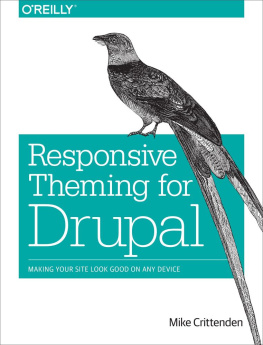
Responsive Theming for Drupal: Making Your Site Look Good on Any Device — read online for free the complete book (whole text) full work

Below is the text of the book, divided by pages. System saving the place of the last page read, allows you to conveniently read the book "Responsive Theming for Drupal: Making Your Site Look Good on Any Device" online for free, without having to search again every time where you left off. Put a bookmark, and you can go to the page where you finished reading at any time.

Light

Font size:

Reset

Interval:

Bookmark:

Make
Responsive Theming for Drupal
Mike Crittenden
Preface
What Youll Find Here

This book will guide you through the basics of proper Drupal 7 theming. This includes things like:

  • An introduction to responsive web design (RWD).
  • An introduction to Drupal theming as it relates to RWD.
  • A discussion of the what and the why of Drupal-based themes and subthemes.
  • A comparison of a few popular base themes (Zen, Omega, and Aurora).
  • Step-by-step instructions for creating custom subthemes based on those base themes.
  • Some common gotchas, tips, and tricks for building and theming responsive Drupal sites.
  • Pointers to more information and next steps that pick up where this book leaves off.

Throughout the book, well use as an example a very fake-sounding online business that sells turnip sauce and desperately needs your help.

Intended Audience

This book makes a few assumptions about the reader:

  • You should have at least a very basic understanding of Drupal. If you arent sure what a node is, for example, youll want to learn a bit more about Drupal before diving into this book.
  • You should feel comfortable using the command line to run pre-written commands. You wont need enough command-line know-how to write your own commands or do anything tricky, but you will need to run them and read the output.
  • You should know and understand HTML and CSS fairly well. If you arent sure of the difference between a div and a span or between #header and .header, for example, youll want to study up a bit on that first.
  • You should want to become a better, more efficient, more knowledgeable Drupal themer. If you just want to get a site built and out the door and arent interested in bettering yourself, this book might offer a bit too much detail.
Conventions Used in This Book

The following typographical conventions are used in this book:

Italic Indicates new terms, URLs, email addresses, filenames, and file extensions. Constant width Used for program listings, as well as within paragraphs to refer to program elements such as variable or function names, databases, data types, environment variables, statements, and keywords.
Tip

This element signifies a tip or suggestion.

Note

This element signifies a general note.

Warning

This element indicates a warning or caution.

Using Code Examples

This book is here to help you get your job done. In general, if example code is offered with this book, you may use it in your programs and documentation. You do not need to contact us for permission unless youre reproducing a significant portion of the code. For example, writing a program that uses several chunks of code from this book does not require permission. Selling or distributing a CD-ROM of examples from OReilly books does require permission. Answering a question by citing this book and quoting example code does not require permission. Incorporating a significant amount of example code from this book into your products documentation does require permission.

We appreciate, but do not require, attribution. An attribution usually includes the title, author, publisher, and ISBN. For example: Responsive Theming for Drupal by Mike Crittenden (OReilly). Copyright 2014 Mike Crittenden, 978-1-449-37331-3.

If you feel your use of code examples falls outside fair use or the permission given above, feel free to contact us at .

Safari Books Online
Note

Safari Books Online is an on-demand digital library that delivers expert content in both book and video form from the worlds leading authors in technology and business.

Technology professionals, software developers, web designers, and business and creative professionals use Safari Books Online as their primary resource for research, problem solving, learning, and certification training.

Safari Books Online offers a range of product mixes and pricing programs for organizations, government agencies, and individuals. Subscribers have access to thousands of books, training videos, and prepublication manuscripts in one fully searchable database from publishers like OReilly Media, Prentice Hall Professional, Addison-Wesley Professional, Microsoft Press, Sams, Que, Peachpit Press, Focal Press, Cisco Press, John Wiley & Sons, Syngress, Morgan Kaufmann, IBM Redbooks, Packt, Adobe Press, FT Press, Apress, Manning, New Riders, McGraw-Hill, Jones & Bartlett, Course Technology, and dozens more. For more information about Safari Books Online, please visit us online.

How to Contact Us

Please address comments and questions concerning this book to the publisher:

OReilly Media, Inc.
1005 Gravenstein Highway North
Sebastopol, CA 95472
800-998-9938 (in the United States or Canada)
707-829-0515 (international or local)
707-829-0104 (fax)

We have a web page for this book, where we list errata, examples, and any additional information. You can access this page at http://oreil.ly/responsive-drupal.

To comment or ask technical questions about this book, send email to .

For more information about our books, courses, conferences, and news, see our website at http://www.oreilly.com.

Find us on Facebook: http://facebook.com/oreilly

Follow us on Twitter: http://twitter.com/oreillymedia

Watch us on YouTube: http://www.youtube.com/oreillymedia

Acknowledgments

Many thanks to the following technical reviewers:

  • Dani Nordin
  • Michael Ross
  • Rob Decker

And a huge thanks to Mike Granger for the thorough revisions and suggestions.

Chapter 1. Responsive Design: A Quick and Dirty Intro

A couple years ago, Riley had a problem. His businessRileys Terrific Turnip Saucewas exploding and his phone wouldnt stop ringing with new orders. So Riley did what any ambitious small business owner would do: he took it to the Web. He did a little reading and in a few days time had set up an online order form so he could take orders 24-7 without ever talking to anyone. This was an overwhelming success.

Fast-forward to now, however, and Rileys tried-and-true order form isnt chugging along like it used to. Hes starting to get complaints about it being hard to use on this customers iPad or not loading right on that customers smartphone. Riley is once again in a bind and this time hes stumped, so he comes to you for help.

Lucky for you, youve been hearing some shop talk about a thing called responsive design that aims to solve this very problem, but you dont know what the heck it is.

So, What the Heck Is Responsive Design?

In the context of the Web, responsive web design (RWD) is sort of a technical one-size-fits-all paradigm for websites. All in this case refers to all resolutions, meaning anything from a tiny Android phone to a 30-inch desktop monitor.

However, unlike that Velcro hat you won in a contest, one size really does fit all with RWD. Rather than just stretching or squishing to fit into the viewing device or browser window as is done in fluid designs, RWD allows you to actually craft different layouts per resolution so that each size gets a truly tailored experience. All that is done with the same code, and without requiring JavaScript (for the most part).

The idea here is to write CSS that only applies to resolutions in a specific range. That way, we can write code that applies only to phones, code that applies only to tablets, and code that applies only to regular desktop/laptop devices.

Next page
Light

Font size:

Reset

Interval:

Bookmark:

Make

Similar books «Responsive Theming for Drupal: Making Your Site Look Good on Any Device»

Look at similar books to Responsive Theming for Drupal: Making Your Site Look Good on Any Device. We have selected literature similar in name and meaning in the hope of providing readers with more options to find new, interesting, not yet read works.


Reviews about «Responsive Theming for Drupal: Making Your Site Look Good on Any Device»

Discussion, reviews of the book Responsive Theming for Drupal: Making Your Site Look Good on Any Device and just readers' own opinions. Leave your comments, write what you think about the work, its meaning or the main characters. Specify what exactly you liked and what you didn't like, and why you think so.