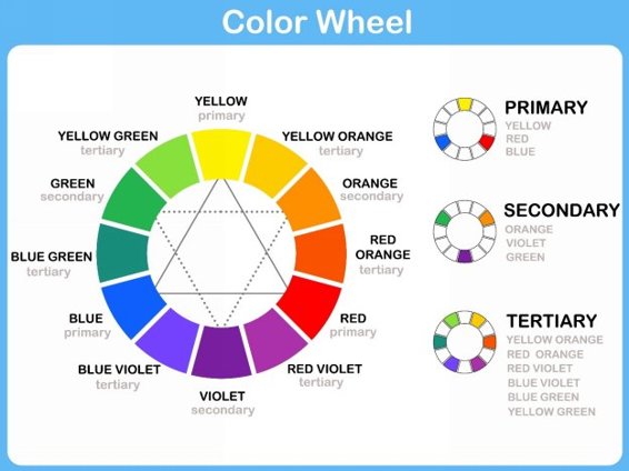
This image illustrates the color wheel used by artists and illustrators.
Primary colors are colors are the base for all colors in the spectrum. Primary colors are called primary because they are not created by mixing colors and include blue, red, and yellow.
Secondary colors are a mixture of two primary colors. They include orange, violet, and green. Orange is a mixture of red and yellow. Violet is a mixture of blue and red. Green is a mixture of yellow and blue.
Tertiary colors are a mixture of primary and secondary colors. These include yellow orange, red orange, red violet, blue violet, blue green, and yellow green.
There are colors between the three main categories and the shades, tints, and hues can be an endless combination of colors. Adding white to a color creates a lighter tint, while adding black or gray creates a darker shade.
White and black are usually considered neutral as well as gray. White is actually all of the colors in the spectrum, while black is the absence of color. This may sound counterintuitive, but we see color when the colors in the light spectrum are absorbed by a material. White absorbs all the colors so our eyes see it as white. Black material rejects, or bounces back, the colors of the light spectrum, so we see these materials as black.
Now if you are mixing paints you know that if you mix all the colors together you get a muddy black, but as far as the light spectrum and what makes colors appear as they do, black is actually the absence of color.
This information really isnt important for the crochet artist, but it is fun knowing these facts if color theory is something that interests you.
Color Temperature
Colors are normally categorized into two main types; warm and cool. If you look at the color wheel you can see where the colors change from warm to cool and this divides the color wheel almost exactly in half.
Warm colors include orange reds, browns, gold, orange, orange yellows, and yellow greens. Warm colors tend to create a calm and soothing color scheme.
Cool colors include violet, violet reds, blue, blue greens, and silver. Cool colors create an energetic and vibrant color scheme.
Black, white, and gray are considered temperature neutral and can be used in combination with warm and cool colors.
Choosing a Color Scheme
How you use color will determine the look of your project, and the feeling the colors evoke. Color has very strong psychological impact and there have been several studies about the effect color has on people. As a crochet artist it is good to know the rules, but feel free to break them. Some of the prettiest projects Ive seen use all sorts of colors ignoring all of the traditional color scheme rules. Use the information in this section as guidelines, but dont be afraid to experiment and combine whatever colors you like.
Contrasting Color Scheme
A contrasting color scheme uses colors on the opposite side of the color wheel. If you look at the color wheel you will see that red is opposite of green, orange is opposite of blue, and yellow is opposite of violet and are known as contrasting colors. You can also use secondary and tertiary colors to compliment your main color selections. When paired with black or navy blue, contrasting color schemes are especially bright and vibrant.
Analogous Color Scheme
An analogous color scheme uses colors right next to one another on the color wheel. Usually the colors are in the same color family such as green, green blue, and blue. You can also use different shades of these colors to create a very pretty and rich looking project. One option is to use analogous colors as a gradient going from light to dark, or dark to light. This effect can be really stunning in a project if the light color is very light and the dark color is very dark.
Triadic Color Scheme
A triadic color scheme uses colors which form a triangle on the color wheel. If you look at the color wheel in the image above you will see an example of a triadic color scheme would be orange, green, and violet. Another example would be the main primary colors of red, blue, and yellow.
Tetradic Color Scheme
The tetradic, or rectangular, color scheme uses two sets of contrasting colors for a very vibrant color combination. For example, orange and blue paired with violet and yellow. If you connect these colors with lines, they form a rectangle. When using a tetradic color scheme it is a good idea to choose one color as the dominate color and be aware of the combination of cool and warm colors if you want a particular color temperature in your project.
Square Color Scheme
The square color scheme is very similar to the tetradic. The colors in a square color scheme are evenly spaced to form a square when connected with lines. An example of a square color scheme is green, yellow orange, red, and blue violet. This color scheme can also be very vibrant, or soothing depending on the shades and tints you choose.

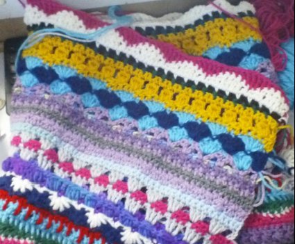
Scrapghan with lots of colors!
Tips for Choosing the Color Scheme for Your Project
The information I shared in this chapter should be seen as guidelines. Color choice is very personal, so dont feel bound by the different explanations of color schemes and color families. If you like a color theme, use it. That being said, here are some tips for choosing the right colors for your projects.
- Decide if you want a color scheme which is soothing or vibrant. This will help you choose colors which either contrast each other, or are from the same color family.
- Do you want your colors to be cool or warm? Cool colors have more blue in them while warm colors tend to have more orange or yellow. For example, violet red is a cool color, while red orange is a warm color.
- Choose a neutral color to compliment the color scheme. Neutrals include white, black, gray, and sometimes brown.
- Look to nature for inspiration. What are the colors in your favorite flower? Is there a landscape you are fond of? Inspiration can be found in many places so keep your eye out for any color combinations which speak to you.
- Choose colors which make you happy. In the end your color choices are your own, so use the colors you like and that make you happy with your project. Be bold and daringthrow the rules out the window and experiment!
Chapter Two Crochet Color Changing Techniques
Using color in crochet is fun, and it is very easy. There are no hard techniques to learn, and if you know the basic color changing techniques you will be on your way to learning more advanced techniques well cover in a later chapter.
In this chapter well go over the way to change colors at the beginning of a row, how to carry colors up a row or a round of crochet, and how to change colors in the middle of a row or round.

