Contents
Guide

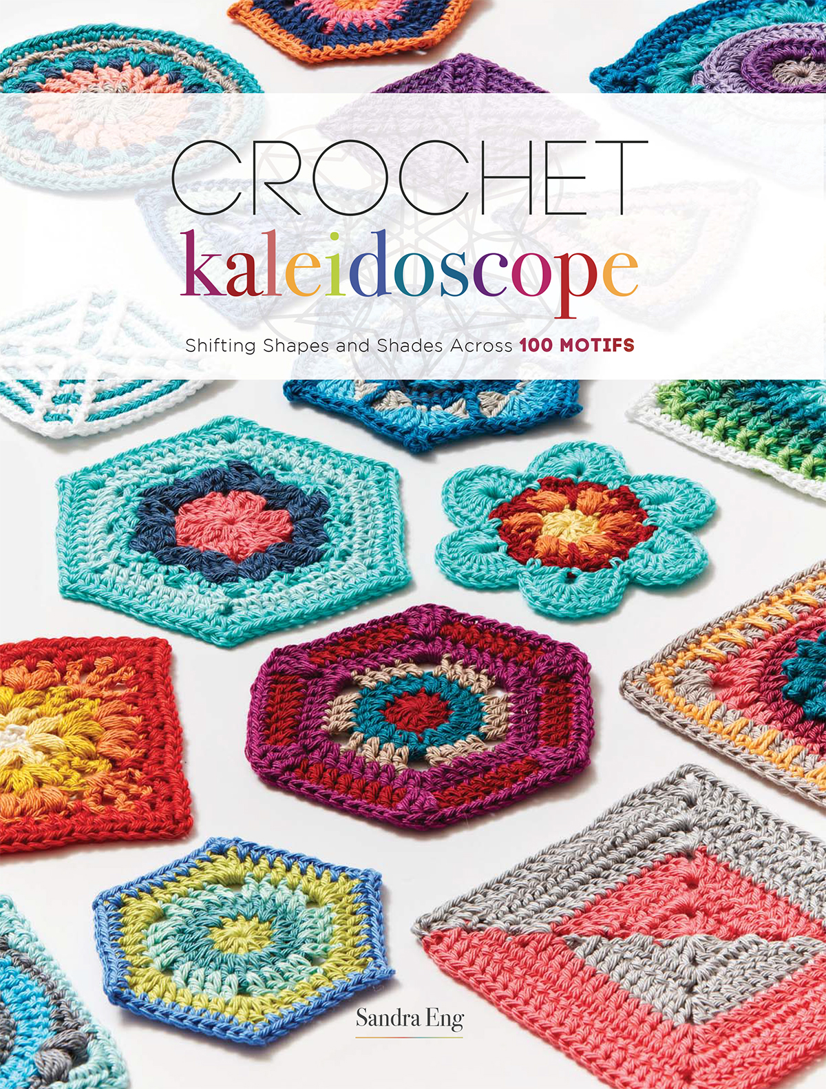
Shifting Shapes and Shades Across 100 MOTIFS
Sandra Eng

dedication
To the lights of my life,
Adeline and Bryson.
contents

introduction
Crochet Kaleidoscope was born out of my love of crochet, color, and geometry. While most of you likely share my love of crochet and color, my fascination with geometry is perhaps somewhat more obscure. Nevertheless, I imagine that many of you also find delight in the ways you can combine crocheted shapes to create intricate and exquisite tapestries.
Motifs are the bread and butter of crochet. From the humble, ubiquitous granny square to more complex and detailed shapes, motifs comprise the building blocks of an endless array of crocheted projects. The versatility of working with individual motifs is unparalleled; from one shape, you can create a blanket, a shawl, a cushion, or a rug. The possibilities are limited only by your imagination (and perhaps the size of your yarn stash!).
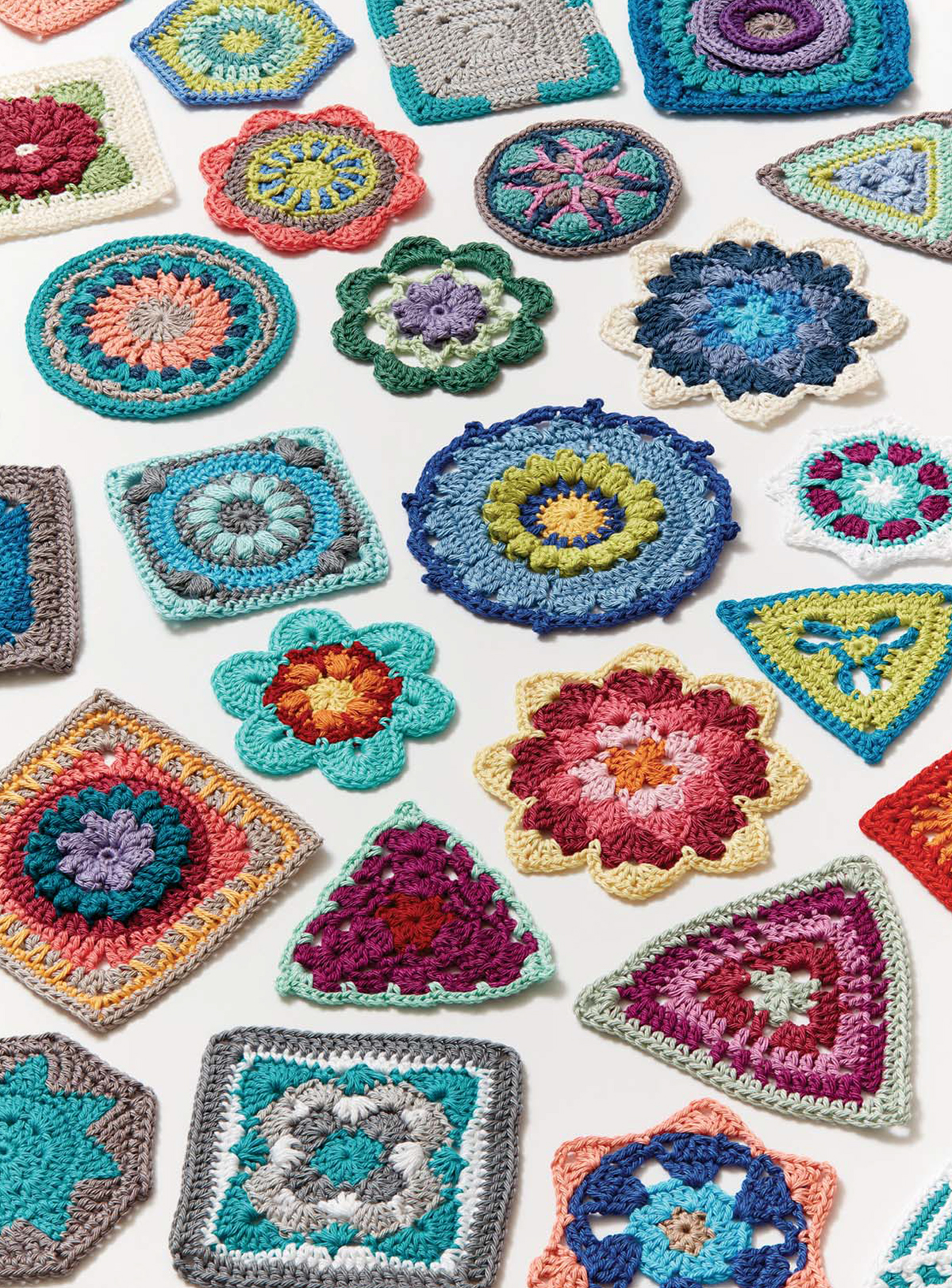
When I set out to write this book, I wanted to create shapes that could highlight the ways in which different combinations of colors, whether across a single motif or an entire project, could shift the appearance of the motif or project. In the same way that a twist of a kaleidoscope shifts what you see through the eyepiece, changing up yarn colors, or the order in which you use them, can alter the look of a crocheted piece. Crochet Kaleidoscope offers not only a compendium of crochet motifs of varying shapes and sizes, but also a compilation of alternative ways of working with the colors in motifs to achieve a variety of effects.
As you peruse the motifs in this book, try to envision what each might look like when worked in a different color scheme, or if you alter the rounds on which you change colors. What appears as a flower in one palette may be transformed into a more abstract shape when worked in an alternate palette. Motifs comprised of a single color will contribute to a very different finished object than motifs worked in multiple colors. I offer a substitute palette and/or order of colors for many of the motifs in this book; you can use these alternates as a concrete guide, or as more of a suggestion for how to begin experimenting with your own color ideas. I also offer color choice guidelines in the first chapter to kick-start your own exploration process.
Take some risks, reach beyond your color comfort zone, and let your imagination run wild when it comes to considering how to apply your own unique color schemes to the motifs in this book. With every turn of the crochet kaleidoscope, youre sure to land upon new and exciting ideas to apply to individual motifs, and to projects as a whole.
Happy Hooking!

color me creative
A GUIDE TO CHOOSING COLORS IN CROCHET
Choosing yarn colors for a crochet project can become a project unto itself. We all know a good color combination when we see one, or at least which ones resonate with our personal taste, but how do we systematically go about choosing the right set of colors for a particular pattern? Absent guidance from the pattern writer, questions abound: How many colors should I choose? Pastel, bold, or neutral? In what sequence will the colors best complement each other? Which colors will best emphasize this patterns attributes? And so on.
If youre like me and have no formal training in art or color, you might find yourself at a loss as to where to start. Over the years that I have been crocheting, my tastes in colors and my methods for choosing them have evolved. For example, the first blanket I crocheted included colors I liked individually, but that did not necessarily coordinate well together. Now I keep an eye out for ways in which colors complement or contrast with each other, and have worked to branch out beyond my color comfort zone. I have honed my eye for color though trial and error, feedback from others, and a whole lot of practice. Ill share some of the tips Ive picked up over time in this chapter.
Favorite Colors
There is no right or wrong when it comes to selecting yarn colors. What looks good to you is most important. Everyone has a favorite color, or set of colors. What you are drawn to is what you are drawn to; there doesnt have to be a rhyme or reason to it. Looking around your living space and peering into your closet, you will likely see your favorite colors reflected in your choice of home dcor and clothing. Using your favorite colors is a solid starting point for choosing project colors. With time, you may find yourself wanting to push beyond the familiar into less-charted color territory. In my experience, this is when things really start to get fun!

Color Theory 101
If we want to get more technical, we can turn to color theory for guidance. Open up any beginning art techniques book, and youre sure to come across a color wheel, onto which the entire spectrum of colors is mapped. Color theory, as related to the color wheel, can tell us about how colors mix and which groupings of colors appear more harmonious than others.
TERMINOLOGY
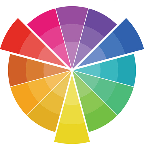
Before we delve into using the color wheel to guide color choice, lets review some relevant terminology. Hue refers to the position of a particular color on the color wheel; when we say blue, or red, or yellow, what we are referring to is hue. Analogous colors are those that lie adjacent to each other on the color wheel. For example, red and orange are analogous to each other. By contrast, complementary colors are found directly across from each other on the color wheel. These include pairings such as red and green, or blue and orange. Finally, different variations of hues can be created by adding white or black to lighten or darken a particular color. You can create different tints by adding white to a color, and different shades by adding black. When it comes to yarn, adding white or black simply refers to choosing a lighter or darker variation of a color.

A color wheel can help you choose and group colors.
PAIRING COLORS
Color theorists assert that both complementary and analogous pairings of colors can contribute to aesthetically pleasing palettes. Depending on your taste, groupings of complementary colors might seem too bold of a contrast. In this case, a palette based on split complementary colors can lend to a more visually pleasing combination. Split complementary refers to pairing one hue with another hue that is analogous to the complementary color of the first hue. For example, combining blue with red-orange and/or yellow-orange, rather than with pure orange.

