Table of Contents
For my wife, lone. Im finally finished!
FOREWORD
by Matt Kish
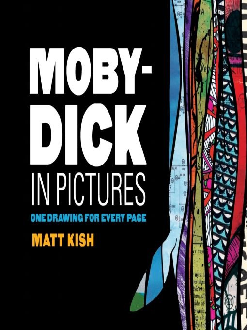
Really, I just wanted to make a version of Moby-Dick that looks like how I see it. Thats all.
Ive been obsessed with Moby-Dick for most of my life. Although it has drifted in and out of my mind, it has never disappeared entirely. My first encounter with the White Whale was the classic 1956 film of the same name starring Gregory Peck as Captain Ahab. I remember seeing bits and pieces of it at my grandmothers house on one of the many Saturday afternoons I spent with her as a child in the mid-1970s. I was smitten. I already had a voracious appetite for any and every monster movie I could lay my eyes on, but here was something new and shockinga monster that could almost have been real!
Some family member must have been paying attention, because soon after that I was given a tiny square paperback version of the novel. Heavily abridged, it was printed on cheap newsprint with inky, scribbly black-and-white illustrations on every other page. I must have read that book a dozen times, and I probably spent more hours looking at the pictures than I did reading the words. Some of those images are embedded so deeply in my memory that I can see every line of them simply by closing my eyes, and, not surprisingly, a few of my own illustrations for this project were made in homage to them.
It wasnt until 1984, when I was a freshman in high school, that I read the unabridged novel for the first time. Im not quite sure what I expected, but I will admit to being a bit surprised by how dull some of it seemed to me. The characters were as vivid as I had remembered, and the chapters describing the chases and the battles with the mighty leviathans were visceral and thrilling, but I wasnt prepared for the lengthy digressions on the history and nature of the American whaling industry or the dry, semiscientific expositions on the nature of the whale. Still, I pushed my way through it, partly out of an adolescent sense of pride in reading what most of my school friends vocally derided, and in the process I was truly hooked (or harpooned!) for life. While I didnt get much out of that first reading that I hadnt already gotten from watching the film, I sensed that there was more lurking beneath the words, and I knew it was a story I would come back to again and again.
Since then, Ive read the book eight or nine times: again in high school, several times as an undergraduate, a few times while working as a high school English teacher and as an assistant manager in a bookstore, again in graduate school, and most recently while making these illustrations. Each and every reading has revealed more and more to me and hinted tantalizingly at even greater truths and revelations that I have yet to reach. Friends often question my obsession with the novel, especially since I am not a scholar or even an educator any longer, and the best explanation I have been able to come up with is that, to me, Moby-Dick is a book about everything. God. Love. Hate. Identity. Race. Sex. Humor. Obsession. History. Work. Capitalism. I could go on and on. I see every aspect of life reflected in the bizarre mosaic of this book.
Paralleling my lifelong obsession with Moby-Dick is an equally obsessive, almost frantic appetite for images. I spent my childhood in a household full of garishly colored and fantastically exaggerated 1970s album covers, bookshelves packed with fantasy and science fiction paperbacks, childrens books on monsters and dinosaurs, comics running the gamut from the Bronze Age madness of Jack Kirby to the European exoticism of Heavy Metal magazine, and early video games like The Legend of Zelda and Kid Icarus. I simply couldnt get enough, and my head became a seemingly limitless warehouse for these images. It wasnt much of a leap for me to begin drawing, or at least trying to draw, monsters and spaceships and dinosaurs, but I was often frustrated at my inability to create art that looked as good as what I saw in my books and comics. Over the years, I tried my hand at building a darkroom and printing my own 35mm black-and-white photos, drawing and xeroxing my own comics and zines, and illustrating my own personal mythology. While the results were predictably mixed, the process always felt good, and eventually I started to like what I was making more often than not.
Despite these parallel obsessions, I never thought about illustrating Moby-Dick. Then I spent a summer of boredom and creative restlessness, wanting to do something but unsure of what. Most of the art I was making had become painfully overwrought and so detailed that it was no longer fun to create. A good friend of mine from college reminded me of how often he and I used to talk about Melville and Moby-Dick, and that comment sparked something. I was already aware of, and in awe of, Zak Smiths illustrations for every page of Thomas Pynchons novel Gravitys Rainbow, and the idea of something that nakedly ambitious appealed to me enormously. I dont know if Smith was the first artist to illustrate every single page of a novel, but he was certainly the first I knew about. Within a day or two, by a process I still cant quite explain, I decided I would create an illustration for every single page of Moby-Dick.
Its important to know that I do not consider myself an artist. In spite of all the drawing and photography and comics I have worked on over the years, I have no formal artistic education. However, I have never viewed this as a limitation, and for this project it was actually quite liberating. Since I have never had to depend on art for an income, I have always been able to make whatever kind of art I want. The work is for me. Still, I knew how easy it would be to give up on the project if I didnt set at least some rules for myself.
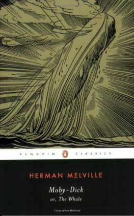
The version of Moby-Dick I decided to use for this project is the Signet Classics paperback edition with the Claus Hoie painting Pursuit of the Great White Whale on the cover. So many editions of the novel have boring historical illustrations on the cover; this one really appealed to me for its fearless modernism. The Signet edition has 552 pages, and the first chapter starts on page one, so it was a perfect fit. To force myself to learn new ways to make art that wasnt so overly detailed and stiff, I decided to challenge myself to make one illustration per day. I would simply have to find ways to be creative each and every day for 552 days in a row, until I reached the end of the book. The only other rule I set for myself was to move through the novel in a linear manner, starting with page one and ending with page 552. I wanted to see how my art would change during the year-and-a-half-long journey. Beyond that, I freed myself to do just about anything I wanted. I could and would use any media, from ballpoint pen to crayon to acrylic paint to stickers and collage. I wouldnt limit myself to a specific size, a specific orientation, or even a specific style. I would take each image as it came and do what I wanted with it, fitting them all into the mosaic narrative of Melvilles complex and mighty book.
When I was in grad school, I worked in a used bookstore where we had boxes and boxes of paper ephemera. These pages always fascinated me, especially the diagrams, electrical repair charts, and maps. I started taking a lot of them home, thinking there had to be some better fate for them than the dumpster. I had experimented with painting robots on the more abstract television repair diagrams, and I was fascinated with the way certain elements of the diagrams showed through the paint, almost at random. To me, this hinted at a greater complexity and a hidden structure. When it came time to begin the
