Craig Buckler - CSS Grid Layout: 5 Practical Projects
Here you can read online Craig Buckler - CSS Grid Layout: 5 Practical Projects full text of the book (entire story) in english for free. Download pdf and epub, get meaning, cover and reviews about this ebook. year: 2018, publisher: SitePoint, genre: Home and family. Description of the work, (preface) as well as reviews are available. Best literature library LitArk.com created for fans of good reading and offers a wide selection of genres:
Romance novel
Science fiction
Adventure
Detective
Science
History
Home and family
Prose
Art
Politics
Computer
Non-fiction
Religion
Business
Children
Humor
Choose a favorite category and find really read worthwhile books. Enjoy immersion in the world of imagination, feel the emotions of the characters or learn something new for yourself, make an fascinating discovery.
- Book:CSS Grid Layout: 5 Practical Projects
- Author:
- Publisher:SitePoint
- Genre:
- Year:2018
- Rating:3 / 5
- Favourites:Add to favourites
- Your mark:
CSS Grid Layout: 5 Practical Projects: summary, description and annotation
We offer to read an annotation, description, summary or preface (depends on what the author of the book "CSS Grid Layout: 5 Practical Projects" wrote himself). If you haven't found the necessary information about the book — write in the comments, we will try to find it.
CSS has grown from a language for formatting documents into a robust language for designing web applications. Its syntax is easy to learn, making CSS a great entry point for those new to programming. Indeed, its often the second language that developers learn, right behind HTML.
One of CSSs new features is the Grid Layout Module, which enables complex layout designs that previously would have been very difficult to achieve. In this book, well examine five projects that use grid layout. It contains:
- Redesigning a Site to Use CSS Grid Layout by Ilya Bodrov
- Redesigning a Card-based Tumblr Layout with CSS Grid by Giulio Mainardi
- Easy and Responsive Modern CSS Grid Layout by Ahmed Bouchefra
- Progressively Enhanced CSS Layouts from Floats to Flexbox to Grid by Diogo Souza
- Make Forms Great with CSS Grid by Craig Buckler
This book is suitable for developers with some CSS experience.
**
Craig Buckler: author's other books
Who wrote CSS Grid Layout: 5 Practical Projects? Find out the surname, the name of the author of the book and a list of all author's works by series.


CSS Grid Layout: 5 Practical Projects — read online for free the complete book (whole text) full work
Below is the text of the book, divided by pages. System saving the place of the last page read, allows you to conveniently read the book "CSS Grid Layout: 5 Practical Projects" online for free, without having to search again every time where you left off. Put a bookmark, and you can go to the page where you finished reading at any time.
Font size:
Interval:
Bookmark:
CSS Grid is a new hot trend in web development these days. Forget about table layouts and floats: a new way to design websites is already here! This technology introduces two-dimensional grids which define multiple areas of layout with a handful of CSS rules. Grid can make third-party frameworks such as 960gs or Bootstrap grid redundant, as you may easily do everything yourself! This feature is supported by all major browsers, though Internet Explorer implements an older version of the specification.
In this article we are going to see CSS Grid in action by creating a responsive multi-column website layout.
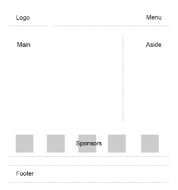
So, we were asked to create a typical website layout with a header, main content area, sidebar to the right, a list of sponsors, and a footer:
Another developer has already tried to solve this task and came up with a solution that involves floats, display: table, and some clearfix hacks. We are going to refer to this existing layout as "initial".
See the Pen Multi-Column Layout With Floats.
Until recently, floats were considered to be the best option to create such layouts. Prior to that, we had to utilize HTML tables but they had a number of downsides. Specifically, such table layout is very rigid, it requires lots of tags (table, tr, td, th etc), and semantically these tags are used to present table data, not to design layouts.
But CSS continues to evolve, and now we have CSS Grid. Conceptually it is similar to an old table layout but can use semantic HTML elements with a more flexible layout.
First things first: we need to define a basic HTML structure for our document. Before that, let's briefly talk about how the initial example works. It has the following main blocks:
.containeris the global wrapper that has small margins to the left and to the right..main-headeris the header that contains the.logo(occupies 20% of space, floats to the left) and the.main-menu(occupies 79% of space, floats to the right). The header is also assigned with a hacky fix to clear the floats..content-area-wrapperwraps the main.content-area(occupies 66.6% of space minus1remreserved for margin, floats to the left) and the.sidebar(occupies 33.3% of the space, floats to the right). The wrapper itself is also assigned with a clearfix..sponsors-wrappercontains the logos of the sponsors. Inside, there is a.sponsorssection with thedisplayproperty set totable. Each sponsor, in turn, is displayed as a table cell..footeris our footer and spans to 100% of space.
Our new layout will be very similar to the initial one, but with one exception: we won't add the .main-header and .content-area-wrapper wrappers because the clearfixes won't be required anymore. Here is the new version of the HTML:
Welcome!Content
Additional stuffItemsAreListedHereWow!
Our sponsors2018 DemoSite. White&Sons LLC. All rights (perhaps) reserved.
Note that you may utilize the body as the global .container that's just a matter of preference in this case. All in all, we have six main areas:
- Logo
- Menu
- Main content
- Sidebar
- Sponsors
- Footer
Usually it is recommended to to implement mobile-first approach: that is, start from the mobile layout and then designing for larger screens. This is not necessary in this case because we are adapting an initial layout which already falls back to a linearized view on small-screen devices. Therefore, let's start by focusing on the grid's implementation, and after that talk about responsiveness and fallback rules. So, return to our scheme and see how the grid columns can be arranged:
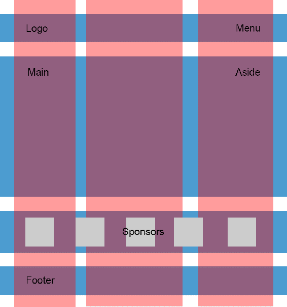
So, I propose having three columns (highlighted with red color) and four rows (highlighted with blue). Some areas, like logo, are going to occupy only one column, whereas others, like main content, are going to span multiple columns. Later we can easily modify the layout, move the areas around, or add new ones.
Following the scheme, give each area a unique name. These will be used in the layout defined below:
.logo { grid-area: logo; } .main-menu { grid-area: menu; } .content-area { grid-area: content; } .sidebar { grid-area: sidebar; } .sponsors-wrapper { grid-area: sponsors; } .footer { grid-area: footer; }Now set the display property to grid, define three columns and add small margins to the left and right of the main container:
.container { display: grid; margin: 0 2rem; grid-template-columns: 2fr 6fr 4fr; }display: grid defines a grid container and sets a special formatting context for its children. fr is a special unit that means "fraction of the free space of the grid container". 2 + 6 + 4 gives us 12, and 6 / 12 = 0.5. It means that the middle column is going to occupy 50% of the free space.
I would also like to add some spacing between the rows and columns:
.container { // ... grid-gap: 2rem 1rem; }Having done this we can work with individual areas. But before wrapping up this section let's quickly add some common styles:
* { box-sizing: border-box; } html { font-size: 16px; font-family: Georgia, serif; } body { background-color: #fbfbfb; } h1, h2, h3 { margin-top: 0; } header h1 { margin: 0; } main p { margin-bottom: 0; }Good! Now we can proceed to the first target which is going to be the header.
Our header occupies the first row that should have a specific height set to 3rem. In the initial layout this is solved by assigning the height property for the header wrapper:
.main-header { height: 3rem; }Also note that the logo and the menu are vertically aligned to the middle which is achieved using the line-height trick:
.logo { // ... height: 100%; line-height: 3rem; }With CSS Grid, however, things are going to be simpler: we won't require any CSS hacks.
Start by defining the first row:
.container { // ... grid-template-rows: 3rem; }Our logo should occupy only one column, whereas the menu should span two columns. We can express our intent with the help of grid-template-areas property which references the grid-area names assigned above:
.container { // ... grid-template-areas: "logo menu menu"; }What is going on here? Well, by saying logo only once we are making sure that it occupies only one, the left-most column. menu menu means that the menu occupies two columns: the middle and the right-most one. See how straightforward this rule is!
Now align the logo on the Y axis:
Font size:
Interval:
Bookmark:
Similar books «CSS Grid Layout: 5 Practical Projects»
Look at similar books to CSS Grid Layout: 5 Practical Projects. We have selected literature similar in name and meaning in the hope of providing readers with more options to find new, interesting, not yet read works.
Discussion, reviews of the book CSS Grid Layout: 5 Practical Projects and just readers' own opinions. Leave your comments, write what you think about the work, its meaning or the main characters. Specify what exactly you liked and what you didn't like, and why you think so.