Chapter 1. Semantic Structure, Dirty Pretty Presentation
simon collison
www.collylogic.com
Before starting Erskine Design in 2006, Simon Collison was lead web developer at Agenzia (www.agenzia.co.uk), where he worked on numerous web projects for record labels. Simon passionately ensures everything he builds is accessible and complies with current Web Standards.
Simon coauthored Blog Design Solutions and CSS Mastery (both published by friends of ED). His first solo book, Beginning CSS Web Development (www.csswebdevelopment.com), was published by Apress in 2006.
Away from the office, Simon runs the popular blog Colly Logic (www.collylogic.com), and he is an active member of the so-called Britpacka collective of laid-back designers and developers who all share a passion for responsible web design. When prized away from the laptop, Simon can most likely be found in the pub or at a gig, waffling incessantly about good music, football, or biscuits.
Simon has lived in many cities, including London and Reykjavik, but has now settled back in his beloved Nottingham, where the grass is green and the girls are pretty.
The brief
Building a website compliant with Web Standards for a record company is a challenge. For years, Flash has been the essential tool for band websites. Plus, there are unfathomable navigation challenges, jukebox widgets, frames, questionable color palettes, and the ever-present Loading bar. While much of the Web looks current, in the music industry, it is still 1999. The situation is getting better, as Dan Rubin will illustrate in
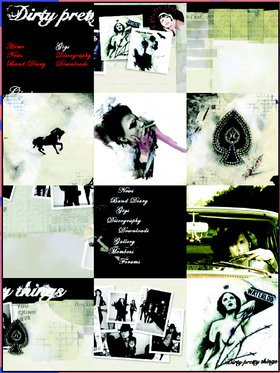
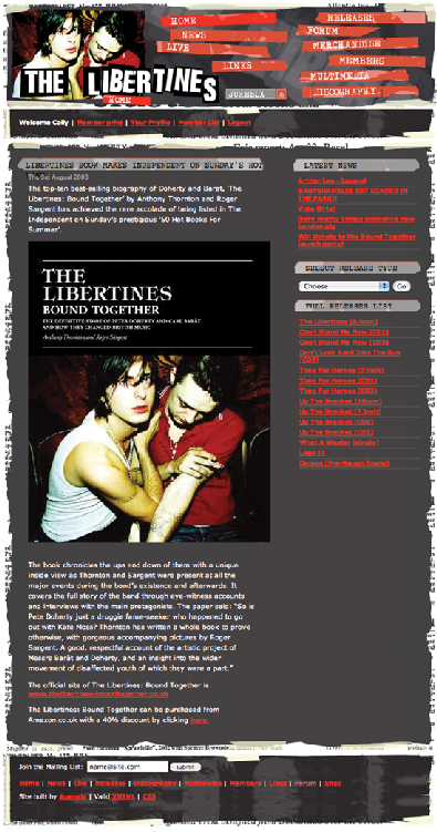
For the Dirty Pretty Things website (www.dirtyprettythingsband.com), I and my fellow designers at Agenzia had the opportunity to build on the impact we had made with the relaunched Libertines (www.thelibertines.org.uk) site in the summer of 2004 (see ). We built the Libertines site with Web Standards, using Flash elements in a responsible way. We were hell-bent on keeping content separate from presentation to capitalize on the growing number of users accessing the site through mobile devices, and to ensure longevity for the core content, regardless of future redesigns. As it happens, the great hopes of UK rock and roll disbanded amidst a maelstrom of excess and bad behavior, but the site lives on with an ever-growing community of users.
Fast-forward 18 months, and Libertines cofounder Carl Barat has formed a new band, and there is major anticipation from the music press and fans alike. With celebrity ex-Libertine Pete Doherty all over the tabloids for all the wrong reasons, it is up to Carl and company to bring joy back to the thousands of fans who sold their souls to the Libertines. From the outset, it is clear that any new website is going to be on the popular side, and armed with our experiences from the Libertines site, it is easy to convince the record company that Web Standards are the only way forward.
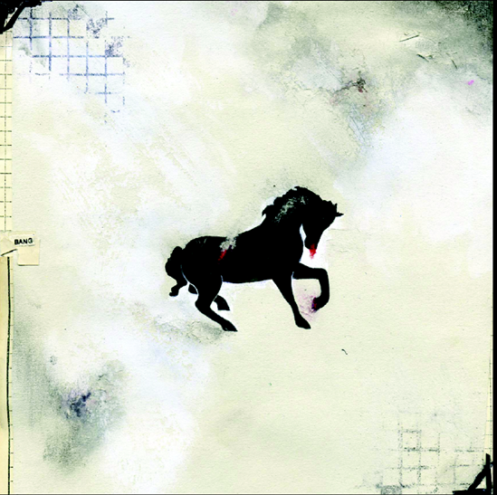
A mass of original artwork created for the band by Hannah Bays is thrown our way, and although distinctive and cool, none of it seems to lend itself to a web design. In fact, getting a design together becomes a long and drawn-out process, and is put on the back burner while we begin building the core content of the site using just XHTML and PHP/MySQL.
Figure 1.1. The final version of the Libertines website (www.thelibertines.org.uk)
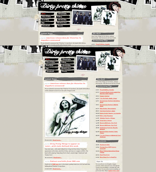
This chapter will join the process as we complete the XHTML and database and return to the presentational approaches, looking at how this was achieved with a separate layer using CSS. The focus will be on applying the presentational visual touches, such as custom backgrounds, headers, and other widgets with CSS, leaving the core content uncompromised. shows the final version of the website.
Figure 1.2. The completed Dirty Pretty Things website (www.dirtyprettythingsband.com), launched in January 2006
Semantic structure
We're flying the flag for Web Standards here, so we need to be sure that the document (XHTML plus content) is separated from the presentation (CSS and decorative images). By applying all decorative presentational richness using an external style sheet, the document (the XHTML) remains pure and focused. With all presentational material kept separate from the markup, site-wide style changes can be made with little or no fuss. We just need to amend a single CSS file, rather than having to update every page in the site, making wholesale redesigns a veritable breeze. Equally important is the facility for users to take control of the content themselves by applying their own style sheet to the website, if desired.
An important step is to give any divisions (divs) added to the core content meaningful names, rather than presentational ones. For example, the masthead is called masthead, the main column is called content_main, and so on. This approach is also applied to smaller details, such as IDs and classnames used to change the color or emphasis of an element. There is no point in creating a class called green_heading if that might be used later as a hook for the CSS to render that heading in blue. Instead, the class is given a name that describes the role of the element rather than its style, such as date_heading. In most cases, such hooks are not even needed, as descendant selectors in the style sheet are used to select elements that are the children of others. You'll see how that works in the "Contents" section later in this chapter.
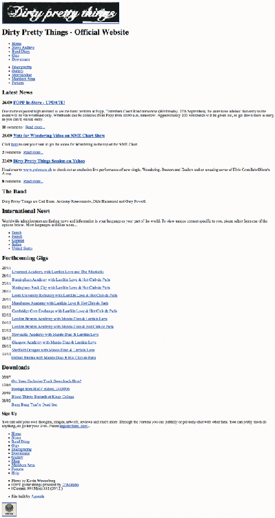
shows a screenshot of the website as styled by the browser's own default style sheet. The site is a fully functioning, database-driven site that completes the first stage of the build and demonstrates that everything can function perfectly well, even if a style sheet is not available.
With this stage of the build over, the team can now start thinking seriously about the presentation, and how the core content can be used as a framework for the look and feel of the site. Time to get dirty, and a little pretty.
Figure 1.3. The document (XHTML plus content) as styled purely by the browser's default style sheet
Dirty pretty presentation
When building purely with XHTML, it is sensible to have a good idea of what the layout of the site will be. Naturally, we will be thinking in terms of columns and core areas, such as masthead and footer, and often this will be informed by a Photoshop layout (or even a sketch using pencils and paper!) from a designer on the team. With the Dirty Pretty Things site, this was not the case, as none of us had yet arrived at a layout that we ourselves could agree on, never mind the folks at the record company.

