COLOR LAB
FOR MIXED-MEDIA ARTISTS
 52 EXERCISES FOR EXPLORING COLOR CONCEPTS THROUGH PAINT, COLLAGE, PAPER, AND MORE
DEBORAH FORMAN


2015 by Quarto Publishing Group USA Inc.
First published in the United States of America in 2015 by
Quarry Books, a member of
Quarto Publishing Group USA Inc.
100 Cummings Center
Suite 406-L
Beverly, Massachusetts 01915-6101
Telephone: (978) 282-9590
Fax: (978) 283-2742
www.QuartoKnows.com
Visit our blogs at QuartoKnows.com.
All rights reserved. No part of this book may be reproduced in any form without written permission of the copyright owners. All images in this book have been reproduced with the knowledge and prior consent of the artists concerned, and no responsibility is accepted by the producer, publisher, or printer for any infringement of copyright or otherwise, arising from the contents of this publication. Every effort has been made to ensure that credits accurately comply with information supplied. We apologize for any inaccuracies that may have occurred and will resolve inaccurate or missing information in a subsequent reprinting of the book.
Digital edition published in 2015
Digital edition: 978-1-62788-766-3
Softcover edition: 978-1-63159-064-1
Library of Congress Cataloging-in-Publication Data
Forman, Deborah.
Color lab for mixed-media artists : 52 exercises for exploring color concepts through paint, collage, paper, and more / Deborah Forman.
pages cm. -- (Lab series)
ISBN 978-1-63159-064-1 (paperback)
1. Art--Technique. 2. Color in art. I. Title.
N7433.F67 2015
701.85--dc23
2015005404
Series design: John Hall Design Group, www.johnhalldesign.com
Page Layout: Leigh Ring // www.ringartdesign.com
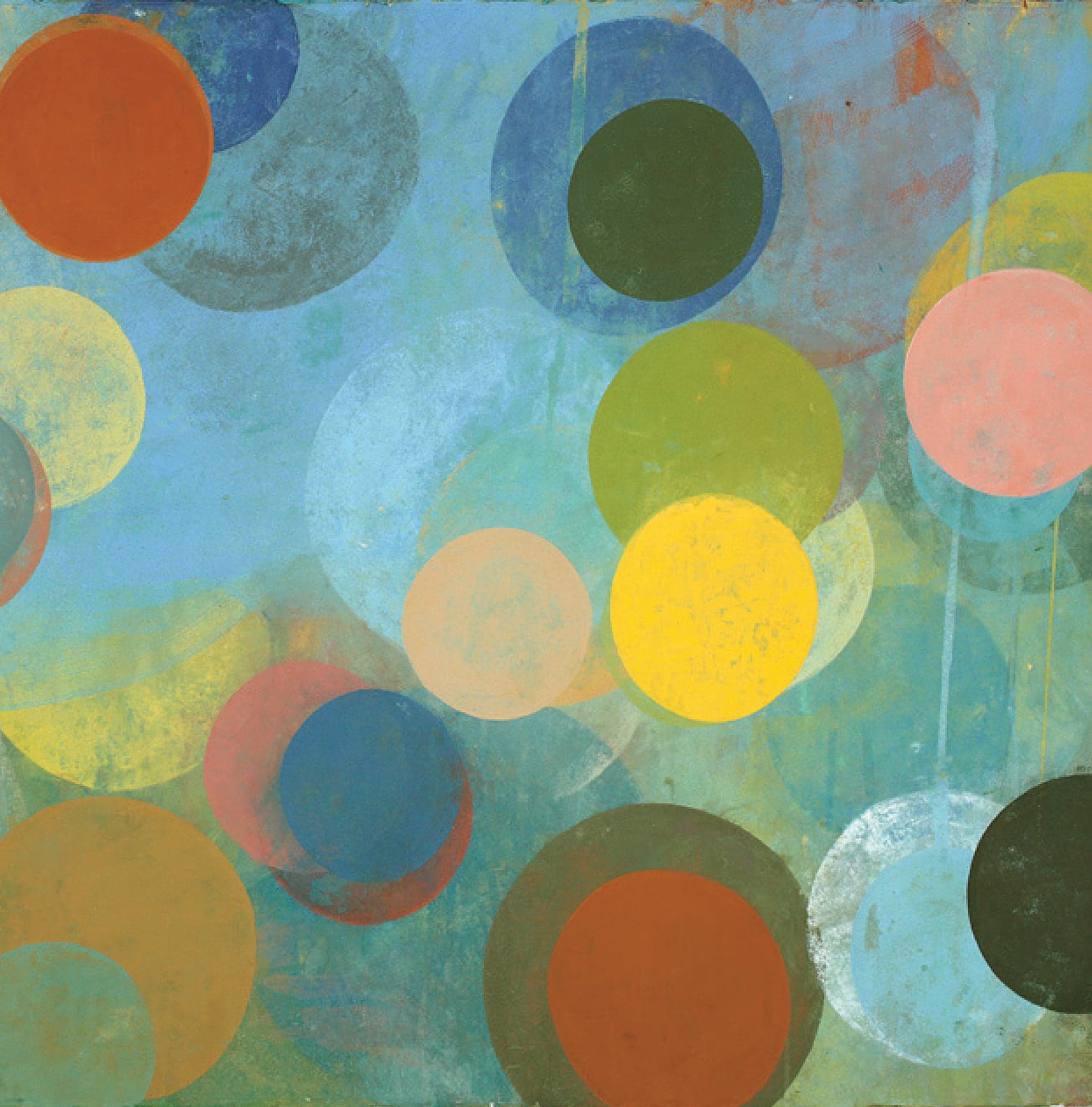
Blue Veil. gouache and egg tempera on paper, ; Deborah Forman
FOR MY COLORFUL BOY, WITH LOVE
CONTENTS
Guide
INTRODUCTION
When I was a child, my favorite part of painting was often those beginning moments of squeezing out the colored paint from the tube. I loved raw pigmented materials and the anticipative creative journeys that lay therein. Now that Im grown up and a painter, the feeling remains. I still get a visual and tactile thrill out of the coolness of cerulean blues, the zing of cadmium reds, and the rich earthiness of yellow ochers on my palette. There is a basic pleasure in the beauty and potential of these initial puddles of chroma.
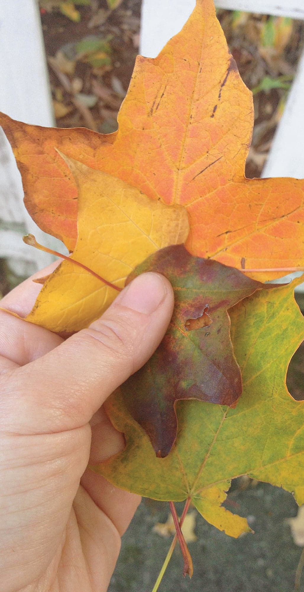
In my twenty years of teaching about color, I have come to understand that a multitude of sources inform color sensitivity. Where you reside (or where you were born) deeply informs perception. This is very evident in this book: as a born and bred coastal New Englander, I draw much inspiration from the ocean, lakes, and vibrancy of the autumnal season, as demonstrated in Labs 7, 9, and 14. This is in great contrast, for example, to my friend and contributor Christopher Beane, who in Labs 26 and 29 conjures his palette from the urban landscape of New York City. I would hope for you to do the same in approaching these projects, and to adjust them to the climate and regional color particular to your environment. Ones cultural identity also plays a part in color perception. For example, take the bridal dress: a garment that arises as a rite of passage in every culture is approached with many variations, depending on the region. In a traditional Chinese wedding, the color of the dress is red, not white as in the West. These culturally derived color associations can impact ones approach to color as well, and it should be honored.
Color can be a vehicle for so many aspects of life. It can describe the observable natural world. It can express universalities or a cultural vantage point, as well as internal psychology or emotion that cannot be put into words. The potential is infinite. I hope in this book to convey the countless ways that you can approach color creatively.
I found I could say things with color and shapes that I couldnt say any other waythings I had no words for.
Georgia OKeeffe
In this book, we will investigate a multifaceted approach to color, with the chapters organized by the spectrum. Within each chapter are some projects geared toward formal color theory and some that explore a multicultural approach to color use. We will traverse time as we examine the history of pigments in the ancient world and the color inspirations of contemporary artists. Throughout, we will explore how color can be investigated through a variety of innovative materials and techniques, always with an emphasis of process over product.
In the course of making this book (and in my own studio practice), time and time again I start with an idea of what to make, but it will change and take a different direction. What seems like a wall of frustration will ultimately become a door I walk through as I allow myself to expand the idea and shift the artwork into what it needs to be. I am responsive to what unfurls before me in the process of doing. It may mean taking scissors to a piece, adding color, taking away color, or even changing the imagery or concept entirely.
I see this book as a means of opening doors for you on your creative journey. I hope that each of these projects inspires a kernel of an idea that you will make your own as you embark on your unique artistic path. In the creative practice, it is so important not to let a preconceived notion or your inner critic sully the joy of making art. You never really know what is going to happen when you start a piece. Embrace this!
In addition, Color Lab for Mixed-Media Artists will give you a deeper understanding of color history and its applications, ignite inspiration, and show you ways to explore color in its endless and mutable forms.
Here are some basic ideas about color theory that are helpful to understand, ones that I will be referencing throughout the book:
HUE
Hues are the twelve purest and brightest colors, the colors on a basic color wheel. Hue is very helpful in naming a gray or neutral. For example, you could describe a tan neutral color as a brown with a reddish hue.
VALUE
This is simply the degree of lightness or darkness of a color. A good way of thinking about value is equating the color in an artwork to the black-and-white scale of a photograph. Compare the darkness or lightness in the color to a gray scale. Where it falls is the value.


 52 EXERCISES FOR EXPLORING COLOR CONCEPTS THROUGH PAINT, COLLAGE, PAPER, AND MORE


