Publisher: Amy Marson
Creative Director: Gailen Runge
Art Director: Kristy Zacharias
Editors: Lynn Koolish and Monica Gyulai
Technical Editors: Priscilla Read and Nanette S. Zeller
Cover / Book Designer: April Mostek
Production Coordinator: Rue Flaherty
Production Editor: Katie Van Amburg
Illustrator: Tim Manibusan
Photo Assistant: Mary Peyton Peppo
Photography by Diane Pedersen and Nissa Brehmer of C&T Publishing, Inc., unless otherwise noted
Dedication
This book is dedicated to the Fellowship of the Riverroom Quilters, beloved friends who join me for quilt class, where we talk, laugh, encourage, and bless each other. Sometimes we even sew.
Acknowledgments
I would like to thank my best friend and husband, who spent the time tinkering with my cantankerous vintage longarm machine. Also, I need to thank my sons. One is my personal technology coach, who patiently and repeatedly showed me which buttons to push in the process of assembling and submitting the various parts of this book. Another is my personal carpenter, who, along with my husband, builds, unbuilds, and rebuilds my quilt shop.

I have long been fascinated by Bargello quilts because they look so much more complicated than they really are. The process is truly simple, but with the right blending and contrasting, the results can be stunning. I think what catches the eye is the impression of motion, as with kinetic op art. I was drawn to the idea that if I viewed a quilt as a three-dimensional medium with a wind-blown ribbon or a painted line scribbled across a stationary environment, I could experiment with different ways of making the apparently moving design distinct from the apparently static background.
I developed four different solutions for creating the separation of the two elements:
A collection of prints forming a busy pattern (the scribble) on a solid background, as in Batikiello ()
A solid, gradated pattern (the scribble) on a background of busy prints, as in Moody Blues ()
The scribble and background constructed from different, contrasting color runs, as in Vine and Branches ()
A solid-color run splashed across a series of plaids or a background of stripes, as in Total Plaidness ()
I started by making the green panels for Vine and Branches, cutting strips of various widths and pinning them on a design wall. I auditioned different ways of making the design appear as if it were being scribbled back and forth across a page with twists and curves, sometimes doubling back on itself or spilling off from the background. After I had the scribble in place, I filled in the spaces on a piece of graph paper to represent the position of the green fabrics and then added numbers on the graph to represent the brown background fabrics. Stitching it into reality was extremely rewarding. On a subsequent canoe trip to Isle Royale, Michigan, with my youngest son, I passed the quiet time by Lake Siskiwit drawing the rest of the designs in this book.

Selecting Fabric
It seems like you need a separate set of fabric shopping eyes for each style of quilt you set out to create. For a quilt with repeat blocks, you shop for fabrics that work together but have a strong value contrast, so that the shapes within the blocks stand out and the perfect points and seam matchups are showcased. For watercolor- or landscape-style quilts, you are on the lookout for a gradual blending of values so that the transition from one fabric to another is smooth and the shape of the individual pieces disappears into the composition as a whole.
The projects in this book require a little bit of both strategies. Scout for two distinct sets of fabric that blend smoothly from light to dark within their set but that contrast strongly with the other set of fabrics. First, decide how you would like to separate the two elements of your designthe scribble and the background. Choose a light-to-dark series of prints (batiks, florals, or plaids) to go with a graduation of solid color, or choose two contrasting color sets that you like together. If youre going to use a striped fabric for your background, as in Asleep at the Beach (), choose a variable-width, multicolor stripe that runs parallel to the selvage edge of the fabric for one fabric and a light-to-dark graduation of solid-color fabrics that go with the stripe but that will stand out from it.
Tools and Supplies
ROTARY CUTTING
Rotary cutter
Rotary cutting mat (at least 18 24)
Acrylic ruler (I prefer the 6 24 size.)
SEWING
Scissors
Seam ripper
Pins (I prefer flathead flower pins.)
Tape measure
MARKING
There are dozens of choices of marking utensils; I prefer a #2 pencil.
Clear tape, used to tape fabrics to Fabric Number Chart ()
PRESSING
Iron
Pressing surface
TIP Making Your Own Pressing Surface
I made a quilted four-layer 36 36 pressing surface that I really like. It starts with a bottom layer of cotton fabric, then a second layer of Insul-Bright or Insul-Fleece interfacing, a third layer of cotton batting, and a top layer of silver ironing board cover fabric. Quilt with a simple grid and finish with a binding. I use it at whichever table I am working.

All of the quilts in this book follow the same basic construction method, as described in the following pages.
Cutting Fabric into Strips
Fold the fabric wrong sides together selvage to selvage. Fold the fabric again to bring the selvage edges even with the first fold.
Place the fabric on a rotary cutting mat with the folded edge along one of the horizontal lines on the mat.
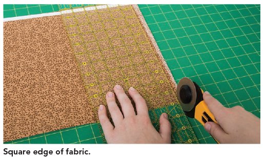
Square off the uneven edge.

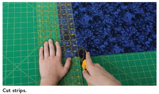
Cut strips the desired width across the grain of the fabric. All of the projects in this book use 2-wide fabric strips.

Cut the required number of strips as indicated in the project instructions.
note
Making a Fabric Number Chart
Each fabric used in a quilt has a number. Save cutoff pieces of fabric to use in a Fabric Number Chart so you can keep track of your fabrics. Simply tape a piece of each fabric on a piece of paper next to its number. You will refer to this chart throughout the entire process.
Constructing Strip Sets
Construct strip sets by sewing together the strips in numerical order, using a consistent seam allowance, usually . (I use the edge of a presser foot.) The actual measurement of the seam allowance usually isnt critical in Bargello quilts, as long as its precisely the same allowance throughout the strip set construction process. Being as consistent as you can at this stage will really make things easier later.
Construct separate strip sets for the scribble (fabrics 110) and the background (fabrics 1118 or 1120). The required number of strip sets from each fabric group will be indicated in the project sections.
Next page
