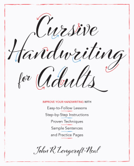
IMPROVE YOUR HANDWRITING WITH
Easy-to-Follow Lessons
Step-by-Step Instructions
Proven Techniques
Sample Sentences
and Practice Pages
John R. Longcroft-Neal
Text copyright 2019 John R. Longcroft-Neal. Design and concept copyright 2019 Ulysses Press and its licensors. All rights reserved. Any unauthorized duplication in whole or in part or dissemination of this edition by any means (including but not limited to photocopying, electronic devices, digital versions, and the internet) will be prosecuted to the fullest extent of the law.
Published in the United States by:
Ulysses Press
P.O. Box 3440
Berkeley, CA 94703
www.ulyssespress.com
ISBN: 978-1-61243-906-8
Library of Congress Control Number: 2018967976
Printed in Canada by Marquis Book Printing
10 9 8 7 6 5 4 3 2 1
Acquisitions editor: Bridget Thoreson
Managing editor: Claire Chun
Editor: Renee Rutledge
Proofreader: Barbara Schultz
Front cover design: David Hastings
Interior design: Jake Flaherty
I would like to dedicate this book to my family, who help, support, and encourage me through good and bad times: my wife, Margaret; my two sons, Hugh and John; my daughter-in-law, Kate; and my beautiful grandchildren, Aria and Jonathan.
Contents
Introduction
Imagine opening your mailbox to find a letter enclosed in a quality envelope, with your name and address beautifully handwritten in a flowing, attractive, individual style. The magic of such a delightful sight makes you want to open the envelope with extra care for fear of damaging the beautiful letter within. With perseverance and practice, you could be the author of such a dazzling letter.
With modern forms of technology sweeping the world, we often write messages now by typing out texts, emails, and the like. The skill of handwriting tends to be a forgotten art, but when it is done well, with an individual style thats fluid and attractive, it conveys a beauty that seems to defy definition.
This book will show you how to rediscover your handwriting skills or even develop them from scratch, and how to avoid some common errors. You might have ingrained habits of poor handwriting, such as holding the pen or pencil the wrong way. You might be trying too hard and writing with a tensed-up hand that results in an inconsistent, spidery scrawl. To fix these issues, we will start with the basics of holding the pen correctly (sometimes it is best to practice with a pencil), as well as how to sit and how to position the paper. Next, well look at the letter shapes and the rhythm of the hand movements.
Once you have mastered and practiced these initial exercises, I will show you a few flourishes and more elaborate forms. I am sure you will be inspired by looking at samples of other peoples handwriting, and I will comment on why I find them attractive or where there might be some pitfalls to avoid.
CHAPTER ONE
Cursive Handwriting
Cursive might mean different things to different people, but broadly speaking, it is a style of handwriting that involves joining letters to form words. Various styles of cursive have emerged over the centuries. Printing, on the other hand, is a basic form in which each letter stands on its own. This is the way we learn to write in our very early years. Some adults, particularly those who need to write on engineering drawings, have adapted their handwriting to print in capital letters only. Others only write notes or lists that they read themselves and so can get into bad habits because no one else has to read them.
I want you to revisit the time you moved from printing to cursive, when you considered the basics of handwriting and eventually moved on to develop your own style. In this book, we will start with a very basic cursive handwriting style that you should be familiar with so you can get the hang of it, and then you can move on to other related styles.
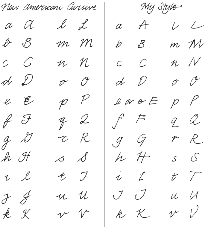
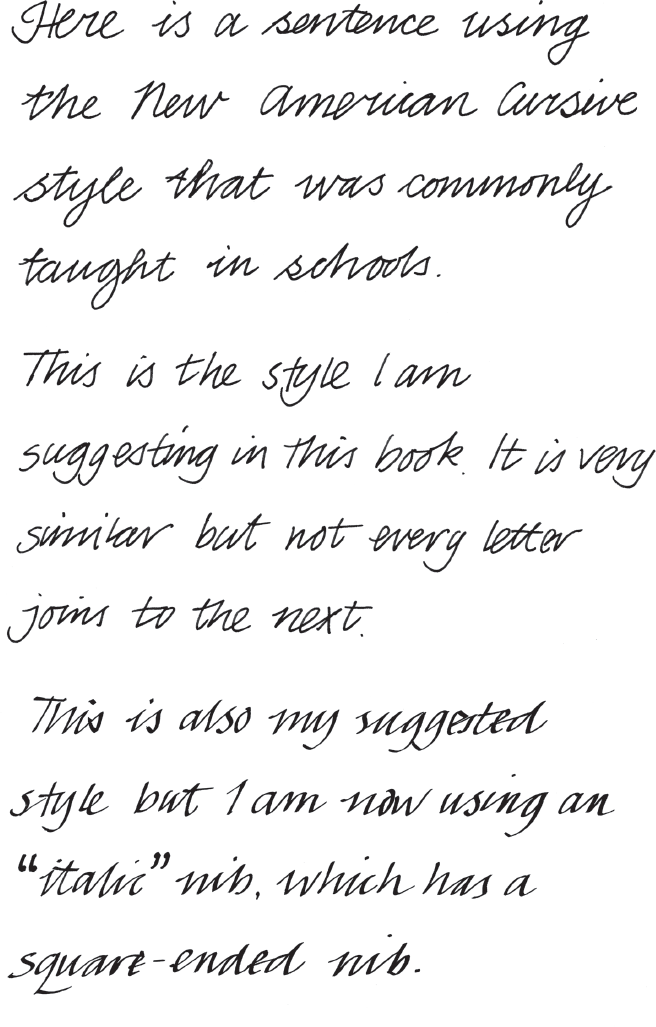
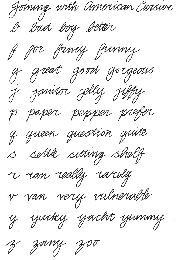
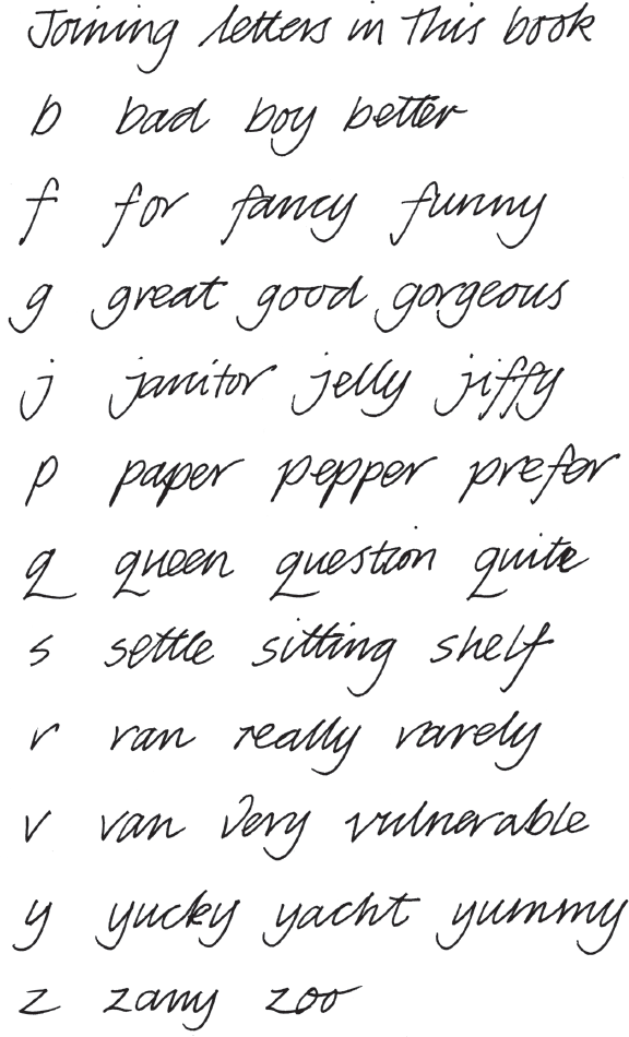
The examples that follow will be of a standard American handwriting style called New American Cursive. This style is different from my personal style, which I will also demonstrate so you can decide how youd like to adapt your own handwriting style.
One difference you will notice is New American Cursive style is designed to join every letter of a word together, while my style has fewer joins. As you progress through the basics and solidify your knowledge of the formal style, you can begin experimenting with what feels best for you.
Different Styles of Cursive Handwriting
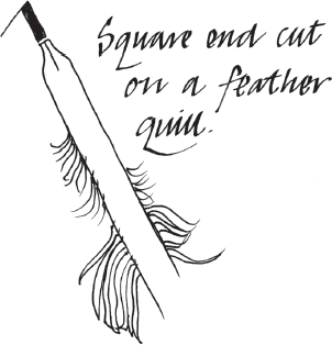
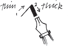
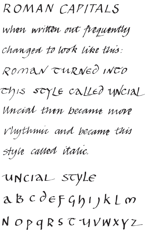
A square-ended nib often cut from a feather produced the classic italic style that I prefer. In addition to italic, I will also discuss other older styles, such as uncial (see ), where the pen is held with the square nib more horizontal and very rounded shapes are formed, often looking more like the Roman capitals that they copied.
Classic italic handwriting slopes slightly forward, and the squared nib produces elegant thick and thin variations.
Other cursive styles such as copperplate are often seen in books and ledgers of the Victorian Age, and no doubt Bob Cratchit in Dickenss A Christmas Carol would have employed that style. The strokes are made thick using extra pressure on the pen to make it spread out on the downstrokes. The Spencerian style is very similar, if not more elaborate, and is commonly taught in schools. It does not rely on thick and thin lines, as copperplate does, but has more complex flourishes, especially on the capital letters. Unfortunately, if Spencerian is written badly it can become illegible quite quickly.
CHAPTER TWO
Before You Begin
Before you dive into practicing, lets quickly review some basics. In the sections that follow, well go over some simple tools youll need, as well as the proper form and warm-up techniques to get the best results.
Next page
