monochrome home


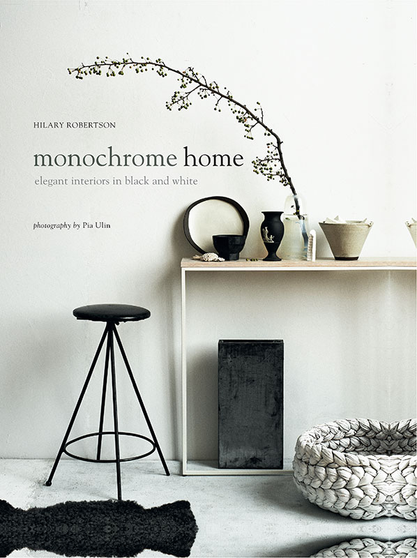
monochrome home
HILARY ROBERTSONphotography by Pia Ulin

Designer Paul Tilby
Senior Commissioning Editor Annabel Morgan
Production Manager Gordana Simakovic
Location Researcher Jess Walton
Art Director Leslie Harrington
Editorial Director Julia Charles
Publisher Cindy Richards
First published in 2015 by
Ryland Peters & Small
2021 Jockeys Fields
London WC1R 4BW
and
341 East 116th Street
New York NY 10029
www.rylandpeters.com
Text Hilary Robertson and Ryland Peters & Small 2015
Design and photographs Ryland Peters & Small 2015
ISBN: 978-1-84975-613-6
E-ISBN: 978-1-78879-391-9
10 9 8 7 6 5 4 3 2 1
The authors moral rights have been asserted. All rights reserved. No part of this publication may be reproduced, stored in a retrieval system or transmitted in any form or by any means electronic, mechanical, photocopying or otherwise, without the prior permission of the publisher.
A CIP record for this book is available from the British Library.
US Library of Congress Cataloging-in-Publication data has been applied for.
Printed and bound in China

Contents

I have an embarrassingly voracious eye; I want it all. I love colour. I love texture. I love combining both. I also believe that more or less anything can be beautiful in the right context, the right juxtaposition. And yet as I write, I am staring at an apple green plastic laundry basket. I am wishing it were black. Or white, for then it wouldn't look so out of place in my pinky taupe bedroom.
Years of absorbing so many images, of desiring so many things, of flirting with trends and decorating fads have made me understand how helpful rigour can be. How freeing. Several decades ago, I met a girl who only dressed in black and white; some days all white, others all black, and she would also mix the two. She always looked wonderful in her self-imposed uniform; elegant, crisp, classic, like an MGM movie-star publicity shot. She stood out. And Ill bet my Farrow & Ball paint chart that getting dressed was easier for her than it ever has been for me, with my magpie approach to clothes. Im sure she would look just as smart today. She might have changed details and silhouettes, but her no-colour edited wardrobe would always work.
Scrolling through hundreds of stylish monochrome interiors on Pinterest convinced me that applying the same black and white formula to the home was an approach every bit as chic, effective and timeless as the Uniform Girls wardrobe. Should I consider a colour cleanse? Ive always veered towards large doses of white or grey but could never resist adding a dollop of turquoise, chartreuse or pale pink somewhere or other. What would it be like to eschew colour completely? How do people do that? And why do they resist the siren call of the paint chart?


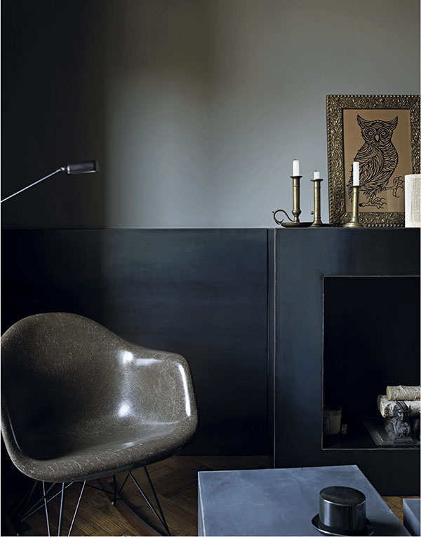
Marzio Cavannas Milan apartment combines shades of grey and numerous textural layers; linens and velvets in related neutral tones. In the living room, Marzio installed a dark metal box resembling a fireplace and painted the lower section of the wall the same colour (opposite). A black woodburning stove in a London studio merges with the walls (left); brick painted very dark green with a top coat of black (above).

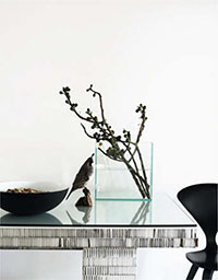
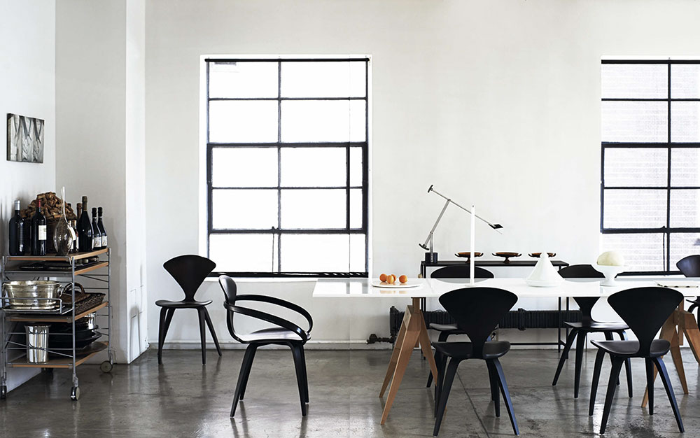
In Giorgio Delucas classic loft, the dining area is stationed beside two graphic black metalframed windows that become a decorative feature in such a rigorous space. Curvaceous black chairs by Norman Cherner add character and definition around the glossy white table.
After much research, Ive discovered that the reasons for limiting a scheme to neutrals are almost always the same. Monochrome interiors are restful, timeless and practical. By restricting the colour palette, any number of eclectic elements can exist happily together, inexpensive or simple things look more sophisticated and decorating decisions are made easier. Creativity flourishes within the boundaries of black, white, grey and all the shades in between.
Monochromists seem to divide into two camps: those who err on the brighter side, preferring shades of white, light-flooded rooms, pale or bleached floors and a smattering of black for details; and the others, who would happily swap day for night, veering towards darker neutrals and unafraid of the liberal use of black, creating rooms that are enveloping retreats. Both tribes understand how to shift the balance of light and dark when needed, reserving black for a bedroom or white for a kitchen, where light keeps the mood energetic rather than soporific.
Committing to a monochrome scheme might sound restrictive, but it affords the decorator considerable freedom to experiment with mixing pieces from different decades, adding pattern and layering texture. If its all neutral, it all works together; theres a flexibility that allows you to change your arrangements without having to wonder Where can I put that chartreuse upholstered chair now that my living room is turquoise? It might take some discipline at first, but once you start editing, decisions become remarkably simple. Those hours spent contemplating paint swatches, combining them, imagining a way for all the different spaces in a home to flow visually, creating a cohesive whole are over.
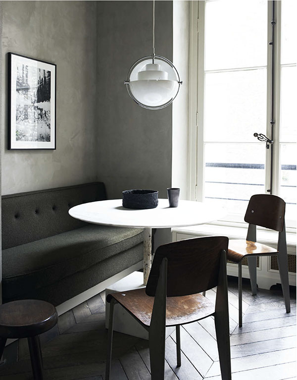
There is a sub-tribe of monochromists who have not abandoned colour altogether but who opt for grey in all its variety. That might mean lilac-tinged feminine shades, a rich brownish grey the colour of dried mud and beach pebbles or a greenish sea-grey and so on. Grey is a softer, more subtle option that works best when combined in several different tones and saturations.

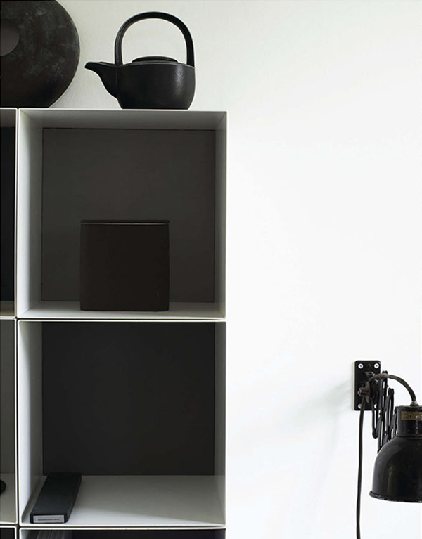
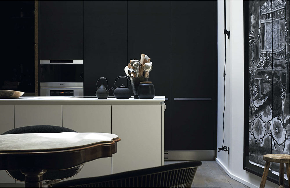
In a historic apartment in Lyon, the contemporary kitchen is lit by an atrium. Its design is discreet and economical, with a simple white island containing storage and sink, and a bank of tall black units concealing appliances.

