Using Pose Photos
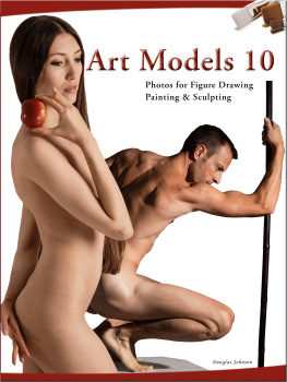
The best way to improve in most things is to practice. This is especially true in art. To practice, you need qualityreference material that inspires you. Thats what the Art Models series of books, disks, and website are all about.Art Models 10 is not a how-to book. It is more of a what-to book, with photos for figure art. It can be usedby students for practice, professionals for finished works of art (which can be sold), or by anyone who needsa quality figure reference.
For students, it might not be obvious how you benefit from pose photos. For that reason, we wanted to providean example of how you can use pose photos to improve, plus give you an extra incentive to start using the photosright away. So we have included an exercise at the beginning of the book to get you started. It is designed forintermediate students. For beginners, you can see our book Figure Drawing Studio by Butch Krieger which has practical,hands-on exercises that he learned over a career as a professional artist. FDS also has more of our referencepose photos.
How the Poses Were Chosen
The poses were chosen by a group of art instructors, which we hope will make the collection genuinely useful forboth students and experienced artists. One of the artists gave his thoughts on the selection process. He saidhe looked for:
- Mood/expression
- Dynamic action/torsion
- Dramatic shadows
- Compositional dynamics between multiple figures
- Personality
- Graceful/elegant
- Traditional classical poses
- Strong sense of depth
- Sometimes, basic simplicity
"I avoided obscured contours and eclipsed body parts. I also decided to include only nude models. Overall,I looked for variety in poses and model types and lighting."
The following art teachers helped select poses for this book. We are sincerely grateful for their time and expertise!
- Butch Kriegerwww.butchkrieger.com
- Pauline Adairwww.paulineadair.com
- Steven Hugheswww.primaryhughes.com
- Rickey Lewislewisartdesigns.com
- Scott Barneswww.artandwater.com
- Gillian Lee Smithwww.gillianleesmithartist.com
Photo Layout
Recognizing that students might want to keep expenses as low as possible, we have chosen to separate the printbook from the Companion Disk for Art Models 10. This allows us to dramatically reduce the cover price even whileincreasing the number of pages.
Our goal was to make a very affordable book that is genuinely useful on its own. That led to making the photosas large as possible and putting one pose per page for the full body poses. If space allowed, we put two viewsof the pose (the Companion Disk typically has 24). There are roughly 100 distinct poses. In addition, sectionson hands, feet, and faces give close-up views of these notoriously tricky areas.
If you do get the Companion Disk, the name of each pose appears right after the photo and can be used to find the poseon the disk.
Please let us know what you think of these choices by writing to us at contact@livemodelbooks.com.
Making Photos Work in eReaders
If the photos are not displaying well, please experiment with your reader's settings or, if you can, even try a different reader app. This book adheres to the EPUB3 standard and passed validation.
Dedicated Readers
We gave extra attention to dedicated reading devices, where you cannot change the displaywindow. If you are not getting good results, try changing display settings; sometimes found under Fonts, or Settings, or More Options, or ooo. For example, reduce margins or change font size or line spacing.On most devices you can zoom in (see Zooming below), which may give a better view of each photo.We tested on actual devices as well as in simulators.
On PC, Mac, or Laptop
Every display device is different and the photos will look different on each one. Try resizing the display window.We set the photos to a 3 by 4 ratio or higher. If you resize the window to, for example, about 600x900 pixels or 800x1175(a little extra height to allowfor titles and margins) that should produce a good display of the images. Often, that will fix the problem of parts of the photos being outside the view.Even though we designed the book so the photos would maintain their aspect ratio while filling the width of the viewer, some applications will ignore the design and distort the photos. For example, during testing, the one viewer sometimes squashed the photos to fit in the window.Some experimentation is required to get the best results.
Reading Apps
Apps vary in their ability to display large images well. Sometimes changing settings will give a better view. For example, the Aldiko app was clipping photos until Advanced Formatting was turned off. If one Reader App does not work well, we recommend trying another one, if you can. Please experiment.
This book was designed to the EPUB3 standard and was verified using ePubCheck 4. If it does not displayproperly, it may be that your Reader App is not adhering to the standard.
You can help by contacting the company that makes your Reader and letting them know you want it to work with EPUB3 and photos.
Zooming
Every device or app is also different in how it supports zooming of images. Here are some methods that may work:
- Pinch out to zoom in.
- Double-tap, wait a moment, then pinch to zoom.
- Tap and long hold then pinch to zoom.
- Right-click is worth trying.
To exit zoom, sometimes double-tapping worked, sometimes there's an [X], sometimes a <--- symbol, or the back button. Some apps simply refuse to zoom images, for example, the Nook app on some devices did not work.
Tutorial
Learning with Pose Photos
by Butch Krieger
About the Author
Butch Krieger, a self-taught artist, originally established himself as a courtroom Illustratorin the 1970s and 80s. Since then he has become known best for his innovative portraitureand figure drawings. See more of his work at www.butchkrieger.com.
In this exercise, we wanted to give you a small sample of how you can use pose photos to improve your skills. If you like this article, you can find much more in the book Figure Drawing Studio by the author of this exercise, Butch Krieger.
The objective of this exercise is to teach you the technique of modeling. In the lexicon of the artists techniques, to model means to use tonal contrasts (shading) to create the illusion of a three-dimensional form on what is actually a two-dimensional surface. Modeling is also called chiaroscuro, particularly when done with dramatically strong contrasts, such as with the image that you will be using in this exercise.
As you undertake this effort, keep in mind that this multi-layered approach is not a style of drawing nor a method for creating drawings to frame and sell. It is a skills-training exercise for mental and manual techniques, as well as judgment. You can later use this skill to make presentable, marketable works of art.
The materials that you will need for this project are as follows:
- Graphite pencil(s) #2 and possibly a softer lead (e.g. #6) for darkest areas. For my demonstration I used just one pencil, which is the Ebony Jet Black Extra Smooth.
- Kneaded eraser.
- Drawing paper, pad or board of your choice.
- Sheets of velum or tracing paper. If you have no experience with drawing on velum and tracing paper, particularly along with a kneaded eraser, I suggest that you experiment and practice with them before undertaking this exercise.

