DEMONSTRATION 1:
TRANSPARENT WATERCOLOR TECHNIQUE
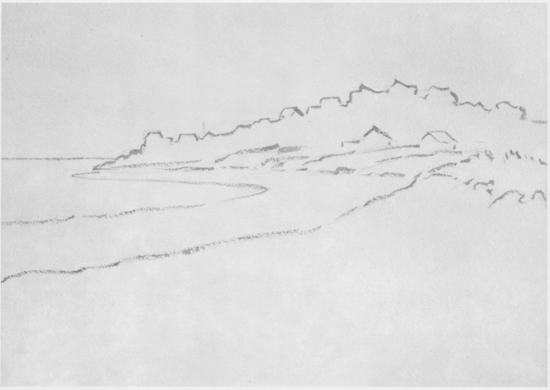
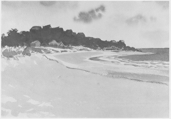
Good Harbor Beach, October by John C. Pellew: Step One
The artist begins by sketching in his composition with diluted burnt umber. He works with a No. 5 round sable brush and simply indicates the large, abstract shapes of the composition. The big shape of the cloud shadow in the foreground contrasted nicely with the sunlit area beyond, says the artist, so I gave it plenty of space. For this reason, Pellew explains, I kept my horizon line well above the center. At this preliminary stage, Pellew draws the absolute minimum number of lines necessary to rough in the major shapes, but makes no attempt to indicate details or even a touch of tone.
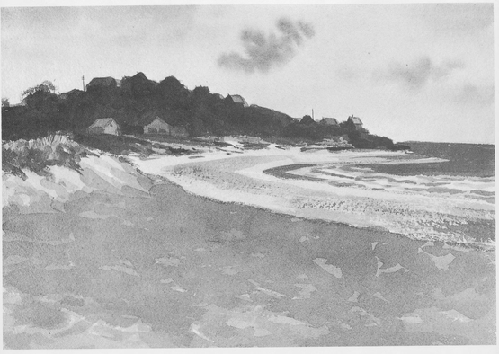
Good Harbor Beach, October by John C. Pellew: Step Two
The sky is the first thing painted. After wetting the area with clean water, applied with a 1 flat oxhair brush, I waited until the shine was off the surface. Working with diluted thalo blue, he finishes the sky, keeping it very simple, so that it wont compete with my interesting busy foreground. Next, he puts in the big mass of the headland with its clutter of houses; he uses mixtures of thalo blue, Paynes gray, raw sienna, and burnt umber. This is purposely left unfinished. Now, working down the sheet, he puts in the blue of the ocean, leaving white paper for the surf, and then paints the bright, sunlit part of the beach. When this is dry, he mixes a puddle of yellow ochre, warmed with a little burnt sienna, and paints in the middle tones seen above on the curve of the distant beach; this also goes over most of the foreground. Finally, some yellow-green is added for the beach grass atop the dune.
Good Harbor Beach, October by John C. Pellew: Step Three
Time out for a smoke while everything dries, says Pellew. Now the headland is given its finishing touches taking care not to overdo the details, the artist emphasizes, which were all too plainly visible. The tone of the ocean is darkened and some drybrush is used to give textural interest to the distant beach. A few cool green tones are introduced into the beach grass on the sand dune, leaving only the large foreground to deal with. Of course, I knew when I started that the cloud shadow would disappear from the landscape as I painted, so I studied its color and tone at that time, and finally painted it from memory. The cloud shadow is Paynes gray, a little thalo blue, and a touch of burnt umber, grayed with a little opaque white. This is painted over the warm underpainting and allowed to dry. Finally, a darker mix of the same colors is used to give the shadow area some variety.
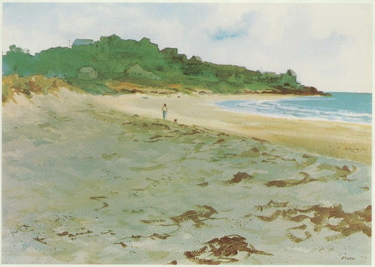
Good Harbor Beach, October by John C. Pellew: Step Four
The last steps in the painting are details, like putting in the seaweed left by the outgoing tide, and indicating the small figure. A No. 9 round sable is used for the seaweed and a No. 2 round sable for the figure. The seaweed is raw sienna, burnt umber, and Paynes gray, rather loosely mixed. The girls shirt, of course, is opaque white. Except for that one opaque touch, the picture is entirely transparent. Pellew points out that: This painting is a good example of one of the many problems that bedevil the landscape painter: the change in light. Sunlight and shadow wont stand still. That first impressionthe effect that attracted you in the first placemust be captured. The landscape before you changes so fast that youve got to keep that effect in mind and face the fact that most of the picture will have to be painted from memory. I liked the cloud shadowed foreground and kept this first impression in mind even though the actual effect lasted only two or three minutes. The painting is a half sheet (15x22) of 300 lb. cold pressed paper.
DEMONSTRATION 2:
TRANSPARENT, SEMI-TRANSPARENT, AND SEMI-OPAQUE COLOR
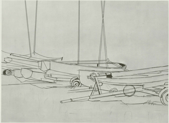
Boats by Hardie Gramatky: Step One
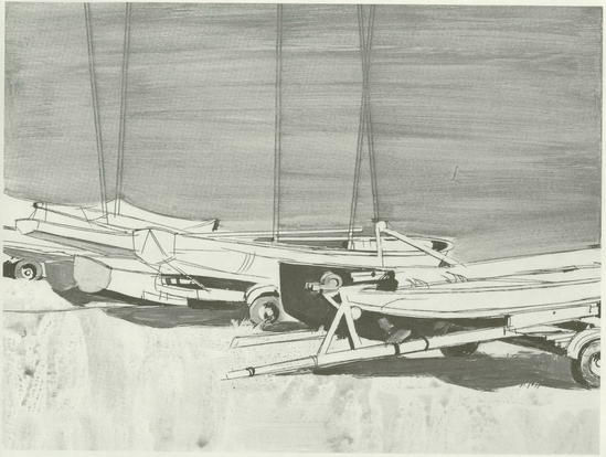
The artist begins by sketching in the composition entirely in line, with a few dark notes to indicate prominent touches of shadow. These dark touches are sparingly placed on the central boat and on the wheels. The rhythmic forms of the boats are indicated with swinging, gently curving lines. The abstract basis of the composition is clearly indicated at this stage. The division of the picture plane is the result of very careful study and nothing is left to chance: note how the area above the boats is divided by the masts into a variety of shapes, no two of them the same. Although its easy to correct acrylic by resorting to opaque painting, Gramatky doesnt leave compositional decisions to chance or to last minute impulse, but begins with a complete pictorial design. This actually allows him to work more spontaneously when he begins to apply paint, because the basic framework of the picture is complete from the very beginning.
Boats by Hardie Gramatky: Step Two
The next stage is to establish the color areas. Gramatky sets the color key to the entire picture with the bright spring green foreground, which is a luminous, transparent wash. Notice the interesting texture of the wash, which has the lively, scrubby, bubbly quality of an acrylic wash on gesso. (The picture is painted on a sheet of illustration board coated with acrylic gesso, applied with a slightly streaky texture.) The deep green shadows under the boat are related to this basic foreground color. The artist then concentrates on the excitement of harmonious local colors: the red and light blue sterns become foils for the dark blue boat and the red pulley at the center of the picture. Gramatky says that he relates these colors as carefully as if they were the dominant notes in a symphony. A blue-green tone is thrown over the entire background to set off the lightstruck forms of the boats. Throughout this phase of the painting, colors are essentially transparent, and no attention is given to such details as the cast shadows on the boats themselves, or the masts that will loom up before the mass of trees. Gramatky still concentrates on the large shapes.
Boats by Hardie Gramatky: Step Three
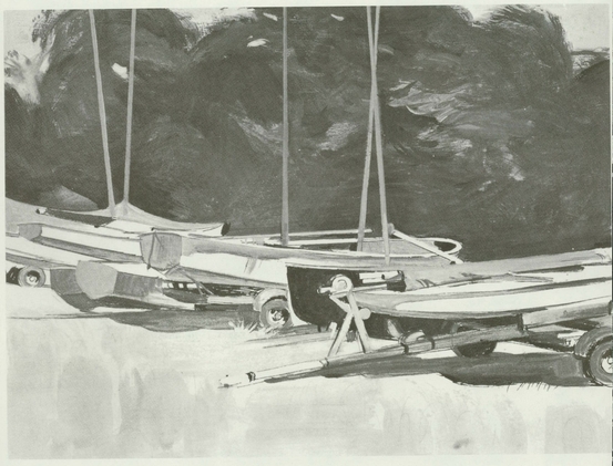
Now for the fun, says the artist. Heres where he establishes the final formspainting the bright white areas on the boats with a loaded brush and fluid, opaque color. The opaque gray shadows on the hulls complete their rounded, rhythmic forms, while free swinging strokes of transparent and semi-transparent color convert the dark background wash to the shape and texture of a clump of trees. The masts of the boats are indicated in decisive strokes of opaque color. Gramatky points out that he avoids using black as much as possible; note that his shadows are as richly colored as the rest of the picture.

