Laura Perryman - The Colour Bible
Here you can read online Laura Perryman - The Colour Bible full text of the book (entire story) in english for free. Download pdf and epub, get meaning, cover and reviews about this ebook. year: 2021, publisher: Octopus, genre: Romance novel. Description of the work, (preface) as well as reviews are available. Best literature library LitArk.com created for fans of good reading and offers a wide selection of genres:
Romance novel
Science fiction
Adventure
Detective
Science
History
Home and family
Prose
Art
Politics
Computer
Non-fiction
Religion
Business
Children
Humor
Choose a favorite category and find really read worthwhile books. Enjoy immersion in the world of imagination, feel the emotions of the characters or learn something new for yourself, make an fascinating discovery.
- Book:The Colour Bible
- Author:
- Publisher:Octopus
- Genre:
- Year:2021
- Rating:5 / 5
- Favourites:Add to favourites
- Your mark:
The Colour Bible: summary, description and annotation
We offer to read an annotation, description, summary or preface (depends on what the author of the book "The Colour Bible" wrote himself). If you haven't found the necessary information about the book — write in the comments, we will try to find it.
Laura Perryman: author's other books
Who wrote The Colour Bible? Find out the surname, the name of the author of the book and a list of all author's works by series.


The Colour Bible — read online for free the complete book (whole text) full work
Below is the text of the book, divided by pages. System saving the place of the last page read, allows you to conveniently read the book "The Colour Bible" online for free, without having to search again every time where you left off. Put a bookmark, and you can go to the page where you finished reading at any time.
Font size:
Interval:
Bookmark:
For Rufus (rufs) my little red head.
Select one of the chapters from the and you will be taken straight to that chapter.
Look out for linked text (which is in blue) throughout the ebook that you can select to help you navigate between related sections.
You can double tap images to increase their size. To return to the original view, just tap the cross in the top left-hand corner of the screen.
Colour is intrinsic to the human experience. It guides us with subconscious visual cues throughout our lives. Get it right in your design or art and you can enhance mood and atmosphere, and create a desired psychological or even physiological effect. Finding success in colour requires a level of nuance in approach, context, form and use, and thats where dedicated study of colour comes into play.
The Colour Bible is a contemporary handbook for navigating the fascinating world of colour. Inside you will find 100 significant colours and explore their importance or role in the world around us, from milestone industrial processes to social media sensations. Every colour profile starts from the colours origin then tracks its evolution, historical use and where it lands today the then and the now. Each entry finishes with a suggestion for the modern utility of the colour. It is vital that we look to the present: as contemporary designers and arbiters of choice, style and ethical practice, we each have a role to play in selecting colour that has real value and meaning behind it, with the wellbeing of humans and of the planet at the forefront of our minds.
This edit includes only a fraction of the colours we see and experience, and the selection is based on my own research, associations and informed preferences. The shades were chosen by observing the physical materials used in art and design as well as the resulting outcomes. Each chapter also reveals much about my own background and working methods as a design trend forecaster. Im naturally drawn to sourcing visual cues, ordering and connecting ideas, and that is reflected in these pages. Colour has many facets, and this isnt a list of colours from a paint chart; colours represent much more than physical pigment they are digital, material and even little pieces of cultural narrative.
This book is not just about singular colours; its also about how to create successful palettes, and that is where context and colour relationships come into play, as the context reveals other supportive tones and hues in which successful palettes can be observed and then formed. Colour choice can be daunting, but with practice anyone can learn to create colour combinations by eye in an instinctual way by exploring simple principles such as opposing cool and warm colours, and learning to recognize harmonious and dynamic colour pairings.
The book aims to be an inspirational resource for your journey with colour; to help you make informed decisions in your work and art. Colour is complex, a sum of many parts and approaches, and its critical to understand the core ideas before searching for new ones. Colour is useful beyond pure aesthetic appeal: it can aid, guide and connect objects, services, people and communities. Look to the work of ink-makers, pigment-producers, artists, designers, architects, manufacturers, scientists and even bioengineers to unlock this mediums true potential.
Colour choice can be daunting, but with practice anyone can learn to create colour combinations by eye in an instinctual way.
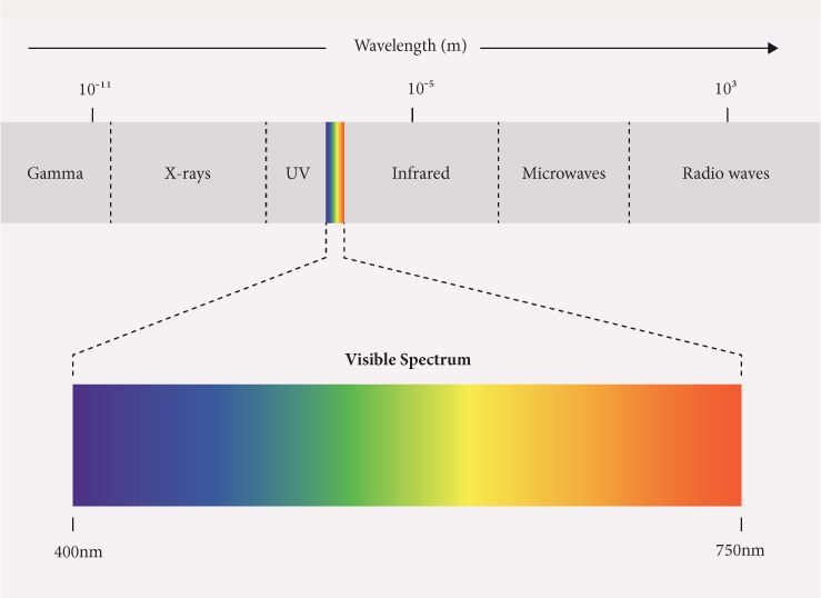
In the most basic sense, we see different colours because different objects absorb or reflect different wavelengths of light depending on their physicality or matter. When the wavelengths they reflect reach our eyes, light receptors transmit messages to the brain via the optic nerve. The brain then interprets these messages as colour. Humans are trichromats, meaning that our eyes have three cones that interpret colour one for red wavelengths, one for blue and one for green with the potential to distinguish a million distinct colours.
The colour spectrum was first identified by Isaac Newton in 1666. By splitting a ray of white light through a prism, he cast a rainbow on his wall and divided the spectrum into seven observable zones: red, orange, yellow, green, blue, indigo and violet. We are now able to identify the wavelengths that make up Newtons spectrum, which are measured in nanometers, and we know that the visible section only makes up a part of the broader electromagnetic spectrum of light. Our eyes find it harder to interpret colours at the edges of the colour spectrum, namely red and violet, and are more able to read yellow, green and blue tones in the middle. The fringes of infrared and ultraviolet are in fact invisible to the human eye. At one end, violet (380450nm) has the shortest wavelength and therefore the highest frequency and energy, and at the other, red (620750nm) has the longest wavelength and therefore the shortest frequency and lowest energy.
Colours and lightstand in the most intimate relation to each other.
Johann Wolfgang von Goethe
These delineated colour zones bleed into one another: greens range from grassy yellow tones to watery teals as they begin to encroach upon the blues. Its hard to say precisely where we can locate the perfect shade of shimmering emerald, but it sits somewhere just before green tips into the blues. Half the allure of colour is the hunt for the perfect shade, to reproduce what weve witnessed in nature or even to invent a new hue that might exist only in the minds eye, or not at all before its creation. The advancement of colour has always been a balance between happy accidents and focused pursuit, but throughout its history, colour has repeatedly shown its capacity to surprise us, to fascinate us and often to help us in unexpected ways.
The interplay of primary colours is fundamental to how we craft colour for use in art and design, both in print and on screen, but there are different models of primaries depending on the nature of our medium. First, it depends on whether we are working with immaterial colour, or light, which entails an additive system, or material colour, such as paint and ink, which is known as subtractive.
Artists and designers who work with light as a medium rely on additive colour theory. Light has three primary colours from which the other spectral colours can be made: red, green and blue (RGB). An overlap of pure red and green light makes yellow; green and blue make cyan; and red and blue create magenta. If all three overlap in one spot, they make white light hence the term additive, because adding colour adds light. RGB is the colour system used for digital displays such as computer and phone screens.
The subtractive colour method that applies to physical colour takes yellow, cyan and magenta as its primaries (CMY), while red, blue and green are secondary shades. Colour mixing in this system subtracts the amount of reflective light: adding more different colours gives a darker result. Fully coalesced, CMY creates a murky mud colour, hence the need for a pure black to be added to the trio to complete the CMYK four-colour process that was developed specifically for the print industry. The unspoken letter in this system would be W for white the base colour of the paper that designers learn to work with instinctively.
Next pageFont size:
Interval:
Bookmark:
Similar books «The Colour Bible»
Look at similar books to The Colour Bible. We have selected literature similar in name and meaning in the hope of providing readers with more options to find new, interesting, not yet read works.
Discussion, reviews of the book The Colour Bible and just readers' own opinions. Leave your comments, write what you think about the work, its meaning or the main characters. Specify what exactly you liked and what you didn't like, and why you think so.