Text and photographs copyright 2018 Jess Park. Design and concept copyright 2018 Ulysses Press and its licensors. All rights reserved. Any unauthorized duplication in whole or in part or dissemination of this edition by any means (including but not limited to photocopying, electronic devices, digital versions, and the internet) will be prosecuted to the fullest extent of the law.
Published in the United States by:
Ulysses Press
P.O. Box 3440
Berkeley, CA 94703
www.ulyssespress.com
ISBN: 978-1-61243-861-0
Acquisitions editor: Bridget Thoreson
Managing editor: Claire Chun
Editor: Shayna Keyles
Proofreader: Renee Rutledge
Front cover design: Ashley Prine
Cover art: Jess Park
Interior design: Jake Flaherty
Distributed by Publishers Group West
NOTE TO READERS: This book is independently authored and published and no sponsorship or endorsement of this book by, and no affiliation with, any trademarked brands or other products mentioned within is claimed or suggested. All trademarks that appear in this book belong to their respective owners and are used here for informational purposes only. The author and publisher encourage readers to patronize the quality brands mentioned in this book.
Dedicated with love to Andrew (my rock) and Harper (my heart)
Contents
Table of Contents
Guide

When I was a little girl, my late grandmother would walk me to and from my art classes. During one of these walks, she told me about the time she entered a painting of pomegranates into an art contest and won first prize. She was just a young girla little older than I was at the time. Her story surprised me, as it was the first time she had ever mentioned to me that she painted. At the time, it made me feel like I had art in my blood, coursing through my veins. But mostly, it warmed my heart to share this special bond with my grandmother. This story has stayed with me throughout my art career.
Watercolor is like an old friend. I love trying new media, but I always come back to watercolor. The tapping of the brush on the glass of water, the smell of the paint, the way the paper feelsits all familiar and comfortable. It brings me back to the days I painted as a little girl.
But at the same time, watercolor is unpredictable and exciting. You never know how a wash will settle or blend. I love that I can paint the same subject multiple times, but it will look and feel different depending on my mood. The days I feel frustrated, Ill produce something that looks overworked. The days I sit down more at peace, my work will look loose and free. And every once in a while, Ill get a happy accident or a blend within a painting that is just so perfect.
Im excited to share my love and knowledge of watercolor with you, through both painting and lettering. I hope the following pages better acquaint you with my dear old friend.
Love,
Jess Park

Though watercolor and lettering have been around for some time now, there has been a recent popularity surge in loose watercolor and modern lettering, and in combining the two techniques. But starting a new hobby combining the two can be confusing. Which supplies should you start with? What are the things you absolutely need, and which items are purely supplemental? In this chapter, youll learn about all the different supplies youll need for lettering and watercolor lettering.
LETTERING SUPPLIES
PAPER
You want several different types of paper: for practicing, for lettering only, and for projects that combine watercolor and lettering.

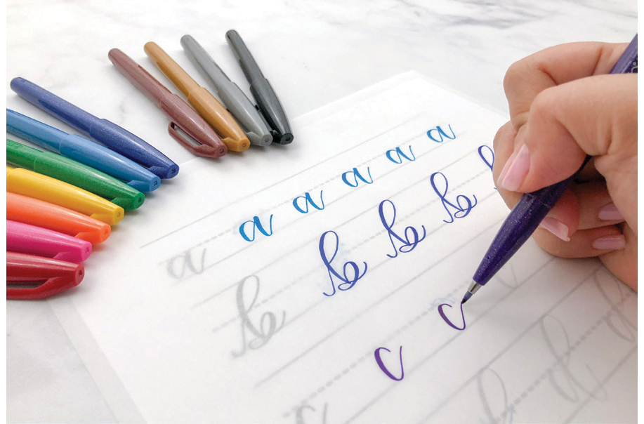
TRACING PAPER. Semi-transparent and smooth, this paper is perfect when first starting out. I recommend using tracing paper to practice the different strokes and letters in Chapters 5, 6, 7, 8 and 9 of this book. The smooth finish is easy on your brush pens and the transparent quality allows you to see the underlying exemplars. In addition, using tracing paper allows you to practice over and over.
PRACTICE PAPER. I recommend using a smooth finish paper such as a Rhodia pad when practicing lettering. The smooth finish allows for ease of movement as well as protecting your brush pens against damage. HP Premium Laser Jet (32 lb.) Printer Paper or Hammermill Color Copy Digital (32 lb.) are alternatives that are not quite as smooth but are more economical. I use these printer papers when Im just practicing or loosening up.
MARKER PAPER. Marker paper also has a smooth vellum-type finish and is thicker than the previously mentioned papers. It can be used for blending brush pens without fraying your pens. Because it is a thicker paper, it can be used for final products.
VELLUM PAPER. Vellum paper is similar to tracing paper but more elegant and may be less translucent. It can be used with just lettering, or with a combination of print and lettering. Another way it can be used is over a watercolor painting. It softens the colors of the painting and adds an elegant touch. It is also perfect for those who are nervous about lettering over a painting.
WATERCOLOR PAPER. See .
PENS
With the amount of brush pens available for lettering, there could probably be a whole chapter devoted to them. To keep things simple, I have divided the pens into two broad categories: small tip and large tip. In addition, I only include information on the ones I typically use. I rarely use large-tip brush pens in combination with watercolor, as the rough paper tends to ruin these pens. However, for the sake of completeness, I have included information on them in this section.

Remember that like paint and paintbrushes, picking a brush pen that works for you is a personal choice. What works for me may not be ideal for you. Many are sold individually so I recommend trying out a few and seeing which you like best.
SMALL-TIP PENS
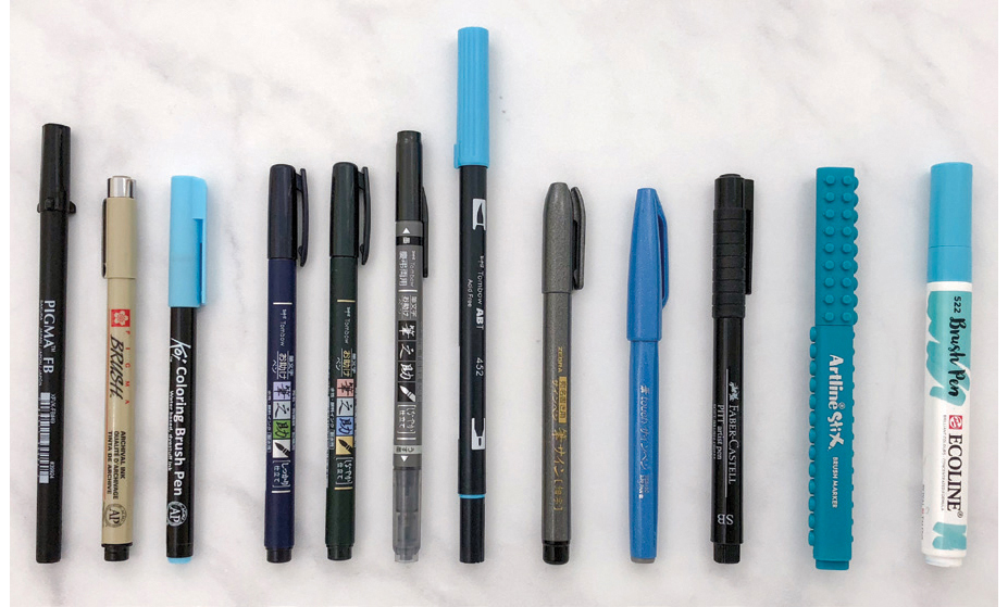
Small-tip pens produce fine lines and are used for small-scale lettering. Some are waterproof like the Tombow Fudenosuke Brush Pens (hard and soft), Faber Castell Pitt Artist Brush Pens (which also have archival ink and come in various colors), Sakura Pigma Professional Brush Pens (which have archival ink), and the Zebra Disposable Brush Pens. This means you can letter first and then paint over the lettering without worrying that the ink will bleed. The latter two also come with various sized tips. Others, like the Pentel Fude Touch Sign Pens, come in various colors but are not waterproof.
I recommend that beginners start out with a small-tip pen for three reasons:
Durability: Small-tip pens do not fray as easily as the large-tip pens. When starting out, you are still getting used to how hard to press to produce a thick downstroke. As a result, many beginners press a little too hard. These pens can take a lot of abuse before they begin to fray.
