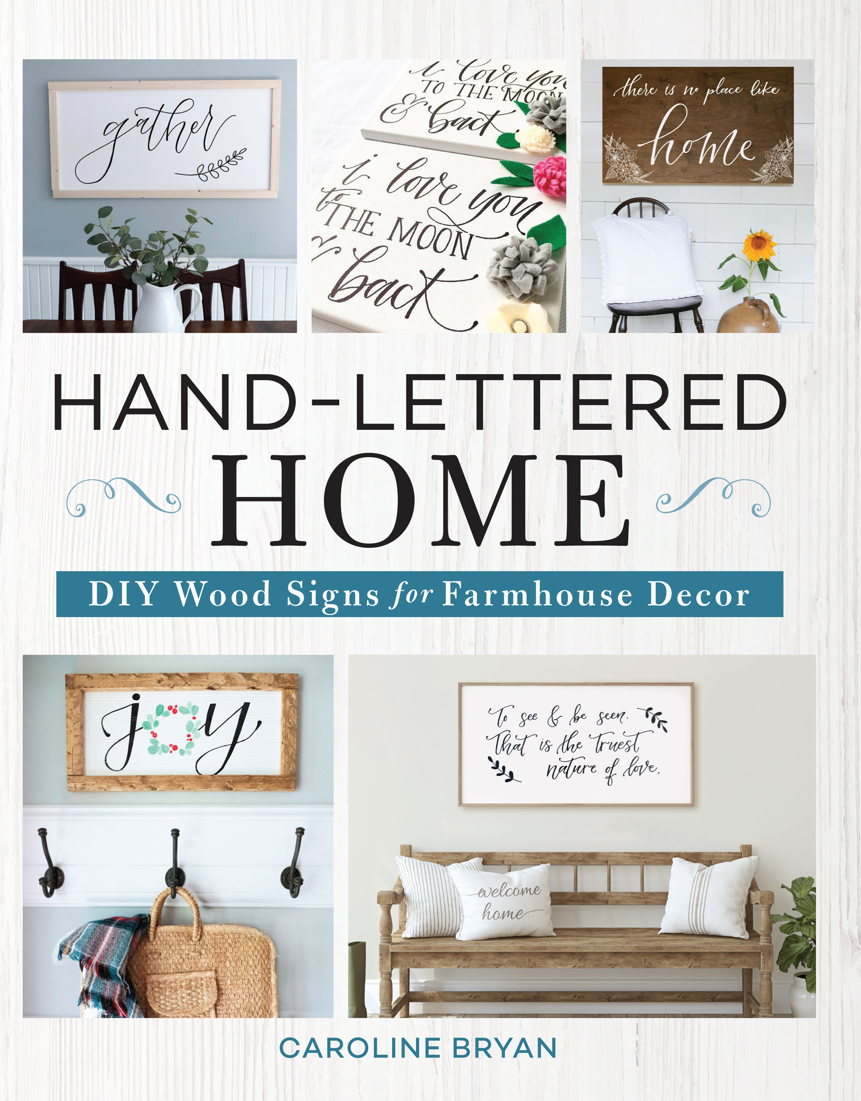
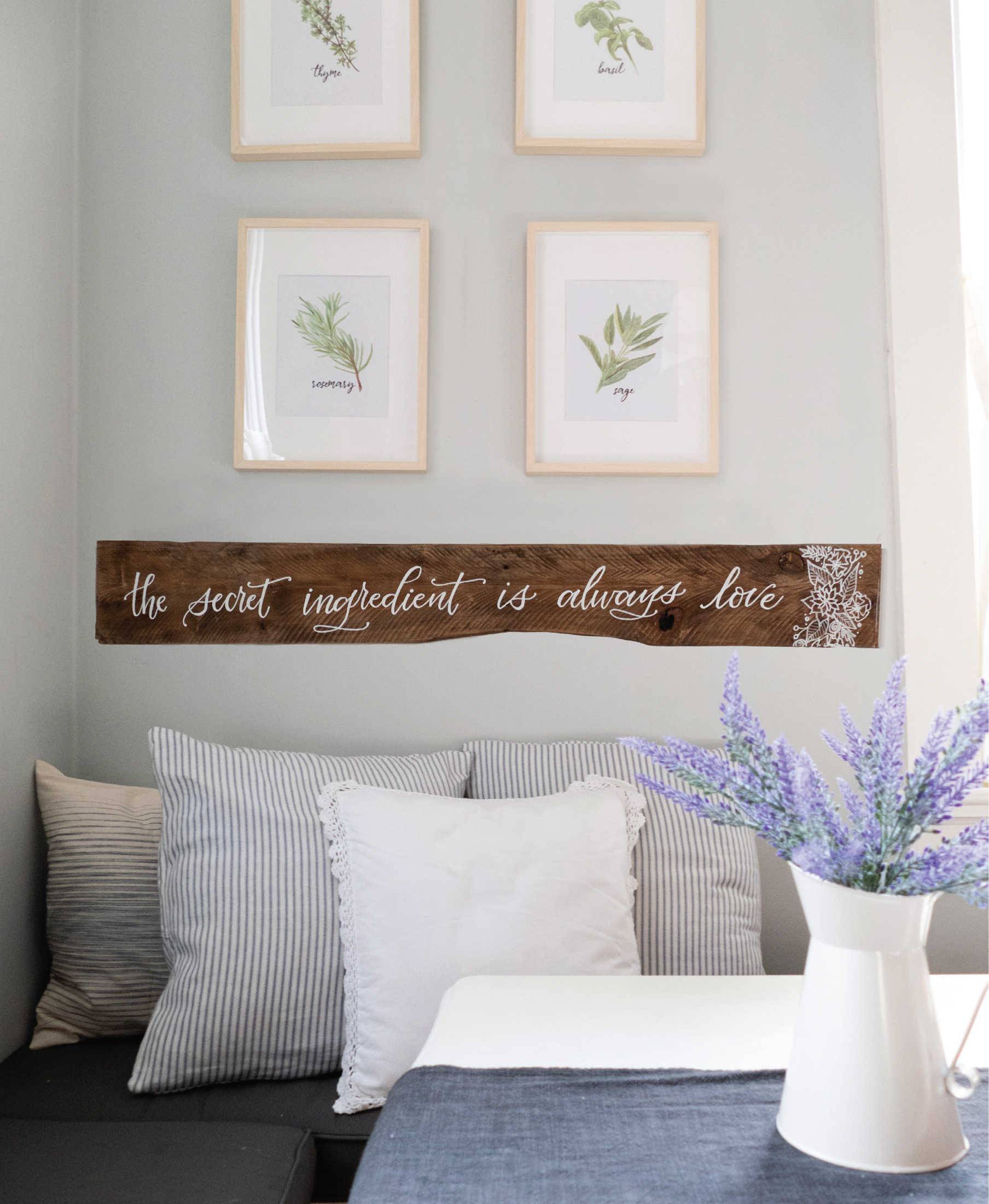
Do you gravitate toward the decor signs in home stores, just like me? I love exploring the words, flourishes, finishes, and textures. Most of all, I love the warmth and meaning that a well-made sign can add to a home. But still, Im often left disappointed at the choicesmaybe the colors dont coordinate with my design or the standard size doesnt fit my space well. Often, the cost isnt within my budget. The beautiful solution: DIY hand-lettered signs.
I can make a one-of-a-kind piece of affordable art for my home exactly as I wantin the size, color, and finish that I need for my space. And you can too, with the step-by-step tips and design ideas in Hand-Lettered Home ! In the pages that follow, youll find 20 sweet signs to add warmth, whimsy, and modern farmhouse style to every area of your home. Best of all, the lettering and wood techniques you learn through the designs are completely customizable to help you create signs that are uniquely yours. Each project is a starter path to endless design possibilities! Simply switch up any element you wantfrom the hand-lettering style to the wood finish to the paint pen color. The Mix It Up section at the end of each project gives you great variations to consider, but you dont need to stop there with inspired ideas that branch out from the original sign.
While youre decorating your own home with special meaning and memories, keep in mind that hand-lettered signs make amazing gifts. It is such a joy to be able to create wood signs for my own home as well as the homes of family, friends, and customers. I hope that you find the same joy and satisfaction in creating your own signs with Hand-Lettered Home !

To create the gorgeous hand-lettered signs in this book or any signs you dream up, you will need to get to know three basic but highly customizable lettering styles: Faux Calligraphy, a beautiful script; Block Print, a versatile serif print; and Cafe Print, a lighthearted sans serif print. With these three lettering styles in your toolbox, you will be able to mix and match to create unique signs for every occasion and room in your home!
STEPS FOR THE BEST LETTERING
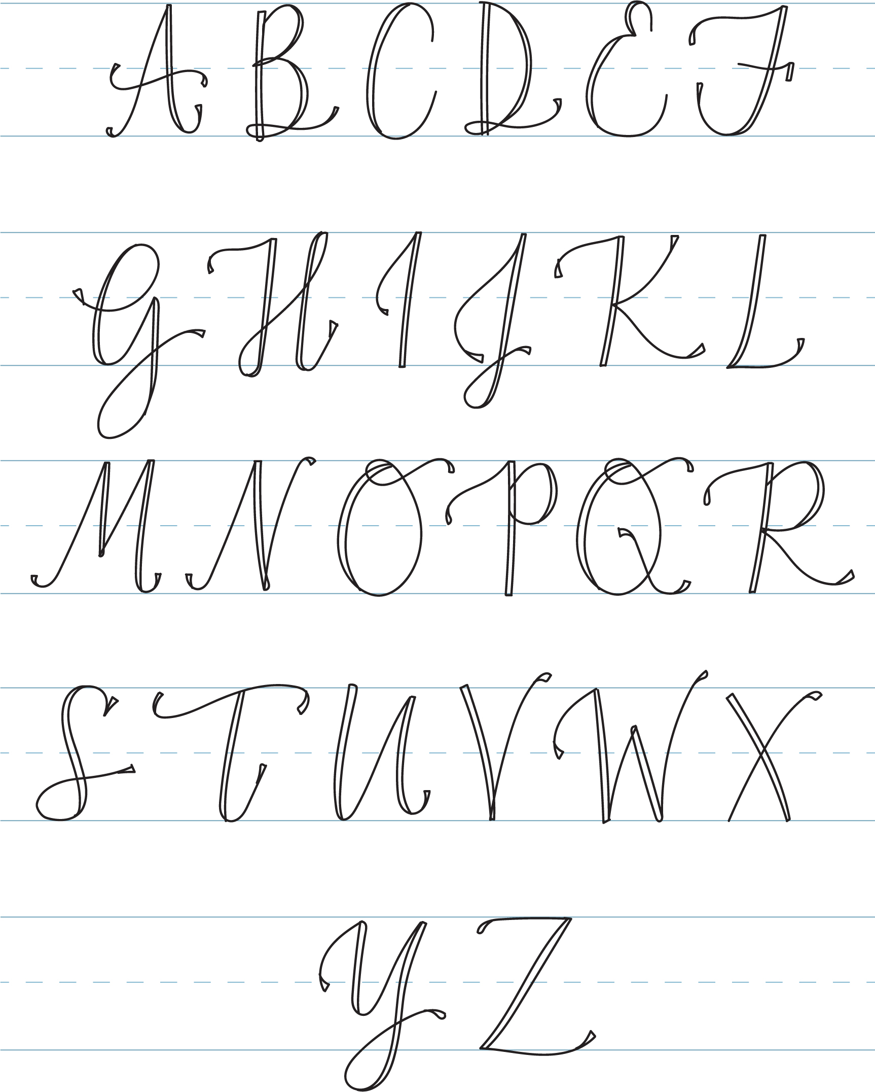
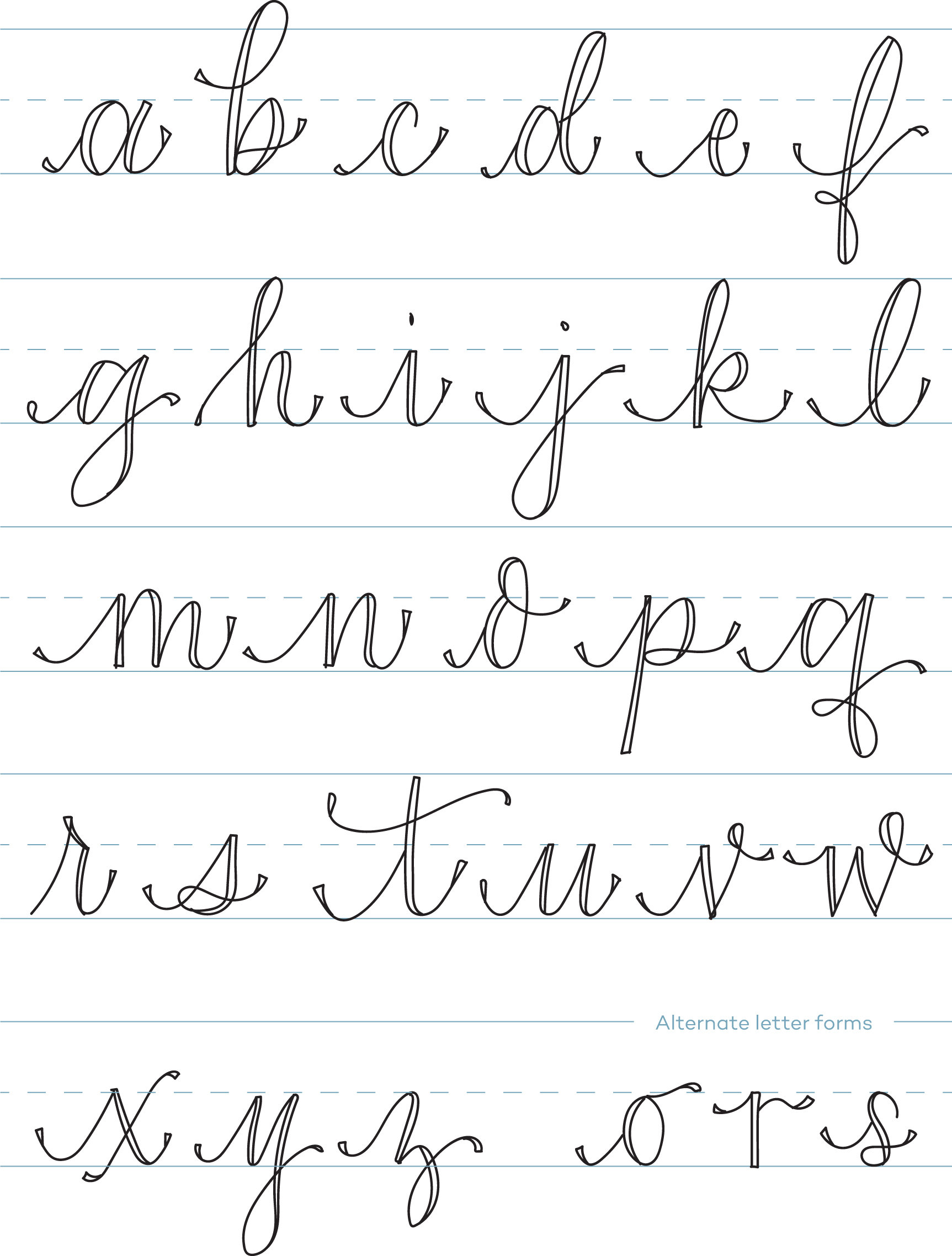
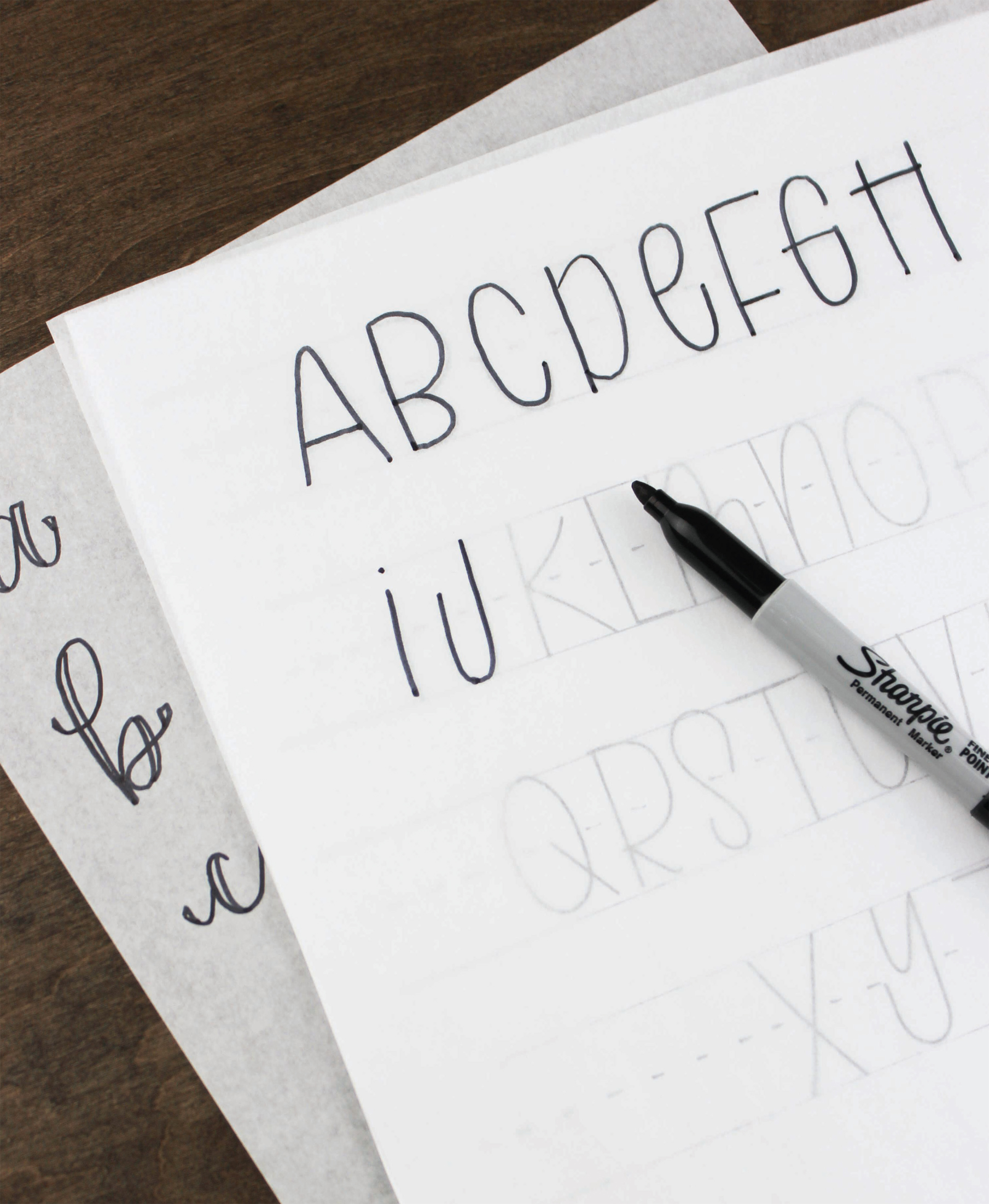
1.PRACTICE BEFORE PAINTING. Use the practice pages that follow to learn how to build letters (capitals and lowercase) and numbers in the three lettering styles. The more you practice, the more natural the process will feel and the smoother your lettering will become. Need a refresher as you work on signs? These pages will be here for you to revisit.
2.USE TOOLS WISELY. No matter how much you practice with these lettering pages, its only natural to find yourself in a whole new scenario when you go from paper to sign. Suddenly, youve lost your guides to make sure your lettering is even. Fortunately, some simple tools can come to the rescue.
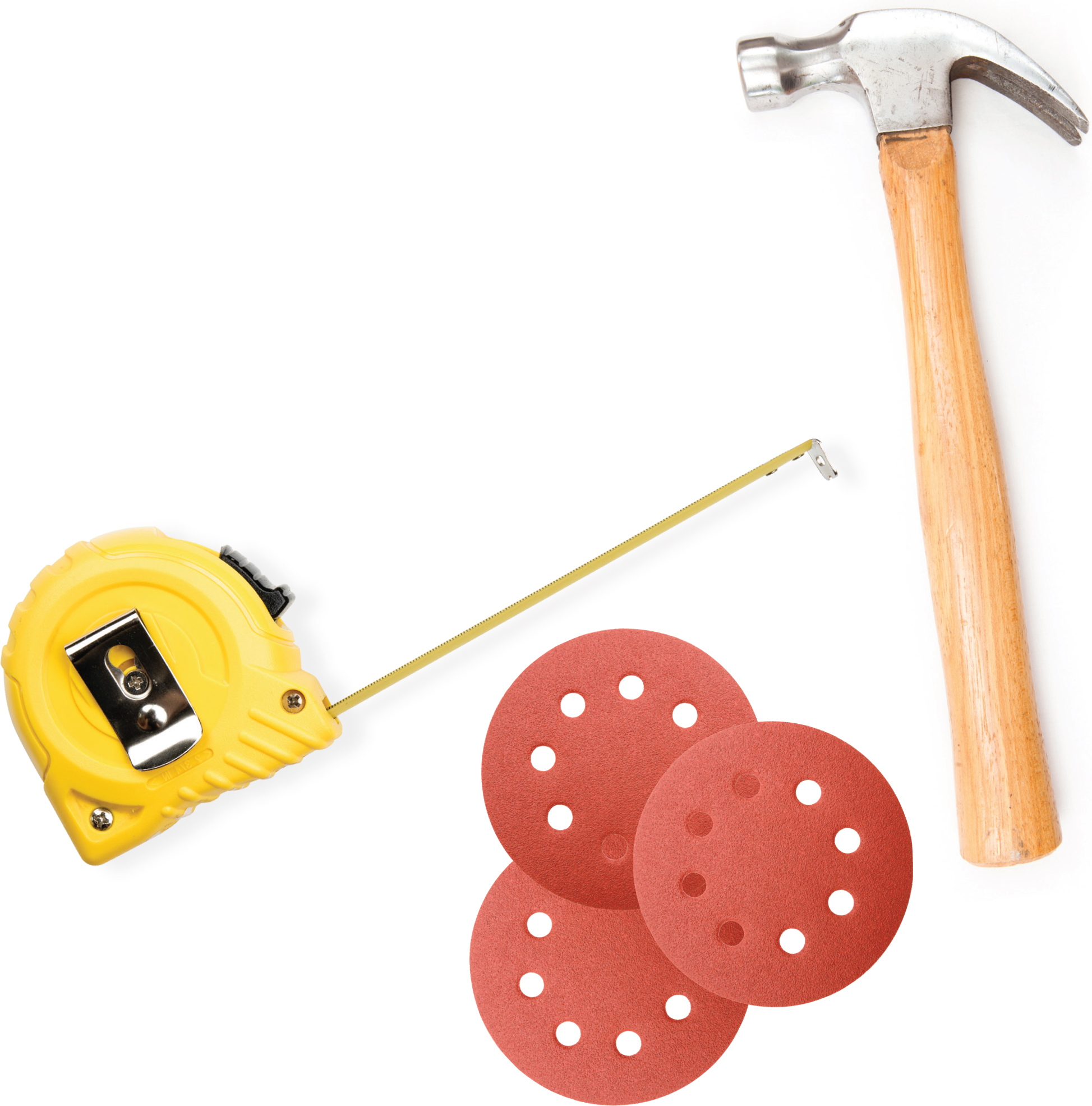
- For beginners and experts at hand lettering alike, its a smart idea to create a baseline guide. This basic but super-helpful step keeps all letters the same height and avoids the natural downward slant when we write. A ruler or painters tape works well when writing Block or Cafe letters. Use a laser level guideline for Faux Calligraphy.
- Remember that when youre ready to move your hand lettering onto a sign, chalk can be your best friend for creating lettering guides before you commit to paint.
3.GO SLOWLY. Your grocery list might be hardly legible, but that doesnt mean you cant learn to hand letter! Take your time and be deliberate about forming each letterwhether youre working on practice pages or have progressed to lettering on a sign. Youll appreciate the results.
Wondering about serif versus sans serif lettering styles? A serif is a decorative line added to a letters stem. So serif fonts have those lines (sometimes called feet) while sans serif fonts dont. (Sans means without in French.)

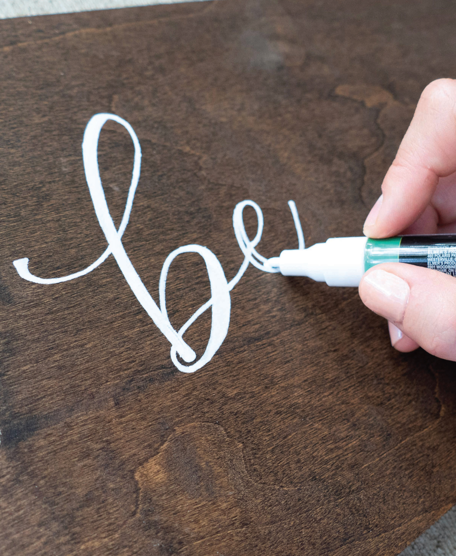
Faux Calligraphy mimics the look of a calligraphy pen and nib, which allow a calligrapher to create different line weights depending on how much pressure is put on the pen. On the upstrokes of letters, the calligrapher uses hardly any pressure on the pen and the strokes are thin and light. However, on the downstrokes of letters, the calligrapher places pressure on the nib so more ink flows to the paper, creating a heavier line weight and a thick, dark stroke. In sign making, we mimic this look by going back over the letters to double the downstrokes with the paint pen. The upstrokes of letters are a single line of paint and look thin compared to the downstrokes of the letters, which are doubled and thicker. To vary the style, you can also stick with monoline Faux Calligraphysimply a single line without doubled downstrokes.
You will notice in the following pages that I also add extra weight at the beginning and end strokes of letters to create end caps. This style adds polish to large-scale lettering on a sign. Practice the end caps for each letter. When it is time to create words with the letters, simply drop the end caps where needed to connect letters.
DOUBLED DOWNSTROKES & END CAPS
Heres an example: Begin by drawing the letter with a single line. Mark the doubled downstrokes and add end caps. Fill in the downstrokes and end caps.

Once you master a basic Faux Calligraphy alphabet, you have the option to alter the letters to create a signature style. I find that the three letters o , r , and s can be easily swapped for a slightly different look from the start. For this reason, you will find two ways to write each of those letters in the following practice pages.
Buy a pack of tracing paper and lay the paper over this book for additional practice! Any bullet-tip pen or marker will work well as you are learning.
