ABOUT DRAWING ANIMALS
I ts not surprising that most of our work revolves around nature. I (Zanna) grew up in beautiful Cornwall, UK, and spent most of my childhood running around woods filled with wildflowers, or searching for shells in the rock pools around the coast. Harry, like me, grew up exploring the countryside around his homes in Nottingham and Peterborough. Though we lived more than three hundred miles apart, our childhoods were similarwe were both creative and had parents who encouraged and nurtured our artistic talents. It was perhaps those similarities that led both of us to the University of Gloucestershire to study illustration in 2012.
After many late nights together in the studio, Harry and I discovered our shared love of nature and color, which led us to collaborate on many projects. In 2014, we finally found our calling when we started our own business, Papio Press. Running our own business gave us the creative freedom to draw whatever we chose, and that was when we really started to see our work improve and blossom into what it is today.
Harry and I are very lucky that we function well as a team. Harry likes to work on the behind-the-scenes elements of the businesssuch as product photography or website designand I really enjoy the front-facing aspects, such as social media and interacting with customers. This is why Im writing this book for both of us, although it is a combination of our collective knowledge, skills, and ideas.
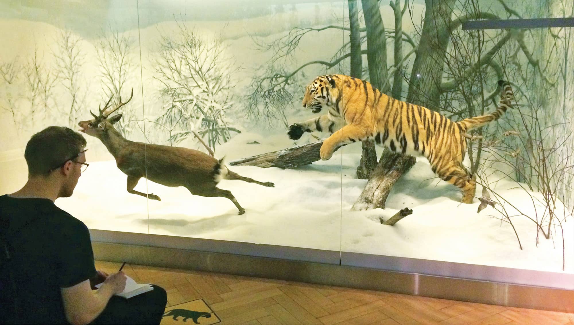
Although well provide you with plenty of illustration instructions in this book, the best way to teach yourself how to draw is through practice. I had already been learning to draw for three years before I started my illustration course at university. Though I had always loved drawing, my work had no life in it. While at university, I went on my first drawing trip to a museum, where I was asked to draw what I sawanything I likedwith the only caveat being to fill ten pages. At the end of the day, I had produced my best drawings, because I had taken the time to really look at and understand the objects in front of me.
So, my advice to you: Take the time to understand the creatures you are drawing! Watch some videos on YouTube (Im especially fond of David Attenborough videos), see how the animals move, watch the way their legs bend, and notice how many of their feet touch the ground at one time while they walk. Even better, go to a zoo or a natural history museum where you can see an animal up close. What shape is its nose? Where do its ears and eyes fall on its face? Copying a photo will only get you so far; a photo is a frozen image by nature, whereas illustrations are a way of telling a story and capturing the energy behind a moment or a character.
Most of all, have faith and persistence! Its okay to struggle, but dont ever give up on something that you love. If you stay curious and keep looking, learning, and trying, then with time, it will come to you. You might find that you discover a hobby or even a career that brings you a lifetime of pleasure.
Good luck!

HARRY SKETCHING AT THE HELSINKI NATURAL HISTORY MUSEUM IN HELSINKI, FINLAND.
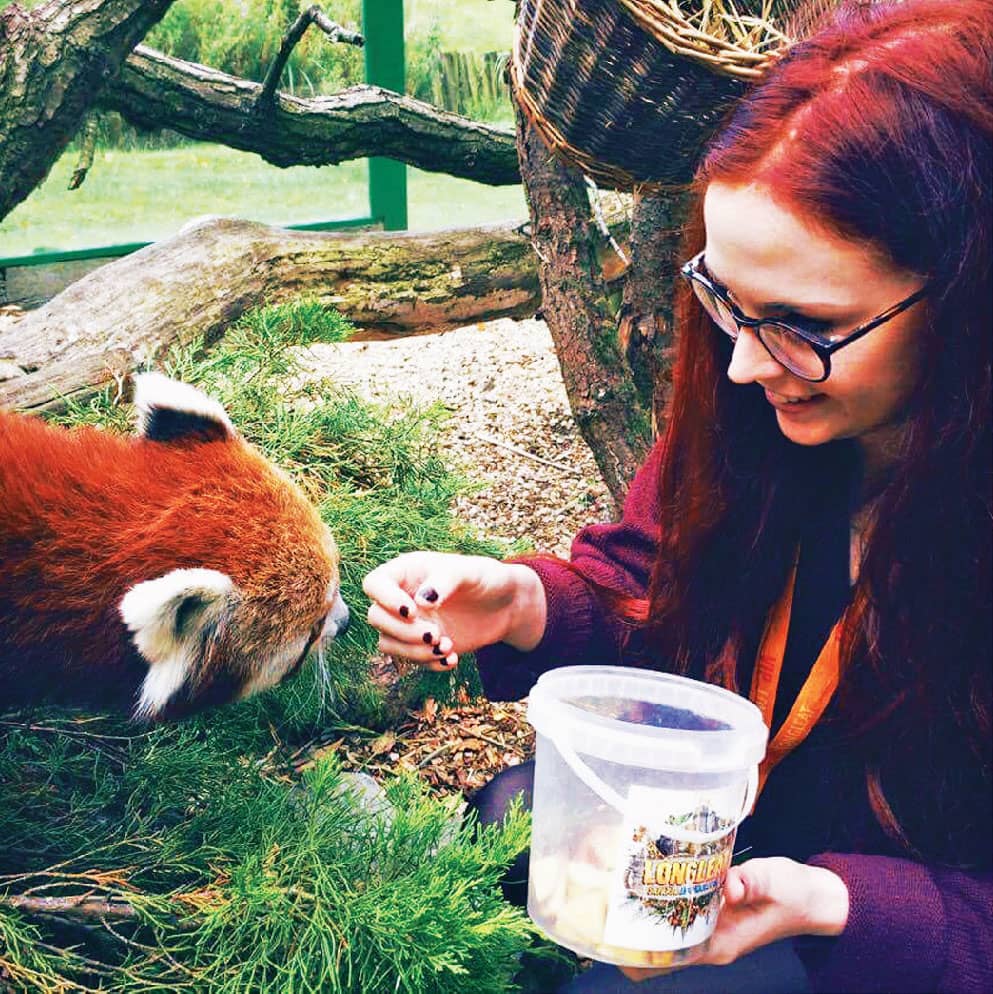
ZANNA MEETING A RED PANDA AT LONGLEAT SAFARI PARK IN WILTSHIRE, UK.
TOOLS
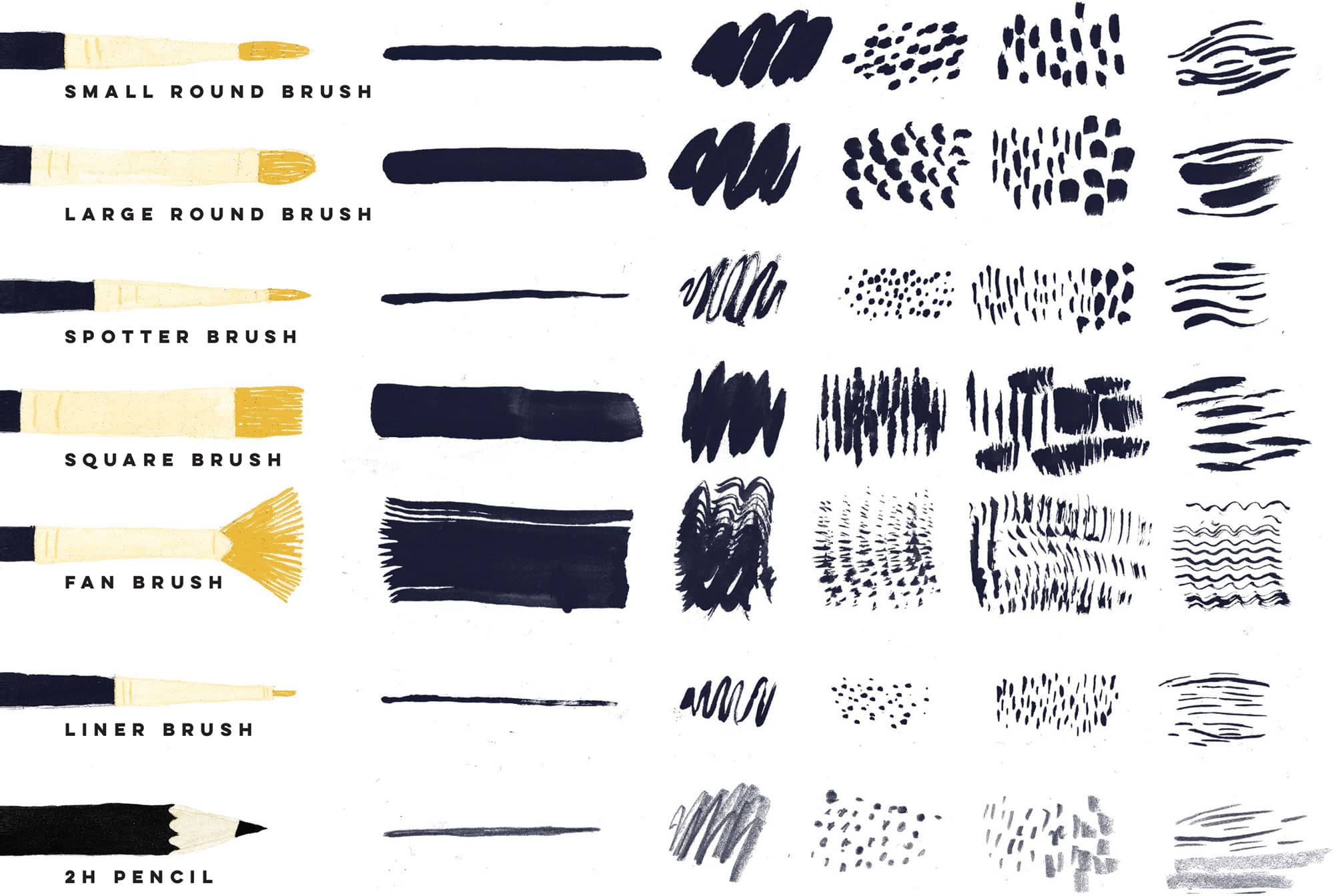
T he tools you use can entirely affect your work. Above, we show some of the different textures you can create using different types of tools.
The first thing you need to decide is whether you want your work to have a textured element. Plenty of illustrators create beautiful work in a flat, graphic style, so it really comes down to preference. We love playing with texture in our work, and we spend lots of our time trying out different things. Before you start, do some experimenting! Pick up a selection of different tools and materials (opposite), and try making different textures that look like fur or feathers. Dont worry about shape yet; if you are in tune with your tools first, youll find following the step-by-step instructions a lot easier later on. Go wild!
MATERIALS
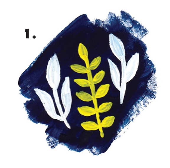
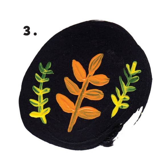
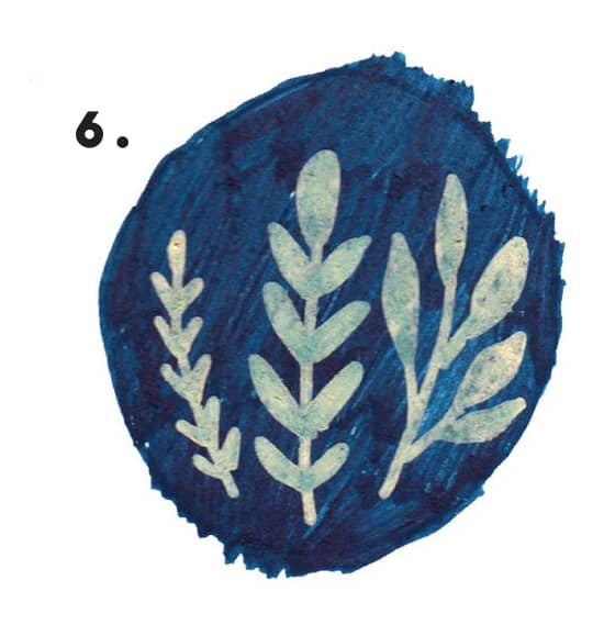
1. GOUACHE is perfect for painting in a flat and neat style. The paints thickness means you can paint white over black without the black showing through.
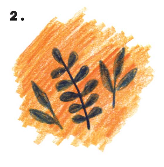
2. PENCIL CRAYONS can create a lovely texture. They look similar to pastels, but theyre less messy and provide richer color. Make sure that you get artist-grade pencils, thoughthe ones for children just dont cut it!
3. ACRYLIC is lighter than gouache and a bit more flexible. It can be watered down to create more textured work, but it also lies flat on the page.
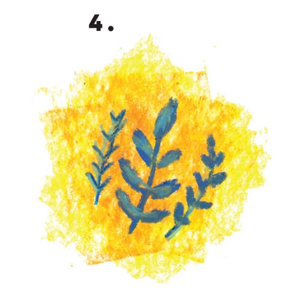
4. PASTELS are slippery and can make a big mess. It is tricky to get a rich color from a pastel; the way they layer on top of each other allows you to see the color underneath the top layer.
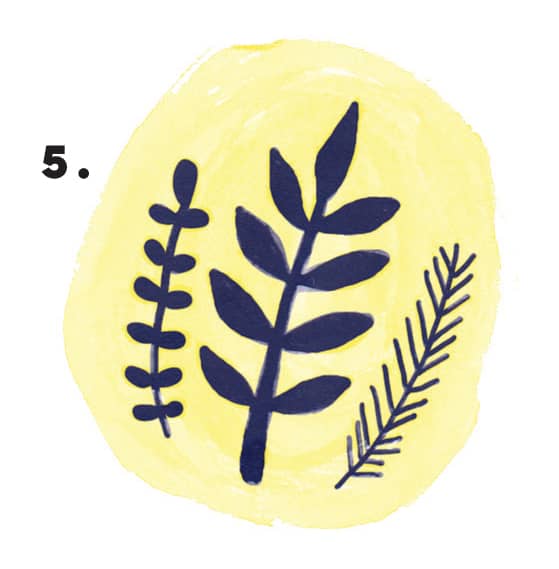
5. WATERCOLOR is my personal favorite. Watering it down means that as each layer is added, the color gets stronger. You can get some amazing textures because of this, but you can only paint from light to dark.
6. PAINT PENS are popular nowadays. They create a rich color and have the same flat look as gouache, but without the hassle of a brush. The downside here is that you cant mix colors.
7. INK is similar to watercolor in that you can water it down to get a lighter shade, and then can only go from light to dark. You can buy inks in lots of different colors, and they can be mixed. Ink is good for making fine marks and can also be used with a dip pen that has different-size nibs. You can draw with it as well.
