Cyrus Highsmith - Inside Paragraphs
Here you can read online Cyrus Highsmith - Inside Paragraphs full text of the book (entire story) in english for free. Download pdf and epub, get meaning, cover and reviews about this ebook. year: 2020, publisher: Princeton Architectural Press, genre: Children. Description of the work, (preface) as well as reviews are available. Best literature library LitArk.com created for fans of good reading and offers a wide selection of genres:
Romance novel
Science fiction
Adventure
Detective
Science
History
Home and family
Prose
Art
Politics
Computer
Non-fiction
Religion
Business
Children
Humor
Choose a favorite category and find really read worthwhile books. Enjoy immersion in the world of imagination, feel the emotions of the characters or learn something new for yourself, make an fascinating discovery.
- Book:Inside Paragraphs
- Author:
- Publisher:Princeton Architectural Press
- Genre:
- Year:2020
- Rating:4 / 5
- Favourites:Add to favourites
- Your mark:
- 80
- 1
- 2
- 3
- 4
- 5
Inside Paragraphs: summary, description and annotation
We offer to read an annotation, description, summary or preface (depends on what the author of the book "Inside Paragraphs" wrote himself). If you haven't found the necessary information about the book — write in the comments, we will try to find it.
Inside Paragraphs — read online for free the complete book (whole text) full work
Below is the text of the book, divided by pages. System saving the place of the last page read, allows you to conveniently read the book "Inside Paragraphs" online for free, without having to search again every time where you left off. Put a bookmark, and you can go to the page where you finished reading at any time.
Font size:
Interval:
Bookmark:
Published by
Princeton Architectural Press
202 Warren Street
Hudson, New York 12534
www.papress.com
First edition 2012 Cyrus Highsmith
Second edition 2020 Cyrus Highsmith
All rights reserved.
ISBN 978-1-61689-941-7 (paperback)
ISBN 978-1-61689-978-3 (epub, mobi)
Editor: Kristen Hewitt
Design: Cyrus Highsmith
No part of this book may be used or reproduced in any manner without written permission from the publisher, except in the context of reviews.
Every reasonable attempt has been made to identify owners of copyright. Errors or omissions will be corrected in subsequent editions.
Library of Congress Control Number: 2019957149
The text used in the illustrated examples on is from Twenty Thousand Leagues Under the Sea by Jules Verne (trans. by Mercier Lewis).
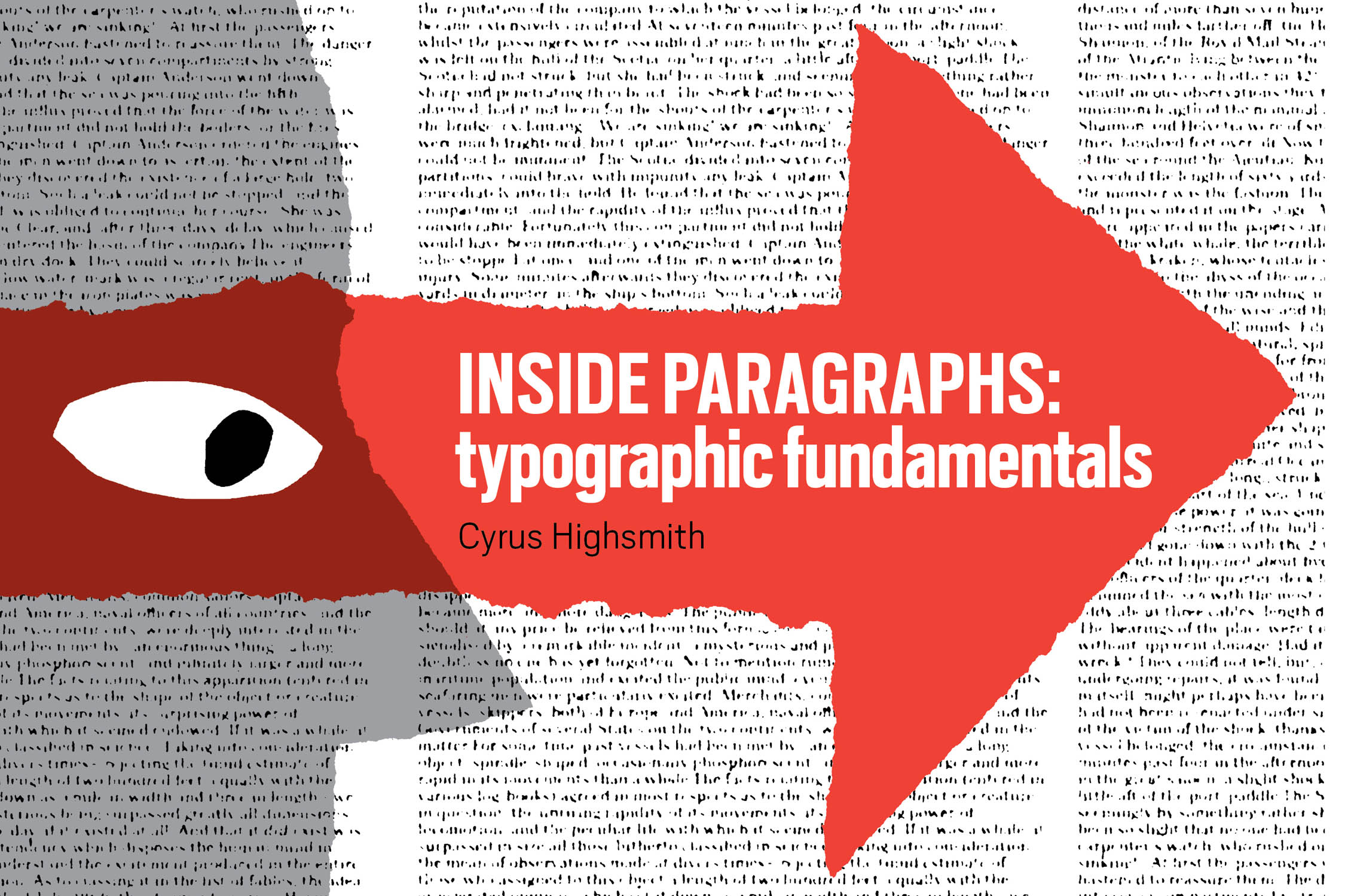
A S I FIRST struggled to write Inside Paragraphs nearly a decade ago, I had an unwelcome epiphany. I realized that I didnt want to write a book about typography. What I actually wanted was to draw a comic book about typography.
I wasnt sure if the idea would work, but since drawing is, and was, how I make my living, I figured I could at least give it a try. I quickly sketched what it might look like.
Those sketches were a turning point. I stopped being trapped by the typography book I thought I should write and began working on the one I could. Inside Paragraphs is not a comic book but it is a very visual book, the result of lots of scribbling and scrawling on big sheets of newsprint.
The diagrams illustrate the text, and the text explains the diagrams. That might seem redundant, but as a teacher Ive found the more ways you can explain something, the better your students will understand it. The circular process of writing and drawing Inside Paragraphs also helped to break down complicated concepts into smaller and simpler pieces.
Basic awareness of typography is valuable for every reader. It can enhance their enjoyment of a well-set document. It can help them recognize when something is deliberately made difficult to decipher, like the terms and conditions of a credit card application or a social media companys privacy policy. We make important decisions every day based on things we read.
The books emphasis on the fundamentals of typography means it has remained relevant despite changes in software and technology. Since it was first published in English, Inside Paragraphs has been translated into Japanese, French, Spanish, Polish, Brazilian Portuguese, Persian, and traditional Chinese. This is a testament to the Latin alphabets global reach. It is also thanks to the place where much of the content was developed.
I see my classroom at Rhode Island School of Design (RISD) as a laboratory for explaining and refining my ideas about typography. The students and faculty come from all over the world. They bring with them their experiences in multiple languages and writing systems. Im grateful for how this diversity shaped this book and continues to shape my professional practice.
In addition to publishing the first edition, Font Bureau provided all that paper, coffee, and room for pacing while I made it. Thanks to David and Sam Berlow for their support and confidence in me. I know they will be happy this second edition will reach an even larger audience.
Thanks also to Matthew Carter for reading a very early draft and to Krzysztof Lenk for encouragement.
Finally, Im happy to correct an omission from the first edition. I didnt give enough credit to its editor, Anna Galloway Highsmith. Not only did Anna provide support and insight during the books long development process, she picked apart and improved every sentence. She made my writing make sense. This book could not have been finished without her.
Cyrus Highsmith, December 16, 2019,
Providence, Rhode Island
W E LIVE in a typographic wonderland. Typographers have more typefaces to choose from than ever before, and computers make setting type easier than ever. The truth is, if youre using a good typesetting application and you just leave the settings on default, you can set type thats more or less adequate.
However, good typographers are experts who have something to add to the reading experience. They finely tune the typography for specific documents to make it more than just adequate. In their choice of typefaces and decisions about things like point size and spacing, typographers clarify the voice of the author and make the reading experience more enjoyable.
This isnt meant to discourage beginners from attempting typography. But it is important to acknowledge that the art of typography is often subtle, and without training it can be difficult to see whats going on. The goal of this book is to help students train their eyes to see text as typographers do.
The focus of this text is on the Latin alphabet (which is the alphabet used for English) and Latin typography. Of course, there are many other writing systems in use in our world. There are other alphabetic systems like Greek, Hebrew, and Arabic. There are syllabic systems like Hangul, used for the Korean language. There are logographic systems like Chinese. The rules for Latin typography might not apply to these other writing systems.
This doesnt mean that our typographic insights are limited to English. Variants of the Latin alphabet are used all around the world to write hundreds of different languages. These include Roman languages like French, Spanish, and Italian; Germanic languages like English, Dutch, and German; Celtic languages like Irish and Welsh; Slavic languages like Czech and Polish; and many others. Some of these languages use characters that are not used in English, like the Danish or the German . Or characters might be dropped, like the K in Italian. The Latin alphabet is a global phenomenon.
Even for languages within the same writing system, different rules may apply. In addition to the basic rules of Latin typography that they share, there are specific rules tuned to the peculiarities of a languages grammar and appearance. The focus here is mostly limited to the common basics.
This book is about what goes on inside a paragraph of printed text, and there are three different ways to read it: you can just look at the illustrations (which is how I would start), you can just read the text, or you can do both.
It begins with general explanations of how type works and how we read. Then it steps through the different kinds of space in a paragraph. Finally, it puts everything together with a discussion about paragraph settings.
Typography started with paragraphs of printed text. Since then, it has evolved in all sorts of directions, sometimes leaving printing behind entirely. But the printed paragraph is still a good starting point. Understanding what goes on inside it is a solid foundation on which to add additional knowledge.
And thats what this book is meant to be a foundation. Its the book I wanted when I was a student in my first typography course.
C OMPUTERS HAVE MADE SETTING TYPE fast and easy compared with hand-setting metal type (also known as foundry type). But many of the basic concepts of typesetting are still the same. A good way to learn how to use typesetting software and understand how type works is to go back to the very beginning, to the invention of movable type.
Next pageFont size:
Interval:
Bookmark:
Similar books «Inside Paragraphs»
Look at similar books to Inside Paragraphs. We have selected literature similar in name and meaning in the hope of providing readers with more options to find new, interesting, not yet read works.
Discussion, reviews of the book Inside Paragraphs and just readers' own opinions. Leave your comments, write what you think about the work, its meaning or the main characters. Specify what exactly you liked and what you didn't like, and why you think so.

