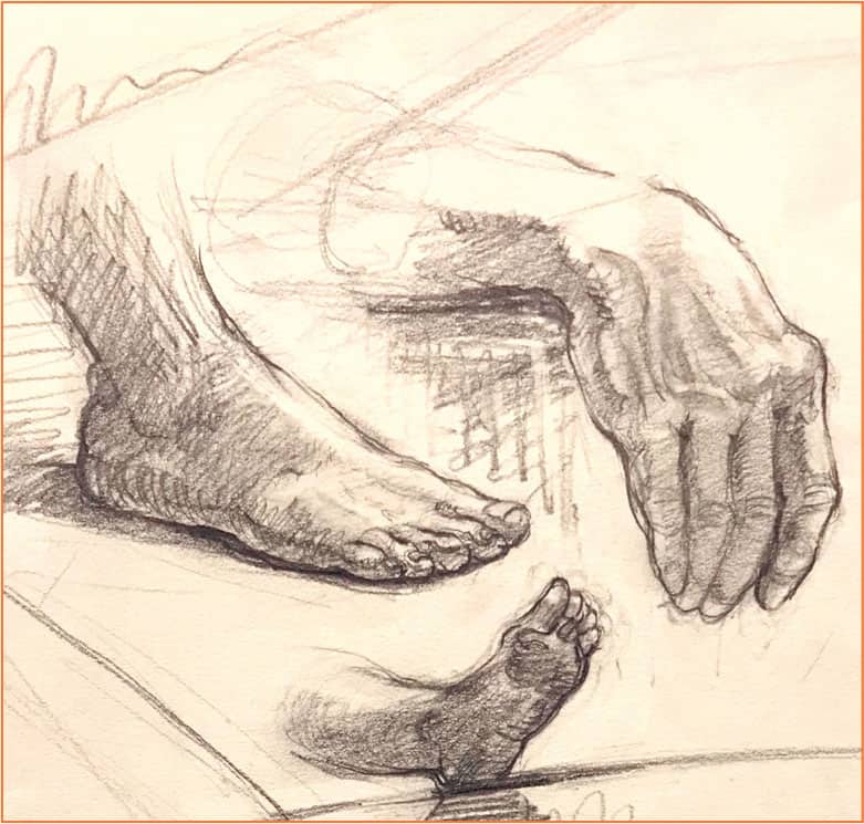
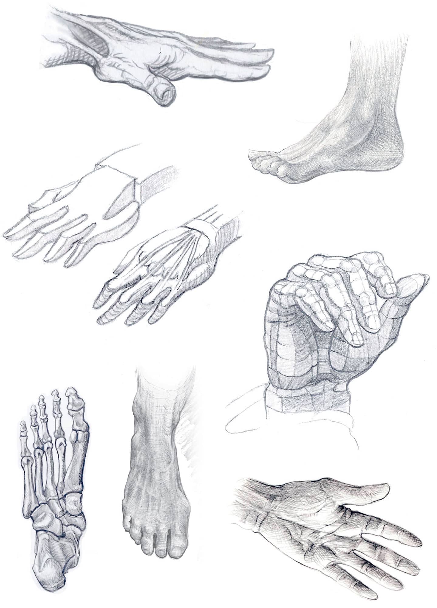
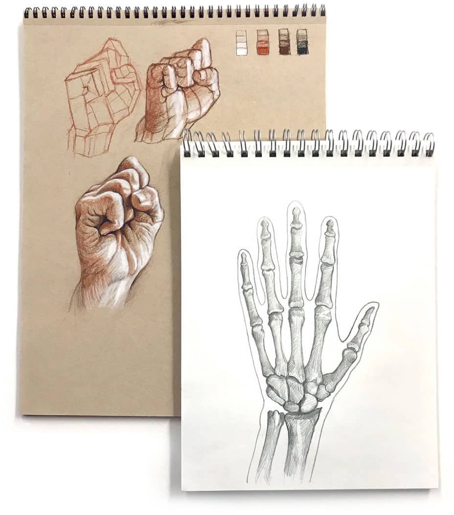
In this approach, an artist learns how to see and draw shapes rather than things. Shapes, such as hands or feet, are drawn objectively without being labeled as what they are. This removes the stigma of hands or feet being too difficult to draw. With this shift in attitude, hands and feet suddenly become unique abstract shapes with very definite values. As these puzzlelike shapes are carefully put together, they evolve naturally into an accurate hand or foot drawing.
The Structural Approach
In this way of working, artists learn to simplify the complex anatomical shapes of hands and feet into basic simplified geometric forms, such as blocks, spheres, cylinders, and cones. Basic forms are much easier to draw than palms, knuckles, and fingers. Beginning this way creates a firm foundation on which to continue building toward more complex anatomical details. The illustrations in this book will take you through a step-by-step process of learning to see shapes, identifying their light and dark values, and assembling them into recognizable images.
Section I of this book shows how easy it is to set up a simple studio almost anywhere. The only tools I recommend are the same ones used for all of the drawings in this book.
Section II covers basic hand and foot anatomy (for artists, not doctors) with color-coding to help you remember which bones are which.
Section III describes the different techniques of seeing and transferring what is seen onto paper, understanding the picture plane, knowing when and how to use positive and negative shapes, and the importance of values and perspective in relation to hands and feet.
Section IV helps to put what youve learned into action: drawing from life, working from photographs, and building detailed step-by-step hand and foot drawings in graphite, charcoal, and Cont pencil.
I am extremely grateful to my artist wife, Stephanie Goldman, who was not only my best hand and foot model but was always there to proof every drawing and to keep my writing as clear as possible.
Jump in and make this book look ragged through overuse! I wish you much success in your drawing adventure.
-Ken Goldman
SECTION I
Tools & Materials
One of the best parts of drawing on a pad is its simplicity. This is especially useful for life-drawing groups where only a drawing board, pencils, charcoal, and drawing pad are necessary. Even at home, when many other tools and materials are available, I favor the following supplies for their compact effectiveness and mobility.

Drawing Tools
Mechanical Graphite Pencils
A 2.0mm 4B and .05mm 2B pencil are essential. The 2.0mm works great for most of the drawing, while the smaller .05mm is perfect for final crosshatching and details. Compared to wooden pencils, mechanical pencils are much easier to sharpen with sandpaper and work better for shading large areas with their long-tapered leads.
Many artists also use harder leads such as HB, 2H, or 4H to attain their lightest values. But if you are careful with hand pressure, as your drawing progresses, a 4B not only yields the lightest values but, with increasing pressure, will also deliver the rich middle and darker values.
Top: .05mm 2B. Bottom: 2.0mm 4B
For ease of quick erasing, try wrapping a small piece of kneaded eraser around the end of the pencil to erase with its side.
Cont Pencils
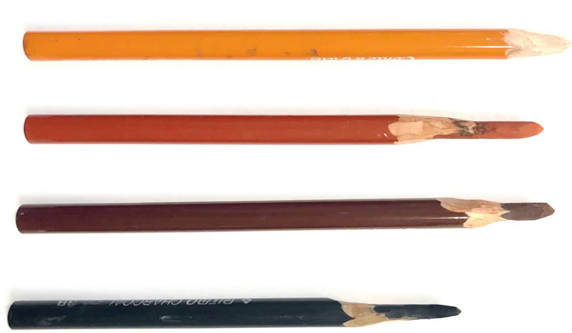
My favorite Cont pencils are the Cont #630 Blanc (white for toned paper), Sanguine #610, Sepia #617, and Black B #1710 (mainly for line accents and toning).
Top to bottom: Cont #630 Blanc, Sanguine #610, Sepia #617, and Black B #1710
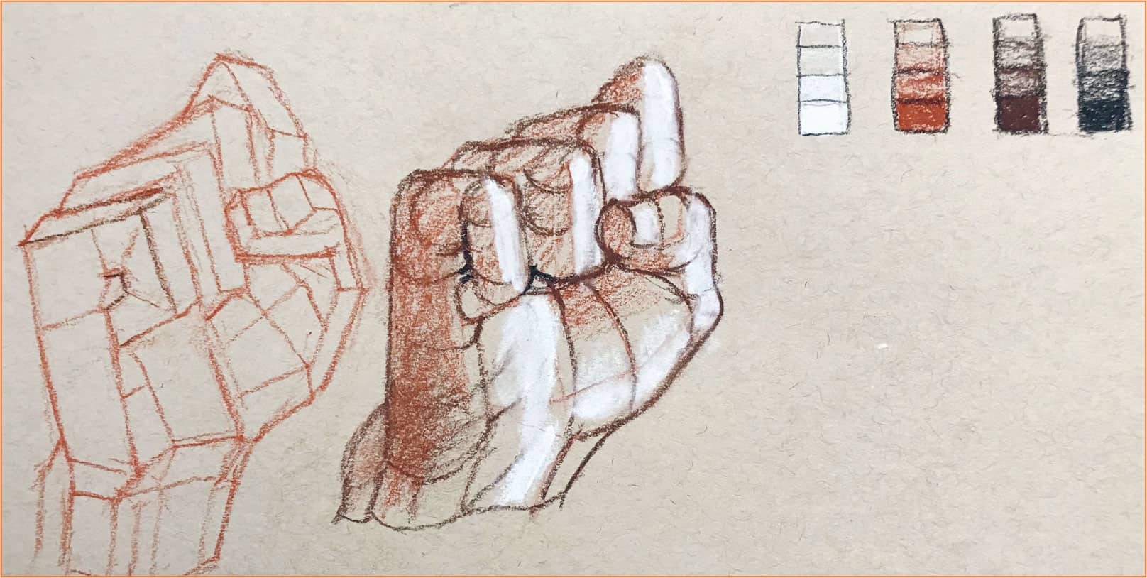
Drawing on toned paper follows the same process as on white paper, except the middle tone is already established and only the darkest and lightest values need to be applied.
Whether your paper is white or toned, sanguine is the best pencil to start with because its textural dryness makes it easy to stay light at the beginning. As the drawing progresses and sanguine starts looking too red, sepia is the next step for further darkening. Finally, black is mainly used for final accents and overall toning. Cont white is not very bright, so it should only be used for general lightening. To indicate highlights and brighter areas, use a softer white pastel sparingly.
Charcoal Pencils
Charcoal pencil lead is a combination of graphite and clay, which provides a unique gliding characteristic. It is available in grades ranging from H to 3B. Soft 3B pencils produce intense lines and rich, dark tones, but they are also difficult to sharpen without breaking. I recommend a B or 2B if you are new to sharpening. Cont, Generals, Prang, and Ritmo all make excellent charcoal pencils of varying hardness.
Cont #1710 B
Vine & Willow Charcoal
Although both are often called vine, there is a difference between vine and willow charcoal. Vine charcoal (from charred grapevines) is dark gray, while willow is black. Vine and willow are excellent for large drawings but do not work as well for small drawings or final crisp details. I recommend starting with soft vine charcoal for the lay-in and using a charcoal pencil for final details.
Green NuPastel Chalk
In addition to being a great drawing tool on its own, vine charcoal also acts as a subtle gray toner for various colored pastels such as NuPastel 308-P. Try first massing-in with the NuPastel chalk, and then begin adding vine charcoal shading and linework.
