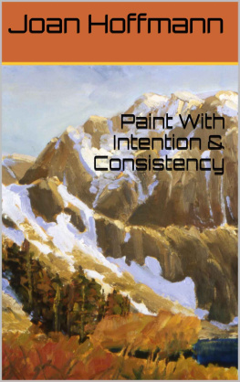
Hoffmann - Paint with Intention
Here you can read online Hoffmann - Paint with Intention full text of the book (entire story) in english for free. Download pdf and epub, get meaning, cover and reviews about this ebook. year: 2012, publisher: Joan Hoffmann, genre: Children. Description of the work, (preface) as well as reviews are available. Best literature library LitArk.com created for fans of good reading and offers a wide selection of genres:
Romance novel
Science fiction
Adventure
Detective
Science
History
Home and family
Prose
Art
Politics
Computer
Non-fiction
Religion
Business
Children
Humor
Choose a favorite category and find really read worthwhile books. Enjoy immersion in the world of imagination, feel the emotions of the characters or learn something new for yourself, make an fascinating discovery.
Paint with Intention: summary, description and annotation
We offer to read an annotation, description, summary or preface (depends on what the author of the book "Paint with Intention" wrote himself). If you haven't found the necessary information about the book — write in the comments, we will try to find it.
Paint with Intention — read online for free the complete book (whole text) full work
Below is the text of the book, divided by pages. System saving the place of the last page read, allows you to conveniently read the book "Paint with Intention" online for free, without having to search again every time where you left off. Put a bookmark, and you can go to the page where you finished reading at any time.
Font size:
Interval:
Bookmark:
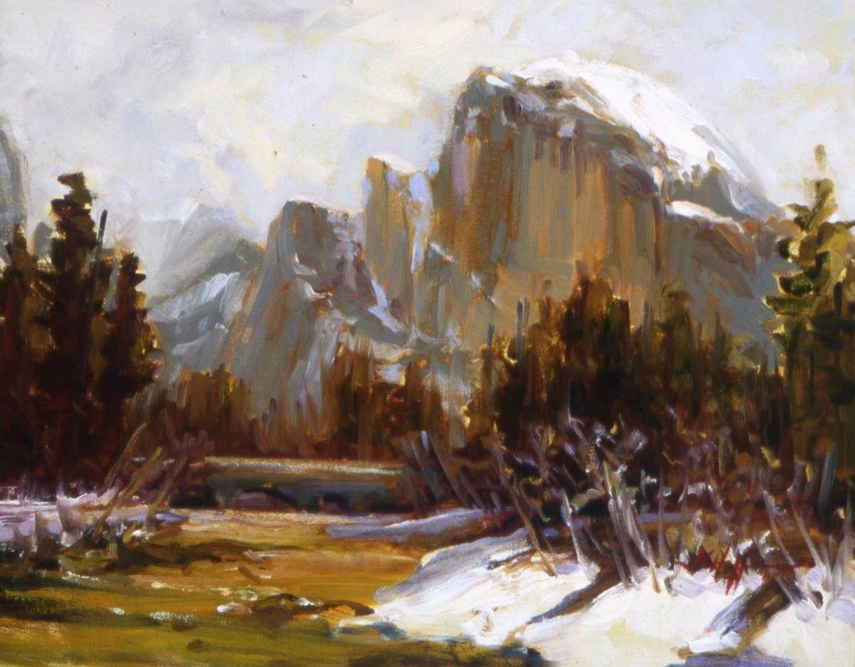
Paint with Intention
SHAPE, VALUE, COLOR & BRUSHWORK
Joan Hoffmann
Dedication
This book is dedicated to all my students during forty years of painting, teaching and protecting the wild habitats which I love.
I studied painting in college and used oils and acrylics.
I used watercolors while married and raising two girls.
I paint impressionistically.
And today I paint en plein air in oils or watercolors.
I create studio images from memory.
I have learned all that I know by explaining it to students.
All rights reserved.
Published by Joan Hoffmann 2002, 2019
Table of Contents
- Color
Color Qualities
Color Wheel
Primary Colors
Palette
Complementary Colors
Neutral Colors
- Full Spectrum of Color
- Color Temperature
Warm Colors Cool Colors
Chart the Greens
Mixing Color
Toning Color
Tints and Shades
Highlight Colors
- Color Perception
Color Atmosphere
Color Bright Light
- Color Notes
- Shape
Space or Objects
Simplify, Simplify, Simplify
- Value
- Brushwork
Oils, Mixables, Watercolors, Acrylics, Pastels
- Train Your Eye to See
- Symbolism
- Critique
- Paint with the End in Mind-Intention
- Paint Waste-Reduce, Reuse, Recycle
- Celebrate Paintings
Color
Color is painting. Color is a temperature and feeling. Color is a wave length, and a measurement of distance. Color sings and color talks. Color is eternal.
Color is painting. Color is defined by Chroma or Hue which is the actual color.
Saturation is the darkness or lightness of the color.
And temperature is its spectrum.
The Color Wheel lets us visualize color and how colors relate to each other. We have been taught that the color wheel is a circle. John Sloans Gist of Art explains the three-D color wheel and the triads of color.
There are twelve notes of color. Find these twelve colors on you palette.
1. Make a large circle on standard notebook paper. Make twelve marks evenly spaced around the circle. These are for the twelve notes of color which is similar to the twelve notes in music. Mark them: yellow(Y), yellow-orange(YO), orange(O), orange red(OR), red(R), red-blue(RB), purple(P), purple blue(PB), blue(B), blue green(BG), green,(G), green yellow(GY).
Primary Colors
Academia teaches us there are three primary colors: red, blue and yellow. These are the only colors absent of any other color. This information is no longer all there is to know about primary colors. For the painter there are six primaries: three warm and three cool primaries.
Colors in nature are not all manufactured by paint companies.
There is no agreed upon absolute Primary Colors by name (and no agency policing primary colors). And there is no standard for, or in, the paint industry. There are historical primary colors, and historical palette colors such as the Anders Zorn Palette.
There are colors which are employed in the Printing Industry. They utilize a limited palette of colors to make reproductions. Your trained eye will discern more colors than this industry presents.
Artist Jack Laws, a popular bird painter, has developed his personal color wheel that allows his art to reproduce well in photos.
Place your paint tubes on the color wheel that you made. Begin with yellows. Place: the lemon yellow on the blue side of the yellow mark and the Cadmium yellows on the red side of the yellow mark. Is Cadmium Yellow dark a yellow-orange? Place it on that mark. Reds: cadmium reds go on the yellow side of the red mark and alizarin crimson or permanent rose goes on the blue side of the red mark. Blues: Ultramarine Blue goes on the red side of the Blue Mark and all the other blues go on the blue side of the blue mark. Use all your tubes of paint to fill in the other notes of color.
The Quiller Color Wheel lists manufactures paint labels and names of each color and where these colors fall on the color wheel. Find it on the web.
Exercise: Find your Warm and Cool Primary Colors
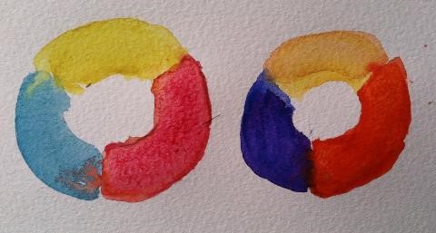
Find one primary and see which color from your new color wheel is to the right and which color is to the left of this primary. Yellow and reds are warm colors and cool colors have blue in them. This is the warm and cool variation of the primary. Paint two donuts a Primary Color wheel: one cool and one warm set of primary colors, shown in color above.
Palette
Memorize the names of the colors that make up your palette. Lay out your palette any way that works for you. Then keep it consistent. A palette is like a key board; dont move the keys. If you add a new color, pay attention to what happens when it is mixed with the other colors.
Complementary colors are colors which are opposite on the color wheel. Here are examples:
Red and Green
Blue and Orange
Purple and Yellow
But what red and green? What manufacturer? What label? What actual color are we talking about? This is the reason that you made your own color wheel. Label the twelve notes of color with your labels: manufacturer such as Gamblin, and the label name such as Sap Green. This is your alphabet of colors which I suggest you memorize both the label name and the order that they fall on the color wheel.
Complementary colors are also the complement in temperature as well as in hue. Therefore, a warm Cadmium Red is complemented by a cool green. What are all the complements? Use your warm and cool knowledge to arrive at its complement. For example, a warm purple made of Ultramarine Blue and Cadmium Red would be complemented by a cool yellow which means Lemon Yellow.
When painters create mud and dont like the color, it is because it needs its complement!
Neutral colors are complementary colors mixed together. They will look like a brown or gray. The color wheel is actually a globe and there are triads of color, like cords in music, which sing. Again, see the book, Gist of Art by John Sloan for a detailed understanding of the color wheel and triads of color.
Our eye, when it sees one color, will crave its complement. Therefore depend on your eye to see or feel complements.
Split complements, are complements one to the right or left which are opposite on the color wheel and they satisfy a craving and create dynamics in paintings. For example, reds split complements are yellow-green or blue-green.
Impressionists discovered that color is light. In the mid 1800s science had just explained that light is a wave length of color. Visible light to a painter is the rainbow of colors. A spectrum is a circle of color or a rainbow of color. This explains a three dimensional color wheel. Remember that a grey day still has light and therefore it is necessary to use a range of yellow, peach or salmon colors to show some light. Look at night paintings by Fredrick Remington. There is a feeling of light or energy in each painting. Frank Tenny Johnson painted in a cool palette with shade in the foreground. Study his colors which begin and end with ochre. Very few great painters forego Naples yellow which adds a spark of light!
Next pageFont size:
Interval:
Bookmark:
Similar books «Paint with Intention»
Look at similar books to Paint with Intention. We have selected literature similar in name and meaning in the hope of providing readers with more options to find new, interesting, not yet read works.
Discussion, reviews of the book Paint with Intention and just readers' own opinions. Leave your comments, write what you think about the work, its meaning or the main characters. Specify what exactly you liked and what you didn't like, and why you think so.

