This Chronicle Books LLC edition published in 2014 by arrangement with Walter Foster Publishing.
Copyright 2014 Walter Foster Publishing, a Division of the Quayside Publishing Group.
Artwork 2013 Elizabeth Mayville.
All rights reserved. No part of this book may be reproduced in any form without written permission from the publisher.
ISBN 978-1-4521-3158-0 (unbnd edition)
ISBN 978-1-45214243-2 (epub, mobi)
This book was conceived, designed, and produced by Walter Foster Publishing, a Division of the Quayside Publishing Group.
Walter Foster is a registered trademark.
Chronicle Books LLC
680 Second Street
San Francisco, CA 94107
www.chroniclebooks.com


Getting Started with Your Still Life Painting Studio
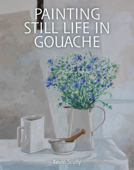
Painting still lifes is both rewarding and enjoyable because you have complete control over the subjectyou decide which objects to include, where to place them, and how to light the scene. Gouache is ideal for painting still lifes because of its vivid color, opacity, and ability to achieve minute detail. In this book youll discover the knowledge and inspiration you need to choose your subject, develop your style, and paint your own captivating still lifes.


Color Basics
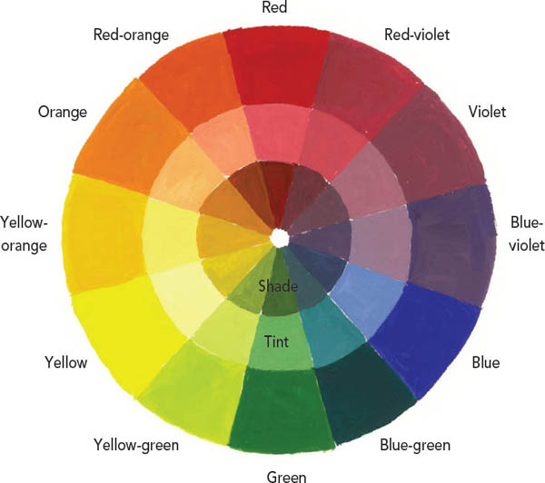
A fundamental knowledge of color can assist us in clearly expressing what we see and what we want to say. Rather than conduct an exhaustive analysis of color theory, it is best to experiment with different colors. A basic understanding of color will go a long way when it comes to choosing your color palettes, however. Your palette should provide a wide color spectrum and have good balance. The color wheel that follows shows the basic relationships between colors. In this section, you will find some guidelines that will help you with your own experimentation.

Color Relationships
The basic color wheel is made up of twelve colors, all originating from the three primaries: yellow, red, and blue. From these are created the secondary colors: orange, violet, and green. Colors directly across from each other on the color wheel are complementary. For example, red and green are complements; yellow-green and red-violet are complements. They appear brightest next to each other, but when mixed, create grays and neutral colors.

Tints and Shades
Value refers to a colors lightness or darkness. Variations of color values are an important tool for creating the illusion of form and depth in your paintings. Add white or water to lighten the value (creating a tint of the color); add black to darken the value (creating a shade of the color).
Color: Expand Your Palette
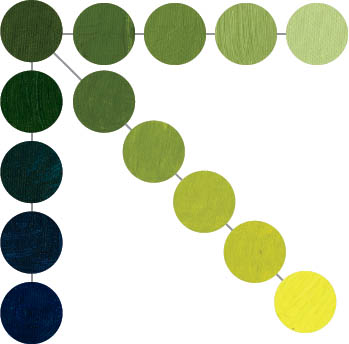
Mixing colors will help you broaden your palette to include a variety of tints, shades, and secondary colors. The diagram below illustrates how you can expand your palette of greens by adding varying amounts of white, yellow, and blue. The top row shows green plus increasing amounts of white, the diagonal row shows green plus increasing amounts of yellow, and the left row shows green plus increasing amounts of blue. As you mix new colors, think about how they might be useful for painting various subjects, i.e. which greens will be best for different kinds of foliage.


Introduction to Gouache
Gouache is essentially opaque watercolor paint. The word gouache comes from the Italian guazzo, which literally means splash or puddle. Gouache differs from other mediums (such as transparent watercolor, oils, and acrylics) in several ways, many of which give it distinct advantages for still life painting. Gouache has a crisper feel, because shading is layered and not blended as it would be in other mediums. Youre also able to achieve more minute detail. Because these paints dont require thinners like oil, and drying time is still faster than acrylic or transparent watercolor, gouache is also very portable, ideal for painting still lifes on location. Gouache allows for a great degree of versatilityby adding more water, you can achieve a look similar to transparent watercolor. Add less and its more like acrylic.

Gouaches brightness comes from the color itselfunlike transparent watercolor, which gets its brilliance from the reflective qualities of the paper. The opaque, chalky quality of gouache gives the paint a matte sheen and a soft, flat appearance that lends itself well to graphic work. A common choice for posters, animation backgrounds, childrens book illustrations, and other commercial art, the medium is enjoying a resurgence in popularity among fine artists.


Gouache Painting Tips
Remember this phrase: Dark colors dry lighter, light colors dry darker. Gouache changes as it dries, so take into account the slight color shift. It also dries really, really quickly. While oil takes days and acrylic a few minutes, gouache (depending on how much water you add) can dry in a matter of seconds. This can work to your advantage, because when layering color, you dont need to wait an extensive period of time for the bottom layer to dry before painting over. While working in layers is normal for gouache, to avoid cracking, be mindful not to make your layers too thick. Fewer layers are ultimately best for your gouache painting.

Paint Consistency: The proper consistency for gouache is similar to heavy cream; the paint should brush out easily and appear opaque. Test your colors on scrap paper first to see the consistency and how it looks with other colors.
Next page