Table of Contents
WHY DOES MY BOOK NOT SELL? 20 SIMPLE FIXES
Copyright Rayne Hall 2014-2015
All Rights Reserved
Cover art and design by Erica Syverson
Scimitar Press (February 2015 Edition)
St. Leonards
INTRODUCTION
Does your book sell as well as it deserves?
If it doesnt, one of twenty blocks may hinder its salesblocks which can be easily removed once youre aware of them.
Each chapter reveals one area where indie authors are sabotaging their books success, and shows how you can free yourself from that trap. The focus is on simple fixes, and actions you can take immediately, although sometimes I point out long-term strategies.
Whether you want to sell 100,000 copies or would be happy with just 100, this guide helps you raise your book above the hundreds of thousands of titles competing for attention.
Sometimes youll experience a joyful aha moment as you discover a new approach. At other times, you may cringe when you realise how your hard promotion work has been driving readers away. Be prepared for tough insights.
This book provokes. It turns advice youve read elsewhere upside down, and challenges what you think you know. You may not like it.
If a suggestion displeases you, feel free to skip it. Im merely the consultant, youre the CEO. I advise, you decide.
This is not a Book Publishing 101 manual. It is a guide for authors who have indie-published (self-published) at least one book, and have already tried different marketing strategies, but not yet achieved success. If youve chosen the traditional publishing path or if youre still at the planning stage, it will be of limited use, although you may pick up pointers.
It also assumes you have written a great book. Your book need not please everybodyno book ever doesbut unless it pleases the kind of people for whom youve written it, no marketing strategy can conjure up success.

Ive made many mistakes, have learnt from them, and reveal them in this book. You dont need to make those mistakes if you learn from mine.
While I have sold a lot more books than most indie authors, bear in mind that Im not one of the million-copy sellers. I can show you how to boost your sales from meagre to substantial, but I dont have a magic wand.
To avoid clunky phrases like he or she does this with him or her Im using female pronouns in some sections, male in others. The words, grammar and spelling are British English.
Now lets look at ways to propel your book to success.
Rayne Hall
CHAPTER 1: THE BOOK COVER
Your book cover is pretty, aesthetic, stunningbut it doesnt do its job.
Most book purchasesebooks or printhappen online. The reader browsing sites sees a dozen or more books displayed on the page. Her eye scans over them, and unless one catches her attention, she clicks next, sees another page of covers, next again, next, next, next.
Your book cover has a fraction of a second to arrest the eye. Catching the casual browsers attention is the book covers main function. Everything else counts for nothing if it fails at this stage.
Lets see if your cover lets you down, and if we can fix it.
IS THE DESIGN SYMMETRICAL?
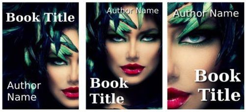
Symmetrical designswhere the shapes on the right side reflect those on the left like a mirrorlook beautiful and harmonious. But they dont attract attention. When several images are displayed on one page, the eye skips the symmetrical ones and lingers over the asymmetrical ones. Those hint at tension, excitement, a suspenseful read.
Heres an example I created. First, the nice but unexciting symmetrical version: 
And here are three quick asymmetrical variations, each of them more likely to catch the eye:

My friend, German comedy thriller author Chris van Harb, has given permission to include a before and after of one of her real covers.
Heres the symmetrical (boring) version:

I used the same stock photo to create an asymmetrical design, and tweaked several other details (text colour, fonts) at the same time: 
The new cover coincided with a general dip in Amazon.de sales, so unfortunately Chris couldnt measure the effects. I would have loved to tell you what the actual boost in sales was.
Suggested Actions:
Crop the picture differently, so the main graphic element is off-centre.
Instead of centring title and author name, align one of them left, the other right.
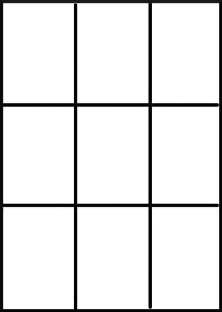
Use the Rule of Thirds for the design. Image lines dividing your book into thirds horizontally and vertically, like this: 
If possible, arrange the title on one of the two horizontal lines, and an arresting part of the picture where two lines cross. If the cover image is a close-up of a face, try to place the pupil of one eye on such a cross. This needs a bit of jiggling, but the effects are startling.

IS THE PICTURE TOO COMPLEX?
You may want the picture to reflect the complexity of the cover, showing several interesting characters in a detailed landscape. Perhaps youve paid an artist to paint everything just so, and are thrilled with the results.
However, theres simply too much for the eye to take in. The casual viewers glance is arrested by simple images and passes over the complex ones. Remember, most books are sold online, and the covers are first seen in thumbnail size. With minute displays, the detail gets lost.
A character attracts the eye more than a landscape or an object. A portrait or half-body character (from the waist up) typically gets more attention than a full-body figure. At thumbnail size, a single character works better than a group, and a simple background better than a complex one.
Unless your books genre requires several characters (for example, two men on the cover for gay romance), use just one. This is probably the main character, or the main characters love interest. With straight romance, a handsome hero on the cover helps sell the book.
In some genres, a simple object can work instead of a character if the design is rightfor example, a pair of fashion shoes for a Chicklit novel about a shoe-loving fashionista.
Suggested Action:
Crop the picture, using just a part of it, to show a single character. You can use the other parts of the picture in your publicity materials, for guest posts and on your website.
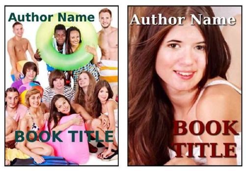
Heres an example of a cover with too many characters, and a quick cropped version which is stronger: 
DOES THE COVER HAVE TOO MUCH TEXT?

