ACKNOWLEDGEMENTS
Without the mentorship and assistance of so many of my friends and colleagues in this industry, not only would this book have never been written, but I would not have been in a position to write it. Id like to take a moment to extend them my sincerest gratitude:
To Molly Holzschlag and Jeffrey Zeldman for taking me under their wings and helping hone my skills as both a speaker and writer. And to the numerous conference organizers and publications whove given me the opportunity to apply those skills.
To Carolyn Wood for helping shape some of my early drafts and to Krista Stevens for finding the crux of my arguments, streamlining my prose, and taming my inner wiseass.
To Craig Cook and Derek Featherstone for keeping my code on the straight and narrow and to the handful of early reviewers for giving me thoughtful advice (and corrections): Dan Cederholm, Simon Collison, Kristina Halvorson, Christian Heilmann, Whitney Hess, Jeremy Keith, Dan Rubin, and Jonathan Snook.
To the Easy Designs team for their attention to detail and invaluable assistance crafting this book: Jessica Martin, Daniel Ryan, Jessi Taylor, Matthew Turnure, and Laura Helen Winn.
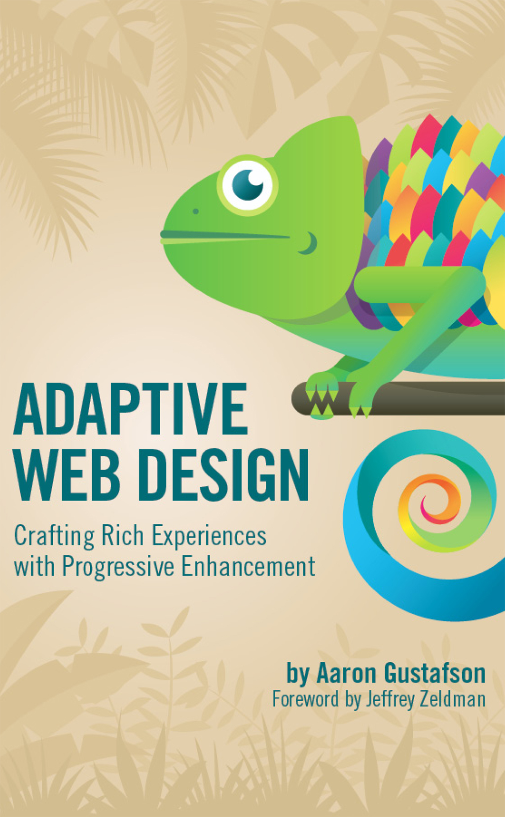
To Veerle Pieters for making time in her busy schedule to design me an absolutely beautiful cover.
And, of course, to Kelly, for finding me the time to write this book, helping me organize my thoughts, and then pushing me to get it done.
FOREWORD
One glorious afternoon in March, 2006, as a friend and I hurried past Austins Downtown Hilton Hotel to catch the next session of the SXSW Interactive Festival, a young stranger arrested our progress. With no introduction or preliminaries, he announced that he was available to speak at An Event Apart, a conference for web designers that Eric Meyer and I had launched three months previously. Turning to my companion with my best impression (which is none too good) of Mr Burns of The Simpsons, I asked, Who is this brash young upstart, Smithers?
The brash young upstart quickly became an essential colleague. In the months and years that followed, Aaron Gustafson created dazzling front- and back-end code for some of my agencys most demanding clients. Just as importantly, he brilliantly tech-edited the third edition of Designing With Web Standards. The job largely consisted of alerting Ethan Marcotte and me to the stuff we dont know about web standards. Ill let you think about that one. For five years now, Aaron has also been a tough but fair technical editor for A List Apart magazine, where he helps authors succeed while ensuring that they are truly innovative, that their methods are accessible and semantic, and (thanks to his near-encyclopedic knowledge) that they give all prior art its due. Moreover, Aaron has written seminal pieces for the magazine, and, yes, he has lectured at An Event Apart.
Given my experiences with the man and my admiration for his knowledge and abilities, I was thrilled when Aaron told me the premise of this book and began letting me look at chapters. This isnt just another web design book. Its an essential and missing piece of the canon. Our industry has long needed a compendium of best practices in adaptive, standards-based design. And with the rise of mobile, the recent significant improvements in desktop and phone browsers, and the new capabilities that come with HTML5, CSS3, and gestural interfaces, it is even more vital that we who make websites have a reliable resource that tells us how to take advantage of these new capabilities while creating content that works in browsers and devices of all sizes and widely differing capabilities. This book is that resource.
The convergence of these new elements and opportunities is encouraging web professionals to finally design for the web as it always should have been done. Adaptive design is the way, and nobody has a wider command than Aaron of the thinking and techniques required to do it well. In these pages you will find all that thinking and those methods. Never again will you lose a day debating how to do great web design (and create great code) that works for everyone. I plan to give this book to all my students, and to everyone I work with. I encourage you to do likewise. And now, enough preliminaries. Dive in, and enjoy!
Jeffrey Zeldman
Author, Designing With Web Standards 3rd Edition
CHAPTER 1: THINK OF THE USER, NOT THE BROWSER
If youve been working on the web for any amount of time, youve likely heard (or even used) the term progressive enhancement before. As you probably know, it is the gold standard of how to approach web design. But what is progressive enhancement really? What does it mean? How does it work? And how does it fit into our workflow in a time of rapidly evolving languages and browsers?
These are all good questions and are the very ones I answer throughout this book. As youll soon see, progressive enhancement isnt about browsers and its not about which version of HTML or CSS you can use. Progressive enhancement is a philosophy aimed at crafting experiences that serve your users by giving them access to content without technological restrictions.
Cue the kumbayahs, right? It sounds pretty amazing, but it also sounds like a lot of work. Actually, its not. Once you understand how progressive enhancement works, or more importantly why it works, youll see its quite simple.
As we progress through this book youll see numerous practical ways we can use progressive enhancement in conjunction with HTML, CSS, and JavaScript to create adaptive websites that will not only serve your users well, but provide them with a fantastic experience, no matter what browser or device they are using to access it.
But before we get down to the brass tacks of application, we need to discuss the hows and whys of progressive enhancement, the underpinnings of the philosophy.
ADAPT OR DIE
And when it comes right down to it, progressive enhancement relies on one principle: fault tolerance.
Fault tolerance is a systems ability to continue to operate when it encounters an unexpected error. This property makes it possible for a lizard to regrow its tail and for a brain to reroute neural connections after a trauma. Nature has proven herself quite adept at fault tolerance and, following her example, weve incorporated that concept into our own creations. For example, the oft-lauded smart grid can automatically avoid or mitigate power outages by sensing (and in some cases anticipating) system problems.
If you use the web, whether as your professional canvas or simply as a casual consumer, you benefit from fault tolerance all the time. Not only is it baked into the protocols that route a request from your web browser to the server youre trying to reach, it is sewn into the very fabric of the languages that have made the web what it is today: HTML and CSS. As prescribed by the specifications for these two languages, browsers must ignore anything they dont understand. That simple requirement makes progressive enhancement possible. But more on that in a minute.

