Part I: Using SharePoint Technologies and Exploiting Functionality
- Chapter 1: Leveraging the SharePoint Object Model
- Chapter 2: Creating Visual Web Parts
- Chapter 3: Customizing Search
- Chapter 4: Leveraging the SharePoint Lists Web Service
- Chapter 5: Custom Field Types, Content Types, and List Definitions
- Chapter 6: Workflow
- Chapter 7: Administrating SharePoint 2010 with PowerShell
Chapter 1
Leveraging the SharePoint Object Model
SharePoint provides a rich and complex object model for working with SharePoint data. Although it is challenging to master the details of the SharePoint object model, an even greater challenge that many developers face is taking their knowledge of the object model and using it to craft a solution that delivers on a set of requirements. By its nature, SharePoint solutions are often made up of loosely coupled components that combine to deliver a full set of functionality, and it is sometime difficult to figure out how to translate knowledge of the object model into the set of loosely coupled components in SharePoint. Ask three SharePoint developers how to solve a particular, nontrivial problem, and you will likely receive three unique solutions that might all be equally valid.
This chapter attempts to first cover, in broad strokes, the various customization mechanisms that SharePoint exposes to developers and then provides a number of sample problems and describes how they can be solved the SharePoint Way. The chapter provides some basic code snippets illustrating how you can implement various features, but because this chapter is more about how components can be plugged together and combined into solutions, the coverage is not exhaustive.
Customizing SharePoint
SharePoint is a powerful platform that offers many points of extension and customization. You cant cover everything that SharePoint encompasses within a single chapter, but this chapter highlights some of the most common bits of functionality that you are likely to need to implement in your role as a SharePoint developer.
UI Components
Master Pages and Themes
Master Pages and Themes are the primary mechanism in SharePoint to modify the look and feel of SharePoint. Master Pages can best be thought of as controlling the edges of a SharePoint page. Everything from the breadcrumb and up and from the quick launch and left is determined by the Out of the Box (OOTB), v4.master Master Page. This could be extended to control items to the right and below the primary content area of SharePoint pages as well. One common change typically implemented by deploying a custom Master Page is the addition of a standard footer to the bottom of pages in SharePoint.
Themes determine the color palette utilized by SharePoint. You can build themes using the Theme Designer available from Site Settings or also by using PowerPoint 2010 themes. In addition to developing a custom theme, you likely also need a custom .CSS file to provide the granular control most branding efforts require.

Chapter 8, UI Design and Branding, provides a good overview of Master Pages, themes, and what goes into branding a solution.
Custom Web Parts
Web parts are the primary UI building block within SharePoint. They are modular elements that you can place on almost any page within SharePoint. SharePoint ships with a large number of web parts, but it will often be necessary to write your own.
Within SharePoint 2010, there are two types of web parts: visual web parts and traditional web parts. Back in the days of SharePoint 2007, there was only a single type of web part, the traditional web part. Unlike most other visual controls within Visual Studio, web parts did not have any sort of WYSIWYG designer, and developers had to build the UI via code. SharePoint 2010 introduces the ability to build visual web parts that enable the developer to use a WYSIWYG designer to build the UI.
Following is code for a traditional, Hello World! web part:
using System;
using System.ComponentModel;
using System.Web;
using System.Web.UI;
using System.Web.UI.WebControls;
using System.Web.UI.WebControls.WebParts;
using Microsoft.SharePoint;
using Microsoft.SharePoint.WebControls;
namespace Wrox.ObjectModel.TraditionalWebPart
{
[ToolboxItemAttribute(false)]
public class TraditionalWebPart : WebPart
{
protected override void CreateChildControls()
{
Label label = new Label();
label.Text = "Hello World!";
Controls.Add(label);
}
}
}
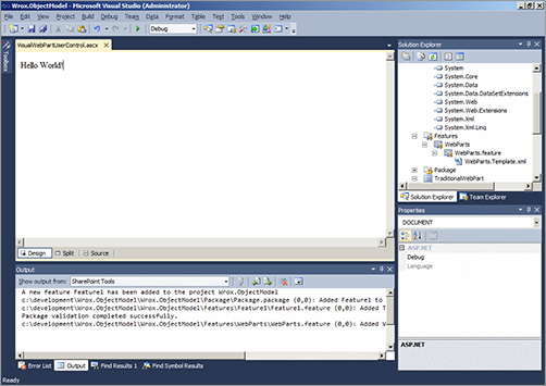
As stated earlier, the visual aspect of the new Visual Web Part simply refers to the design time experience. Rather than having to programmatically create the controls and adding them to the web part as in the preceding example, a Visual Web Part enables you to drag and drop controls onto the design surface. shows what a visual web part looks like in Visual Studio.
A Visual Web Part design canvas

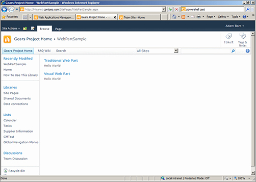
When placed on a SharePoint page, the two web parts appear to be nearly identical, as shown in .
Web parts

You probably wonder why traditional web parts continue to exist within SharePoint 2010 because Visual Web Parts provide a better design experience. The answer is twofold. The first is to maintain backward compatibility and to allow solutions that can be deployed to both 2007 and 2010 environments. The second is that because of the way Visual Web Parts deploy, they are not supported within Sandboxed Solutions. There are some alternative implementations of Visual Web Parts, such as those found within Microsofts Visual Studio 2010 SharePoint Power Tools, which do work for sandboxed solutions.
Web parts are primarily applicable when you need to implement functionality that requires a UI, is meant to be end-user configurable, and is meant for the site owners or designers to place on pages of their choosing. This may not always be the case however.

Chapter 2, Creating Visual Web Parts, delves into Visual Web Parts in much greater depth.
Custom Application Pages
The other primary UI building block within SharePoint is the custom application page. These are standard .ASPX pages that are deployed beneath the _layouts directory within your SharePoint environment.
Unlike web parts, custom application pages are standalone pages of self-contained functionality. Users cannot edit the contents of the page or add custom web parts. If you dont want the user to determine the placement of the control, or you need to link to the page from another solution element (for example, a custom action, web part, and so on), application pages are generally the right solution to the problem.
A common use for custom application pages is for settings pages, which is probably the scenario in which you see them most used within the OOTB SharePoint screens. For example, go to the site settings section of any site in SharePoint, and every one of the settings links take you to an application page.
Creating a custom application page is as simple as selecting AddNew Item within your project, and selecting the Application Page type. This creates an .ASPX page beneath the Layouts directory of your project, as shown in .


