New possible uses of CSS appear every day, and you shouldnt miss any of them. This eBook Mastering CSS3 brings together tips on the newest approaches to CSS, such as CSS animation guidelines, CSS grid frameworks and modern techniques for constructing page layouts, among others. Also, you will get guidelines on how to use CSS in email newsletters and how to code email designs with improved readability and usability for the Web, mobile and email desktop.
CSS3 vs. CSS: A Speed Benchmark
Trent Walton
I believe in the power, speed and update-ability of CSS3. Not having to load background images as structural enhancements (such as PNGs for rounded corners and gradients) can save time in production (i.e. billable hours) and loading (i.e. page speed). At our company, weve happily been using CSS3 on client websites for over a year now, and I find that implementing many of these properties right now is the most sensible way to build websites.
Until today, all of that was based on an assumption: that I can produce a pixel-perfect Web page with CSS3 quicker than I can with older image-based CSS methods, and that the CSS3 page will load faster, with a smaller overall file size and fewer HTTP requests. As a single use case experiment, I decided to design and code a Web page and add visual enhancements twice: once with CSS3, and a second time using background images sliced directly from the PSD. I timed myself each round that I added the enhancements, and when finished, I used Pingdom to measure the loading times.
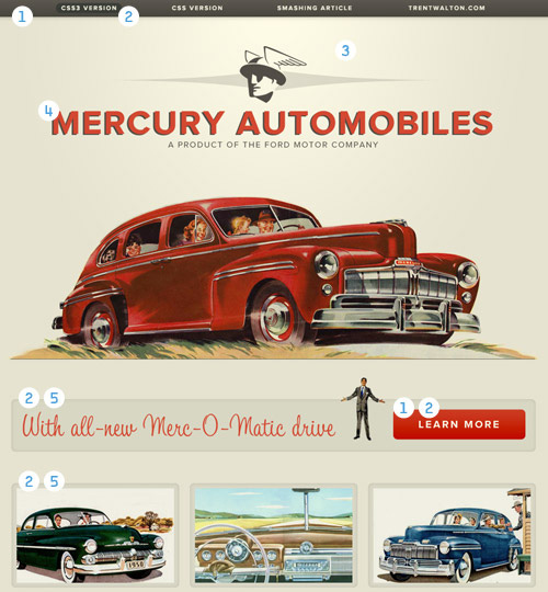
Heres a fictitious Web page for Mercury Automobiles that might have been online had the Interweb existed back in the 1950s. The page was designed to showcase specific widely compliant CSS3 properties that in the past would have had to be achieved using background images.

Above is a diagram that breaks down where I applied visual enhancements first with CSS3, and then with CSS background images (i.e. the image-based approach):
linear-gradient
border-radius
radial-gradient
text-shadow
box-shadow with RGBa
The Experiment Process
Day 1
I coded the HTML and CSS from a structural standpoint. That means no rounded corners, no shadows, no gradients and no images aside from logos and car photographs. I decided to include Web fonts at this phase because I wanted to focus on stuff that could also be done with the Web-safe font of your choice (Helvetica, Georgia, etc.). Furthermore, @font-face was around long before CSS3.

This gave me a blank canvas to add visual enhancements. The index page shows the end of my day 1 work, as well as what unsupported browsers will display, the appearance of which is structurally intact and visually pleasing. More on this later, but the way I see it, older browsers arent penalized with a broken layout, and modern browsers are rewarded with a few visual bonuses. Part of implementing CSS3 is about planning ahead and designing websites that look fine as a fallback.
Day 2
Starting with the base index page, I created a CSS3 page. It took 49 minutes to complete. Here is the CSS code (css3.css):
/*-----CSS3 Started on 2/26/11 at 7:28 AM CST-----*/
h1 {
text-shadow: -3px 2px 0px #514d46; }
#nav {
-moz-box-shadow: 0px 0px 12px rgba(88, 83, 74, .7);
-webkit-box-shadow: 0px 0px 12px rgba(88, 83, 74, .7);
box-shadow: 0px 0px 12px rgba(88, 83, 74, .7);
background-image: -moz-linear-gradient(top, #5c5850, #48473e);
background-image: -webkit-gradient(linear,left top,left bottom,color-stop(0, #5c5850),color-stop(1, #48473e));
background-image: -webkit-linear-gradient(#5c5850, #48473e);
background-image: linear-gradient(top, #5c5850, #48473e); }
nav a {
-moz-border-radius: 12px;
-webkit-border-radius: 12px;
border-radius: 12px; }
nav a:hover {
background-color: #3a3e38;
background-color: rgba(47, 54, 48, .7); }
nav a.active {
background-color: #070807;
background-color: rgba(7, 8, 7, .7); }
body {
background-image: -webkit-gradient(radial, 50% 10%, 0, 50% 10%, 500, from(#FBF8E3), to(#E6E3D0));
background-image: -moz-radial-gradient(50% 10%, farthest-side, #FBF8E3, #E6E3D0); }
#learn_more, #details img {
-moz-border-radius: 8px;
-webkit-border-radius: 8px;
border-radius: 8px;
-webkit-box-shadow: inset 0px 0px 8px rgba(88, 83, 74, .2);
-moz-box-shadow: inset 1px 0px 1px rgba(88, 83, 74, .2);
box-shadow: inset 0px 0px 1px rgba(88, 83, 74, .2); }
#learn_more a {
-moz-border-radius: 8px;
-webkit-border-radius: 8px;
border-radius: 8px;
background-color: #cc3b23;
background-image: -moz-linear-gradient(top, #cc3b23, #c00b00);
background-image: -webkit-gradient(linear,left top,left bottom,color-stop(0, #cc3b23),color-stop(1, #c00b00));
background-image: -webkit-linear-gradient(#cc3b23, #c00b00);
background-image: linear-gradient(top, #cc3b23, #c00b00); }
a {
-moz-transition: all 0.3s ease-in;
-o-transition: all 0.3s ease-in;
-webkit-transition: all 0.3s ease-in;
transition: all 0.3s ease-in; }
/*-----CSS3 Finished on 2/26/11 at 8:17 AM CST (49 minutes) -----*/
Day 3
I added visual enhancements by slicing and CSSing background images directly from the PSD. Even though there is less code, all of the extra app-switching and image-slicing added up to a total of 73 minutes to complete. Check out the page for the CSS image-based approach. Heres the code (css.css):

