Smashing Magazine is an online magazine dedicated to Web designers and developers worldwide. Its rigorous quality control and thorough editorial work has gathered a devoted community exceeding half a million subscribers, followers and fans. Each and every published article is carefully prepared, edited, reviewed and curated according to the high quality standards set in Smashing Magazine's own publishing policy. Smashing Magazine publishes articles on a daily basis with topics ranging from business, visual design, typography, front-end as well as back-end development, all the way to usability and user experience design. The magazine is and always has been a professional and independent online publication neither controlled nor influenced by any third parties, delivering content in the best interest of its readers. These guidelines are continually revised and updated to assure that the quality of the published content is never compromised.
Smashing Media GmbH is one of the world's leading online publishing companies in the field of Web design. Founded in 2009 by Sven Lennartz and Vitaly Friedman, the company's headquarters is situated in southern Germany, in the sunny city of Freiburg im Breisgau. Smashing Media's lead publication, Smashing Magazine, has gained worldwide attention since its emergence back in 2006, and is supported by the vast, global Smashing community and readership. Smashing Magazine had proven to be a trustworthy online source containing high quality articles on progressive design and coding techniques as well as recent developments in the Web design industry.
Modern CSS Layouts, Part 2: The Essential Techniques
Zoe Mickley Gillenwater
In the previous chapter Modern CSS Layouts, Part 1: The Essential Characteristics, you learned that modern, CSS-based web sites should be progressively enhanced, adaptive to diverse users, modular, efficient and typographically rich. Now that you know what characterizes a modern CSS web site, how do you build one? Here are dozens of essential techniques and tools to learn and use to achieve the characteristics of todays most successful CSS-based web pages.
Just as in the previous chapter, were not going to be talking about design trends and styles; these styles are always changing. Instead, were focusing on the specific techniques that you need to know to create modern CSS-based web pages of any style. For each technique or tool, well indicate which of the five characteristics it helps meet. To keep this shorter than an encyclopedia, well also just cover the basics of each technique, then point you to some useful, hand-picked resources to learn the full details.
You can jump straight to:
CSS3
HTML5
IE Filtering
Flexible Layouts
Layout Grids
Efficient CSS Development Practices
CSS Performance
Font Embedding and Replacement
CSS3
CSS3, the newest version of CSS that is now being partially supported by most browsers, is the primary thing you need to know in order to create modern CSS web sites, of course. CSS is a styling language, so its no surprise that most of whats new in CSS3 is all about visual effects. But CSS3 is about more than progressive enhancement and pretty typography. It can also aid usability by making content easier to read, as well as improve efficiency in development and page performance.
There are too many CSS3 techniques to cover in a single article, let alone an article that isnt just about CSS3! So, well go through the basics of the most important or supported CSS3 techniques and point you to some great resources to learn more in-depth.
CSS3 VISUAL EFFECTS
Semi-transparent Color
Aids in: progressive enhancement, efficiency
RGBA allows you to specify a color by not only setting the values of red, green, and blue that its comprised of, but also the level of opacity it should have. An alternative to RGBA is HSLA, which works the same way, but allows you to set values of hue, saturation, and lightness, instead of values of red, green, and blue. The article Color in Opera 10 HSL, RGB and Alpha Transparency explains how HSLA can be more intuitive to use than RGBA.

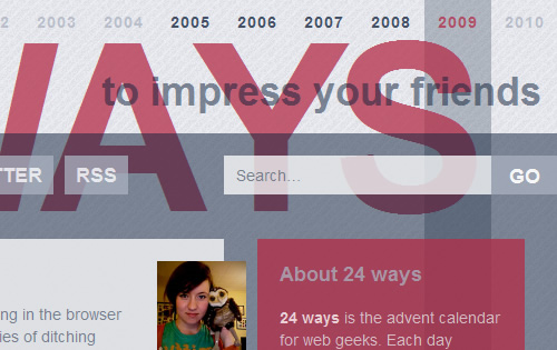
The 24 Ways web site makes extensive use of RGBA to layer semi-transparent boxes and text over each other.
RGBA or HSLA isnt just about making things look cool; it can also improve your web sites efficiency. You dont have to take time to make alpha-transparent PNGs to use as backgrounds, since you can just use a color in the CSS, and the user agent doesnt have to download those images when loading the site.
Styling Backgrounds and Borders
Aids in: progressive enhancement, efficiency
CSS3 offers a whole host of new ways to style backgrounds and borders, often without having to use images or add extra div s. Most of these new techniques already have good browser support, and since theyre mainly used for purely cosmetic changes, theyre a good way to get some progressive enhancement goodness going in your sites right away.
Here are some of the new things CSS3 lets you do with backgrounds:
Multiple backgrounds on a single element: You can now add more than one background image to an element by listing each image, separated by commas, in the background-image property. No more nesting extra div s just to have more elements to attach background images onto!
More control over where backgrounds are placed: The new background-clip and background-origin properties let you control if backgrounds are displayed under borders, padding, or just content, as well as where the origin point for background-position should be.
Background sizing: You can scale background images using the new background-size property . While scaling wont look good on many background images, it could be really handy on abstract, grunge-type backgrounds, where tiling can be difficult and where some image distortion would be unnoticeable.
Gradients: While just part of a CSS3 draft spec, Safari, Chrome and Firefox support declaring multiple color and placement values in the background-image property to create gradients without images. This allows the gradients to scale with their container unlike image gradients and eliminates the need for page users to download yet another image while viewing your site.
CSS3 lets you do the following with borders:
Rounded corners: Use the border-radius-property to get rounded corners on div s, buttons, and whatever else your heart desires all without using images or JavaScript.
Images for borders: With CSS 2.1, the only way to create a graphic border was to fake it with background images, often multiple ones pieced together on multiple div s. You can now add unique borders without having to use background images by adding the images to the borders directly, using the new border-image property , which also allows you to control how the images scale and tile.

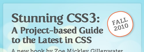
The border-radius property can be used to round corners and even create circles out of pure CSS, with no images needed. (Stunning CSS3 web site)

