CHAPTER 1
Vision and Architecture
This chapter covers three core topics: the principles behind the Windows Phone UI and the role that Windows Phone Store apps play in it; a primer on the architecture of the Windows Phone development platform; and an overview of what is required to build and deliver Windows Phone apps. Together, these topics form a critical foundation that will support the detailed examinations of individual platform features that follow in subsequent chapters. And, just so you dont leave this chapter without getting your hands a little bit dirty, you will walk through a simple Hello World project to ensure that youre all set to tackle the more involved topics ahead.
A Different Kind of Phone
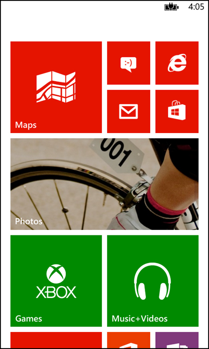
When Windows Phone 7 was released in the fall of 2010, it represented a significant departure not only from previous Microsoft mobile operating systems, but also from every other mobile operating system (OS) on the market. The user interface was clean, bold, and fluid, with a strong focus on the users content, rather than app chrome. The Start screen (see ) provided a level of personalization available nowhere else. Live Tiles provided key information at a glance as well as the ability to launch not only apps, but specific parts of those apps, such as opening a favorite website, perhaps, or checking a friends Facebook status. The developer platform offered unrivalled efficiency and familiar tools, and gave app developers the ability to extend core phone experiences rather than building isolated apps.
FIGURE 1-1 The distinctive Windows Phone Start screen offers unrivalled personalization.
With Windows Phone 8, Microsoft has significantly expanded the capabilities of the OS, but the fundamental philosophy remains the same. Indeed, much of the original Windows Phone philosophy is now being adopted in the core Windows OS, Microsoft Office, Microsoft Xbox, and other Microsoft products, making it all the more valuable to understand its basic tenets.
The User Interface
The distinctive Windows Phone user interface (UI) is built upon a set of core principles. Understanding these principles will help you to understand not only why the phone looks the way it does, but how you can build beautiful apps that integrate well into the overall experience. After all, in the mobile app marketplace, it is generally not the app with the most features that wins out, but the one which is the easiest and the most enjoyable to use.
For an in-depth review of these principles, watch the talk from Jeff Fong, one of the lead designers for Windows Phone on Channel9. (http://channel9.msdn.com/blogs/jaime+rodriguez/windows-phone-design-days-metro)
Light and Simple
The phone should limit clutter and facilitate the users ability to focus on completing primary tasks quickly. This is one of the principles that drew significant inspiration from the ubiquitous signage in major mass transit systems around the world. In the same way that a subway station needs to make signs bold and simple to comprehend in order to move hundreds of thousands of people through a confined space quickly, Windows Phone intelligently reveals the key information that the user needs among the dozens of things happening at any one time on the phone, while keeping the overall interface clean and pleasing to the eye.
Typography
One element that is common across virtually any user interface is the presence of text. Sadly, it is often presented in an uninteresting way, focusing on simply conveying information rather than making the text itself beautiful and meaningful. Windows Phone uses a distinct font, Segoe WP, for all of its UI. It also relies on font sizing as an indicator of importance. The developer platform provides built-in styles for the various flavors of the Segoe WP typeface, making it simple to incorporate into your app.
Motion
Someone who only experienced the Windows Phone UI through screenshots would be missing out on a significant part of what makes it unique: motion. Tactical use of motionparticularly when moving between pagesnot only provides an interesting visual flourish at a time when the user could not otherwise be interacting with the phone, but also a clear connection between one experience and the next. When the user taps an email in her inbox and sees the name of the sender animate seamlessly into the next screen, it provides direct continuity between the two views, such that there can be no doubt about what is happening.
Content, Not Chrome
If youve ever tried browsing around a new Windows Phone that has not yet been associated with a Microsoft Account, youll find that there isnt very much to look at. Screen after screen of white text on a black background (or the reverse if the phone is set to light theme), punctuated only by the occasional endearing stringIts lonely in here.encouraging you to bring your phone to life. The moment when you sign in with a Microsoft Account, however, everything changes. The phones UI recedes to the background and your content fills the device; contacts, photos, even your Xbox Live avatar all appear in seconds and help to make your phone incredibly personal.
Honesty in Design
This is perhaps the most radical of the Windows Phone design principles. For years, creators of graphical user interfaces (GUIs) have sought to ease the transition of users moving critical productivity tasks from physical devices to software by incorporating a large number of skeuomorphic elements in their designs. Skeuomorphic elements are virtual representations of physical objects, such as a legal pad for a note-taking app or a set of stereo-like knobs for a music player. Windows Phone instead opts for a look that is authentically digital, providing the freedom to design UI thats tailored to the medium of a touch-based smartphone, breaking from the tradition of awkwardly translating a set of physical elements into the digital realm.
The Role of Apps
In addition to its distinctive UI, Windows Phone takes a unique approach to the role of Store apps in the experience. Historically, mobile operating systems only provided simple entry points for users to launch appsApples iPhone is the canonical example of this, with each app able to display one and only one icon on the phones home screen. Although this model is simple and clean, it creates a disjointed environment that obstructs how users want to interact with their content.
With Windows Phone, Microsoft made an explicit shift from the app-focused model to a content and experience-focused model, in which the user is encouraged to think primarily about what he wants to do, rather than how he wants to do it. Something as simple as making a phone call, for example, should not require remembering which cloud services your friend is a member of so that you can launch the appropriate app to look up her phone number. Rather, you should simply be able to launch a unified contacts experience which aggregates information from all of your apps and services.
The content and experience-focused approach doesnt make Store apps less important; it just changes how they fit in the experience. Windows Phone provides an immersive hub experience for each of the primary content types on the phonephotos, music, people, and so onand each of these hubs offers a rich set of extensibility points for apps to extend the built-in experience. These extensibility points offer additional ways for users to invoke your app, often with a specific task in mind for which you might be uniquely positioned to handle.


