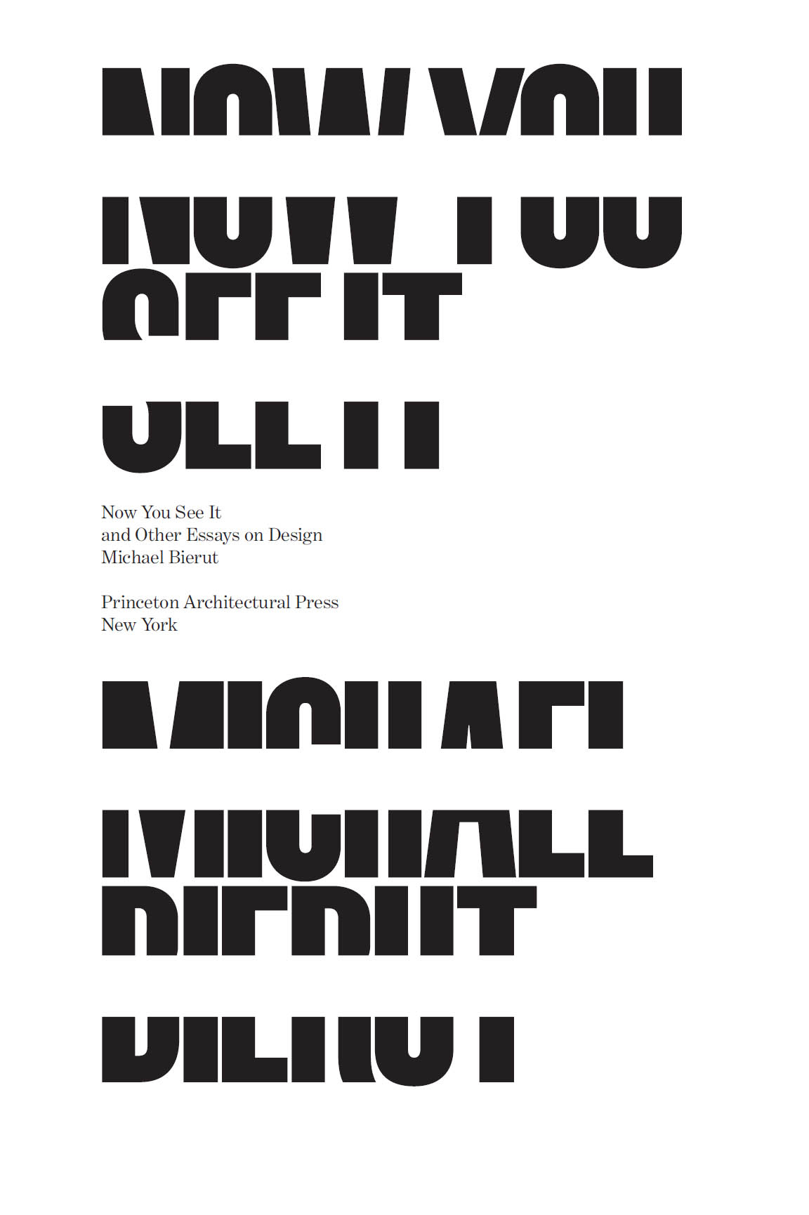


Published by
Princeton Architectural Press
A McEvoy Group company
202 Warren Street, Hudson, New York 12534
Visit our website at www.papress.com.
2018 Michael Bierut
All rights reserved
No part of this book may be used or reproduced in any manner without written permission from the publisher, except in the context of reviews.
Every reasonable attempt has been made to identify owners of copyright. Errors or omissions will be corrected in subsequent editions.
Editor: Sara Stemen
Special thanks to: Janet Behning, Nolan Boomer, Nicola Brower, Abby Bussel, Barbara Darko, Benjamin English, Jan Cigliano Hartman, Lia Hunt, Valerie Kamen, Simone Kaplan-Senchak, Jennifer Lippert, Sara McKay, Eliana Miller, Rob Shaeffer, Sara Stemen, Paul Wagner, and Joseph Weston of Princeton Architectural Press Kevin C. Lippert, publisher
Library of Congress Cataloging-in-Publication Data
Names: Bierut, Michael, author.
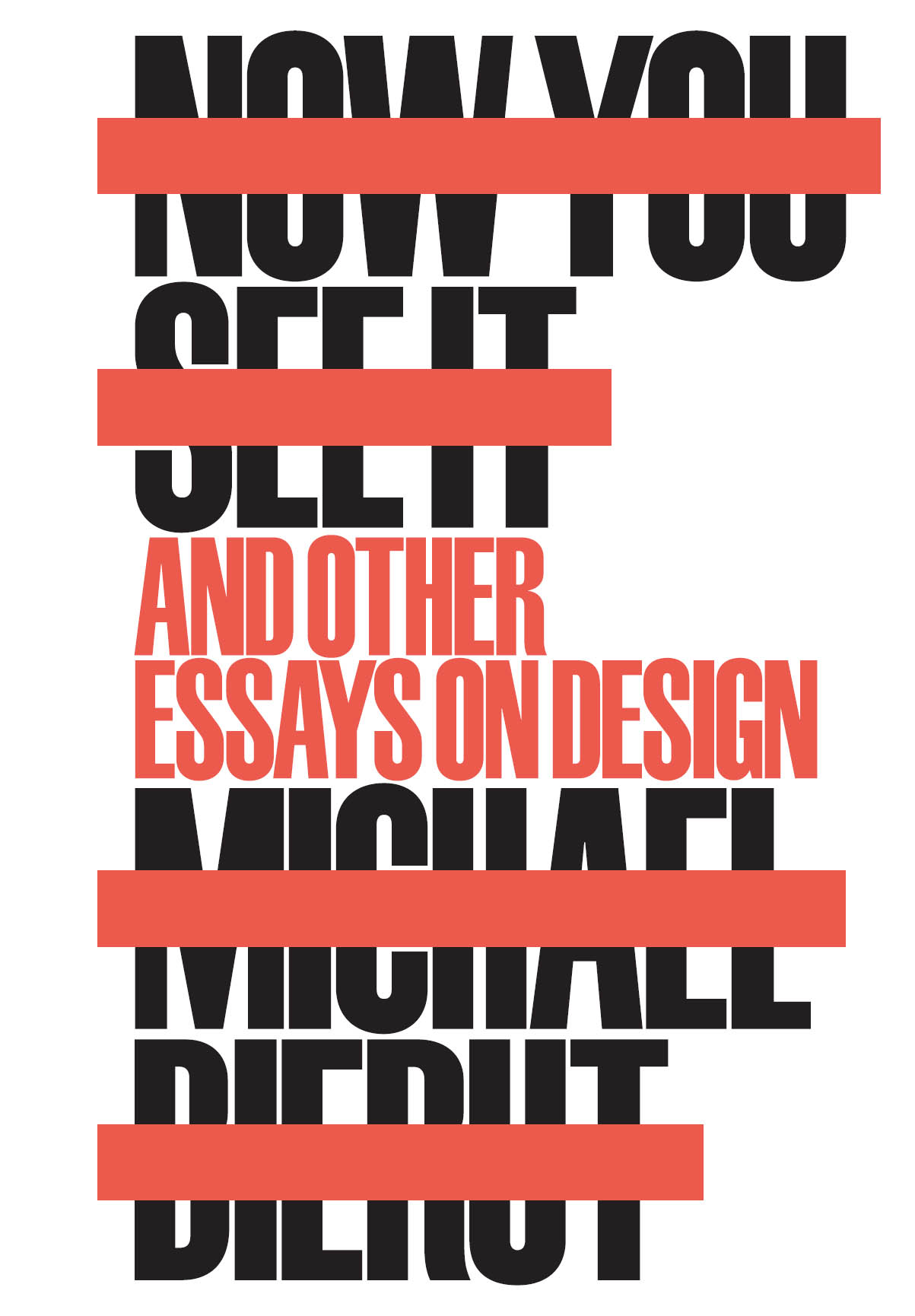
Title: Now you see it and other essays on design/Michael Bierut.
Description: First edition. | New York : Princeton Architectural Press, 2017.| Includes bibliographical references and index.
Identifiers: LCCN 2017020824 | ISBN 9781616896249 (hardback) | ISBN 9781616896768 (epub, mobi)
Subjects: LCSH: Commercial artUnited States. | Graphic artsUnited States. | BISAC: DESIGN / Graphic Arts / General. | DESIGN / Essays.
Classification: LCC NC998.5.A1 B45 2017 | DDC 741.6dc23
LC record available at https://lccn.loc.gov/2017020824
CONTENTS
And suddenly, with the terrible clarity
of a man too long deceived,
Leamas understood the whole ghastly trick.
John le Carr
The Spy Who Came in from the Cold
1963
PREFACE
I may have become a graphic designer because I was a frustrated writer. I liked the paintings in the Cleveland Museum of Art, but I liked the posters in the gift shop even more. Somehow, the combination of words and images seemed exciting and purposeful. The paintings waited quietly upstairs in the gallery; the posters mixed it up with the crowds on the street. Words made art come alive. Combining words and pictures gave form to ideas.
Some of my earliest creative efforts were homemade publications, handmade knockoffs of favorite magazines like Mad or Cracked. It helped that my father was a salesman for a company that sold printing equipment. One day he took one of my self-authored one-off comic books to work and returned with a box full of copies. Xerox machines were still a rarity, and the mimeographic copier at my local library was expensive (a quarter a page) and produced blurry reproductions on faintly greasy paper. My dads print run was a miracle: crisp and authoritative, not to mention great-smelling. The power of mass production conferred its own authority. Many years later I read an interview with one of my heroes, the artist Ed Ruscha, who described funding his own publishing efforts: I still get that thrill every time.
I was once asked if it was important for a graphic designer to know how to draw. I answered that Id prefer one who knew how to read. Typography is the fundamental starting point for our work. Letterforms together become words, then sentences, then paragraphs, all in the service of communicating ideas. When you design a logotype, the name of the client is usually nonnegotiable. And often the name has the design within it. The right sequence of letters can almost design themselves. On the other hand, an unlucky grouping may look wrong no matter what you do. Graphic designers working with text serve as casting directors when they pick a typeface. What kind of characters do you want to speak these lines?
Perhaps because of this intimate connection between graphic design and language, reading and writing have had a different relationship to graphic design than to other design disciplines. Writers are inevitably participants active or unwitting in the graphic design process. And every reader on earth, whether the text is an eight-hundred-page book or a four-letter exit sign, is undergoing an experience orchestrated by a (usually invisible) graphic designer. Words are at once the designers raw materials and reason for being, simultaneously a means to an end and the end itself. I am suspicious of any graphic designer who is not an enthusiastic reader.
When I began writing about graphic design, it was with all the self-consciousness that only a lifelong manipulator of letterforms could bring to the task. I was not very good at the beginning, and even now it is a painful process. In my professional life as a graphic designer, I have been supported by an army of enablers. When I sit down to write, I am entirely on my own. But I have been lucky to have had good editors and collaborators, including Steven Heller, Chee Pearlman, Rick Poynor, Bill Drenttel, and Jessica Helfand. Ive also been grateful for (and recommend) advice from seasoned writers like William Zinsser (on the importance of having something to say), Anne Lamott (on how to face a terrifying blank page), and (of course) E. B. White (on omitting needless words, something I still hate to do). There are few things I get to do all by myself. Writing is one of them. Thats what makes it so nerve-racking and so gratifying.
The oldest piece in this book is almost thirty years old. In 1989 graphic design was still territory that was largely unexplored by writers and critics. The professions trade magazines were beautifully illustrated but mostly stuck to laudatory profiles. The first substantial history of the field, Philip Meggss History of Graphic Design, was barely five years old. And the notion that things like logos and posters and typefaces might be written about in a way that would make them interesting to a general audience would have seemed naive, if not downright laughable.
Today anyone with a software program with a pull-down font menu and a coffee shop with free wireless has the capacity to create and publish things that would have astonished my nine-year-old comic-book-drawing self. Contact with the means of production has made people more interested in the mechanics of graphic design. As a result, there is more written about graphic design every day from long, thoughtful essays to 140-character bursts than I ever would have dreamed possible. This attention to the ways that messages are shaped has the potential to make each of us a more critical consumer of mass communication. Each of us is a publisher. Each of us is a critic. Each of us lives in a world thats inundated with misinformation, half-truths, and fake news, so much of it beautifully packaged and beguilingly delivered. Thinking hard about the forms that ideas take may be the most important kind of thinking of all.
Cornelia Butler and Margit Rowell, Cotton Puffs, Q-Tips, Smoke and Mirrors: The Drawings of Ed Ruscha (New York: Whitney Museum of Art, 2004).
To Dorothy, Liz, Drew, and Martha
1
From Drawing Board to Desktop
In 1972, when I was a sophomore in high school in suburban Cleveland, Ohio, I was asked to do a poster for our drama clubs production of Arsenic and Old Lace. I found a nice, big piece of cardboard, did the most elaborate piece of hand lettering I could manage with a couple of black felt-tipped pens, and turned it in to the plays director. That was on a Friday. When I arrived for class on Monday morning, my poster was hanging in every hallway, in every stairwell, and on every bulletin board in the school. Among my peers I was considered a good artist and was used to getting compliments for my work, but the miracle of mass production took things to a different level altogether. More people saw my poster than would actually see the play. It was at that moment that I decided to become a graphic designer. My dream was to design album covers for rock bands.
Next page