Contents
Landmarks
Page List


WELCOME!
Ive always thought that one of the best jobs in the world is naming paints. That yellow is just like a No. 2 pencil. This blue is exactly the color of a July sky. Splashing one of these onto the walls of your home is like prepping the canvas of your life. Theres a reason we dont see the world in black and white, beloved designer Celerie Kemble once told HB. Wistful pastels, electric leafy greens, pigment-rich reds and blues, even inky blacks and blinding whites... the outdoors would be a very sorry place without them, so why would we settle for any less in our homes? Inside this book youll find nearly one hundred homes awash in color, and probably your dream palette too. All credit to the designers. As anyone whos wielded a paintbrush knows, its not very easy to whip up a vibrant and yet truly livable color palette. The experts employ infinite tricks: fabrics with a thousand dyes in the weave, trim defining the edge of a piece of upholstery, and (of course) very carefully selected paints. When you hear the word color, what do you feel? Thrill or trepidation; its rarely something in between. But using it doesnt mean you have to paint all the walls chartreuse. So-called neutral tones can be appetizing: cream, cinnamon, coffee, nutmeg, almond. Gemstone tints, from emerald to ruby to amethyst, are rich and seductive but very much mined from the natural world. Or maybe youd like to live in a watercolor painting? Pastels! Whichever palette suits your personality, the beauty of living colorfully is that whichever combination you choose, it will be completely unique.
Joanna Saltz

Earth Tones
WOODSY BROWNS, SUNSET ORANGES, SANDY OCHERS. Earthy interiors channel the simple beauty of the natural world for a serenely grounding effect. They are quiet and calming but never boring; a breath of fresh air.
STUDIO SHAMSHIRI
Los Angeles
When you get there, you dont want to leave.

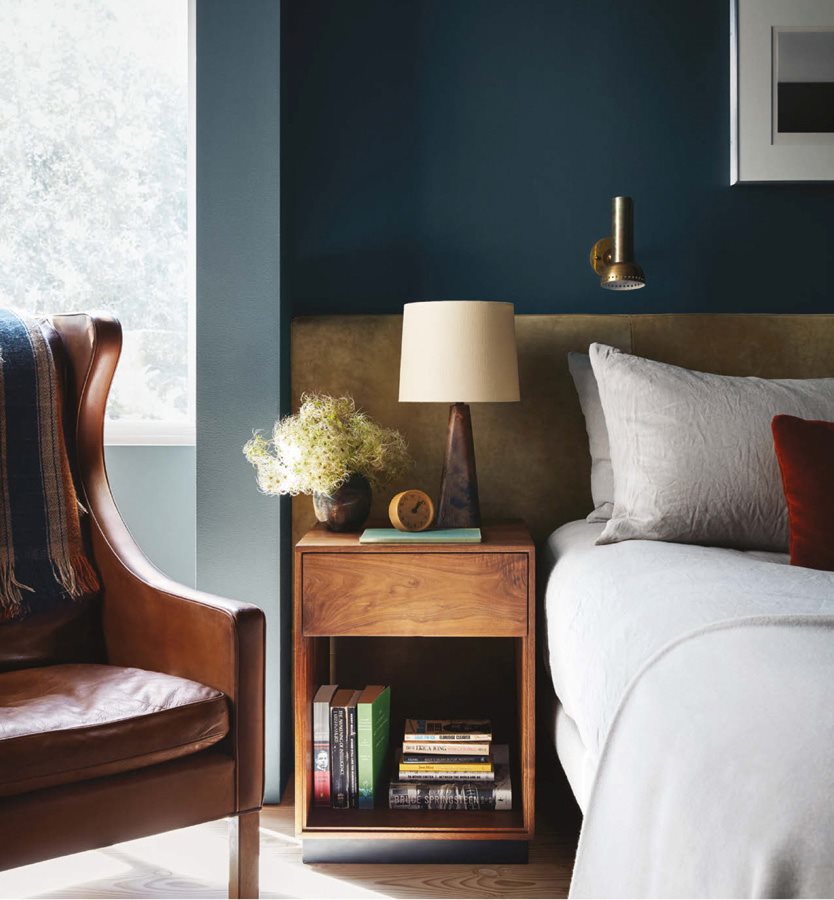
A buttery leather Hans Wegner armchair, burnished brass lighting, and a headboard upholstered in Ashbury Hides suede create a cocoon-like feel in the primary bedroom. Sconce: vintage. Lamp: vintage Lisa Johansson-Pape. Nightstand: custom walnut.

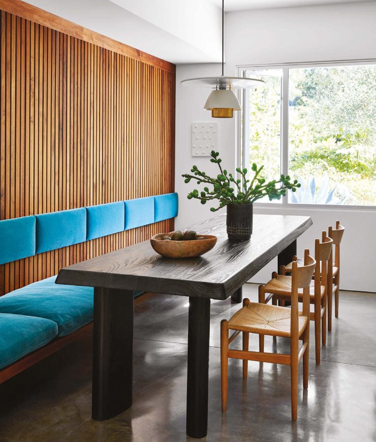
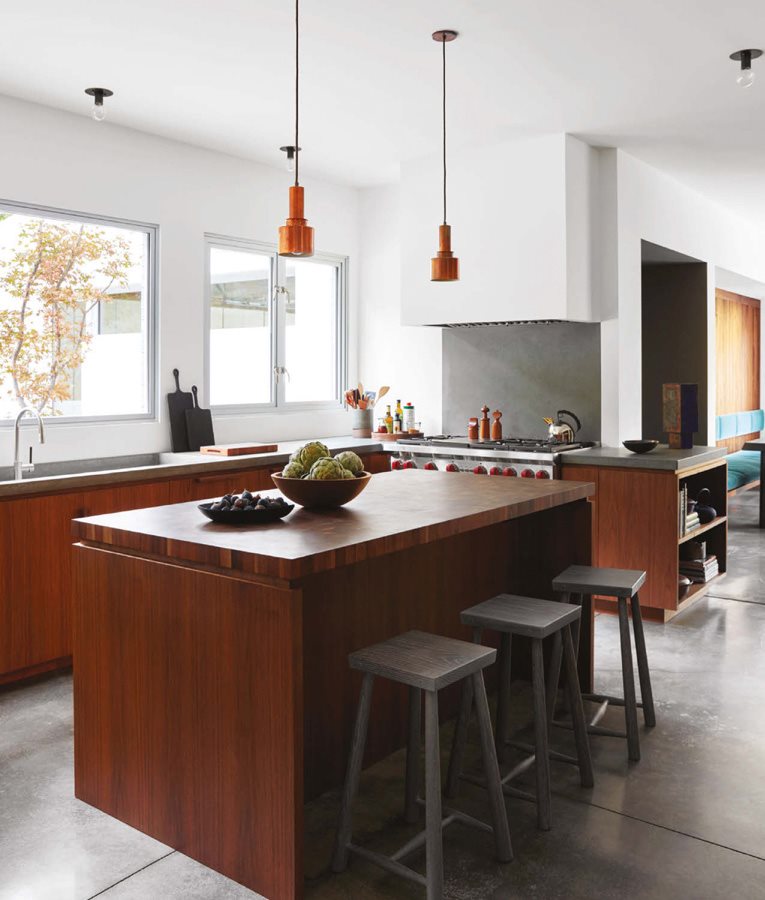
Everybody is using white oak, thats very much a thing of our time, so I try to avoid it as much as possible, says Shamshiri, who instead used black walnut paneling to tie this room to the kitchen cabinets. Paint: All White, Farrow & Ball. Pendant: Lisa Johansson-Pape. Cushions: custom, in mohair. Table: custom. Chairs: vintage Danish.
It was really my goal for him to love this house and to be in it for a long time.
A Southern California hillside is a tricky place to set down roots: The sun leaves plantings in the dark half the year, and drought and fire are never far from mind. But this house in Los Angeles, a sunny nineties build on a sizable plot of land in Bel Air, inspired the homeowner to nest, and he called in his friend Pamela Shamshiri of Studio Shamshiri to handle the renovations. I wanted it to be like a womb, the designer says. It was really my goal for him to love this house and to be in it for a long time.
To that end, Shamshiri and her team overhauled the interiors, cloaking the home in soothing wood tones and blue-greens, and sumptuous textures to foster a cocooning effect. They chose California walnut for the extensive millwork, sourced vintage and custom furnishings to complement the clients private art collection, and tapped local Hollywood craftspeople to produce showstopping moments, like an aged copper bar. We have one metalworker whos literally a lowrider guy, who has the right stuff because he does bumpers, says Shamshiri, whose background is in set design. It all adds up to a narrative, so we are very precise with our material language.
Getting to that point was easier said than done, however. Several months into construction, it was discovered that the windowsa major selling point for the ownerhad to be removed due to unresolvable water issues. It was a big emotional loss for me, says Shamshiri, who made the most of the six-month delay by working out new metal window casings that felt stylistically in line with the house. These frame a hillside of wildness outside, designed by landscape architecture firm Terremoto.
Its always been my inclination [to create] homes that are a place of refuge, because were living in an era where you need that, says Shamshiri. I used to say, Youre gonna put your socks on and never want to leave!

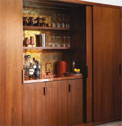
Featuring an aged brass panel and raw copper countertop, the bar felt so right for this house and this client, says Shamshiri, subtle and sophisticated. Millwork: custom, Northstar Cabinet Construction. Faucet: Vola.

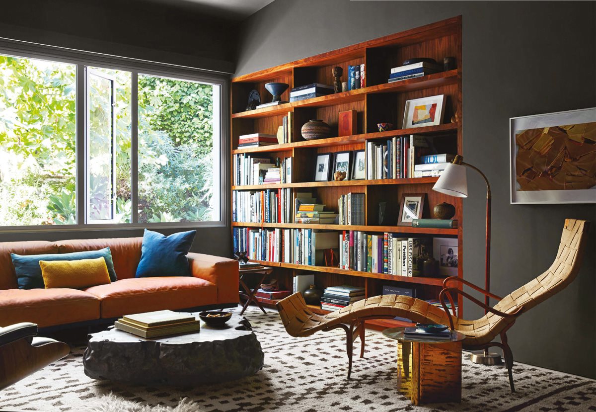
Black walnut shelving was built into the wall, rather than on top of it. Paint: For similar, try Down Pipe, Farrow & Ball. Floor lamp: Lisa Johansson-Pape. Sofa: Umberto Asnago for Arflex. Chaise: vintage Bruno Mathsson. Coffee table: Alma Allen. Rug: Mansour Modern.
HOW TO PAIR PAINTS
with Wood
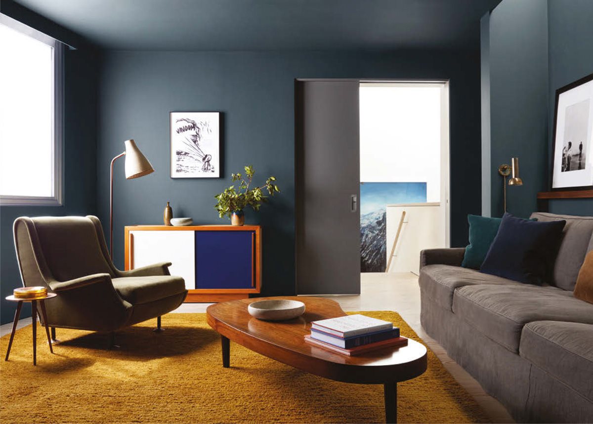
Juxtaposition is key when using multiple species of wood, says Shamshiri. Pair light and dark finishes for a distinctive lookjust dont overdo it. I like to keep species to one or two max, and I always use the same species on millwork throughout, says Shamshiri. Then, think of each wood grain as a color when you choose paints to pair with ita dark blue-gray, like Farrow & Ball Down Pipe, plays off the dark grains in a rich walnut. This blends the wood to read as a part of the palette more so than the overarching material, the designer explains.

I wanted to make sure the owner felt like he had a new cozy home base, says Shamshiri. Paint: Stiffkey Blue, Farrow & Ball. Armchair: vintage Marco Zanuso. Cocktail table: vintage Danish rosewood. Rug: Christopher Farr. Console: vintage Andr Sornay. Art: clients own.

My personal goal was to make a kitchen that would persuade him to cook, Shamshiri says.

