Vidiela - 150 Best Minimalist House Ideas
Here you can read online Vidiela - 150 Best Minimalist House Ideas full text of the book (entire story) in english for free. Download pdf and epub, get meaning, cover and reviews about this ebook. year: 2014, publisher: HarperCollins;Harper Design, genre: Home and family. Description of the work, (preface) as well as reviews are available. Best literature library LitArk.com created for fans of good reading and offers a wide selection of genres:
Romance novel
Science fiction
Adventure
Detective
Science
History
Home and family
Prose
Art
Politics
Computer
Non-fiction
Religion
Business
Children
Humor
Choose a favorite category and find really read worthwhile books. Enjoy immersion in the world of imagination, feel the emotions of the characters or learn something new for yourself, make an fascinating discovery.
- Book:150 Best Minimalist House Ideas
- Author:
- Publisher:HarperCollins;Harper Design
- Genre:
- Year:2014
- Rating:4 / 5
- Favourites:Add to favourites
- Your mark:
150 Best Minimalist House Ideas: summary, description and annotation
We offer to read an annotation, description, summary or preface (depends on what the author of the book "150 Best Minimalist House Ideas" wrote himself). If you haven't found the necessary information about the book — write in the comments, we will try to find it.
Filled with hundreds of lush, full-color photographs, 150 Best Minimalist Interior Ideas profiles beautiful minimalist rooms around the globe and presents tips, tricks, and techniques revealing how to create your own gorgeous, sophisticated interiors.
One of the most popular contemporary interior design trends, minimalism highlights the essence of a room, stressing clean lines, clutter-free spaces, and a limited color palette.
In 150 Best Minimalist Interior Ideas, photographs and floor plans of minimalist homes around the world are featured. The images are of stunning bedrooms, living rooms, dining rooms, kitchens, and bathrooms; and insightful text complements them to reveal why the minimalist rooms are so eye-catching, cathartic, and desirable. The text includes a wealth of both big picture and more focused ideas. It covers subjects such as walls (if and when to use them), doors, and partitions, flooring, lighting, furniture, and staircases, and explores color, patterns, materials, and texture.
The homes featured in this extraordinary volume were developed by distinguished international designers at the forefront of the minimalist movement. The result is a guide that offers both inspiration and how-to advice for creating maximum beauty using minimal elements.
Vidiela: author's other books
Who wrote 150 Best Minimalist House Ideas? Find out the surname, the name of the author of the book and a list of all author's works by series.

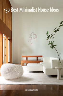
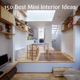

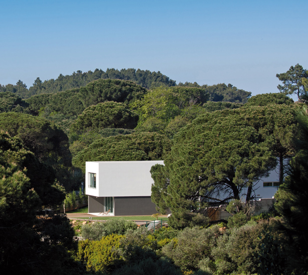
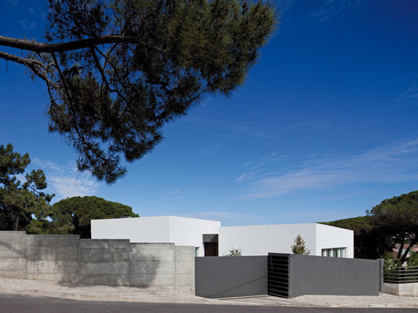
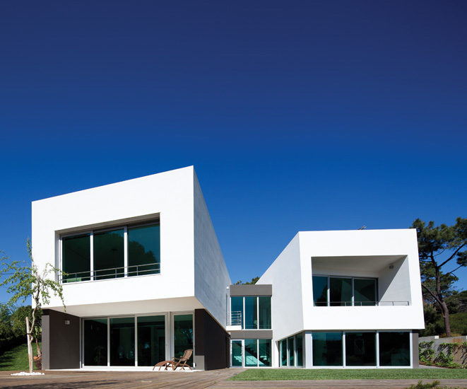
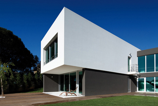
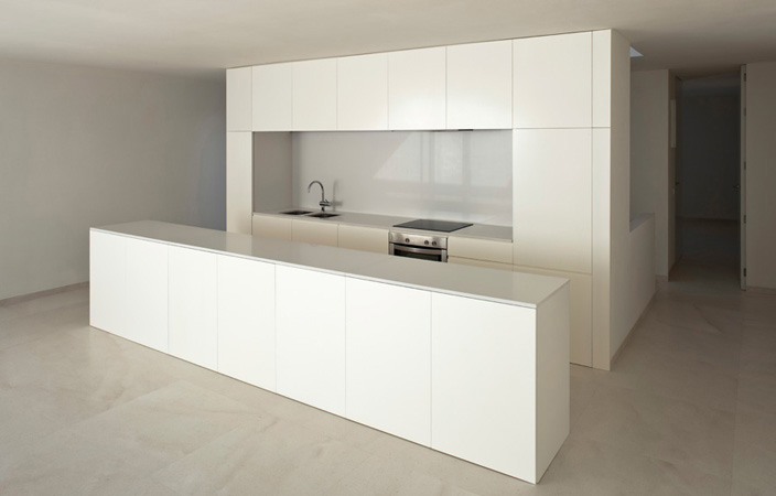
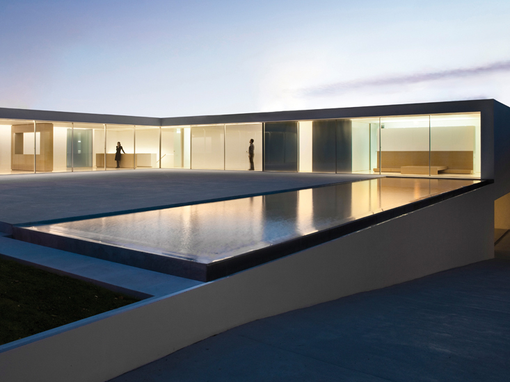 Minimalism implies the reduction of all elements to a minimum and essential level, achieving spaces that are clutter free and free of excessive decoration. If you are looking to simplify your home, and give it a sophisticated look, a minimalist style might be what you are looking for. This book features a rich selection of architecture and interior design projects, and 150 ideas we hope will spur your imagination to design your home in a minimalist style. A minimalist home strives for order and harmony in the relationship between spaces and the objects they contain. Space flows continuously around walls. Living, dining, and kitchen spaces leak into each other.
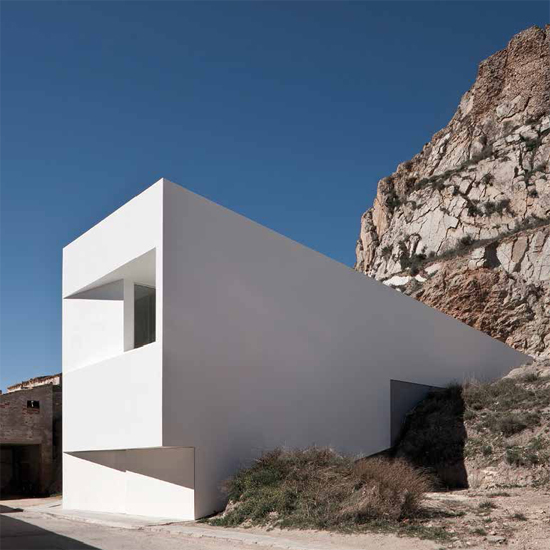
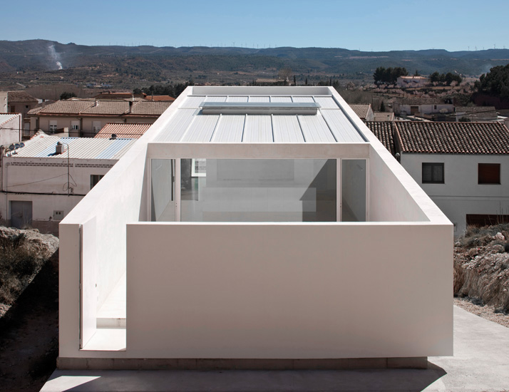
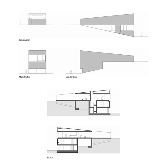
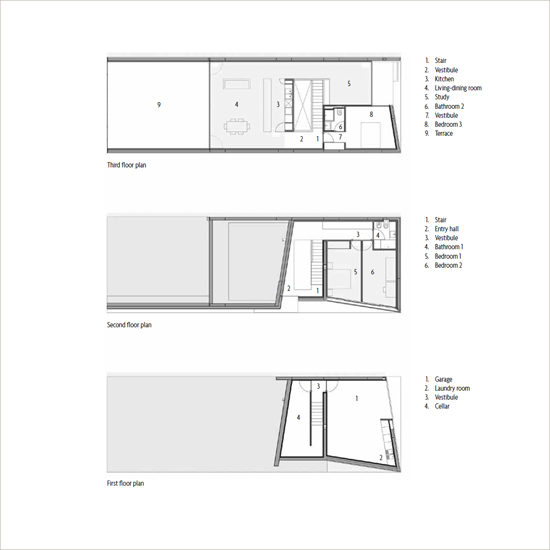
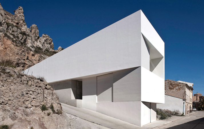 From outside the house looks like a wedge sunk into the rocky hillside. Inside, the layout is stratified and organized around a vertical communication nucleus that also brings light in. Dramatic visual effects can be achieved by the incidence of light on formschanging not only the atmosphere, but also the perception of the geometry.
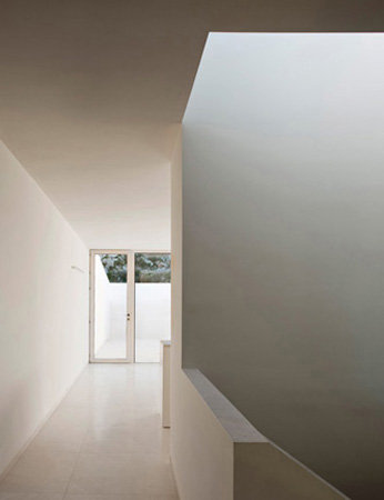
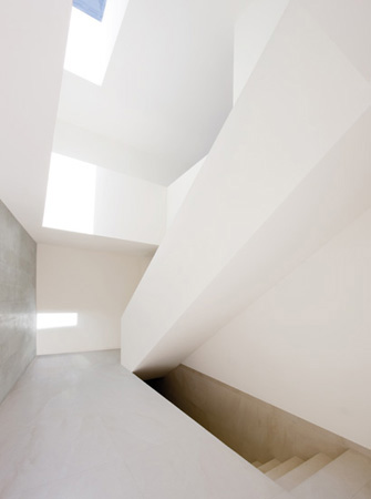 In minimalist architecture, components often serve both visual and functional purposes.
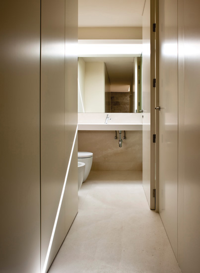 A small bathroom can look bigger when accessed through a narrow corridor.