 Published by Princeton Architectural Press
37 East Seventh Street, New York, New York 10003 Visit our website at www.papress.com. 2014 Louise Fili Ltd
All rights reserved. No part of this book may be used or reproduced in any manner without written permission
from the publisher, except in the context of reviews. Every reasonable attempt has been made to identify owners of copyright.
Errors or omissions will be corrected in subsequent editions. project editor Sara Stemen
designers Louise Fili, Spencer Charles, and Kelly Thorn/Louise Fili Ltd special thanks to Mariam Aldhahi, Meredith Baber, Sara Bader, Nicola Bednarek Brower, Janet Behning, Megan Carey, Carina Cha, Andrea Chlad, Barbara Darko, Benjamin English, Russell Fernandez, Will Foster, Jan Cigliano Hartman, Jan Haux, Diane Levinson, Jennifer Lippert, Katharine Myers, Jaime Nelson, Jay Sacher, Elana Schlenker, Rob Shaeffer, Marielle Suba, Kaymar Thomas, Paul Wagner, and Joseph Weston of Princeton Architectural Press Kevin C. Lippert, publisher Library of Congress Cataloging-in-Publication Data: Fili, Louise.
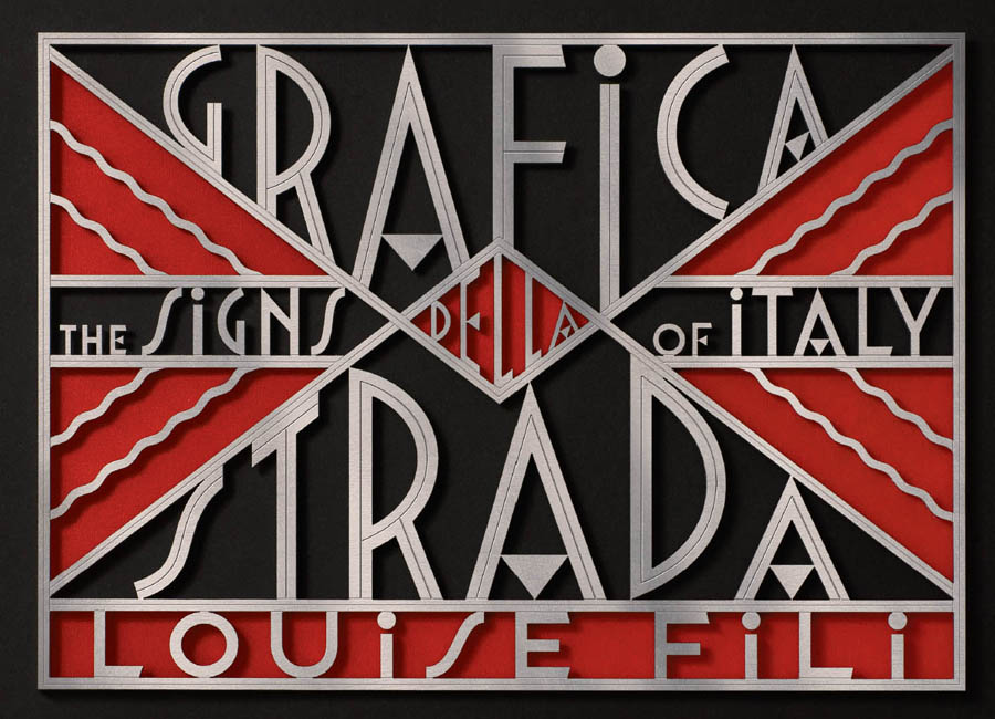
Grafica della strada : the signs of Italy / Louise Fili. First edition. pages cm. ISBN 978-1-61689-269-2 (hc) ISBN 978-1-61689-357-6 (epub, mobi) ISBN 978-1-61689-363-7 (epub3 fxl) 1. Signs and signboardsItalyHistory. 2.
Graphic design (Typography)ItalyHistory. 3. Signs and signboardsItalyPictorial works. 4. Graphic design (Typography)ItalyPictorial works. 5.
ItalySocial life and customsPictorial works. I. Title. GT3911.51.A1F55 2014 686.220945dc23 2013045477
A s an italian american italophile graphic designer living in new york , I have been deeply influenced by
la grafica della strada for a very long time. This infatuation took hold on my first trip to Italy at age sixteen, when, on leaving the Milan airport, I saw a striking billboard for the classic Baci Perugina chocolates. I was completely smittenI had never seen any advertisement of this kind before, and it served as a good introduction to the style of typography and illustration that I would soon become enamored of, leading me on a swift path to graphic design.
This early obsession took me to flea markets, bookstores, antiquarian shops, collectors, and private dealers, and even on searches for packaging ephemera such as orange and lemon wrappers at produce markets. Anything with Italian type on it was magical for me. It would be an understatement to say that all of this had a tremendous impact on my own design and typographic style. As the flea markets started to disappear and the dollar weakened, however, I found a cheaper, more immediate alternativeI took to my museums of the streets, where I started photographing the shop and restaurant signage that I had so admired. In the hands of a sign craftsman, type took on a new life, with a tantalizing menu of styles that was missing from the printed ephemera that I had been collecting. Classical, traditional, eclectic, Futurist, or Fascist; in gold leaf, marble, brass, wood, wrought iron, enamel, ceramic, or neon; painted, carved, inlaid, etched, tiled, or stenciled: the creative possibilities were endless.
Many of the signs proudly bore the imprimaturs of their makers. For decades now, I have been traveling throughout Italy, documenting vernacular design. Each time I plan a trip, I make a point of choosing a town I havent yet visited, just to search out new typographic gems. This, of course, requires walking up and down absolutely every via and strada, scouring blind alleys and the occasional darkened galleria. It also means a great deal of waitingfor clouds or parked cars to move, rain to cease, ombrelloni to to be dismantled, guards to go to lunch, large groups of nuns to shuffle by, and Christmas decorations to be removed. And off. And off.
And on again. I am not a photographer, nor would I attempt to masquerade as one. These images were always intended for my own reference and enjoymentreproduction in a book was never my goal. I started photographing in the late 1970s, in 35-millimeter slides. These evolved into point-and-shoot snapshots, which were assiduously placed in binders, by city, on a dedicated shelf in my studio. Nothing makes me happier than to leaf through these photographs, which are a constant source of inspiration.
Technology, however, soon changed everything; once I started shooting digitally, the quality of the photos was so much improved that I could actually consider reproduction. Ironically, it was technological innovation itself that was responsible for the sad fate of many of my beloved signs: to be replaced by less aesthetically pleasing plastic, with clumsily crafted computer type. I was determined to reshoot as many of these historic signs as possible, before I would lose the opportunity forever. It was a pleasure to revisit several of these cities with better equipment (a new camera, a lightweight tripod, and a telescoping pole that gives me what I had always dreamed of: an extra three feet of height). It was encouraging to see that many of the signs have remained and are well maintained. Turin, Bologna, and Lucca, in particular, seem to have a deep respect for their typographic legacy and, quite impressively, consider signs part of their cultural heritage.
The sign photographs collected for this book naturally fit into three stylistic categories: classic, traditional, and eclectic, followed by more specific genres: Futurist/Fascist, street signs and numbers, signs at the seaside, and ghost signs. Finally, Ive included a profile of Romes last living sign painter. These signs chart the highs and lows of Italian typography, from a classically elegant gold leaf script for a Turin jewelry store to a very spirited (and unreadable) type rendered in orange and blue dimensional plastic letters for a shop selling doormats in Rome. From the sublime to the ridiculous, each and every one, in its unique way, is dear to me. Louise Fili New York City, 2014
C lassic signage in italy is a unique blend of
ottocento ( nineteenth -century) style and
Stile Liberty (art nouveau). Signs for cinemas, pharmacies, hardware stores, jewelers, or butcher shops can be made from any combination of materials, including gold leaf, brass, marble, wood, enamel, and wrought iron.
In Turin, businesses from the humdrum to the most sought-after shine with magnificent and well-maintained gold leaf, or foglia doro: a ferramenta sign , tucked inside a busy galleria, always elicits a gasp. The sheer scale of it is breathtaking, as is the sculpted ornamental detailing. The theater, amazingly, is still in operation. A walk through the charming town of Lucca is a virtual museum tour of Italian gold leaf: the stunning Stile Liberty sign for a forno a vapore continues to grace the shop entrance with its shadowed sans serif lettering and metal Stile Liberty ornament. The nineteenth-century Farmacia di San Marco in Florence, once a pharmacy run by Dominican monks, has been closed since the end of World War I, although the facade were carved and painted in a delicate script in 1880. 
Next page





 Published by Princeton Architectural Press

