SVG Animations
by Sarah Drasner
Copyright 2016 Sarah Drasner. All rights reserved.
Printed in the United States of America.
Published by OReilly Media, Inc. , 1005 Gravenstein Highway North, Sebastopol, CA 95472.
OReilly books may be purchased for educational, business, or sales promotional use. Online editions are also available for most titles ( http://safaribooksonline.com ). For more information, contact our corporate/institutional sales department: 800-998-9938 or corporate@oreilly.com .
- Editor: Meg Foley
- Production Editor: FILL IN PRODUCTION EDITOR
- Copyeditor: FILL IN COPYEDITOR
- Proofreader: FILL IN PROOFREADER
- Indexer: FILL IN INDEXER
- Interior Designer: David Futato
- Cover Designer: Karen Montgomery
- Illustrator: Rebecca Demarest
- December 2016: First Edition
Revision History for the First Edition
- 2016-12-09: First Early Release
See http://oreilly.com/catalog/errata.csp?isbn=9781491939635 for release details.
The OReilly logo is a registered trademark of OReilly Media, Inc. SVG Animations, the cover image, and related trade dress are trademarks of OReilly Media, Inc.
While the publisher and the author(s) have used good faith efforts to ensure that the information and instructions contained in this work are accurate, the publisher and the author(s) disclaim all responsibility for errors or omissions, including without limitation responsibility for damages resulting from the use of or reliance on this work. Use of the information and instructions contained in this work is at your own risk. If any code samples or other technology this work contains or describes is subject to open source licenses or the intellectual property rights of others, it is your responsibility to ensure that your use thereof complies with such licenses and/or rights.
978-1-491-93963-5
[FILL IN]
Chapter 1. Chapter 1: The Anatomy of an SVG
Scalable Vector Graphics are becoming increasingly popular as a means of serving images on the web. The formats advantages can be drawn from its name:
- SVG images are Scalable, which in an age of increasingly varied viewport sizes, is a huge boon to development. Even with srcset and the picture element, we have to cut different sizes. SVG avoids any need for image replacement, along with its subsequent potential HTTP requests.
- Vector (rather than raster) meaning that because they are drawn with math, SVG files tend to have greater performance and smaller file size.
SVG is an XML file format, which means that one is able to describe shapes, lines, and text, while still offering a navigable DOM, which also means it can be performant and accessible.
In this first chapter, well lay the foundation of understanding of what this DOM is comprised of, because well be reaching within it in order to create complex animations. Well be going over some of the syntax within the SVG DOM so that you know exactly what youre manipulating and can debug as needed. We wont be doing a deep dive into everything that the SVG DOM has to offer because its out of the scope of this book. If youd like more backstory, SVG Essentials and SVG Colors, Patterns, and Gradients are great resources.
Chapter 1. SVG DOM Syntax
Consider this SVG graphic, with its resulting code:
p.p1 {margin: 0.0px 0.0px 0.0px 0.0px; line-height: 15.0px; font: 13.0px Arial; color: #232323}span.s1 {font-kerning: none}
Looking at the SVG structure, most of the markup may appear familiar to you. The syntax is easy to read because of the commonalities shared with HTML. p.p1 {margin: 0.0px 0.0px 0.0px 0.0px; line-height: 15.0px; font: 13.0px Arial; color: #232323}span.s1 {font-kerning: none}In the root element, we see a declaration of x and y values- both set to zero here, for the points in the coordinate matrix that were starting at. The width and height are both designated, and youll see that they correspond to the last two values in the viewBox.
Chapter 1. ViewBox and PreserveAspectRatio
The SVG viewBox is a very powerful attribute, as it allows the SVG canvas to be truly be infinite,p.p1 {margin: 0.0px 0.0px 0.0px 0.0px; line-height: 15.0px; font: 13.0px Arial; color: #232323}span.s1 {font-kerning: none}while controlling and refiining the viewable space. The four values here are as follows: x, y, width, and height. This space does not refer to pixels, but rather a more malleable space that can be adjusted to many different scales. Think of this as mapping out shapes and drawings on a piece of graph paper:

We can define coordinates based on this system, and the system itself can be self contained. We can then alter the size of this sheet of paper, and everything within it. If we designate half the width and height for the SVG, but retain the same viewbox, the result would be this:
This is part of the reason why SVG is such a powerful tool for responsive development- it can adjust to multiple viewports very easily.
p.p1 {margin: 0.0px 0.0px 0.0px 0.0px; line-height: 15.0px; font: 13.0px Arial; color: #232323}span.s1 {font-kerning: none}
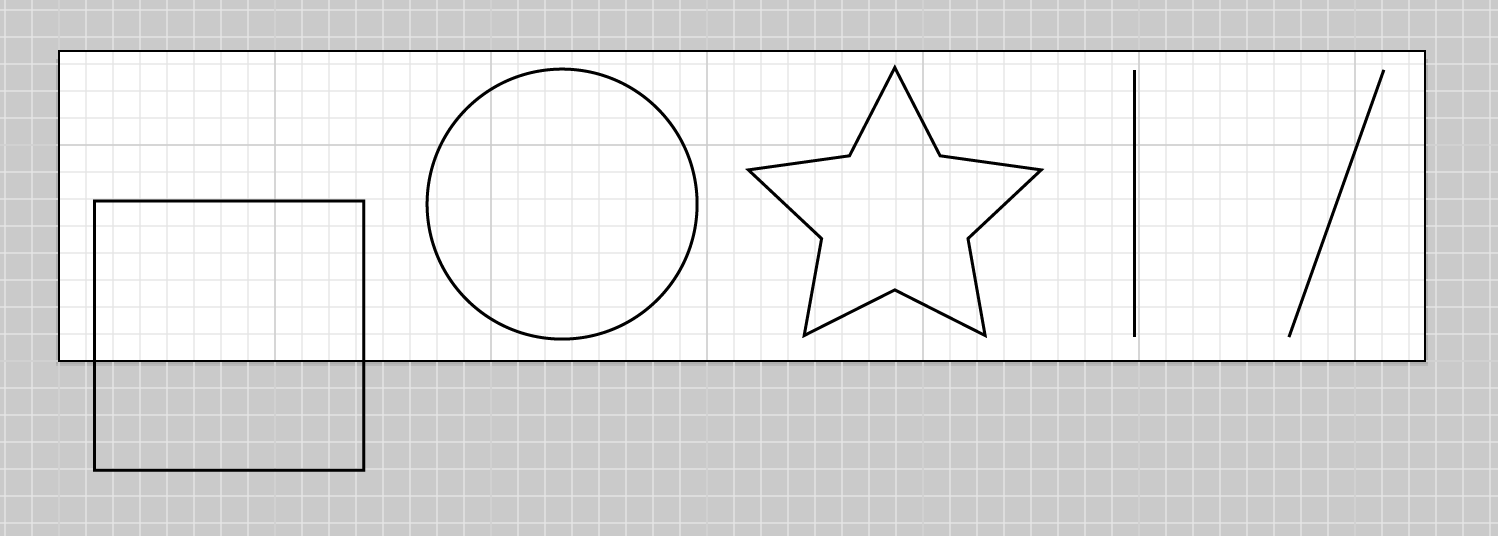
SVG also stores information outside the viewBox area . If we move a shape outside this space, well see this:
The white area is what the viewer sees, while the white and grey area together hold the information that the SVG actually contains. This feature allows the SVG to be both scalable and easy to crop on the fly. This comes in very handy in responsive applications, particularly sprites.
There is one more tool you should be aware of with the viewBox and it is invisible in this example. Most SVGs you will see on the web wont even specify it because the default is what most people will want more than nine times out of ten. It is preserveAspectRatio=xMidYMidmeet. This forces the drawing area to adjust itself with uniform scaling.
There are several other options as well. The first parameter, xMidYMid, determines whether or not to uniformly scale the element, and which part of the viewport to scale from, in camelCased naming. The default is to scale from the center, or Mid, but there are also Min or Max parameters as well, such as xMinYMax, and so on. You may also designate none, in which case the aspect ratio at its default percentages will be ignored, and it will be squashed and stretched to fill the available space.
The second value is defined by meet or slice. meet will attempt to scale the graphic as much as possible to fit inside containing viewBox, while keeping the aspect ratio consistent. This functionality is similar to background-size: contain; in that the image will stay contained in the boundaries of the containing unit.
slice will allow the graphic within the

