Publisher: Amy Marson Creative Director: Gailen Runge Acquisitions Editor: Roxane Cerda Managing Editor: Liz Aneloski Editor: Karla Menaugh Technical Editor: Debbie Rodgers Cover/Book Designer: April Mostek Production Coordinator: Zinnia Heinzmann Production Editor: Alice Mace Nakanishi Illustrator: Valyrie Gillum Photo Assistants: Rachel Holmes and Mai Yong Vang Photography by Mai Yong Vang and Kelly Burgoyne of C&T Publishing, Inc., unless otherwise noted Published by C&T Publishing, Inc., P.O. Box 1456, Lafayette, CA 94549  For Ellery and Orson May you know to the bottom of your hearts how you are loved, in all your wildness, in all your brilliance, through all your stumbles and triumphs. Thank you for being the excellent people that you are. Acknowledgments Thank you to Art Gallery Fabrics for the donation of the gorgeous Pure Elements Solids for the samples in this book. Mountains of gratitude to my sister, Kaila Cameli, for her brave and compassionate piecing and binding help. I am so grateful for our time together! Thanks to my editor, Karla, for helping me feel less overwhelmed with the enormity and time frame for this project! And to all the staff at C&T Publishing, thank you for sharing my work in its best light, with such joy and positivity.
Finally, a deep thank you to Mike Givler for cheerfully feeding me and keeping me company through the final labor pains for this book. You are an absolute treasure.  thinking texturally Quilted textures have a way of drawing you in and making you want to touch the quilt. They bring out the best in the piecing. The play of shadow and light delights even nonquilters, grabbing their attention and inspiring appreciation for the skill involved. Quilting takes a flat piece of fabric or patchwork and breathes depth into it, bringing it into the world of sculpture, a soft bas-relief.
The dimension in a quilted piece invites us to look deeper, to move closer, to wrap up and enjoy. Im going to share with you what Ive learned about quilting textures that delight both eye and hand. Included are many designs that you can recreate, and I hope you enjoy them. I hope even more that this book gives you the tools to understand your quilting choices at a deeper level, and to have the confidence to create the quilting designs that will work best for your projects. I cant teach you perfect quilting. In fact, youll see how imperfect my quilting is as you go through the book! The magic of texture can still shine through.
I hope you try it yourself! 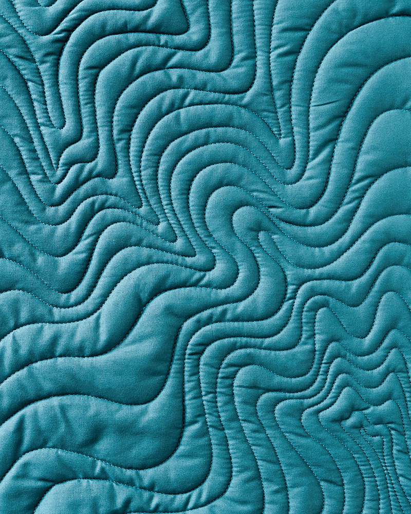 departing from line-based thinking When I first started quilting, the quilting designs I used most were designs like vines and flowers, and motifs like hearts and stars. I still like quilting these sometimes. They are like little drawings or icons in thread. Seeing the thread improves your understanding of the design. I consider designs like these line-based designs.
 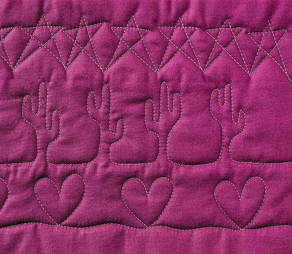 Line-based quilting designs As Ive quilted longer, I realize I now prefer designs that have visual rhythm to them.
These designs rely less on seeing the thread. In fact, to my eye they look better with subtle, matching thread. Instead of focusing on the thread, I notice the places that the thread is and isnt. The places that are not quilted are important and define the texture that is created. I consider these designs texture-based designs. 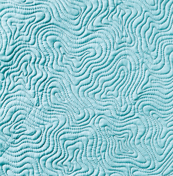 A texture-based quilting design Some of my work is more textural and some is less.
I perceive line and texture as opposite ends on a spectrum in quilting. 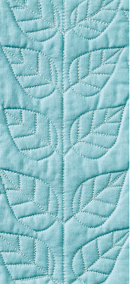 A leaf design with little texture
 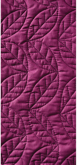 A leaf design with more texture
 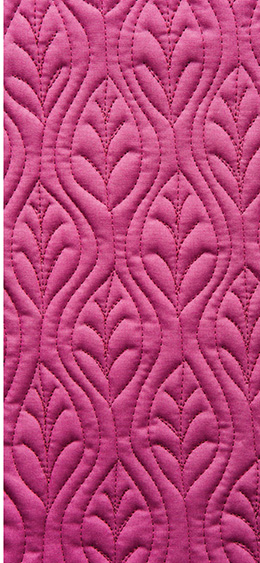 A leaf design with pronounced texture Every quilter will have a different range on this spectrum that feels interesting to them. In this book well focus on the texture end of the spectrum. If youre used to thinking in drawings with your quilting designs, this might feel a little strange. I encourage you to try stitching some of the designs and see how you like them. To begin, lets explore some concepts.
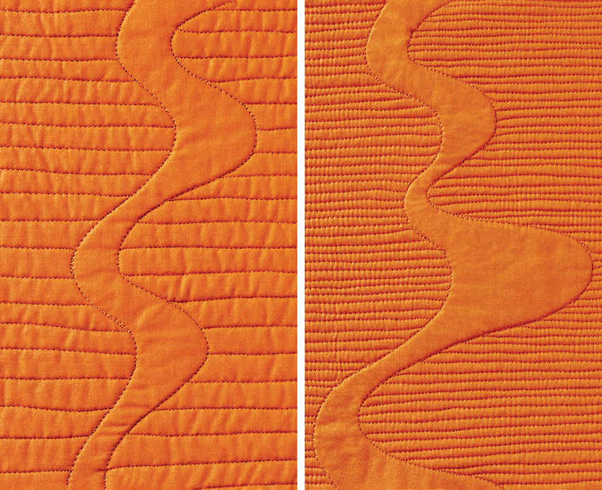
Echoing One of the most powerful ways to create texture in quilting is by echoing. When one line responds to the line before it, mimicking its curve or direction, we see both lines together as a unit, and that unit has visual impact. An example I use in my quilting classes is below. The two pieces were quilted identically with one small difference. Do you see it? 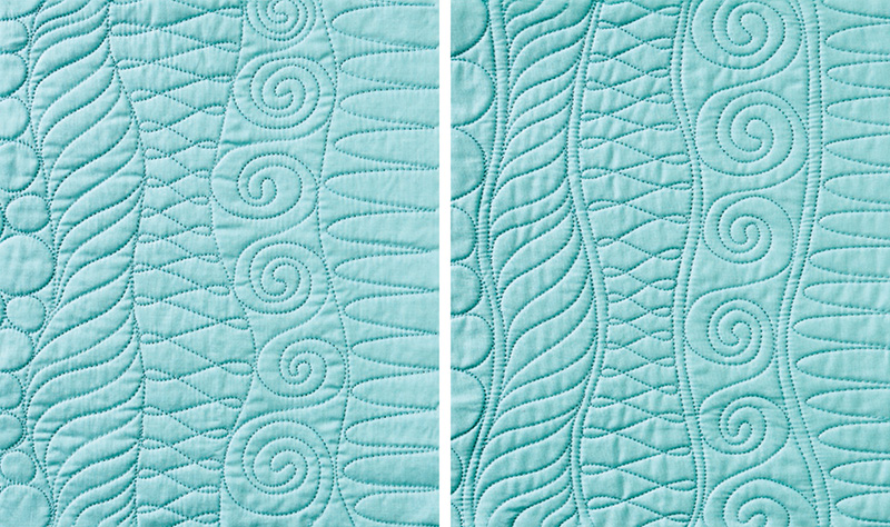 In the piece on the right, the lines between the designs are echoed. In the piece where I doubled the dividing line, an important change happened.
The division was no longer a line, but a three-dimensional object with a left edge, an inside, and a right edge. If you like this doubled-line example better, consider where you can add echoing in your quilting! Echoing can make simple quilting motifs look complex. 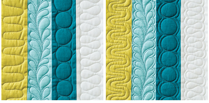 In the piece on the right, the designs are echoed. Echoing can, of course, be more than a single echo. We can echo multiple times, creating increasing texture.
 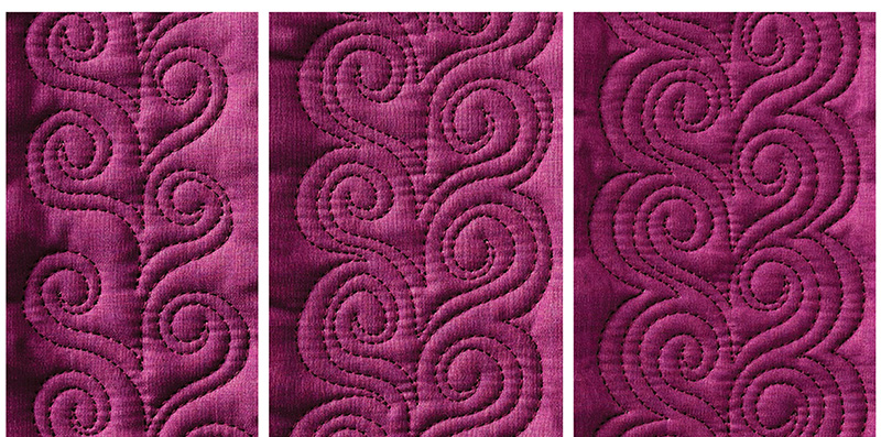 On the left, an unechoed design.
In the middle, the design is echoed once. On the right, the design is echoed twice. Different widths of echoes have different effects. Notice how similar spirals become dissimilar when framed by wider or narrower echoes. 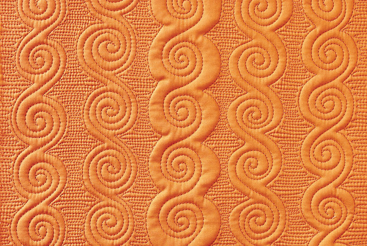 Some designs rely almost entirely on echoing.
 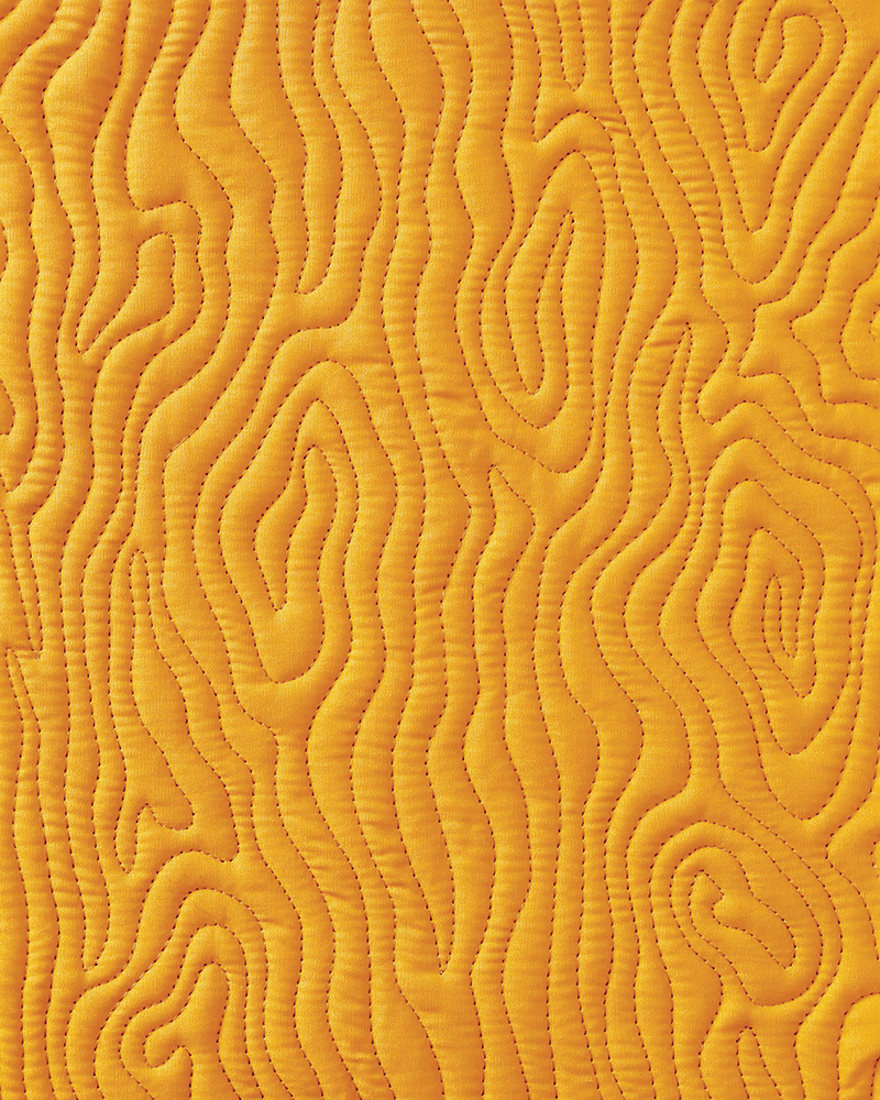 Wood Grain Open Spaces Below is an example I use in my quilting classes.
  Wood Grain Open Spaces Below is an example I use in my quilting classes.
The two pieces were quilted the same way with one small difference. What do you notice? 
Next page

 For Ellery and Orson May you know to the bottom of your hearts how you are loved, in all your wildness, in all your brilliance, through all your stumbles and triumphs. Thank you for being the excellent people that you are. Acknowledgments Thank you to Art Gallery Fabrics for the donation of the gorgeous Pure Elements Solids for the samples in this book. Mountains of gratitude to my sister, Kaila Cameli, for her brave and compassionate piecing and binding help. I am so grateful for our time together! Thanks to my editor, Karla, for helping me feel less overwhelmed with the enormity and time frame for this project! And to all the staff at C&T Publishing, thank you for sharing my work in its best light, with such joy and positivity.
 thinking texturally Quilted textures have a way of drawing you in and making you want to touch the quilt. They bring out the best in the piecing. The play of shadow and light delights even nonquilters, grabbing their attention and inspiring appreciation for the skill involved. Quilting takes a flat piece of fabric or patchwork and breathes depth into it, bringing it into the world of sculpture, a soft bas-relief.
 departing from line-based thinking When I first started quilting, the quilting designs I used most were designs like vines and flowers, and motifs like hearts and stars. I still like quilting these sometimes. They are like little drawings or icons in thread. Seeing the thread improves your understanding of the design. I consider designs like these line-based designs.
  Line-based quilting designs As Ive quilted longer, I realize I now prefer designs that have visual rhythm to them.
 A texture-based quilting design Some of my work is more textural and some is less.
 A leaf design with little texture
  A leaf design with more texture
  A leaf design with pronounced texture Every quilter will have a different range on this spectrum that feels interesting to them. In this book well focus on the texture end of the spectrum. If youre used to thinking in drawings with your quilting designs, this might feel a little strange. I encourage you to try stitching some of the designs and see how you like them. To begin, lets explore some concepts.
 In the piece on the right, the lines between the designs are echoed. In the piece where I doubled the dividing line, an important change happened.
 In the piece on the right, the designs are echoed. Echoing can, of course, be more than a single echo. We can echo multiple times, creating increasing texture.
  On the left, an unechoed design.
 Some designs rely almost entirely on echoing.
  Wood Grain Open Spaces Below is an example I use in my quilting classes.