15 Successful Communications Lessons (Collection)
FT Press Delivers

Less Is More
The Proper Use of Graphics for Effective Presentations
Jerry Weissman
The Proper Role of Graphics
Think about a time when you were in the audience at a presentation and the graphics didnt work. What was the problem? These are the most common answers my business clients give:
The graphics were cluttered.
There was too much on the slide.
The slide looked like an eye chart.
The slide was a Data Dump.
Now flip the lens and take the point of view of an Audience Advocate. Whats the effect on you? Odds are that its another case of the dreaded MEGO (Mine Eyes Glaze Over) syndrome: the same cause and effect as when a story is unloaded on you as a Data Dump. The main reason this happens is that presenters fail to distinguish between a document and a presentation. They treat a presentation as a document. This is the Presentation-as-Document Syndrome, in which the presenter uses the graphics as both a display and as a record, as both show and tell. This is the vestigial legacy of the ancient origins of presentations, the flip chart.
Business documents include
Annual reports, filled with dense text and highly detailed tables, charts, and graphs
Strategic plans, filled with dense text and highly detailed tables, charts, and graphs
Market analyses, filled with dense text and highly detailed tables, charts, and graphs
Meeting notes, filled with dense text and highly detailed tables, charts, and graphs
See the pattern? All these types of documents are necessary and important in their place, but business documents are not presentations.
So the true problem with presentation graphics is that, all too often, presenters take a flood of data, the dense text and highly detailed tables, charts, and graphs, and simply reproduce them, with little or no modification, for their presentation graphics.
This Presentation-as-Document Syndrome represents one of the most common problems that plague presentations. Presenters have become so accustomed to relying on graphics, especially Microsoft PowerPoint slides, that they often think of the presentation as a mere accompaniment to those aids. In fact, many people act as if the presentation is completely dispensable. Theyll say, I cant attend your presentation next week. But it doesnt matter. Just send me your slides! Or they sometimes say, Send me your slides in advance. The PowerPoint slides then are treated as handouts.
Whats more, presenters frequently provide the handouts to their audience before the presentation. The audience then reads the handout, sees the slide, and hears the presenter read what is on the slide. This is known as triple delivery, an assault on the audiences senses that leads to that lethal MEGO. Using slides as handouts is but one manifestation of the Presentation-as-Document Syndrome. There are three others:
Using the slides as notes to help the presenter remember what to say
Cramming a plethora of details on the slides, as if to demonstrate legitimacy
Filling the slides with enough information so that anyone else in the company using the same slides will maintain the uniformity of the message
A presentation must serve only one purpose. If a presentation tries to serve two or more purposes, it dilutes both purposes. The presentation itself is neither fish nor fowl.
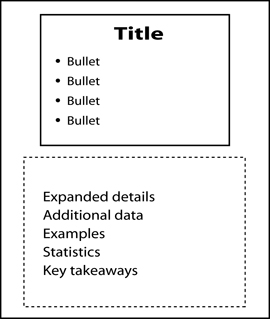
A presentation is a presentation and only a presentation...never a document. If you do need a document of your presentation, Microsoft PowerPoint provides the Notes Page view, as represented in . The top of the Notes Page contains only what your audience sees projected on the screen. The bottom provides the additional material for the handouts.
Figure 1 The Notes Page view in Microsoft PowerPoint.

Be sure to distribute the handouts only after the presentation. If you distribute them before or during the presentation, your audience members will flip through them as you speak, and they wont listen to what you have to say.
If youre asked to provide a copy of your presentation for a conference so that the slides can be printed in book form, use PowerPoints Notes Page view. That way, youll maintain the integrity of your slides as purely presentation material.
If youre asked to provide a copy of the presentation in advance, as so often happens, especially in the venture capital and financial sector, politely offer to provide a business plan or executive summary...as a document. And create that document with Microsoft Word, not PowerPoint.
Presenter Focus
An extension of the Presentation-as-Document Syndrome is what happens to the audience when the screen lights up with a slide filled with dense text and highly detailed tables, charts, and graphs. The focus of the audience immediately, and involuntarily, goes to the graphics, and they start to read. When they start reading, they stop listening. The graphics then become the center of attention, and the presenter becomes subordinate to the slide show, serving, at best, as a voice-over narrator and, at worst, as a ventriloquist.
This problem is compounded as the presenter becomes a reader, too. The reading often fails to rise above the level of a verbatim recitation. Reciting the slides verbatim is patronizing to the audience. They think to themselves: Im not a child! I can read it myself! The results are a failure to connect, a failure to communicate, and, most likely, a failure to persuade.
An even worse variant is when the presenter rambles, talking about subjects that have nothing to do with the slide. This disparity jams the audiences eyes and ears, producing confusion and annoyance.
How, then, should you approach effective slide design? Think of the slides and graphics as speaker support. They are there to support the presenter, not the other way around.
This Presenter Focus/Graphics Support relationship is the only effective model for a presentation. The presentation cannot serve as a document unless it is complete in itself, in which case the audience wouldnt need the presenter. They could sit in silence and read the slides to themselves. On the other hand, if the graphics constitute a partial document, they cannot stand alone, and they serve only to distract attention from the presenter.
Instead, when the presenter interprets for the audience and the graphics provide support, the presenter can lead the audience to a conclusion. When this happens, the presenter manages the audiences minds, creating the subliminal takeaway: Effective Management.
Less Is More
To make all these things happen, we need a guiding principle. That principle is Less Is More. Less Is More should be your guiding principle when you are creating your presentation graphics, as well as its corollary, When in doubt, leave it out.
An important benefit of a slide designed with this minimalist approach is that it serves as an instant prompt for the presenter: a visual mnemonic.
Perception Psychology
In addition to Presenter Focus and Less Is More, the two essential concepts for powerful graphics design, there is a third vital element in the equation: the audience and how they take in what they see. This is

