Why a final edition?
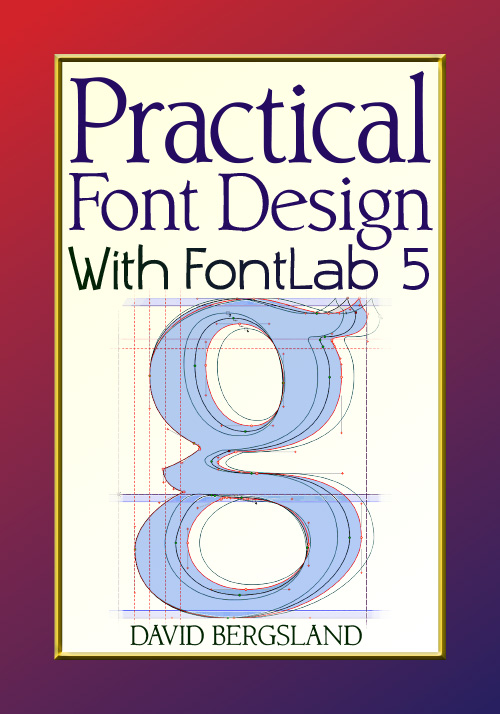
The main reason is that, in the development of my video course on font design at Udemy, I found myself doing things differently. The new workflow is more streamlined. So, this book shows that better workflow. This is a major rearrangement of the bookplus I developed four new font families to use in this book. It is also the last book on workflow development for FontLab 5, now that weve seen FontLab 6.
Practical Font Design has obviously found a niche within the font design communityor at least within that group of graphic designers and Web designers who want to design their own fonts. The comment from Richard Fink at Readable Web is what Ive hoped to hear:
If youre looking for a brief, straightforward introduction to fonts, I recommend David Bergslands Practical Font Design . Unlike a lot of books that make you feel like youre seated in the back row of a crowded lecture hall, this one feels like a private tutorial.
Bergsland takes you inside his studio, sits you down, and talks you through the basics. It keeps to a schedule, too: no bull.....
If youve gone looking for information about fonts, you may have noticed that theres a lot of information about typefaces but not much about the technology of font-making. And what info there is, is scattered piecemeal here and there. And most of it is decidedly not for newbies, either. So unfortunately, in the field of fonts today, it doesnt take much to stand out. That said, this is still a good book, and I wish there were more like it from other designers, offering other perspectives. Richard Fink
More recently, I got this encouraging review from Christopher Murphy in Ireland:
I work as a Graphic Designer Ive been trying to teach myself type design for the last 6-8 months now. Ive found the lack of solid advice on offer shocking, yeah theres plenty of books but they seem to just rehash the same old stuff without actually getting down to anything useful. After the fourth or fifth book, regardless of what they promise in the blurb you realize that the authors have never sat down & actually done any actual designing.
This course taught me more about type design than any of the teachers/lectures I had when I was doing my design degree. Theory is an important aspect when learning any subject, but when all youre offered is theory & no practical advice you end up with just that, a lot of theory & not a clue what to do with it.
However, as usual, my early attempts prove to be an embarrassment when I go back a few years later. I know this is common among creativesyet I have an opportunity here to rectify things. The new workflow is that much better
This is a small, one-person, low budget operation
This book services a small niche of a few thousand people, at most. As a result Ive been forced to forego professional proofers and copy editors. This is not entirely bad as there are no copyeditors of whom I am aware with any knowledge in the font design field. However, there were huge numbers of typos in the first two editions of Part One and in Part Two. The four reedits of the Third Edition improved things a lot. It gets better each time. If you see typos or find problems, please let me know and Ill add them to the next update.
Dealing with the typos
At this point, its catch as catch can. Every version gets a little better. In this final edition, Ill fix all the ones people have shared with me, plus Ill find many more. As I have always taught, you cannot proof your own stuff. You missed it the first time, so youll probably still be blind to the problems the second time. Thats why you missed the mistake in the first place. So, you will find some typoshopefully not many.
All I can do is offer my apologies for that and try to fix as many of them as possible. My writing style has a tendency to be a little terse. I found as I edited that many assumptions needed to be explained a little. When building the third edition, I found things which were now a normal part of my production cycle that were not even mentioned. By the time I put together the video course, I had to deal with the fact that I was actually using a new workflow.
I also changed many portions of the layout. For the third edition, I wanted to use the fonts I developed for Part Two. Contenu and Buddy had become my staples in the other books I had written in the past couple of years now that I have gone to writing and publishing full-time. Now that all the distributors accept ePUB3 with embedded fonts, I can use the fonts in the ebooks also.
Ive really had the opportunity to put these new fonts through the ringer in book design. Ive been writing and publishing several books a year. My book design style has gone through radical revisionsmuch of it the direct result of the style changes implemented in Contenu and Buddy.
As a result, I needed to design two new book design families which will be done in this book. I am setting this book in these new fonts. The basic text font with text letterspacing is Librum Book [Regular], Italic, Bold, and Bold Italic (RIB&BI). I made a second set for ebooks Named Librum E RIB&BI, plus an E Sm Cap font. The companion sans is named Librum Sans . Finally I made a display version for serif headers named Bream R&I.
In this book, the copy will talk about developing a font, the name of which started as Atesqa Oldstyle. I went through two or three more names before settling on Librum. Dont let the names confuse you. This book is the first use of these fonts. I will be updating them as I write this book and will release them at the same time as the book.
Ebooks have brought about radical changes
Another thing I wanted to deal with are the layout changes necessary to produce ePUBs and Kindle books from the content. Like other authors, I now find that about two thirds of my sales are digital books which are downloaded.
Though the typography of ePUB and Kindle books has greatly improved with ePUB3, many things are still not available. InDesign CC 2014 and newer does a pretty good job. CC 2015 adds paragraph shading which I can use in the reflowable ebooks to deal with sidebars. But the fact remains, most of the typographic niceties are simply not available to ebooks of any type other than PDFs or ePUB FXL (fixed layout). Lamenting the change is silly. This is simply the new reality and I must deal with that.
Will Web fonts solve these problems?
Now that TypeKit is part of the Creative Cloud, and they come with an ePUB license, well be seeing more and more fonts in ebooks. This area has matured a lot since I first wrote this in the spring of 2011. But there is a long way to go. The font licensing fees for ebook use are still absurd. Thats why I sell my fonts with an ebook license included. I have found that sales of ePUBs with embedded fonts are better than I thought. Plus, led by the iBooks Store and Kindle Fire, most of the ereaders and the apps on the tablets now support embedded fonts with no problem (other than the old e-ink Kindles and Nook).


