Charles Haine - Color Grading 101
Here you can read online Charles Haine - Color Grading 101 full text of the book (entire story) in english for free. Download pdf and epub, get meaning, cover and reviews about this ebook. year: 2020, publisher: Taylor & Francis (CAM), genre: Home and family. Description of the work, (preface) as well as reviews are available. Best literature library LitArk.com created for fans of good reading and offers a wide selection of genres:
Romance novel
Science fiction
Adventure
Detective
Science
History
Home and family
Prose
Art
Politics
Computer
Non-fiction
Religion
Business
Children
Humor
Choose a favorite category and find really read worthwhile books. Enjoy immersion in the world of imagination, feel the emotions of the characters or learn something new for yourself, make an fascinating discovery.

- Book:Color Grading 101
- Author:
- Publisher:Taylor & Francis (CAM)
- Genre:
- Year:2020
- Rating:4 / 5
- Favourites:Add to favourites
- Your mark:
Color Grading 101: summary, description and annotation
We offer to read an annotation, description, summary or preface (depends on what the author of the book "Color Grading 101" wrote himself). If you haven't found the necessary information about the book — write in the comments, we will try to find it.
Charles Haine: author's other books
Who wrote Color Grading 101? Find out the surname, the name of the author of the book and a list of all author's works by series.


Color Grading 101 — read online for free the complete book (whole text) full work
Below is the text of the book, divided by pages. System saving the place of the last page read, allows you to conveniently read the book "Color Grading 101" online for free, without having to search again every time where you left off. Put a bookmark, and you can go to the page where you finished reading at any time.
Font size:
Interval:
Bookmark:
The Story as Guide
Thats the biggest question that needs to be answered. And while many filmmakers, especially in the beginning of their career, associate a look with a specific technology (such as a TV look or a film look,) in truth every technology offers a tremendous flexibility in how it might finally look. Think about magazines: there is no signature magazine look. Some magazines have a clean, documentary aesthetic; others go for cool and desaturated. The same is true with cinema. There are saturated films, desaturated films, you can over expose or underexpose, and some cameras have more sharpness or less, so basing the look of your project on a specific technology is often not specific enough to determine what you really want the project to look like.
At the start of the process, throw out any technologically driven idea and instead focus on the key question: what do I (or we, if its a team project) want this project to look like? And, even broader, how do we want it to make people feel, because often feelings are driven by images and how they appear.
For instance, in the beginning its often helpful to start with a concept for the mood of a scene, sequence, or entire project before anything else. Many filmmakers start this with a discussion of emotional words drawn from the script or the treatment, and this can be a great place to start. In the sample below, from the short film Oblivion, Nebraska, shot on 35mm, one image has been given a dark, sad look and the other a warm, happy look.
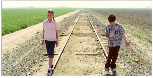
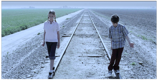
Blue=sad and orange=happy are so basic as to be practically clich, but they give a good example of the way in which color influences the emotion that is communicated by a final image.
The best place to start the conversation with your team is going back to the intended emotional impact of the story. If you are telling a story about creeping ennui in the suburbs, it will likely have different images than if you are telling a story about love among junkies living on the margins of an inner city, postindustrial society. The story is the lead indicator for how you want to shape your images, and conversations with your team about the beats of the story are vital before any conversations should take place about 8k vs 16k, Rec. 709 vs. Rec. 2020, or HDR.
Dont forget that stories are structured, and your images should ideally be as well. With the traditional three act story structure, which we see implemented from 30-second commercials all the way up to multi-hour studio epics, there is a story introduction, a rising action or conflict, and a resolution. Rather than creating a single look for your entire project, many filmmakers plan for a look to evolve in sync with the story structure so that story and images together work together to create a dynamic whole.
If you compare the opening and closing shot of many famous films you will see this structure in action: generally the story has evolved over time, and thus you want your images to evolve over time, but for the story to feel unified, you want some elements of the image to remain connected to each other. Thus, first and final frames of movies often make effective pairings, where the images complement each other. This was seen to great effect in the viral sensation First and Final Frames by Jacob T. Sweeney.
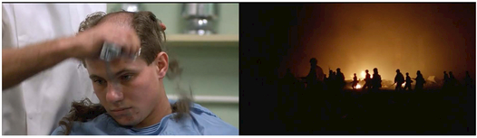
First and Final Frames, Jacob T. Swinney.
In this before/after pair from Stanley Kubricks Full Metal Jacket, we see drastically different images. If the story arc that the team set out to create was dehumanization of war, this is a perfect pairing. The first image is clean, clinical, but still human; you see a person, with zits and flaws, and the first step of dehumanization, removing the hair, has already started. The image is lit in a flat fashion that you could not entirely create in post, but the color grade is also flat: there is no vignette darkening the corners, and the space feels bright and clean with a high degree of clarity. The final image is the silhouette of a group against fire: war has removed each individual as they blend together into a mass. There is a heavy feeling of a vignette (likely in camera considering the time in history it was created was before you could easily do that digitally on a theatrical motion picture), creating an even greater sensation of the world closing in.
Not all of this is created in post-production, clearly. The emotional feeling of those shots needs to be planned for during pre-production and even in the script, then executed on set. But the key here is to understand the intentions of the project so that you can execute properly in post in alignment with those goals. Without firing up the source footage in a color correction application its impossible to know for sure, but its possible there could be detail in the people in that last shot you could bring out by manipulating the tone curve, and it would be a choice to keep them silhouetted. The opening shot could easily be vignetted, to focus our eye more on the soldier getting their head shaved, their skin tones could be brightened so we see the characters more clearly, artificial eye light could be added, but that wouldnt fulfill the goal of the shot within the context of the overall structure of the motion picture. Color correction isnt always about beautifying an image; its about telling a story.
A film should take an audience on a journey, and how you manipulate images in the post process is a vital part of that.
This pairing of first and final images from the Jim Jarmusch film Dead Man are equally dynamic. On the left, pure machine, on the right, nature with just a hint of humanity. But beyond that, study the different contrasts of each image. On the left, the sky blows out to pure white; the sky is so clipped it blends together with the snowy ground. The shadows under the train are pure, inky blackness. On the right, the sky is not that much brighter gray than the ocean. Even the few spots where the sun sneaks through the clouds are muted.
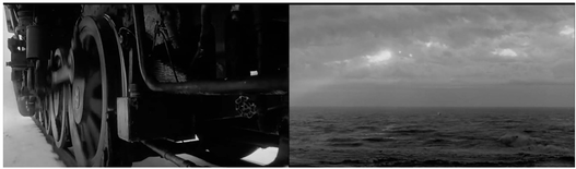
First and Final Frames, Jacob T. Swinney.
Its seldom you walk into a film with a single, solitary look for the whole project. While you want to unify certain elements (all of Dead Man is in black and white, for instance, tying the film together in a lack of color saturation), changes in the story, and changes in the images, will often drive changes in the look, the way contrast changes over the course of the story.
All of these decisions are at least partially drawn from principles of contrast and affinity. Placing images again each other, or items against each other within the frame, is the driving engine of organizing motion picture visuals. Two images that are unalike being edited together creates a visual intensity that is engaging for an audience.
When deciding what you want your film to look like, its helpful to focus on four key areas.
- What qualities do you want to unify?
- What qualities do you want to change with the structure?
Font size:
Interval:
Bookmark:
Similar books «Color Grading 101»
Look at similar books to Color Grading 101. We have selected literature similar in name and meaning in the hope of providing readers with more options to find new, interesting, not yet read works.
Discussion, reviews of the book Color Grading 101 and just readers' own opinions. Leave your comments, write what you think about the work, its meaning or the main characters. Specify what exactly you liked and what you didn't like, and why you think so.