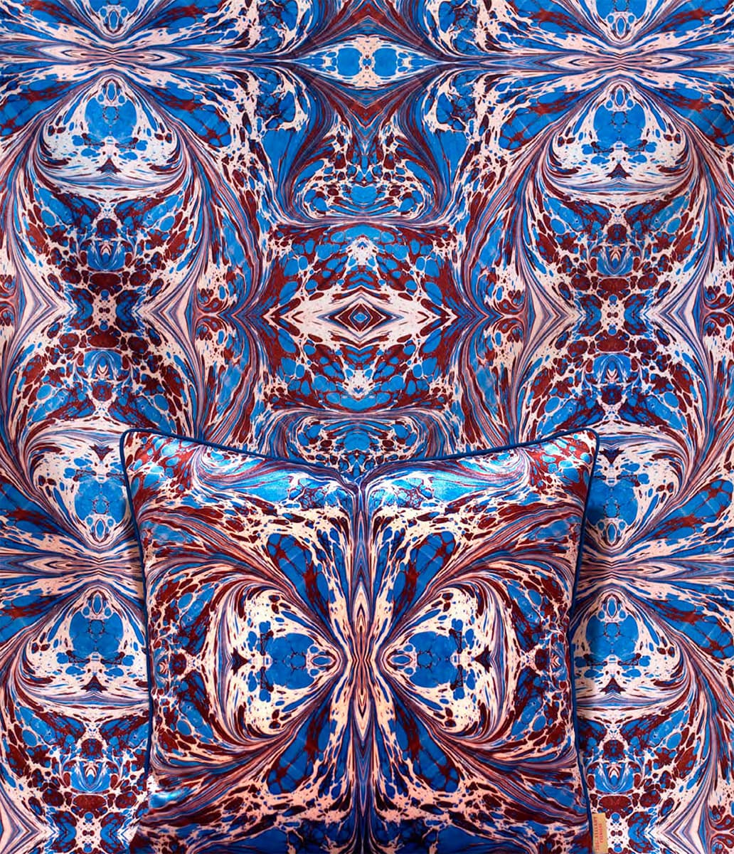
Design: Mindthegap.
I am not a maker of patterns, but pattern has certainly helped to make me. My earliest memory is a pattern a repeat print of a pink cat and a white mouse, which wrapped the walls of my first bedroom. I dont remember the room itself, or the house it was in, but the pattern sits in my head. An image of home.
Then theres the blue gingham check of my nursery school art apron; the needle-thin stripes red, yellow, blue, white of my favourite jeans; the flower and trellis wallpaper border of my parents dining room; and the blue-and-white willow print beneath slices of roast chicken at my grandparents house.
When I first set up home in the mid-1990s, pattern was out of fashion. I was a design writer, a person supposedly in tune with interior trends, so I tried to embrace the plain and the minimal, but I felt ill at ease in my patternless house. Without a pop of print to attract my attention, my eye had nowhere to go, nothing to focus on; plain walls, plain floors and plain furnishings left me feeling as flat as the rooms themselves. Without pattern, there was no depth, no movement, no standout feature and, above all, no joy.
Design: Susi Bellamy.
Perhaps I was doing it wrong. I know plain can be interesting but unless it is offsetting pattern, it doesnt interest me. And thats why Im writing this book. I love pattern and I want you to love it too. More than that, I want you to bring it into your home and make it part of your life because I believe that living with pattern is good for us. It lifts our spirits. It also makes up for all manner of architectural imperfections and is brilliant at hiding domestic detritus from dust to dog hair. Cheering and practical, whats not to love?
But how do you live with pattern? How do you choose? Are you blousy flowers or chic pinstripes, Baroque damask or carefree polka dots, pastoral toile de Jouy or urban geometry? And once you have found your style, how do you bring it into your home?
This book aims to help you find the answers to all those questions. It doesnt set out rules this is home decoration, there arent any rules but it does explain how pattern affects spaces, how light and colour change the way we perceive pattern and how pattern can be used to achieve certain looks. It also offers suggestions on where to look for ideas and, most important of all, contains pages and pages of photographs of gloriously patterned interiors to inspire you. They are a feast for the eyes. Enjoy.
THE POWER OF PATTERN

A pattern is created when one or more motifs are repeated at regular or irregular intervals. Reduced to such a basic description, pattern sounds simple, dull even, but we all know that pattern is neither of those things. Pattern is complex and invigorating. It delights our eye, lifts our spirits, and orders and ornaments our surroundings.
In our homes, pattern has the power to transform spaces by changing the way we perceive scale. Vertical stripes make a low-ceilinged room appear taller, for example, while a regular repeat print will bring a sense of cohesion to a disjointed open-plan interior. Pattern can also define surfaces, convey a design style and camouflage imperfections. Lumpy plaster on the walls? No problem, a dense floral print will seem to smooth away those bumps. And most important of all, pattern can change the way we feel.
Human beings recognize pattern instinctively. Chaos unsettles us, so we are hard-wired to find patterns to help us organize and make sense of the world. And we are richly rewarded because pattern is everywhere, part of the very structure of nature, from the radial symmetry of snowflakes and sunflowers, to the spirals of a nautilus shell and the hexagonal repeat of honeycomb.
We are also programmed to respond to pattern. Scientific research has shown that we have neurons in our brains that react to lines, edges and bars and that our visual development relies on these neurons being stimulated by exposure to pattern when we are babies. Even as adults, our eyes are on a constant quest for visual arousal. A study looking into adults emotional response to pattern, carried out by George Stylios, Senior Research Professor at Heriot-Watt University, and research student Meixuan Chen, revealed that the participants on the trial registered more excitement when they were shown intense patterns rather than weak ones, and more pleasure when they were shown repeating patterns rather than non-repeats.
No wonder then that we have been making pattern part of our homes for as long as we have had places to call home. Patterns have been found in prehistoric cave paintings; Ancient Egyptians wove rushes into patterns to form decorative wall hangings and floor coverings; and, when the Pueblo Indians began to settle rather than roam, around 500CE, they took to decorating their clay pots with patterns composed of geometric, floral and animal motifs. Roll forward to the Victorian age and we find pattern rioting through homes large and small. The Victorians may have a reputation for domestic prudery, but they embraced interior pattern with joyous abandon. Lace curtains hung beside fleur-de-lis wallpaper, and chairs wrapped in floral upholstery sat proudly on garlanded carpets.
There have been attempts to drive pattern off our walls, floors and furnishings. In 1908, the Austrian architect Alfred Loos published a pamphlet entitled Ornamentation and Crime, which stated that decoration had no place in the new, rational, machine-driven century. Eighty-eight years later, the Swedish furniture giant IKEA released a television advertising campaign that urged its British customers to chuck out the chintz.
These exhortations did indeed change tastes the architects and designers behind both the Modern Movement and the Bauhaus were heavily influenced by Loos ideas, while IKEAs attack on floral prints helped to usher in a decade of neutral-toned minimalism but not for long. Pattern-free moments have always been short-lived because, without it, our homes bring us neither excitement nor pleasure and a home without these is no home at all.
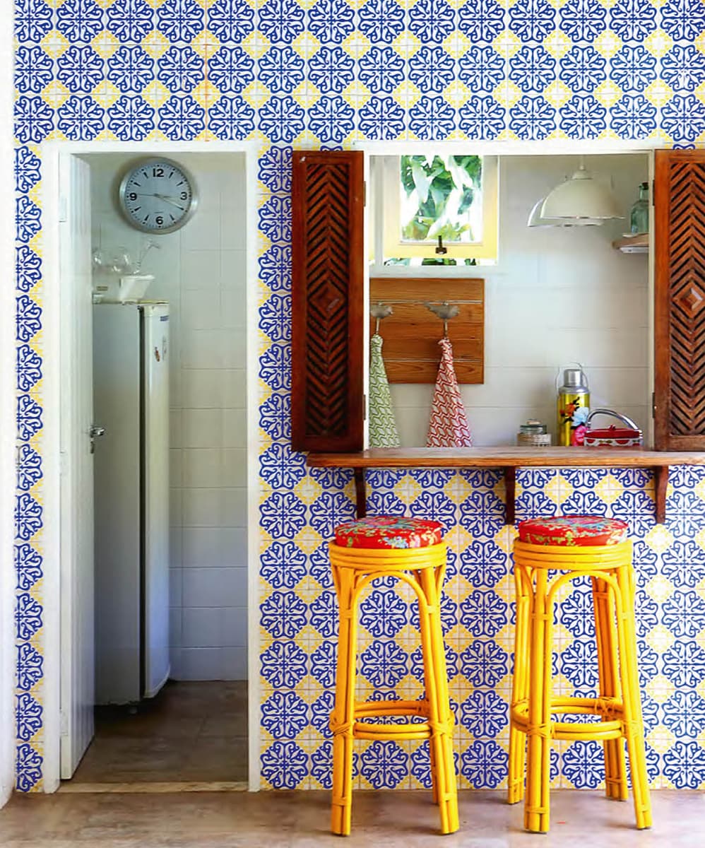
With its fresh blue, white and yellow colour scheme, this pretty, pattern-filled kitchen speaks of carefree summer days. However, there is nothing casual about how the multiple layers of geometric patterns have been brought together and thats why the scheme works. Look closely and youll see that the straight lines that anchor the wall tiles in the foreground are echoed in the simple squares on the back kitchen wall and the chevrons on the wooden shutters.
FINDING INSPIRATION & GATHERING TREASURE

