The Importance of Balance
AN ARTIST AT WORK usually stands at his easel and views his picture at various distances, looks at it over his shoulder, looks at it in reverse through a mirror, turns it upside-down at times, develops it with dots or spots of color here and there. He puts in points of accent carefully and often changes them.
Why does he do all this? He is striving for BALANCE or equipoise. The sensitive eye of artist and viewer tests every picture for balance, a judgment usually rendered naturally by everyone, with or without knowledge of artistic laws.
After the picture has been finished, why does an artist often feel compelled to create an accent on one side or weaken an obtrusive point on the other side of his canvas?
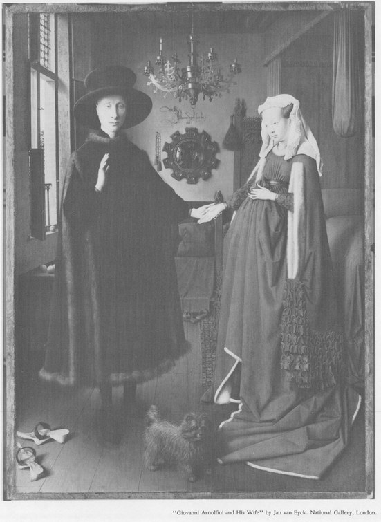
Take a painting which has lived long enough to be considered good by everyone. Subject it to the following test: Find the actual middle of the picture and pass a vertical and horizontal line through it. The vertical division is the more important, as the natural balance is on the sides of a central support. The central point of the canvas is also the actual pivot of the picture, and round such a point the various components group themselves, pulling and battling for their share of attention. The satisfactory picture shows as much design of balance on one side as the other, and the completely balanced picture displays this equipoise above and below the horizontal line as well.
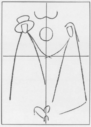
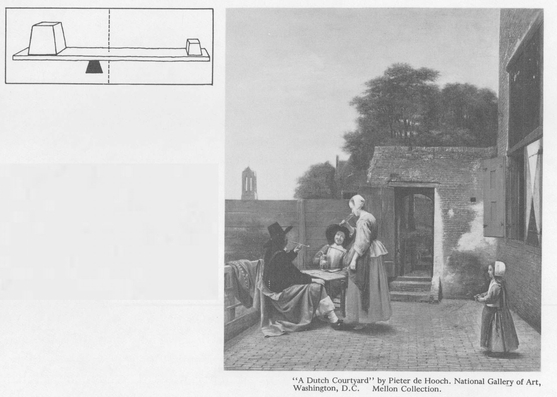
1. A diagram of the painting on the opposite page clearly shows complete balance round the exact middle. The joined hands act as a pivot point for the whole composition.
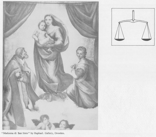
2. Classical balance requires equal measures on each side of a central figure or objectand also ideally displays balancing elements from top to bottom. The visual effect is that of the scales above. For each part, there must be a corresponding part to keep the scales from teetering.
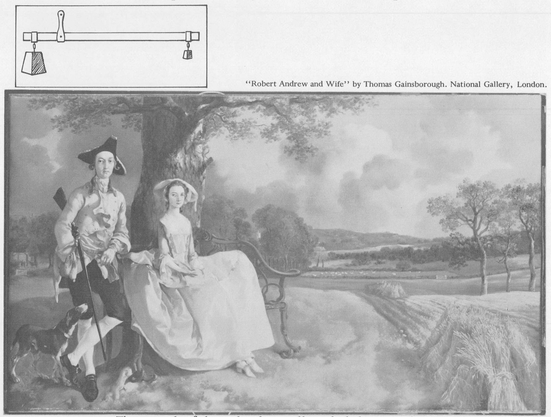
Every item of a picture has a degree of PULLING POWER, as though each object were a magnet of some potency or strength. Each has attraction for the eye. While each draws attention to itself, it detracts from every other part proportionately. On the principle of the STEELYARD (which we will discuss in detail later), the farther from the middle and more isolated an object is, the greater its weight or attraction. In the balance of a picture, you will find that a very important object placed but a short distance from the middle will be balanced by a very small object on the other side of this central point and further removed from it. The whole pictorial interest may be on one side of a picture. The other side may be practically useless, may have no picturesqueness or story to tell. Its reason for existing will be for balance alone.
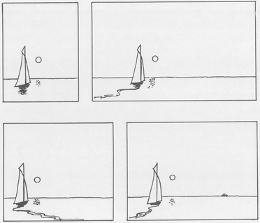
The very small object we spoke of may be an accent or line of attraction, or may be no more than a spiritual quality. A strong feeling of gloom, or light or dark, can be enough for the eye to dwell on. But if all of the subject is on one side of the middle and the other side depends for its existence on only a balancing space or accent, why not cut it off? Try! You will have the entire subject in one-half the former space, but its harmony or balance will depend on its equipoise when pivoted on a new central point.
Balance of the steelyard
Make this test on any painting: Cut away everything on one side in an attempt to place the main subject in the exact middle. See if the picture composes well in this shape. Then re-add to the side and see how the central point has shifted. Note whether the subject is close to the pivot point and whether it demands more balance now that the side is added back. If the main subject has weight enough, leave it alonethe over-scientific enthusiast might err here. The artist will often add a vertical figure to oppose a horizontal, or will catch and turn the line of a shadow on a wall into the line of the floor. The governing principle here is: Where the subject of a picture is on one side of the middle, it must be close to the pivot point. If it departs from the middle, it must show positive anchorage to the other side.
3. The principle of the steelyard, a small weight balancing a large weight, is seen in this composition. The tree acts as a fulcrum for the large mass at the left (which is also the subject) and the lighter weight of the hay and trees at the right, whose importance is for balance alone.
4. When you have completed a picture, try cutting off various parts of it to determine whether you have achieved a balanced composition. Here, the last drawing exhibits the balance necessary when a subject is on one side. The tiny steamer in the distance pulls the entire picture together. Note how the wake of the sailing yacht leads the eye into the picture and adds depth.
Not every good picture can show complete balance, but when the artist striving for balance achieves it, the picture is that much better. By applying the simple test of elimination of overweighted parts (adding items where needed), you will find whether or not the composition will improve. The small balancing weight of the steelyard should not become a point that causes divided interest.
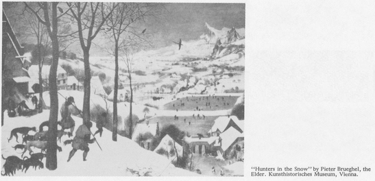
It is easy to recognize a good composition. To tell why it is good may be difficult. To tell how it could be made better is what the artist wants to know. When in doubt, weigh out your picture in balances, keeping in mind the principle of the steelyard to cover the items in the depth as well as across the breadth of your picture, as in Brueghels Hunters in the Snow.
5. The main group is just to the left of the middle, and is balanced by the small figure and the height and mass of the building. Place your hand over the right side of the picturethe effect is like a seesaw or teeter-totter when one person leaves it suddenly, causing the other to go crashing down.
6. The steelyard in depth as well as breadth. Balance in more than one dimension is vital to good composition.
Rules
Every picture is a collection of units or items.
Every unit has a given value.
The value of a unit depends on its attraction, and its attraction varies according to placement.
A unit near the edge has more attraction than the same unit at the middle.

