Kate McInnes - Rockstar Icon Designer
Here you can read online Kate McInnes - Rockstar Icon Designer full text of the book (entire story) in english for free. Download pdf and epub, get meaning, cover and reviews about this ebook. year: 2010, publisher: Rockable Press, genre: Home and family. Description of the work, (preface) as well as reviews are available. Best literature library LitArk.com created for fans of good reading and offers a wide selection of genres:
Romance novel
Science fiction
Adventure
Detective
Science
History
Home and family
Prose
Art
Politics
Computer
Non-fiction
Religion
Business
Children
Humor
Choose a favorite category and find really read worthwhile books. Enjoy immersion in the world of imagination, feel the emotions of the characters or learn something new for yourself, make an fascinating discovery.

- Book:Rockstar Icon Designer
- Author:
- Publisher:Rockable Press
- Genre:
- Year:2010
- Rating:5 / 5
- Favourites:Add to favourites
- Your mark:
Rockstar Icon Designer: summary, description and annotation
We offer to read an annotation, description, summary or preface (depends on what the author of the book "Rockstar Icon Designer" wrote himself). If you haven't found the necessary information about the book — write in the comments, we will try to find it.
Kate McInnes: author's other books
Who wrote Rockstar Icon Designer? Find out the surname, the name of the author of the book and a list of all author's works by series.


Rockstar Icon Designer — read online for free the complete book (whole text) full work
Below is the text of the book, divided by pages. System saving the place of the last page read, allows you to conveniently read the book "Rockstar Icon Designer" online for free, without having to search again every time where you left off. Put a bookmark, and you can go to the page where you finished reading at any time.
Font size:
Interval:
Bookmark:
With roots stretching as far back as the 1970's, the humble icon has come a long way. Evolving from black and white representations of office items into beautifully rendered illustrations of objects, symbols, characters and the same office items from the very beginning, icons have become a visual language that is understood the world over.
Where a picture will tell a thousand words, a computer icon informs, educates and reassures its audience. Because icons are used for such specific purposes, creating a successful icon design is more of a science than an art.
I came to icon design almost by accident. My first year out from University, I was hired to work in-house for a software company who needed an icons and UI illustrator. With two degrees in Multimedia and Communication Design and a portfolio of digital illustration, I stood out as a good candidate for the job.
I had never given icon design much thought beyond the occasional replacement set, but knowing that this was a rare opportunity, I decided to jump in the deep end (with both feet!). I took the offer and a week later I was up to my eyeballs in specifications, requests and a back catalogue of previous designs. I was spending most of my time in review meetings with the development team, product management and even marketing. I quickly learned that when asked, everyone has an opinion, right or wrong.
So here I was, stuck in the middle of the technical requirements of the development team and the aesthetic guides from marketing. To top it off, I was spending hours rendering images and all I had to show at the end of the day was a handful of pixels! It was really frustrating to move from print design and illustration to screen.
As time progressed, I settled into the role of icon lady and started to see the craft and beauty in small images. I also developed a system of project management that greatly improved my workflow (less meetings = more productivity).
During the course of this book, I will share my experiences in the field of icon design, look at rendering styles and ways to achieve them, and the many uses for icons today. This book won't teach you how to emulate others. It won't focus heavily on one OS over another; nor will it turn you into a master overnight. Instead it will help you create designs that will stand up to the test of time and help you better understand the constraints (and the joys) of pixel perfect rendering.
When I first started out in icon design I found that there was very little information to help guide me though the design process. Through a lengthy process of trial and error I came to understand icons.
Throughout the course of this book I will share tips and insights into the world of icon design, discuss various methods of rendering and output and guide you through the process of creating your own icon set.
First I will begin by discussing the history of icon design and highlighting the milestones in icon design that have shaped the way we use them today. Take a look at rendering styles and file conventions then move onto design specific theory before wrapping up with some demonstrations of the process used to create specific icon styles.
By studying the history of computer icons, we can further understand current aesthetics and predict styles that will be used in the future. This chapter will examine a collection of important milestones in computer icon history, each example representing an evolution in technology and design.
The Xerox Alto is the first computer to use a desktop metaphor and graphical user interface (GUI). Developed at the Palo Alto Research Center (PARC) in California, USA. The Alto used bit-mapped graphics, a mouse, menus, icons and was built as a research computer. Xerox only produced 2,000 Altos, but their popularity with various universities and research centers made the new GUI a benchmark for future computer systems. The Xerox Alto was such a significant development in desktop computing, it was a direct source of inspiration for the Apple Lisa (1983).
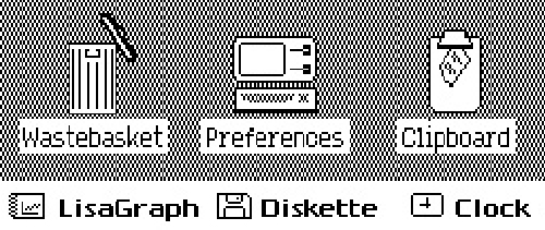
Incorporating design features from the Alto, the Xerox Star was developed with extensive user research and has icons based on traditional grid based design. Early proposals show icons with front and side perspective, but in the end simple yet elegant two dimensional icons were adopted. The Star's icons are 72 pixels wide to clearly render on the black and white 72ppi resolution monitor and align with the halftone-grey background.
The icons have various states that are indicated by levels of pixel shading and display an active state when clicked. The Xerox Star's design features specifically the considerations for user experience and visual feedback have stood-up to the test of time, and continue to be an excellent example of design and usability.
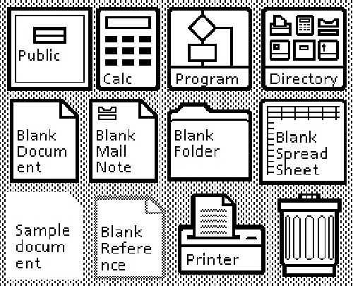
The Xerox Star has carefully designed icons that create smooth lines against the halftone background of the User Interface.
Development of the Apple Lisa started in 1978. At the time Steve Jobs (CEO of Apple) was on the Lisa development team. After a tour of the Xerox PARC facilities in 1979 Jobs was heavily influenced by what he had seen and quickly negotiated for the Lisa team to have two demonstrations of the Alto. After the demonstrations the Lisa development team was able to reconstruct the basic elements of a GUI and adapt its use for a commercial audience. Hoping to carve a niche in the personal computing market, Apple saw the value of the office metaphor as a means to make navigation easier for new users. Lisa was an advanced GUI for the time as it had movable "Desk Accessories" (early Widgets), drop-down menus and folder based directories. The Lisa icons are similar to the Xerox designs, but they lack the visual balance that was achieved at PARC.
Apple's first attempt at icon design, based on designs seen at Palo Alto Research Centre in 1979.
In 1982, Steve Jobs left the Lisa project and joined the Macintosh team. A year after Lisa was launched the Apple Macintosh 1.0 was released. The Macintosh 1.0 introduced drag and drop file copying, movable windows and specially rendered icons. The Macintosh icons were designed by Graphic Artist Susan Kare who is thought to be one of the masters of icon design.
Kare brought a sophistication to icons and digital fonts that hadn't been seen before. Paying special attention to metaphor, visual balance and usability, Kare designed some of today's most recognized icons. Most notable of these designs are the MacPaint interface, the Paint Bucket and the Smiling Mac. Kare's philosophy on icon design is simple, "I believe that good icons are more akin to road signs rather than illustrations, and ideally should present an idea in a clear, concise, and memorable way. I try to optimize for clarity and simplicity even as palette and resolution options have increased." This philosophy is at the core of Apple's early commercial success.

Classic Macintosh Icons Designed by Artist Susan Kare 1984.
Font size:
Interval:
Bookmark:
Similar books «Rockstar Icon Designer»
Look at similar books to Rockstar Icon Designer. We have selected literature similar in name and meaning in the hope of providing readers with more options to find new, interesting, not yet read works.
Discussion, reviews of the book Rockstar Icon Designer and just readers' own opinions. Leave your comments, write what you think about the work, its meaning or the main characters. Specify what exactly you liked and what you didn't like, and why you think so.