strokes of genius
THE BEST OF DRAWING | EXPLORING LINE edited by RACHEL RUBIN WOLF

 LONDON
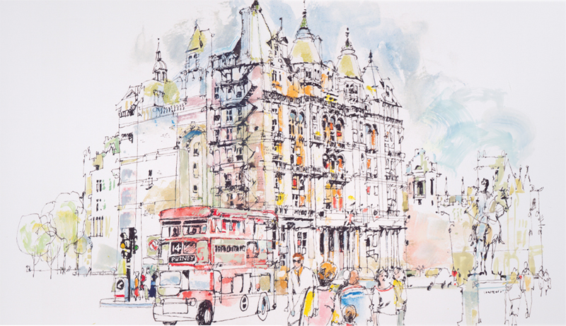
 | PAUL G. MELIA Rapidograph pen and watercolor on white print paper 11 15 (29cm 38cm) This drawing was done in my studio from a composite of some of the hundreds of photographs I took during two earlier trips to Europe. Im a sucker for old, interesting buildings and architecture, the stuff of which London is madea fascinating city. Everywhere you turn there is inspiration for a sketch, a drawing or a painting. You simply have to be there to see and experience it allthe gold-tipped Parliament buildings; the changing of the guard at Buckingham Palace; statues, royalty and antiquity everywheretheres nothing like it.
CONTENTS
Structural lines need no apology.
CONTENTS


Structural lines need no apology.
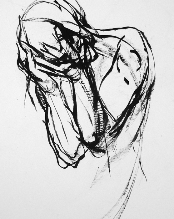
Show how you found your way, what you thought, and how you changed your mind as you shaped your artworkallow your viewer in. JOANNE BEAULE RUGGLES GRIEF | JOANNE BEAULE RUGGLES India ink on paper 20 15 (51cm 38cm)
INTRODUCTION
In this fourth volume of
Strokes of Genius: The Best of Drawing we explore line and our artists thoughts about line. When most people think about drawing, they think of line. The way one makes a line is as personal and identifiable as handwriting. Think of the lines of van Gogh, Rembrandt, Czanne and Albrecht Drer to name a few. (Who says visual artists arent writers?!) Line can be tentative or confident, sensuous or rugged, chaotic, orderly, soothing or violent. (Who says visual artists arent writers?!) Line can be tentative or confident, sensuous or rugged, chaotic, orderly, soothing or violent.
The choice of medium affects the quality of line, but not as much as the artists choice of how to hold and use the medium, and apply tone to the paper. Drawing, though technically two-dimensional, holds many other dimensions for the artists in this book. Julie L. Jilek compared drawing to sculpting a three-dimensional form. She says, I explore line much like a sculptor, working my way around the form boldly at first, then slowing down .... Joe L.
Mac Kechnie hears music in line. He says, Gestural lines are like the strings of an expensive violin. We respond to their exquisite music when it comes from the heart of the artist. For Joanne Beaule Ruggles drawing feels like a risky but exciting activity: It is risk that draws me in, so I choose to walk the tightrope with my ink and pens. For Bets Cole drawing communicates, perhaps tells a story. She says, Line is an artists adjective, adverb and noun.
Different types of lines tell the viewer different things. A loose line always conveys more information, says Charles Jos Biviano. Holly Siniscal thinks that stylized line creates texture. My favorite kinds of lines are the ones that whisper ... says Ellen Erenberg. I want to leave you with two exhortations from our artistsadvice I would do well to heed myself.
Our longtime friend Judi Betts, who has about as much fun with her art as anyone I know, chides us, Artists should doodle more and Google less! And finally Jerome C. Goettsch reminds us to: Be an observer and draw something every day. Good advice for any artist!  Rachel Rubin Wolf
PORTRAITS
 GALEN
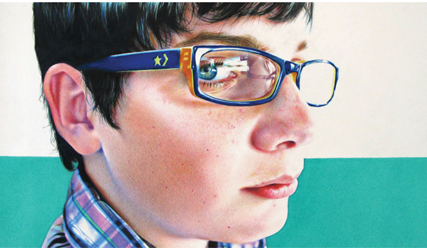
GALEN | TANJA GANT Colored pencil on smooth bristol board 12 24 (32cm 61cm) I work primarily from photographs that already have the right mood, lines and perspective defined. In
Galen, I used Prismacolor colored pencils working from light to dark, dividing the background into two unequal parts to add drama. After making a detailed sketch I applied color in short crosshatching strokes, all the while making sure I captured the right expression of the subject. Its all about the attitude!
 LADY IN WAITING
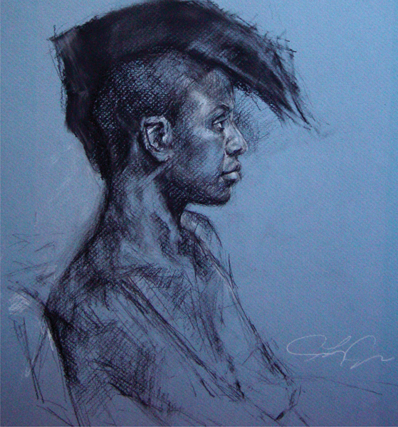
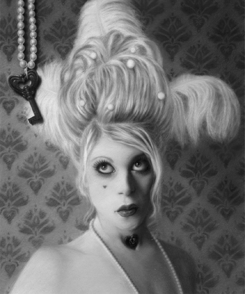
 | STAR GALLER Charcoal on paper 20 16 (51cm 41cm) I love self-portraits.
They record how I feel at different stages in my life. Dressing up is a part of my world; I collect costumes and my makeup collection takes up a whole cabinet. At the time I drew this, I felt like the key I needed to break out of my current situation was beyond my reach. 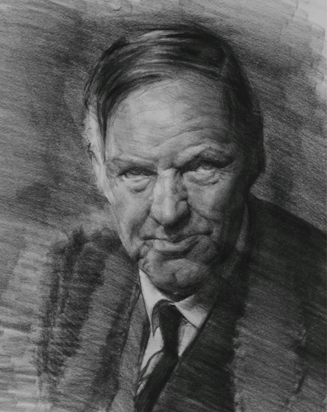 Unblended lines are infinitely flexible; they can craft forms, hit edges hard or show the eye where to go. KEVIN M. WUESTE THE INHERITOR | KEVIN M.
WUESTE Cont, carbon and charcoal pencil on smooth newsprint 24 18 (61cm 46cm) This is a work from several photo references of lawyer Clarence Darrow. It was a demo to show students how to construct a portrait from simple, abstract shapes. I used strong diagonals and clear contrasts to convey strength in my shapes, but used varying line qualities and varying pencil pressure to achieve subtle shifts of light and dark. Although the general color/tone of this paper is light oatmeal, carefully managing values enables the color of the shirt to appear like white material. 



 LONDON | PAUL G. MELIA Rapidograph pen and watercolor on white print paper 11 15 (29cm 38cm) This drawing was done in my studio from a composite of some of the hundreds of photographs I took during two earlier trips to Europe. Im a sucker for old, interesting buildings and architecture, the stuff of which London is madea fascinating city. Everywhere you turn there is inspiration for a sketch, a drawing or a painting. You simply have to be there to see and experience it allthe gold-tipped Parliament buildings; the changing of the guard at Buckingham Palace; statues, royalty and antiquity everywheretheres nothing like it.


 Structural lines need no apology.
  Rachel Rubin Wolf
 GALEN | TANJA GANT Colored pencil on smooth bristol board 12 24 (32cm 61cm) I work primarily from photographs that already have the right mood, lines and perspective defined. In Galen, I used Prismacolor colored pencils working from light to dark, dividing the background into two unequal parts to add drama. After making a detailed sketch I applied color in short crosshatching strokes, all the while making sure I captured the right expression of the subject. Its all about the attitude!
  LADY IN WAITING | STAR GALLER Charcoal on paper 20 16 (51cm 41cm) I love self-portraits.
  Unblended lines are infinitely flexible; they can craft forms, hit edges hard or show the eye where to go. KEVIN M. WUESTE THE INHERITOR | KEVIN M.