Thank you for purchasing this Artist Network eBook.
Sign up for our newsletter and receive special offers, access to free content, and information on the latest new releases and must-have art resources! Plus, receive a coupon code to use on your first purchase from NorthLightShop.com for signing up.
or visit us online to sign up at
http://artistsnetwork.com/ebook-promo

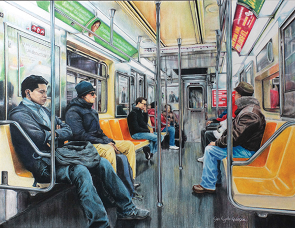
ON A DOWN TIME TRAIN. GINA RUGITO-ANDERSON
Colored pencil on vellum bristol paper / 14" 17" (36cm 43cm)
My fascination with linear perspective, light and color is matched only by my fascination with people. On my first visit to New York City, I snapped a photo on the subway while heading to Times Square. I was intrigued with each riders self-imposed isolation. It was an unexpected moment of tranquility below the hustle and bustle of the hectic city above downtime. The elements that I used to suggest depth and dimension include linear perspective, occlusion, size and scale, cast shadows, texture, color and more!
Space in three dimensions is easily implied by linear perspective using parallel lines, either visible or implied, converging in the distance at a vanishing point.
GINA RUGITO-ANDERSON

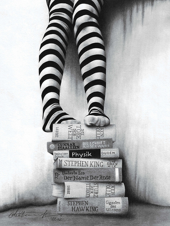
BOOK STORIES. MIKE KLIEMAND
Graphite on vellum bristol paper / 912" 7" (24cm 18m)
Books and pictures have something in commonthey are both paper based and both express our emotions, thoughts and longings. When we look at a picture or read a text, our imagination mingles with what is depicted and brings it to life in our thoughts and emotions. These perceptions create unconscious emotional depth. This topic is the focus of Book Stories, so I tried to keep the background as minimalist as possible. However, to render the objects clearly and convey a certain depth, I have deliberately exaggerated the shadows. I used pencils in a range of 5H to 8B exclusively for finer nuances and bristol vellum paper because of its finer structure.
Contents
Introduction
It is a pleasure to welcome you to Strokes of Genius 7: Depth, Dimension and Space. I was a bit surprised how much the artists in this book had to say about our theme. Everyone seemed to relate to itto the desire to create depth, dimension and space in their drawings. There is a lot of very good advice in the captions and quotes for artists seeking these components in their drawings or paintings.
Many shared their knowledge of how to create the illusion of three-dimensional depth and space on a two-dimensional surface. A common theme, not unexpected, is to understand and be intentional with how you treat value contrast and edges. But each artist shares his or her own unique angle. David Sandell reminds us of a basic principle: Areas of high contrast and sharper edges bring things forward; softer edges and diffuse values push objects back. Cecile Baird emphasizes the priority of light: Drawing lighthow it falls on and bounces off objectsand the shadows it forms, is what creates the impression of three-dimensional shapes in space. Elena E. Green brings out the importance of connecting the background to the subject in order to create spatial dimension in a drawing.
On the other hand, Lara Marshall agrees that tonal value is important for developing dimension but feels that good drawing is an even more important component for achieving depth than value: Value can add a great deal but only when it is built on top of a solid drawing. When each line of the drawing is in correct relationship with other lines across the form, depth can be felt even before value is added.
I found it quite interesting that a number of the contributors spoke about the parallels in art between physical (spatial) depth and emotional depth. Artist ARINA speaks of the limitations of the small flat surface plane, then adds, But once I start, a miracle occurs and all the limitations have gone; there is neither a flat nor a limited surface anymore! A new reality begins with its own three-dimensional world of feelings, movement and drama. David Hardy speaks of capturing the life force and personal feelings" that are uniquely expressed by his model, though he employs a classical atelier technique that includes modeling the form with great sensitivity in order to create lifelike dimensionality.
The theme of depth, interpreted as emotional depth, prompted a number of artworks with very real and deeply felt stories behind them. Simone Tocco reveals that a painful situation motivated her to find her emotional resilience in her art. The story behind this unusual titleDont Contact Me Againis pretty simple: It was the very last text message I got from my ex. I turned that awful text into the title of one of my best artworks. That story leads neatly to Steven A. Wildas memorable words of wisdom: If your subject doesnt intensely move you, move on.
We certainly hope that this latest edition of Strokes of Genius will move you to create some of your best drawings to date, more art filled with depth and dimension.

Rachel Rubin Wolf
1 Portrait Gallery

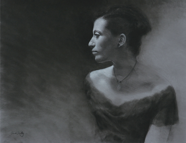
COURTNEY. DAVID SCULLY
Charcoal and pastel on paper / 20" 25" (51cm 64cm)
For this piece the design of positive and negative space was most important. I wanted to push the composition and use a large amount of dark valued space to one side to convey a weighted feeling of emptiness and depth. To help with balance, the background behind the subject was lighter in value. This created alternating dark and light values, but the highest contrast was kept at the focus of the piece.

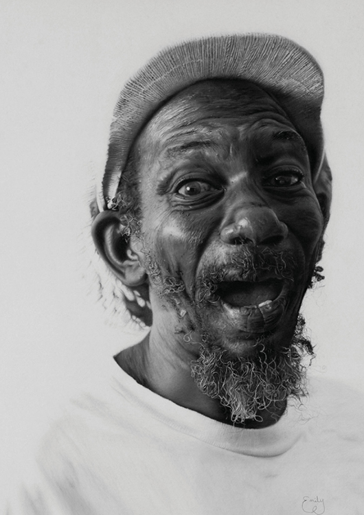
MADUKY. EMILY GARLICK
Charcoal and white pastel on paper / 24" 18" (61cm 46cm)
A man full of laughter, Maduky changes the dimension of a room when he walks in. I wanted to capture the moment in which his soul alters my emotions. My hope is that when viewers look into his eyes, they will feel the same. I want the drawing to make the world smile. Working from my photo, I used charcoal and white pastel to display his positivity, motivation and hard work, traits I desire to emulate. Keys that will enhance your drawing or painting skill include choosing a work environment that helps clear your mind and surrounding yourself with people who will motivate and encourage you in art and life.

