CONTENTS
Page List
Guide

THE
NEW WEB TYPOGRAPHY
CREATE A VISUAL HIERARCHY WITH RESPONSIVE WEB DESIGN
THE
NEW WEB TYPOGRAPHY
CREATE A VISUAL HIERARCHY WITH RESPONSIVE WEB DESIGN
STEPHEN BOSS
JASON CRANFORD TEAGUE

CRC Press
Taylor & Francis Group
6000 Broken Sound Parkway NW, Suite 300
Boca Raton, FL 33487-2742
2017 by Taylor & Francis Group, LLC
CRC Press is an imprint of Taylor & Francis Group, an Informa business
No claim to original U.S. Government works
Printed on acid-free paper
Version Date: 20160519
International Standard Book Number-13: 978-1-138-78139-9 (Paperback)
This book contains information obtained from authentic and highly regarded sources. Reasonable efforts have been made to publish reliable data and information, but the author and publisher cannot assume responsibility for the validity of all materials or the consequences of their use. The authors and publishers have attempted to trace the copyright holders of all material reproduced in this publication and apologize to copyright holders if permission to publish in this form has not been obtained. If any copyright material has not been acknowledged please write and let us know so we may rectify in any future reprint.
Except as permitted under U.S. Copyright Law, no part of this book may be reprinted, reproduced, transmitted, or utilized in any form by any electronic, mechanical, or other means, now known or hereafter invented, including photocopying, microfilming, and recording, or in any information storage or retrieval system, without written permission from the publishers.
For permission to photocopy or use material electronically from this work, please access www.copyright.com (http://www.copyright.com/) or contact the Copyright Clearance Center, Inc. (CCC), 222 Rosewood Drive, Danvers, MA 01923, 978-750-8400. CCC is a not-for-profit organization that provides licenses and registration for a variety of users. For organizations that have been granted a photocopy license by the CCC, a separate system of payment has been arranged.
Trademark Notice: Product or corporate names may be trademarks or registered trademarks, and are used only for identification and explanation without intent to infringe.
Visit the Taylor & Francis Web site at
http://www.taylorandfrancis.com
and the CRC Press Web site at
http://www.crcpress.com
TABLE OF CONTENTS

When it is a good design, the reader has to feel comfortable because the letter is both banal and beautiful.
Adrian Frutiger
You are a typographer. If you type anything on a computer, you have committed an act of typography. You have set letterforms that will aid in the communication of a written message. You may not get ink on your thumbs, or have to stress out about kerning, leading, and tracking, but you have set type. Everyone is a typographer now, but how good is up to you.
Typography is the practice of arranging type within a design. This includes not only the selection of a typeface, but also the size, spacing, color, and styles of type. Typography also deals with the design of type on the page and its interaction with other elements such as photos, illustrations, and interface. The treatment of the text can be every bit as important to the message as the actual words themselves.

WHAT IS GOOD TYPOGRAPHY?
DO NOT DESIGN BY DEFAULT
Typography is the architecture that supports all visual communications, from print to wayfinding, and, of course, the Web. Designers create type systems to build a visual hierarchy, to create the order and flow needed to guide users through their experience. These elements can include headlines, body copy, subheads, navigation, sidebars and more. You should always develop your own design voice, rather than using prebuilt templates.

GIVE YOUR TEXT A VOICE
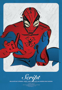
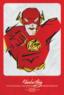
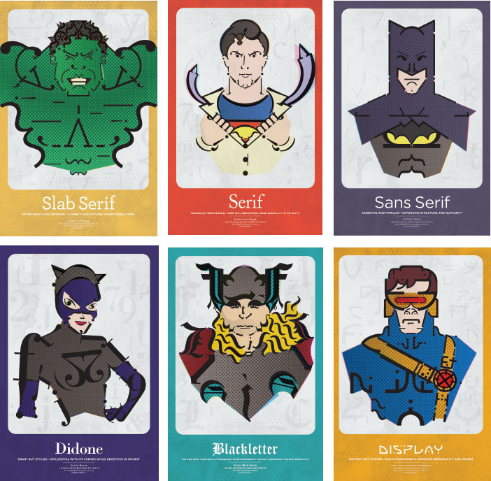
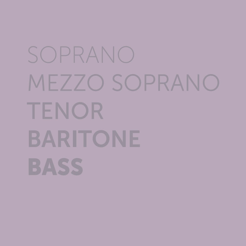
Developing your sites typographical voice will be similar to casting a chorus: youll want tenors, bass, sopranos, and baritones. Each of these has a unique timbre and all blend together to make wonderful music. Your type selections achieve the same goal. The weight and style of your headlines can make them rich and attention grabbing, while a simple geometric typeface for your body copy can be quite subtle. Use the cards on this page to visualize what voice a typeface can bring to your design.


Never mistake legibility for communication
David Carson
Font selection is more than a cosmetic choice, it is a push and pull of harmonies and tensions that create a robust page, one that pulls the reader into your narrative. Similar to how a wine buff looks for depth of flavor, a reader wants to have their taste buds tickled. This can be achieved in many ways. A minimalist style, one that follows the KISS theory (Keep it Simple, Stupid) is safe; a classical look is dignified; a contemporary font can be dynamic.
The project will more than likely help you decide which direction to take, and the overall tone of graphics should suit the subject. Please consider the following tips on creating your font palette to ensure quick download times and overall aesthetics.

When you only had 10 fonts, choosing one from the list was easy. Now that you have dozens of Web-safe fonts, and can link to any font that is licensed for Web downloading, your horizons are much broader. This new power, though, comes with the responsibility of having to be thoughtful in your choices. The exact type you choose should depend on several factors.
ESTABLISH A TYPOGRAPHIC VOICE
Choose your typeface to reflect the mood and demeanor of the message your Web site is meant to reflect. If the site is meant to be upbeat and happy, choose fonts with a playful look to them. If the site is meant to be professional and serious, choose clean simple fonts.
I once worked with a writer who published a daily advice column. She insisted, despite my protests, to publish her column in Comic-sans, a font that is generally ridiculed by typographers. However, I quickly realized that this font spoke to her audience in a relaxed informal tone that no other available font could have achieved. She was actually using the available typeface to better communicate her message.


