Jason Santa Maria - On Web Typography
Here you can read online Jason Santa Maria - On Web Typography full text of the book (entire story) in english for free. Download pdf and epub, get meaning, cover and reviews about this ebook. year: 2014, publisher: A Book Apart, genre: Home and family. Description of the work, (preface) as well as reviews are available. Best literature library LitArk.com created for fans of good reading and offers a wide selection of genres:
Romance novel
Science fiction
Adventure
Detective
Science
History
Home and family
Prose
Art
Politics
Computer
Non-fiction
Religion
Business
Children
Humor
Choose a favorite category and find really read worthwhile books. Enjoy immersion in the world of imagination, feel the emotions of the characters or learn something new for yourself, make an fascinating discovery.

- Book:On Web Typography
- Author:
- Publisher:A Book Apart
- Genre:
- Year:2014
- Rating:5 / 5
- Favourites:Add to favourites
- Your mark:
On Web Typography: summary, description and annotation
We offer to read an annotation, description, summary or preface (depends on what the author of the book "On Web Typography" wrote himself). If you haven't found the necessary information about the book — write in the comments, we will try to find it.
Jason Santa Maria: author's other books
Who wrote On Web Typography? Find out the surname, the name of the author of the book and a list of all author's works by series.


On Web Typography — read online for free the complete book (whole text) full work
Below is the text of the book, divided by pages. System saving the place of the last page read, allows you to conveniently read the book "On Web Typography" online for free, without having to search again every time where you left off. Put a bookmark, and you can go to the page where you finished reading at any time.
Font size:
Interval:
Bookmark:
CHAPTER 1
How We Read
CHAPTER 2
How Type Works
CHAPTER 3
Evaluating Typefaces
CHAPTER 4
Choosing and Pairing Typefaces
CHAPTER 5
Typographic Systems
CHAPTER 6
Composition

HTML5 for Web Designers
Jeremy Keith
CSS3 for Web Designers
Dan Cederholm
The Elements of Content Strategy
Erin Kissane
Responsive Web Design
Ethan Marcotte
Designing for Emotion
Aarron Walter
Mobile First
Luke Wroblewski
Design Is a Job
Mike Monteiro
Content Strategy for Mobile
Karen McGrane
Just Enough Research
Erika Hall
Sass for Web Designers
Dan Cederholm
Youre My Favorite Client
Mike Monteiro
Responsible Responsive Design
Scott Jehl
Copyright 2014 Jason Santa Maria
All rights reserved
Publisher: Jeffrey Zeldman
Designer: Jason Santa Maria
Editor-in-Chief: Mandy Brown
Editor: Tina Lee
Technical Editor: Nick Sherman
Copyeditor: Nicole Fenton
Proofreader: Caren Litherland
Compositor: Rob Weychert
Ebook Production: India Amos
ISBN: 978-1-9375570-7-2
A Book Apart
New York, New York
http://abookapart.com
10 9 8 7 6 5 4 3 2 1
BEFORE USERS start reading a single word of text on a website, they are already judging the typography. More than any other design element, type sends instant messages about a sites content and purpose. Is this digital environment designed for reading, shopping, or gaming? Is it meant for experiencing over time or cruising by in a minute or two? Is its primary function to lead you through a process (subscribing to a service or answering a survey), or does it aim to submerge you in content (reading an article, watching a video, or choosing a stock photo)? Typographyits size, style, and systemhelps tell people what all this content is actually for.
The quality and tone of a websites typography also sends instant messages about the people who made the site. Good type makes you look good. Bad type makes you look bad. Good type inspires confidence and trust; bad type triggers disdain and disgust. Weve all landed on a website that we immediately know is a dumping ground for stolen content and crappy ads. Without even reading that come-on for pimple cream or the latest work-at-home scheme, were already hitting the back button in search of a more savory place to invest our time.
Jason Santa Marias approachable guide to web typography narrates the thought process behind working with type, from choosing fonts to crafting hierarchies to building grids. Rather than handing down a list of rules and prohibitions, Santa Maria walks side by side with readers through a creative journey. He invites us to think about our own reading experience right nowas we peruse this bookby providing clear and compelling examples for visual comparison. We the readers get to judge and evaluate different styles, combinations, and configurations of type, applied to real text that we can picture in the real world.
Designing for the web should always consider the needs of the user. This book considers the needs of you: the reader of these pages. Whether you are a developer or a designer, a student or a professional, a veteran of the web or a secret lover of print, you will find inspiration and guidance in this wise and kindly book, written by one of the webs most respected typographic minds.
Ellen Lupton
IN THE 1977 documentary film Powers of Ten, designers Charles and Ray Eames investigate what makes up the structure of our world and the universe, from the smallest particles to the most vast collections of matter (http://bkaprt.com/owt/1/). The film starts by focusing overhead on a couple having a picnic on a one-square-meter blanket ( FIG 1 ). From there, we zoom out at one power of ten (see?) every ten seconds, all the way out to 10100 million light years from Earth. Then we retrace our path to the picnicking couple and delve through the powers of ten on a microscopic scale, down to 10 where quarks operate. The film shows how big things are made up of smaller things, and how the relationships of those smaller things are integral to forming the bigger ones. Even when we cant perceive them all at the same time.
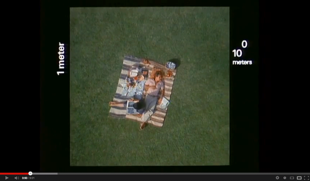 FIG 1: The documentary short Powers of Ten by Charles and Ray Eames, 1977.
 When I first saw the film, I had an immediate revelation. It put to words and pictures things I had never verbalized. The way everything is connected, whether implicitly or explicitly, is the same way I approach typographic design.
I often work by zooming in and out between the general and the specific, orchestrating the tone and message of a design. Type is designs smallest atomic unitthe framework for everything we try to communicate with our boxes, grids, CSS properties, and the other elements that go into making a website.
Whether you move from largest to smallest or smallest to largest, these elements are spun from one another. The width of a grid column influences the line length of a paragraph. A typefaces contrast influences how small you can set that typeface so its still legible on your phone. The tools we use and the choices we make affect a design up and down the supply chain.
Its this reflexive relationship that holds a design togetherthe design equivalent of gravitational force. Okay, maybe not that far, but typography is the craft of setting type to give language a visual form. Typography is a designs voice.
This idea informs the way I like to work and helps me take a relaxed and practical approach to typography. I dont mean I haphazardly throw letters around on a page, but I do believe that developing a feel for typography trumps an encyclopedic knowledge of its history.
Are you with me? Good!
Get ready, because I want to show you how to see type beyond a pretty set of letters with flourishes. To see in and around a typeface. To know how it speaks.
I want to show you how to get to know the myriad typefaces out there, evaluate them for different purposes, and understand how your choices affect the ways we read content and interpret design.
I want to show you ways to improve your typographic design right now. While typography is a centuries-old visual language, we need to see where it works and reinterpret where it falls short for the medium of the interactive screen, where to embrace old design methodologies, and where to diverge to create new ones.
I want to show you that even though this stuff can be difficult to wrap your head around, what you get back is well worth it. Being good at typography makes you a more adept thinker, communicator, and designer. When you immerse yourself in the fine details of text, you not only make yourself aware of those details and how they affect communication, but you also put yourself in your readers shoes.
Typography is a craft that rewards ongoing practice. This book will help you understand how the language of typography adapts when applied to the web and how to choose good typefaces to support your designs.
And while this book is about typography for the web, it overlaps with a lot of good typographic methods that transcend any medium. We can distill good practices from the past, before type existed on glowing panels in front of our faces, and learn about specific considerations for the screen.
Font size:
Interval:
Bookmark:
Similar books «On Web Typography»
Look at similar books to On Web Typography. We have selected literature similar in name and meaning in the hope of providing readers with more options to find new, interesting, not yet read works.
Discussion, reviews of the book On Web Typography and just readers' own opinions. Leave your comments, write what you think about the work, its meaning or the main characters. Specify what exactly you liked and what you didn't like, and why you think so.