Type Directors Club - Typography 34
Here you can read online Type Directors Club - Typography 34 full text of the book (entire story) in english for free. Download pdf and epub, get meaning, cover and reviews about this ebook. year: 2014, publisher: Harper Design, genre: Romance novel. Description of the work, (preface) as well as reviews are available. Best literature library LitArk.com created for fans of good reading and offers a wide selection of genres:
Romance novel
Science fiction
Adventure
Detective
Science
History
Home and family
Prose
Art
Politics
Computer
Non-fiction
Religion
Business
Children
Humor
Choose a favorite category and find really read worthwhile books. Enjoy immersion in the world of imagination, feel the emotions of the characters or learn something new for yourself, make an fascinating discovery.

- Book:Typography 34
- Author:
- Publisher:Harper Design
- Genre:
- Year:2014
- Rating:5 / 5
- Favourites:Add to favourites
- Your mark:
Typography 34: summary, description and annotation
We offer to read an annotation, description, summary or preface (depends on what the author of the book "Typography 34" wrote himself). If you haven't found the necessary information about the book — write in the comments, we will try to find it.
For over fifty years, the Type Directors Club has encouraged the worldwide graphic arts community to achieve excellence in typography through its annual international competitions. Typography 34 is the only annual devoted exclusively to typography and presents the finest work in the field for the year 2012. Selected from approximately 2300 international submissions to the annual Type Directors Club competition, the winning designs are models of excellence and innovation in the use of type design, representing a wide range of categories including books, magazines, corporate identities, logos, stationery, annual reports, video and web graphics, and posters. Typography 34 is designed by Chip Kidd.
Type Directors Club: author's other books
Who wrote Typography 34? Find out the surname, the name of the author of the book and a list of all author's works by series.


Typography 34 — read online for free the complete book (whole text) full work
Below is the text of the book, divided by pages. System saving the place of the last page read, allows you to conveniently read the book "Typography 34" online for free, without having to search again every time where you left off. Put a bookmark, and you can go to the page where you finished reading at any time.
Font size:
Interval:
Bookmark:
 CONTENTS
 TDC59 COMMUNICATION DESIGN CHAIRMANS STATEMENT
BY SEAN KING Those of us who love letters discover beautiful and innovative typography in the pages of every TDC annual. Each year, designers and typographers enter their best work in the TDC competitions and cross their fingers, hoping their work is good enough to make it into this book. I have lost count of how many designers have told me the same story: the day they saw their first TDC annual, and the treasure of type and lettering between its covers. (People usually get a faraway look in their eyes and wear a wistful smile when they tell this story.) It is a tradition that reaches back to the very beginning of the Type Directors Club. The twin traditions of the TDC have always been competition and education. Both ideals are contained in this book: We elevate the art and craft of typography by celebrating the best each year.
I discovered typography through the TDC annuals. I found a few in my high school library and realized there was a name for design with letters. I realized some other people must be as fascinated with letters as I was, because there was a whole book of it, published every year. The TDC and an earlier iteration of this book helped to steer my career. You can imagine my delight when I was invited to chair TDC59. It is an honor and a privilege, and I am proud to bring you the fruit of so many peoples labors in the pages of Typography 34.
Allow me to thank a few of the people who labored to make this happen. Chip Kidd created a unique, provocative, and very funny design style for this years competition and book. Who knew the clubs influence ran so deep? (Cue maniacal laughter.) Our jury is a varied group of women and men with expertise in branding, packaging, publishing, type design, editorial design, lettering, filmmaking, dimensional typography, and design education. As varied as their talents are, all the jurors have two things in common. They are all passionate about type, and they are not shy with their opinions. (Three things, actually: They are all a pleasure to work with.
Thanks, guys!) Of course, the secret ingredient that makes the competition and annual happen every year is Carol Wahler. Her energy and organizational skills are simply amazing, and her hard work has brought this annual into existence. The real stars of the show are the talented designers whose work was chosen to appear here. It was a wide field with tough competition this year; only the very best entries won. This book showcases incredible innovation alongside classical beauty, sumptuous print design alongside digital interaction, established professionals alongside promising students. Enjoy. Enjoy.
New for this year, TDC members are identified in the credits with a*. 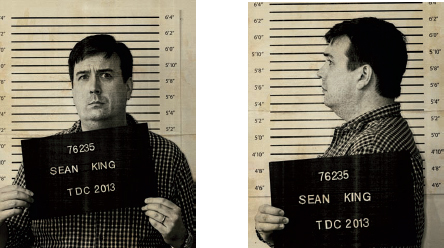 SEAN KING seankingdesign.com @seankingdesign Sean King is a graphic designer, typographer, type designer, design educator, and author. He has worked in print shops, ad agencies, and branding firms. He is a graduate of the Type@Cooper condensed program. The common thread running through all his work is a love of letters, in all their varied forms. He lives and works in New York City and draws inspiration from NYCs rich cultural mix.
He is writing a book on typographic best practices, to be published in fall 2014. Sean has served on the board of the TDC for the past four years. 
 TDC59
TDC59
COMMUNICATION
DESIGN
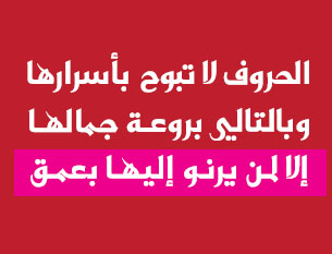
JUDGES 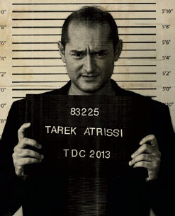 TAREK ATRISSI atrissi.com @atrissi Beirut-born Tarek Atrissi is one of the most recognized designers in the Arab world. He runs the Netherlands-based multi-disciplinary design studio Tarek Atrissi Design, which specializes in Arabic typography and design (www.atrissi.com). His typographic and cross-cultural design approach produced projects that left a significant influence on the contemporary graphic design landscape in the Middle East. Atrissi holds an MFA in design from the School of Visual Arts in New York, a master of arts degree in interactive multimedia from the Utrecht School of the Arts in Holland, and a postgraduate degree in typeface design from the Type@Cooper program of The Cooper Union, New York.
His awards include the Adobe Design Achievement Awards, TDC, and the Dutch Design Award, among others. Tareks clients have included the V&A museum in London, the BBC, the Arab Thoughts Foundation, Este Lauder, and the government of Qatar. He designed custom Arabic typefaces for major brands in the Middle East, including Mathaf, the Arab Museum of Modern Arts in Qatar; Saudi Arabias telecommunications company (STC); and Al-Ghad newspaper in Jordan. His non-custom Arabic fonts are distributed through the Arabic typography portal: www.arabictypography.com. He lectures internationally about Arabic visual culture and teaches at the department of Art, Media, and Technology at the Utrecht School of the Arts in Holland. He has served as a jury member for international design competitions, including the Magdalena Festival in Slovenia and the Adobe Design Achievement Awards.
Atrissi holds dual Lebanese and Dutch citizenships. When he is not on Instagram, he is walking across the streets of different cities in the Arab world documenting their urban typographic landscapes. 
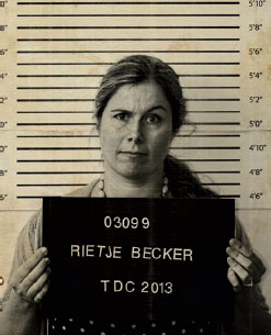 RIETJE BECKER rietjedesign.com @rietjedesign Rietje Becker is a designer, design director, and type enthusiast based in New York City. She specializes in corporate identity and packaging design, and has completed successful design programs for a wide range of internationally known brands and clients, including the 9/11 Memorial, Jane Goodall, Leviton, Ernst & Young, Entenmanns, Kraft, Royal Ahold supermarkets, Johnson & Johnson, Schering-Plough, and Sharp USA. Becker has worked at several branding agencies, including Sterling Brands, Landor Associates, and Interbrand. Originally from the Netherlands, she provides a global perspective to her clients.
Font size:
Interval:
Bookmark:
Similar books «Typography 34»
Look at similar books to Typography 34. We have selected literature similar in name and meaning in the hope of providing readers with more options to find new, interesting, not yet read works.
Discussion, reviews of the book Typography 34 and just readers' own opinions. Leave your comments, write what you think about the work, its meaning or the main characters. Specify what exactly you liked and what you didn't like, and why you think so.