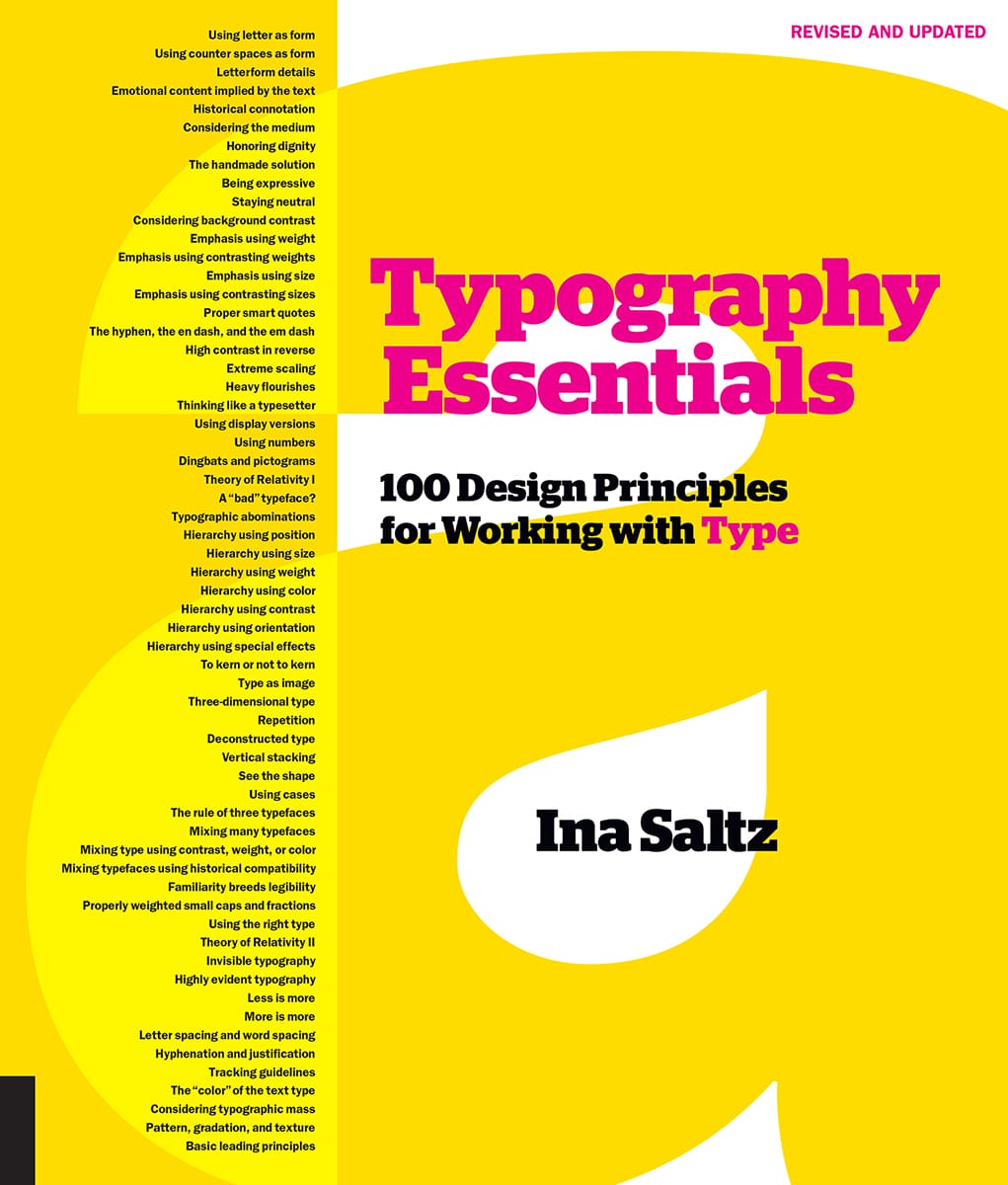
Saltz - Typography essentials 100 design principles for working with type
Here you can read online Saltz - Typography essentials 100 design principles for working with type full text of the book (entire story) in english for free. Download pdf and epub, get meaning, cover and reviews about this ebook. City: Beverly;Mass, year: 2009;2019, publisher: Rockport Publishers, genre: Romance novel. Description of the work, (preface) as well as reviews are available. Best literature library LitArk.com created for fans of good reading and offers a wide selection of genres:
Romance novel
Science fiction
Adventure
Detective
Science
History
Home and family
Prose
Art
Politics
Computer
Non-fiction
Religion
Business
Children
Humor
Choose a favorite category and find really read worthwhile books. Enjoy immersion in the world of imagination, feel the emotions of the characters or learn something new for yourself, make an fascinating discovery.

- Book:Typography essentials 100 design principles for working with type
- Author:
- Publisher:Rockport Publishers
- Genre:
- Year:2009;2019
- City:Beverly;Mass
- Rating:4 / 5
- Favourites:Add to favourites
- Your mark:
Typography essentials 100 design principles for working with type: summary, description and annotation
We offer to read an annotation, description, summary or preface (depends on what the author of the book "Typography essentials 100 design principles for working with type" wrote himself). If you haven't found the necessary information about the book — write in the comments, we will try to find it.
Saltz: author's other books
Who wrote Typography essentials 100 design principles for working with type? Find out the surname, the name of the author of the book and a list of all author's works by series.


Typography essentials 100 design principles for working with type — read online for free the complete book (whole text) full work
Below is the text of the book, divided by pages. System saving the place of the last page read, allows you to conveniently read the book "Typography essentials 100 design principles for working with type" online for free, without having to search again every time where you left off. Put a bookmark, and you can go to the page where you finished reading at any time.
Font size:
Interval:
Bookmark:
 One of the principles of durable typography is always legibility; another is something more than legibility: some earned or unearned interest that gives its living energy to the page. It takes various forms and goes by various names, including serenity, liveliness, laughter, grace and joy. Robert Bringhurst, The Elements of Typographic Style
The mission of Typpography Essentials is to distill, organize, and compartmentalizebut not to oversimplifythe many complex issues surrounding the successful and effective use of typography. It is for designers of every medium in which type plays a role. A deep understanding of letterforms and knowledge of the effective use of letterforms develops over a lifetime of design practice and study. Typography Essentials is intended to advance the progress of designers seeking to deepen their typographic expertise; it is organized and designed to make the process enjoyable and entertaining, as well as instructional. The typographic principles are divided into four sections: The Letter, The Word, The Paragraph, and The Page. Each of the 100 principles has a spread with an explanation and examples representing the principle in action.
You will notice that, in some cases, the principles will contradict one another. Contradiction is inherently necessary because many excellent typographic designs flout the basic rules of any Type 1 class. This is why it is so important to know the rules in the first place. As my calligraphy teacher, Donald Jackson, so eloquently observed: All rules may be broken in divinely successful ways. This sentiment has been expressed in many forms by prominent designers, yet it leads beginners to think that there really are no hard-and-fast rules. Nothing could be further from the truth.
In fact, there are myriad rules that govern the use of type. As design schools and design students chafe under the yoke of teaching and learning those rules, type can be one of the most disliked (indeed, feared) components of design. And yet, it is the most crucial aspect of almost all design-related projects. I believe that those who possess finely honed typographic skills have an enormous advantage in the workplace, whether they are newly graduated designers or mid-career professionals. Typographic skills are eminently transferable across all media, but few designers have a true grounding in typographic essentials. Those who do, immediately stand out.
The number of available typefaces keeps expanding exponentially, but the essential principles of good typographic design remain largely unchanged. Whether in print, on computer screens, interactive interfaces, tablets, or mobile devices, designers must still respond to the same human factors that have always governed sound typographic choices. In fact, as baby boomers age and their eyesight degrades, and as smaller devices demand greater legibility under multiple viewing conditions, the challenges that must be considered have never been greater for designers. Just as some principles may be contradictory, there is, inevitably, some overlap among the four sections of typographic principles in Typography Essentials. And, while there is no single volume that can convey the vast body of information about typography, I hope this book will play a significant role in continuing typographic education with clarity and easy comprehension for designers at all levels. _______________________________________ In Becoming a Graphic and Digital Designer, by Steven Heller and Teresa Fernandez (Fifth Edition, Wiley, 2015), most prominent designers list excellent typographic skills or superior typographic skills as among the most important characteristics of job seekers.
Also, an independent review of hundreds of job descriptions for designers lists excellent typographic skills as a major job requirement. Project Background Panels Design Director Donald Partyka Designer Donald Partyka Client LinkedInLearning
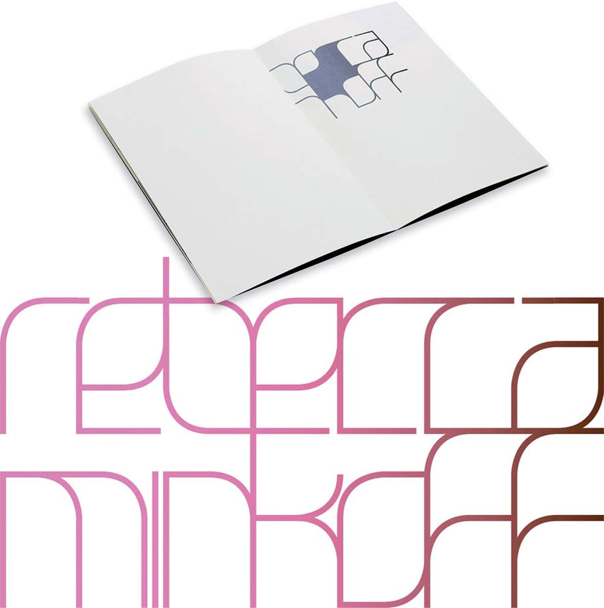
Its inherent integration unifies the design of the whole piece. Project Rebecca Minkoff Couture Identity Concept Design Studio Remake Art Director, Designer Michael Dyer Client Rebecca Minkoff This custom-lettered logo forms a discrete shape, but within its boundaries, each letter is delicate and leaf-like. The delicacy is further underscored by the pastel color gradation. The logo also appears with some of its counter spaces filled with a similar hue.
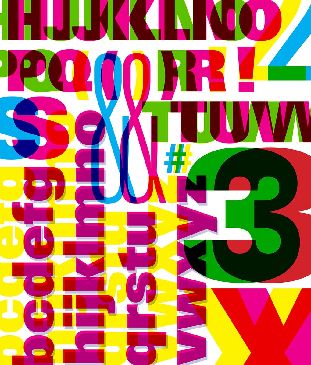
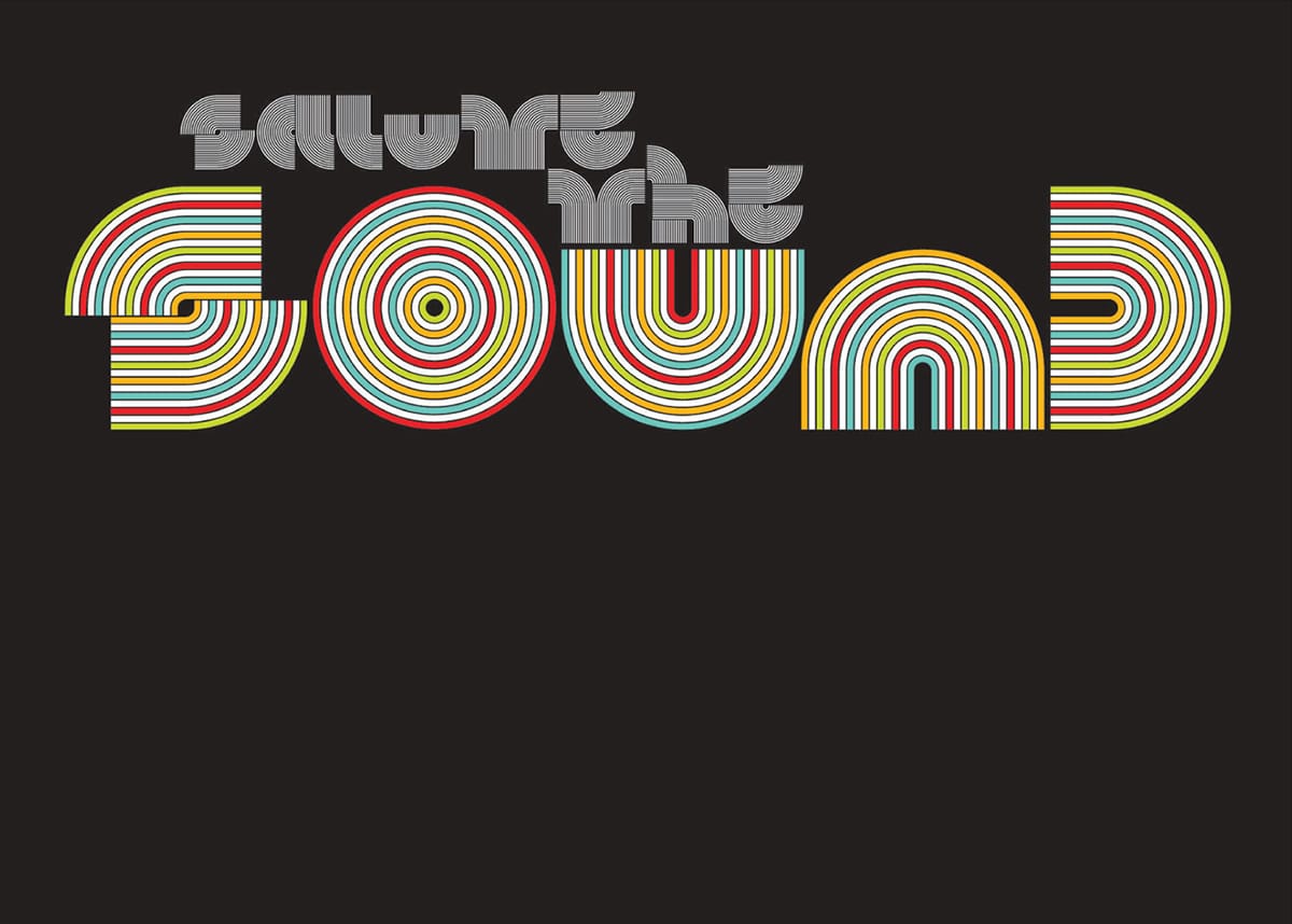
It is amazing that we can actually read this phrase, given how spare the forms are. The letterforms suggest the vinyl ridges of an album or LP.
Font size:
Interval:
Bookmark:
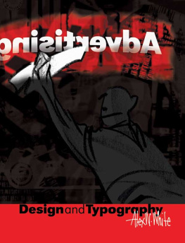
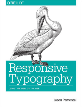
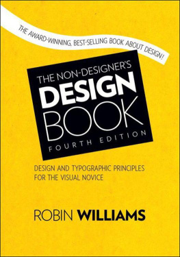
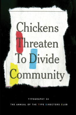
Similar books «Typography essentials 100 design principles for working with type»
Look at similar books to Typography essentials 100 design principles for working with type. We have selected literature similar in name and meaning in the hope of providing readers with more options to find new, interesting, not yet read works.
Discussion, reviews of the book Typography essentials 100 design principles for working with type and just readers' own opinions. Leave your comments, write what you think about the work, its meaning or the main characters. Specify what exactly you liked and what you didn't like, and why you think so.