REVISED AND UPDATED
LAYOUT
ESSENTIALS
100 Design Principles for
using grids
BETH TONDREAU

Just as in nature, systems of order govern the growth and structure of animate and inanimate matter, so human activity itself has, since the earliest times, been distinguished by the quest for order.
JOSEF MULLER-BROCKMANN
A grid is truly successful only if, after all of the literal problems have been solved, the designer rises above the uniformity implied by its structure and uses it to create a dynamic visual narrative of parts that will sustain interest page after page.
TIMOTHY SAMARAMaking and Breaking the Grid
INTRODUCTION
Grids are the most misunderstood and misused element in page layout. A grid is only useful if it is derived from the material it is intended to handle.
DEREK BIRDSALLNotes on Book Design
A grid system organizes space and supports a range of material for many kinds of communication; it ordains and maintains order, oftentimes without being obvious. A grid is a plan and not a prison.
Although grids have been used for centuries, many graphic designers associate grids with the Swiss, whose rage for order in the 1940s led to a systematic way of visualizing pretty much everything. Towards the end of the last century, grids were considered monotonous and boring, but currently, with so much data and imagery moving swiftly along multiple platforms, grids are again viewed as essential tools, relied upon by both newbies and seasoned practitioners alike.
This book is a primer, a short take on how grids can be used. Each of the 100 principles offers a nugget that is helpful in building a layout or communciation systemand each contains images of projects in a range of media by designers or design firms throughout the world.
No single principle works on its own. Often, projects or systems incorporate multiple precepts. So, this update lists how some principles cross refer to different portions of the same project or to a completely different project. One case shows components of communication system in more than one principle. This edition contains more examples of design's applications to print, desktop, tablet, device, or all of the above.
The strength of this book stems from the work of talented and generous designers whose work is inspiring, solid, delightful, controlled, and augment the topic. I hope the examples in Layout Essentials will instruct, intrigue, and excite, while guiding you to recall the most essential precept of communication: Ensure that your work reflects and enhances what you or the author want to communicate.
GETTING STARTED
ELEMENTS OF A GRID
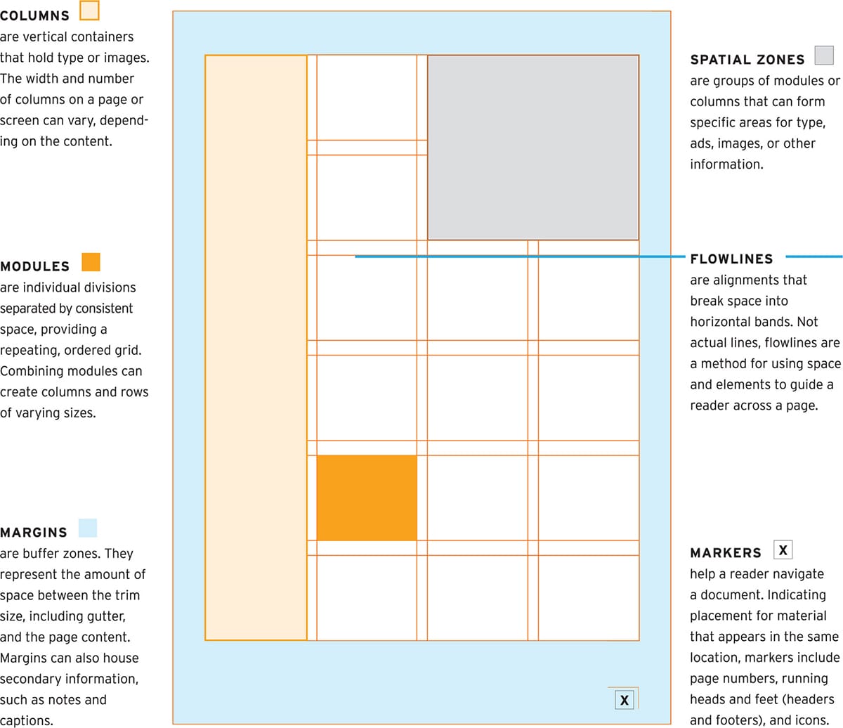
1. Know the Components
T he main components of a grid are margins, columns, markers, flowlines, spatial zones, and modules. Starting a new project can be hard. Begin with your content, then set up your margins and columns. You'll need to make adjustments. Just start.
BASIC GRID DIAGRAMS
2. Learn the Basic Structures
A lthough the diagrams below show common structures, there are additional variations on the basic configurations. The multicolumn grids of newspapers and their sites extend beyond three columns to five or more.
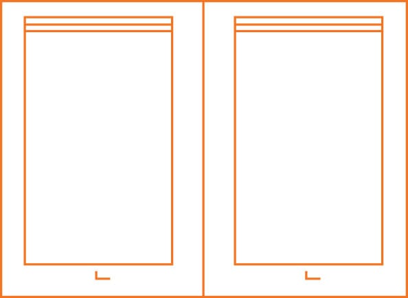
A SINGLE-COLUMN GRID is generally used for continuous running text, such as essays, reports, or books. The block of text is the main feature on the page, spread, or device screen.
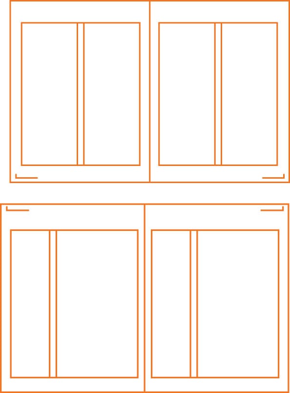
A TWO-COLUMN GRID can be used to control a lot of text or to present different kinds of information in separate columns. A double- column grid can be arranged with columns of equal or unequal width. In ideal proportions, when one column is wider than the other, the wider column is double the width of the narrow column.
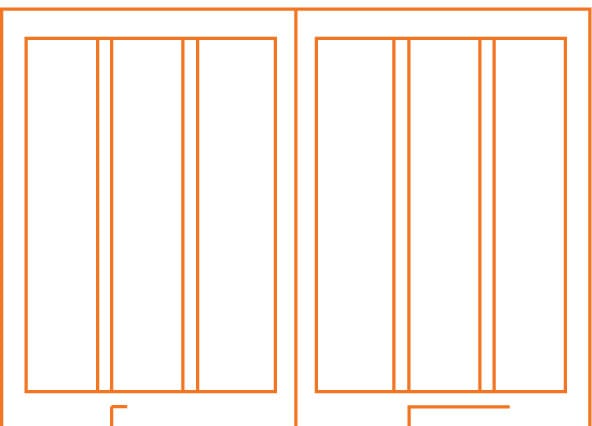
MULTICOLUMN GRIDS afford greater flexibility than single-or two-column grids, combine multiple columns of varying widths and are useful for magazines and websites.
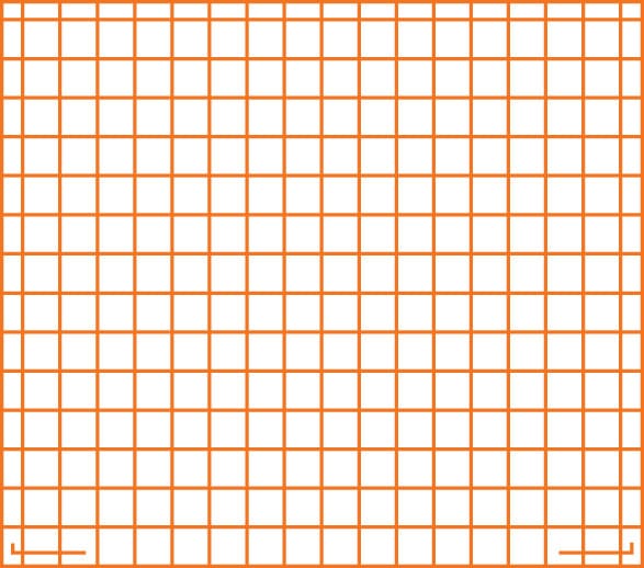
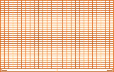
MODULAR GRIDS are best for controlling the kind of complex information seen in newspapers, calendars, charts, and tables. They combine vertical and horizontal columns, which arrange the structure into smaller chunks of space.
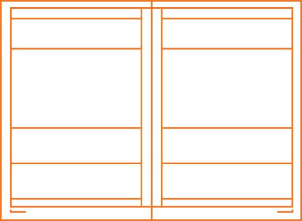
HIERARCHICAL GRIDS break the page into zones. Many hierarchical grids are composed of horizontal columns. Some magazines organize contents pages horizontally. For ease and efficiency, many devices break material into horizontal bands.
START BY ASKING
What is the material? Is it complicated?
How much of it is there?
What is the goal?
Who is the reader/browser/user?
DETERMINE THE APPROPRIATE GRID
3. Assess the Material
C ontent, margins, amount of imagery, desired number of pages, screens, and panels all factor into deciding how to set up a grid. Above all, the content determines the structure of the grid. The grid you use depends on each specific design problem, but below are some general guidelines:
Use a SINGLE-COLUMN GRID when working with continuous text, such as an essay or a book. A single column of text can seem less intimidating and more luxurious than multiple columns, making it suitable for art books or catalogs.
For more complicated material, TWO-COLUMN or MULTICOLUMN grids afford flexibility. Columns that can be further broken into two provide the greatest number of variations. Multicolumn grids are used for websites to manage a huge range of information that includes stories, videos, and ads.
For a lot of information, such as that in a calendar or schedule, a MODULAR grid helps to arrange units of information into manageable chunks. A modular grid can also be applied to newspapers, which have many zones of information.
